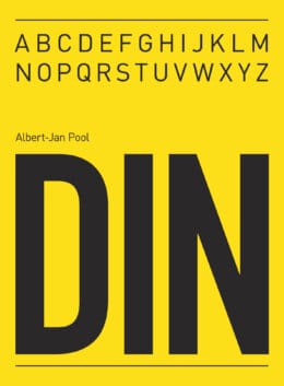
In 1994, Dutch type designer Albert-Jan Pool found himself in a cab with Erik Spiekermann, discussing the potential of typefaces. Spiekermann, a renowned figure in typography, suggested Pool should dive into designing a typeface himself. Drawing inspiration from the DIN 1451 family, known for its technical and industrial use in German traffic signs, Pool set out to create something new.
Pooling his focus on DIN 1451 Mittelschrift and Engschrift styles, Pool admired their precision and mechanical flair. This admiration sparked the journey that led to the creation of FF DIN, a typeface that would become iconic in the world of graphic design. Released by FontFont in 1995, FF DIN preserved the geometric and rigid qualities of its predecessors while adding more weights and styles to cater to modern design needs.
In the nearly three decades since its introduction, FF DIN has expanded to include variations like extra light and thin weights and has incorporated support for Latin, Greek, and Cyrillic scripts. This evolution made it a versatile choice for designers worldwide. From web applications to MacOS installations, FF DIN’s influence is widespread. It has inspired many other typefaces available on platforms like Creative Market, offering designers the robust functionality of DIN with unique twists.
For those who appreciate FF DIN’s structured aesthetic but seek alternatives, numerous fonts inspired by Pool’s work can be found, maintaining the spirit of his design legacy while offering fresh perspectives.
So, we’re going to look at those FF Din-inspired fonts.
10 FF Din Alternatives to Add to Your Font Library
Each of the 10 fonts we’re about to discuss was created by professional type designers on Creative Market or Fontspring. Either way, you’ll be getting variations on a classic typeface family that are ideal for use on everything from websites to logos and other branded materials.
Supporting all major European languages, Compasse’s 12 styles are all similar fonts to FF Din without ever coming off as derivative. You simply get attractive and well-spaced typefaces that are as effective when used for websites as they are for bold marketing materials. Legibility is the key here – each of the styles in this font family has slightly larger x-heights than normal to ensure they’re as readable on mobile devices as they are on desktops.
With an attractive style all its own, Panton comes in so many weights that you might not know what to do with yourself once you have it. Take some time to explore this font family, though, and you’ll find an FF Din alternative that’s perfect for a website project.
Pay particular attention to the uppercase lettering – it’s smooth and subtle without ever feeling like it stands out from the lowercase letters too much. That makes this font as strong a choice for your company logo as it does for website typography – you get access to clean and clear lines.
Substance calls itself the “Grotesque workhorse,” and it’s certainly more than capable of helping you create marketing materials with the FF Din feel.
There’s clearly a nod to Microsoft Windows – and the entire Microsoft suite – here as Substance makes a point of incorporating OpenType features that make it a good choice for the world’s leading operating system. Those features include the use of small caps, along with a host of tabular figures and signs that match those you’ll find in more established fonts.
Bebas Neue Pro comes out of the blocks with claims of being one of the world’s most popular fonts, highlighting its usage in branding from several companies as well as its viability as a font that’s ideal for personal use.
While all of that talk is a bit “marketing-heavy,” there’s no denying that this is an attractive print font that provides plenty of examples of its FF Din inspiration. You’ll especially see that in the character design, which mirrors the grotesque stylings of FF Din, albeit a little more condensed.
As an FF Din alternative, you can see the same influences from Germany that Pool used for his font running throughout StadtMitte. It has that mechanical edge, with the letters having a sharpness that results in them leaping off the page. Granted, this may not make it a great choice as a web font – there are more readable options out there – but this typekit excels when it comes to modern logos.
Versatility, thy name is Core Sans, at least when it comes to offering options for multiple languages that you can use in your published pieces. The creators recommend the font for books and screen display – making attractive PDF documents comes to mind as an ideal use – and it’s great for those who don’t want to see too much of a link between their lettering.
Why?
Large spacing – this is a font made as much for legibility as it is one that’s trying to follow in the footsteps of FF Din.
While far from a free alternative to FF Din – it’s actually one of the more expensive web fonts on this list – Noyh stands out because of its attractive letter design. You’ll see this in the “N” above, which eschews the regular placement of the horizontal line for something that gives the font a little more character.
Perhaps it’s those quirks that explain its enduring popularity, with several versions of the font also giving you access to italics for emphasis or just to increase your design options.
Where the original Transat font took a more…artistic direction that saw it post itself up as anything but a viable alternative to FF Din, Transat Text takes a subtler approach. Its creators even call it the “more rational sibling” of its Art Deco-inspired inspiration, meaning those who love FF Din are sure to be interested in this variation.
There’s a touch more softness in Delm than you might typically expect from an FF Din alternative, with the font moving away from Albert-Jan Pool and his design by introducing a bit more curvature. It doesn’t spam those curves to the point where it starts to feel like a script font, though. That makes it an excellent choice for those who want to find the middle ground between the mechanical nature of FF Din and the rounder edges of an OpenType font like Calibri.
If you’re noticing similarities between Bio Sans and the previously discussed Babas Neue then you have a great eye – Dharma Type called Bio Sans a font that was inspired by that very creation. It aims to stay in contact with the neutrality needed for legibility while still bringing something new to the table.
You’ll see that in the geometric design of the lettering, which lends Bio Sans a sophistication that makes it a great choice for basic type display. We could see something like this becoming the next font of iOS if Apple didn’t already have a huge number of fonts from which to choose.
Sadly, FF Din isn’t part of the collection that you’ll find in the Google Fonts family, though you’re not out of luck if you want something similar to Pool’s creation. Google does offer D Din – one of the inspirations for FF Din – along with Gidole and Alt-Din. All three mirror the grotesque inspiration you see in FF Din, making them viable alternatives.
Is there a free alternative to FF Din?
Sure, there are several free alternatives to FF Din, starting with the previously mentioned D-Din. It’s available as standard in the Google font family. You might also find that Neue House Grotesk – which is available through Microsoft Word – is a solid alternative, though it’s a little thinner and a touch more rigid than FF Din.
What does “Din” mean?
The Din in FF Din is derived from the German term “Deutsches Institut für Normung.” That translates to “German Institute of Standardization,” and offers some hints to the origination of the entire Din family of fonts. We touched on this at the beginning of the article – Pool drew some of his inspiration from the Grotesque-inspired fonts that the German Institute of Standardization used for its road signs.
What is FontFont?
The interestingly named FontFont is the name of the font foundry that Erik Spiekermann ran when he first met Albert-Jan Pool. So, you can see exactly why Spiekermann was so keen to push Pool to create a Din alternative – he wanted a new font that his studio could publish.
Getting started with hand lettering?
Free lettering worksheets
Download these worksheets and start practicing with simple instructions and tracing exercises.