ITC Franklin Gothic Alternatives: A Collection of Alternative Fonts for the Adventurous Designer



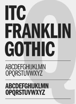
Franklin Gothic is everywhere. The font is so ubiquitous, that you’ve likely seen it hundreds, if not thousands, of times during your life. You just may not realize it, especially if you’re not immediately familiar with this sans serif font and its particular look and feel. But it’s everywhere – newspapers, headlines, books, album covers, and even the occasional sign have all used Franklin Gothic as a font to support the main goals of providing legibility and character.
So, where does the font come from? Its story begins in 1903 with a man named Morris Fuller Benton. Heavily influenced by the Akzidenz Grotesk font – as well as several others that sprung up in the wake of the revolutionary typeface – Benton created Franklin Gothic for American Type Founders (ATF). This was truly a case of a man leading the way for an entire company, as Benton was the head of ATF’s design department, as well as being its chief type designer. So, it was up to him to find a font that would help the company make sales and, ideally, put it on the map in the typeface world.
Franklin Gothic did just that. It became the most famous of the 200-plus fonts that Benton created thanks to its exceptionally wide use in news and magazine print in the years that followed its creation. And even as print has started to fade in popularity – thanks to the rise of the internet – Franklin Gothic enjoyed a new lease of life as a popular web font.
However, Franklin Gothic is not ITC Franklin Gothic. At least, not exactly. ITC Franklin Gothic is something of a remix of the original Franklin Gothic. Created in the 1970s by Victor Caruso, it’s an expansion that brings several new book weights to the original, with a higher x-weight than the original being the key difference. Regardless, anybody who’s worked with ITC Franklin Gothic knows how versatile the font can be. They may also be looking to get creative by using fonts similar to Franklin Gothic. That’s where this list comes in – a collection of fonts that makes achieving the Franklin Gothic look easy without going so far as to mar the aesthetic of the original font design.
ITC Franklin Gothic Alternatives
Frequently Asked Questions
Franklin Gothic has been used in so many ways that it’s almost impossible to associate it with a specific brand – it’s too ubiquitous. Some notable uses include the title cards for the “Rocky” films, which use a heavy version of the font, and a condensed version used for the subtitles in Star Wars. As for major brands, The North Face uses ITC Franklin Gothic. And all of this is without mentioning the multitudes of newspapers and magazines that have used the font over the years. The New York Times uses it, as does a game that any letter enthusiast will recognize – Scrabble.
Interestingly, the “Franklin” part of Franklin Gothic comes from a very famous source – U.S. founding father Benjamin Franklin. Beyond being one of the most important figures in American history, Franklin was a typesetter by trade and published several books himself, such as Poor Richard’s Almanac. As for the “Gothic” aspect of the name, that’s a common term used to describe many fonts contemporary to the late 19th and early 20th century, though it’s now used to describe typefaces that have a more classical flavor.
Benton is responsible for dozens of well-known fonts beyond Franklin Gothic. Century, the Cheltenham series, Norwood Roman, and Monotone Gothic all come from his creative mind, so the odds are high that you’ve seen at least one of his fonts somewhere during your lifetime.

Download these worksheets and start practicing with simple instructions and tracing exercises.
Download now!








Making beautiful design simple & accessible to all.
View More Posts