Welcome to another edition of our Behind the Shop series, where we dive deep into the creative journeys of some of the most inspiring professionals selling on Creative Market. Today, we’re thrilled to introduce you to the mastermind behind SilverStag, a thriving type foundry known for its bold, diverse font families. Our featured shop owner started in a completely different field, yet found their true calling in the world of design. From a first website built in Flash to running a successful type foundry in Madrid, this is a story of reinvention, passion, and unrelenting creativity. Join us as we explore the highs and lows of their creative journey, filled with insights, inspiration, and a love for all things type.
What inspired you to pursue graphic design in the first place? What were you working on before?
It might sound odd, but graphic design/font design is the only job I’ve ever had. I’ve always had an eye for it, but initially never really considered a career in graphic/web design. I went in a completely different direction with my university studies in civil engineering, although I was already experimenting with design during that time. Then a friend asked me to create a website for him—and I made my first one in Flash! (Quite ridiculous from where we are now.) After that, I devoted all my time to learning and experimenting, and never looked back.
For the first nine years, I worked as a brand/web designer and I loved it. But at one point, the only thing I was doing was answering emails—sometimes over 200 a day! That’s when I knew I needed a change.
Around that time, I discovered Creative Market and started making digital products. My success on the platform didn’t come overnight—I had ten years of experience behind me—but even the first month of selling on Creative Market surprised me. It showed me this could be the escape I needed. That’s when SilverStag was born. It has evolved over the past six years into a type foundry, because that’s now the only thing I do, and I couldn’t be happier.
When creating a new font or graphic pack, where does your creative process start? What inspires you?
Inspiration can strike anywhere!
When you live in Madrid, it might hit you while walking down the street, admiring the archways of the 400-year-old Plaza Mayor, or even while enjoying a beer and noticing the signage in a tavern. For example, one of my latest fonts, Reina Sofia, was inspired by a visit to the modern art museum named after the former queen of Spain. I’m lucky to live in a city so full of culture, amazing people, events, and things to do. It’s a constant source of inspiration.
How would you define your signature design style?
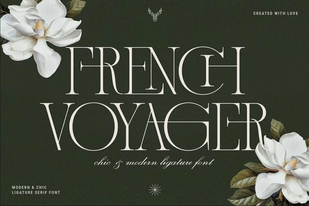
I don’t think I actually have one, unless you define “signature style” as a mix of everything! I love to experiment, which has helped me build a portfolio of over 100 font families, some of which are so different you wouldn’t believe they’re from the same designer. This diversity is what I’m most proud of in my work. My fonts range from super elegant serifs to bold, chunky sans serifs, from elegant handwriting to bold and colorful SVG families. That’s also what keeps it fun for me; otherwise, I’d get bored easily.
Has anyone ever doubted your talent? How did you resolve that challenge?
Myself! While my husband, family, and friends have never really expressed any doubts in my work, imposter syndrome is definitely real, and I often question myself. I’ve given up on fonts many times because I wasn’t satisfied with how they looked. Sometimes, I even feel like what I publish isn’t good enough, but my husband always pushes me forward and encourages me to give it a go.
We all have insecurities, especially when it comes to creative work in an industry where so many people are doing amazing things. I guess accepting that and doing your best each time you create something new is the way to beat the doubt. Even if it’s not perfect, you know you gave it your all.
How has Madrid as a setting inspired your work?
I can’t imagine living anywhere else! I’ve visited many cities and traveled quite a bit, and while each city has its own charm, Madrid is the only place where I feel at home. And as I mentioned, it’s full of inspiration. With so much history, it’s impossible not to be inspired all the time.
I’ve visited many cities and traveled quite a bit, and while each city has its own charm, Madrid is the only place where I feel at home at the moment. And as I mentioned, it’s full of inspiration. With so much history, it’s impossible not to be inspired all the time.
What was the inspiration behind your latest font, Holiday Whispers, in collaboration with Creative Market?
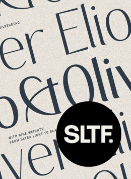
The inspiration behind SLTF Holiday Whispers was to capture the magic and elegance of the holiday season while offering a versatile typeface that could be used across various design applications. I wanted to create something that felt both classic and contemporary, with a touch of whimsy and a lot of personality.
I envisioned brands that embrace a sophisticated and festive aesthetic, such as:
- High-end retailers: Boutiques, specialty stores, and online shops with a focus on curated gifts and luxury goods.
- Hospitality and event planning: Hotels, restaurants, and event spaces looking to create a festive atmosphere and elegant branding materials.
- Beauty and wellness brands: Companies that promote self-care, relaxation, and a touch of indulgence during the holiday season.
- Food and beverage brands: Artisanal food producers, wineries, and confectionery brands with a focus on quality and craftsmanship.
- Creative entrepreneurs and small businesses: Designers, artists, and makers who want to add a touch of festive charm to their branding and marketing materials.
I believe Holiday Whispers can help these brands create a unique and memorable holiday experience for their customers, whether it’s through elegant packaging, captivating social media graphics, or personalized greeting cards.
Out of all the fonts you’ve designed, which one is your favorite and why?
I could never pick just one! Maybe a top three: The French Kiss, First Contact, and Silver Garden. But I could easily replace any of them! I tend to like the fonts that challenged me the most, and I believe these three did that. I could also add Collidge and Amelie Fierce…
What are the top 5 features/quality markers a customer should look for in a great typeface?
There’s one thing Viktor Baltus (@typedesignclass) said and it goes something like “Font is not a collection of beautiful letters, but a beautiful collection of letters” and I believe that sums it all up perfectly. The most beautiful fonts are those where the letters work together, telling the same story. That’s the first thing you should look for.
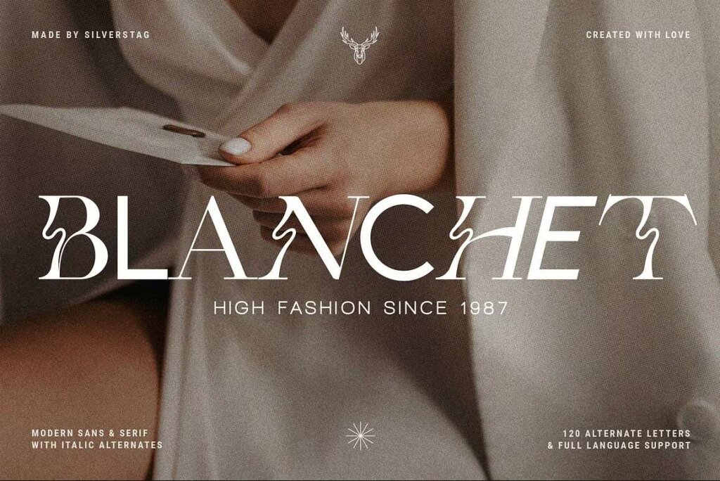
If you see a font with a few letters you like, but the rest don’t fit, it won’t work in the end. You’ll end up editing letters yourself, which either won’t work or will take too much time. So, look for a font that is a beautiful collection of all the letters it contains. There are other things to consider, of course, like the foundry’s rating, experience, and the quality of their other fonts, but I’d make this the most important factor.

Download these worksheets and start practicing with simple instructions and tracing exercises.
Download now!








Making beautiful design simple & accessible to all.
View More Posts