What makes a TV show font memorable? On a subconscious level, the fonts that are used can invoke a feeling, and set the tone of the TV show even before a viewer even sees it. The most successful TV logos can be recognized outside the confines of the show, and you can immediately be drawn into the storyline just by seeing the same font. The chosen typography has a lot to do with this experience. A good designer will choose a font that will be so encapsulating that it can draw you into a romantic era of time such as Mad Men, terrify you as in The Walking Dead, or draw you into a mystical fantasy of a different world like in Game of Thrones.
Breaking Bad
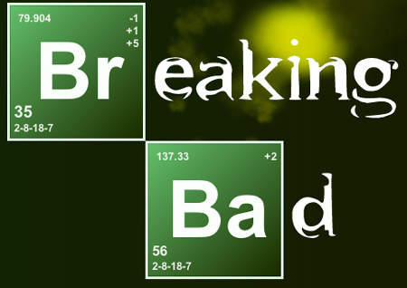
This is undoubtedly one of the best (and most popular) shows on TV right now, and possibly even ever. We are down to the final episodes and viewers are waiting in anticipation to find out what is going to happen to Walter White. We are all rooting for the good-guy turned bad-guy and both aliases are demonstrated in the use of the dual fonts in the beginning credits. Each word contains a periodic table style symbol (using the font of Arial MT Bold), which is a reference to Walt’s former life as a Chemistry teacher. Throughout the show, Walt takes on the alias Heisenberg who is the mastermind behind the greatest crystal meth operation in New Mexico. The second font used is known as Bundy. It is shown as a somewhat broken font, which is quite fitting considering we are now seeing Walt’s life beginning to crumble.
For those as obsessed with the show as I am, you can even have fun by transforming your own name into the Breaking Bad Name Lab.
Take a look at these similar fonts to replicate the Breaking Bad image.
 Â Â
Mad Men
The Mad Men typeface is in Swiss 721 Heavy, which is a variation of what most people commonly know as Helvetica. We see the 2 colors of red and white, and the simple font makes a bold statement. The font is elegant, yet daring. Whenever we see a sans-serif red/white combination, it’s hard not to think about Don Draper lounging on a couch with a cigarette in one hand and a cocktail in the other.
![]()
Are you looking to make an audacious statement in your project? Check out these similar fonts.
 Â
American Horror Story
This show scares the bejesus out of me and I just keep coming back for more. I’m not easily frightened by TV shows, but the opening credits alone make me want to cover my eyes and only peer through the cracks in my fingers. They use a unique font with long, slender strokes called Rennie Mackintosh that has become iconic with the show.
![]()
It took me a while, but I finally found some fonts that can live up to this one.
 Â
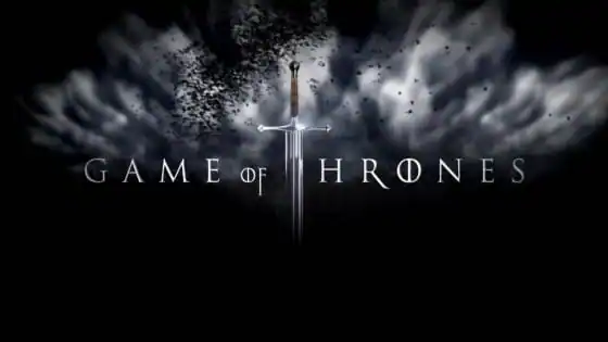
Game of Thrones
The font used in the HBO series Game of Thrones is was created specifically for the show by Charlie Samways. If you’ve never seen it, you will have a hard time following it if you try to begin watching it mid-series. I highly suggest starting from the very beginning. There are many storylines going on all at once, covering a broad spectrum of topics ranging from corruption to religion. One of the overarching themes of this fantasy drama is the civil war that has begun between several kingdoms in a search to gain control of the Iron Throne and the power that comes with it.
The Game of Thrones font is in all capital letters invoking a feeling of power, and has a mystical and fantasy-like twist to it.
This is such a fun font. I found a lot of beauties, but here are a couple that can be considered worthy.
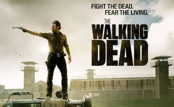
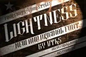
The Walking Dead
The Walking Dead is a horror show that keeps viewers on the edge of their seats. It is set immediately following the zombie apocalypse and almost every episode is action-packed. My heart starts beating a little bit faster every time I even think about the show.
The Walking Dead font is Tungsten. It’s rugged. It’s tough. One might even call it brutish.
Take a look at these similar fonts below.
 Â
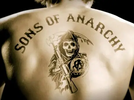
Sons of Anarchy
Sons of Anarchy is a show about an outlaw motorcycle club in California. During the opening of the show, you can see the credits being tattooed on the actor’s bodies, feeding into the rebel persona. So it’s only fitting that the show’s logo consist of a tattoo font, called Canevalee Freakshow.
Check out these tattoo-themed fonts. They are a great way to toughen-up your design.
 Â
Portlandia
What is there to say about Portlandia. It centers around a bohemian couple in Portland, OR who demonstrate the absurdities of all things hipster. The font used for its logo is known as Tiza. It has a grungy feel to it, which is very becoming of the show.
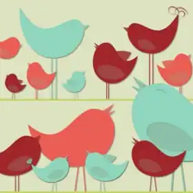
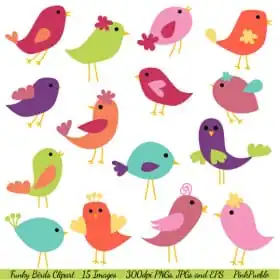
To class things up a bit, they even decided to Put a bird on it.
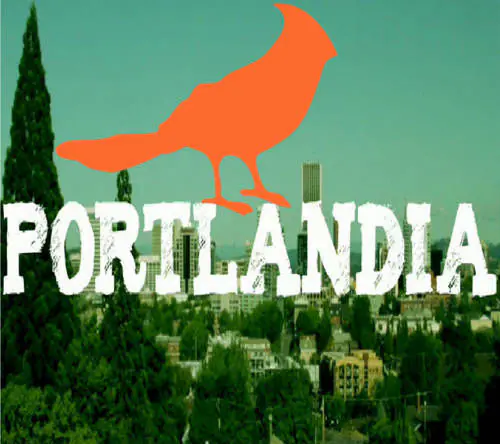
Take a look at these hipster fonts to help replicate the Portlandia look in your project.
 Â
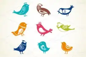
Now I know what you’re thinking…How can I get some birds to help spruce up my design? We have a collection of those as well.

If you’ve enjoyed this article, but still haven’t found quite the right font (or bird icon) that you were looking for, check out all that Creative Market has to offer for additional inspiration.

Download these worksheets and start practicing with simple instructions and tracing exercises.
Download now!