Categories / Inspiration

7 Unfortunate Type Trends We Wish We Could All Forget

Peter M Last updated: April 10, 2024 · 4 min read

Typography is a powerful skill in the designer’s arsenal. But as they say, with great power comes great responsibility. We’ve all seen examples of type that’s gone awry or that’s not so easy on the eye. In this article, we take a look at 7 type trends out there that we’d all like to forget. Designers, take caution! Make sure you’re not guilty of these. And let us know in the comments about any other type trends you’d like to see the end of. Enjoy!


1. Blinking Text.

Remember the HTML tag? If you don’t you’re lucky. Anyone who was around on the web back in the 90’s will remember seeing webpages with distractingly flickering text. It was almost enough to give someone a seizure. Was there ever an occasion where blinking text was appropriate? Probably not. But that didn’t stop designers using it on everything from coffee shop websites to those infamous ´Under Construction’ signs. Thankfully, it’s been a long time since we’ve seen text on a webpage blink. Type-Trends-To-Forget-1b
2. Stretched Type.

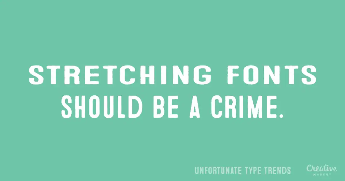
Designers at font foundries put a lot of painstaking care and effort into crafting the fonts we use. So when someone skews or stretches a typeface in Photoshop or using CSS, it’s almost criminal. If you want to give an element emphasis, a much better option is to use kerning or oblique versions of typefaces. Type-Trends-To-Forget-7
3. Dodgy Drop Shadows.

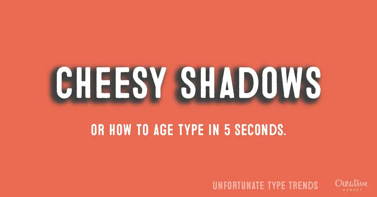
Like most design elements, drop shadows have their place, but only in moderation. A drop shadow works best when used sparingly and with subtlety. Overly thick, dark edges around text will only serve to distract readers from your message, not highlight it. Type-Trends-To-Forget-6
4. Rainbows, rainbows, rainbows.

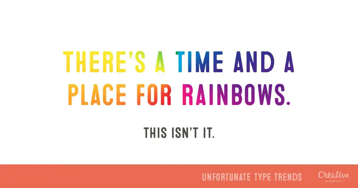
The Photoshop Filter tool has a lot to answer for. It’s certainly been responsible for some beautiful masterpieces, but it’s also been responsible for glaringly bad design work. High on the list of which is anything filled with rainbows. Once again, there’s a time and a place for the multi-colored look, but please, use it responsibly. Type-Trends-To-Forget-5
5. Tiny Type.

This was another common type trend way back in the 90’s. For a while there, it was tough to visit a designer website that didn’t have type that required a magnifying glass to interpret. It goes without saying that if your audience can’t read your type, it doesn’t matter how awesome it looks. Thankfully, we’re seeing a resurgence of big, bold typography on the web of late. Type-Trends-To-Forget-4
6. Papyrus.

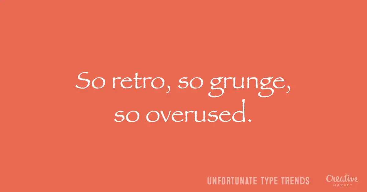
Microsoft’s Papyrus might be a well-crafted typeface, but it’s woefully overused. It’s visible on everything from your local Chinese takeaway menu to the logotypes of every second yoga studio. If you’re a designer, it’s wise to step outside the box and find a typeface that’s more unique. Type-Trends-To-Forget-3
7. Anything With Comic Sans.

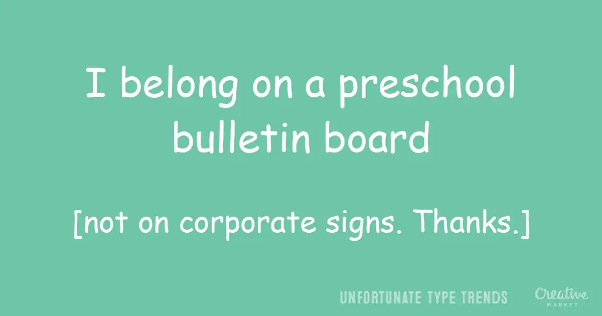
You’d think people would’ve learned by now, wouldn’t you? There’s only one instance where Comic Sans is the BEST typeface to use. And that’s if you’re designing a notice to sit on the bulletin board of your kid’s playgroup. And even then we’re fairly certain you could find something nicer. Type-Trends-To-Forget-2 So there you have it, 7 type trends we’d like to see the end of. What about you? What type trends would you wish were less common? On the web, or in print. Let us know in the comments below.

Products Seen In This Post:


getpaidtowrite-banner

Lettering Worksheets
Getting started with hand lettering?
Free lettering worksheets

Download these worksheets and start practicing with simple instructions and tracing exercises.

Download now!
Tags:
About the Author
Author
Peter M
Related Articles
23 Comments
  • How about not understanding the very concept of contrast? Type over photos of nearly the same color, yellow type on white and don't get me started on the utter non existence of proper kerning among today's woefully under-trained designers. 11 years ago
  • I have to disagree with #7...there is NEVER a good place for Comic Sans! 11 years ago
  • Sorry author, but these are all really obvious, and not really trends, just unfortunate occurrences in a world where people can use the title "graphic designer" without ever having gone to school. 11 years ago
  • Stop it, it's a fine font for doll instructions! 11 years ago
  • 1) here's a favorite that I once shared with a type design instructor who laughed out loud. https://youtu.be/uoMFUkYSLWc 11 years ago
  • 2) have they gotten lazy at Disney? The mailbox at 2:30! https://youtu.be/2HcXfCPAg0M 11 years ago
  • 3) the worst offender for #5 was "Emigre" magazine, followed closely by "Wired." I think it was their way of saying "if you can't read this you are too old and we don't want you to read this." 11 years ago
  • It came a point where doing the same jokes over and over again on Comic Sans and Papyrus became an "unfortunate type trend we wish we could all forget" itself. 11 years ago
  • I dunno, that rainbow type doesn't look half bad to me. 11 years ago
  • Agree with Isadora, these aren't trends, they're just bad design choices. 11 years ago
  • Unfortunately the game Undertale has made Comic Sans and Papyrus cool again. 11 years ago
  • If you're ever looking for a negative example, this website has got to be it. http://www.calvarywilliamsport.com/christian-coloring.html I don't care if it is for kids. 11 years ago
  • Lyn Miller, why did you make me click that link?!!!! I haven't seen something this awful in years. 11 years ago
  • Sadly, these are not the worst. In fact, some of them aren't really all that bad IMHO 11 years ago
  • Amen @Ignacio Igounet - let's hear some fresh jokes please. I frequently tell my 5 year old that even if it's funny the first time, it's no longer funny when you repeat it over and over again. 11 years ago
  • Its a while since I've seen Papyrus used anywhere except in lists of things not to do with type. 11 years ago
  • I agree - these are so obvious, I can't believe any 'designer' actually still does any of this. The Calvary Church - oh Lord Lyn Miller -- I think we can assume no design training there. LOL MINE EYES! 11 years ago
  • )) BUT seems there is one exclusion... when you get greeting card on you birthday with Stretched Comic Sans, filled with rainbow and with so soft and fat shadows.... it's really great when you get It from someone you like (someone who is not in design), after a weeks of hard project) 11 years ago
  • Anonymous
    > Remember the HTML tag? Huh? did you mean / > This was another common type [tiny type] trend way back in the 90’s "back in the 90s?" I see tiny type all the time, TODAY. And it's USUALY designers doing it. :: speaking of UNREADABLE text :: Check out you guys using a shade of gray, on a gray background. A SUPER UNREADABLE design tactic. It's NOT cool, it's idiotic. 11 years ago
  • Sky (broadband and TV provider in the UK) are huge fans of rainbow text. It doesn't look bad to me, but they seem to be the only company that uses that effect. 11 years ago
  • Haha, I really like no. 6: "Papyrus" :))) Just Papyrus! 11 years ago
  • Italic type--all in caps. 11 years ago
  • Completely agree! awesome post! 9 years ago