



You’ve heard of the Super Bowl, right? It’s that event where a bunch of men get together, put on protective padding, and attempt to give each other concussions for anywhere from 2-12 hours, depending on overtime. Oh, and at the beginning of each play, a bunch of men on both sides bend over, while one man puts his hand on the perineum of the center, until the ball is handed to him. Nope, nothing weird about this sport at all.
Anywho, the Super Bowl is when people of all ages sit around and watch as the two best teams in the league battle it out, and this year celebrates 50 years of the big game. And, as such, they have a logo. Here it is.
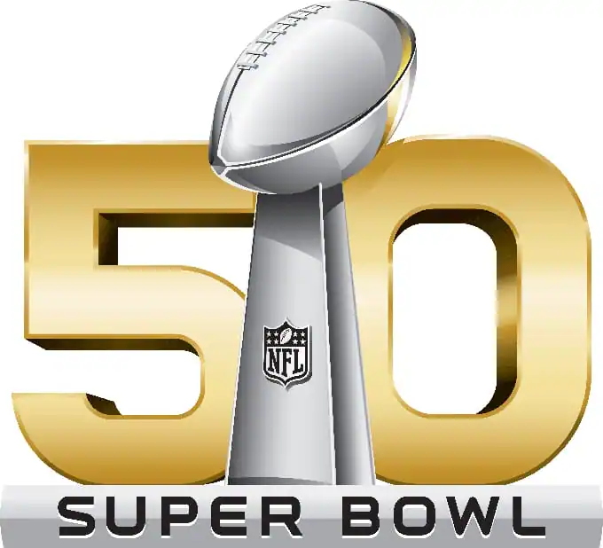
Anything look different about that? Maybe. Well here’s last year’s logo:
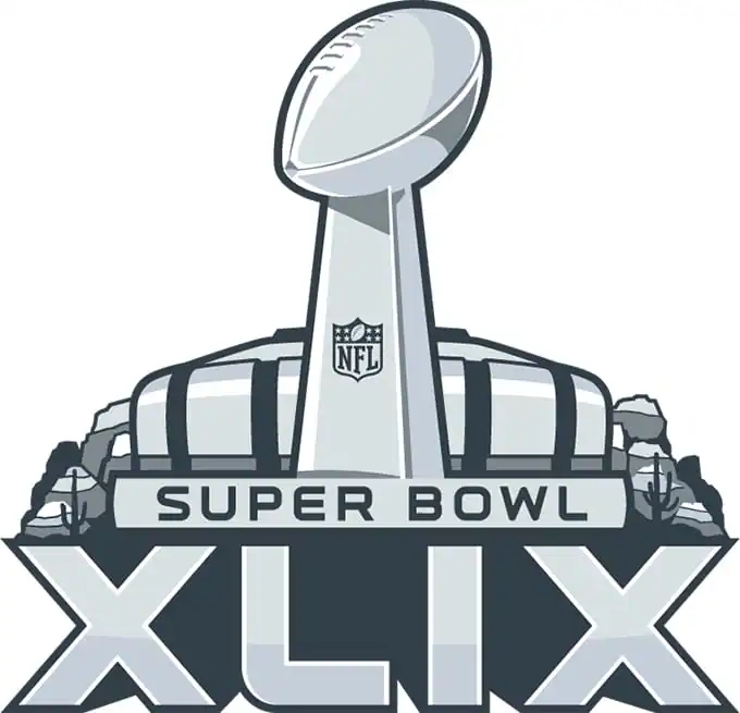
And the year before that:
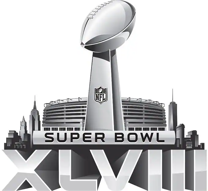
Figure out what’s off yet? That’s right, they switched from Roman numerals to numbers. Why? Well the logical conclusion is that it’s the 21st century and nobody knows how to use Roman numerals. But in reality, it’s a bit more simple.
In Roman numerals, the number 50 is represented by an “L.” And so, this would have been Super Bowl L. Which is silly on a number of levels – or genius, if you want to refer to the Super Bowl in the same way a soccer announcer does when he’s calling a point. “GOOOOOAAALLLLL!”
So, in the infinite wisdom of a corporation that is made up of billionaires that was tax-exempt up until last year, they decided to go back to good, old-fashioned numbers.
When it comes time for you to sit down and watch the big game this weekend, just think about what could’ve been if it weren’t for those jerks. It’s much more fun to ask your friends to come over and watch the Super BOOOOOWWWWWLLLLL!” right?
Kevin Whipps is a writer and editor based in Phoenix, Arizona. When he’s not working on one of the many writing projects in his queue, he’s designing stickers with his wife at Whipps Sticker Co.

Download these worksheets and start practicing with simple instructions and tracing exercises.
Download now!






Hi! My name is Kevin Whipps, and I'm a writer and editor based in Phoenix, Arizona. When I'm not working taking pictures of old cars and trucks, I'm either writing articles for Creative Market or hawking stickers at Whipps Sticker Co.
View More Posts

2 Comments