



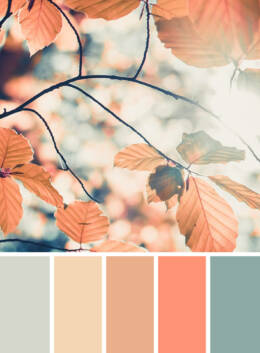
As the air turns crisp and the leaves begin to change, it’s the perfect time to refresh your work with beautiful fall color palettes. From warm earthy tones and golden yellows to rich burgundy reds and deep forest greens, autumn color palettes capture everything we love about the season while bringing warmth and personality to creative projects of every kind.
Whether you’re designing branding, social media graphics, illustrations, websites, home décor, or seasonal marketing campaigns, the right fall color scheme can instantly set the mood. In this collection, we’ve rounded up 15 inspiring autumn palettes complete with HEX codes, making it easy to recreate these seasonal combinations in your own designs.
Love what you see? Download each palette below and start bringing a little autumn magic into your next project.
What Are Fall Colors?
Before we take a look at some examples of color palettes for fall, it’s important to understand what this term actually refers to.
Fall colors (also called autumn colors) are warm, earthy shades inspired by nature during the autumn season. Traditional fall color palettes typically combine rich oranges, burnt sienna, mustard yellow, olive green, rust red, warm browns, and muted neutrals to create a cozy, seasonal aesthetic.
These colors are popular across graphic design, branding, fashion, interior design, packaging, and digital illustration because they evoke warmth, comfort, nostalgia, and the changing landscape of autumn.
Many fall palettes also include complementary shades like deep plum, cranberry, forest green, cream, charcoal, and copper, giving designers endless possibilities for seasonal projects.
Where Can You Use Fall Color Palettes?
The beauty of a fall color palette is its versatility. Whether you’re designing for print or digital, these warm seasonal hues can instantly create a sense of comfort, nostalgia, and sophistication. From earthy neutrals to rich burgundies and burnt oranges, autumn color schemes work across a wide range of creative projects.
If you’re building a fall brand identity, warm autumn colors help create a welcoming, premium feel for seasonal campaigns, packaging, logos, and marketing materials. They’re especially popular with cafés, bakeries, wellness brands, handmade businesses, and lifestyle products looking to embrace the cozy spirit of the season.
For graphic design, fall color palettes are ideal for social media graphics, Pinterest pins, blog graphics, email newsletters, digital ads, presentations, and editorial layouts. Pairing seasonal colors with expressive typography and textured illustrations can instantly make your designs feel fresh and relevant.
Planning a seasonal event? An autumn color palette for wedding invitations, stationery, menus, and event signage creates an elegant, timeless look inspired by changing leaves, candlelight, and harvest celebrations. These same hues work beautifully across greeting cards, printable planners, and scrapbook designs.
Fall colors are also a favorite for website design and UI design, where warm accents and earthy backgrounds can make landing pages, online shops, and portfolios feel inviting without overwhelming the user experience.
If you’re creating illustrations, surface patterns, or digital artwork, autumn palettes lend themselves perfectly to botanical illustrations, cozy landscapes, vintage-inspired prints, packaging design, and seasonal product collections. They’re equally at home in home décor, textile design, wallpaper patterns, and printable wall art.
Our Favorite Fall Color Palettes
Now we know the meaning of the term, let’s explore some awesome examples of color palettes for fall.
1. The Quintessential Fall Color Palette
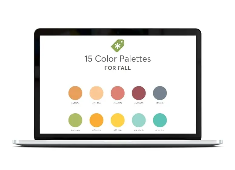
Download our set of color palettes to get their exact hex codes!
Download the palettes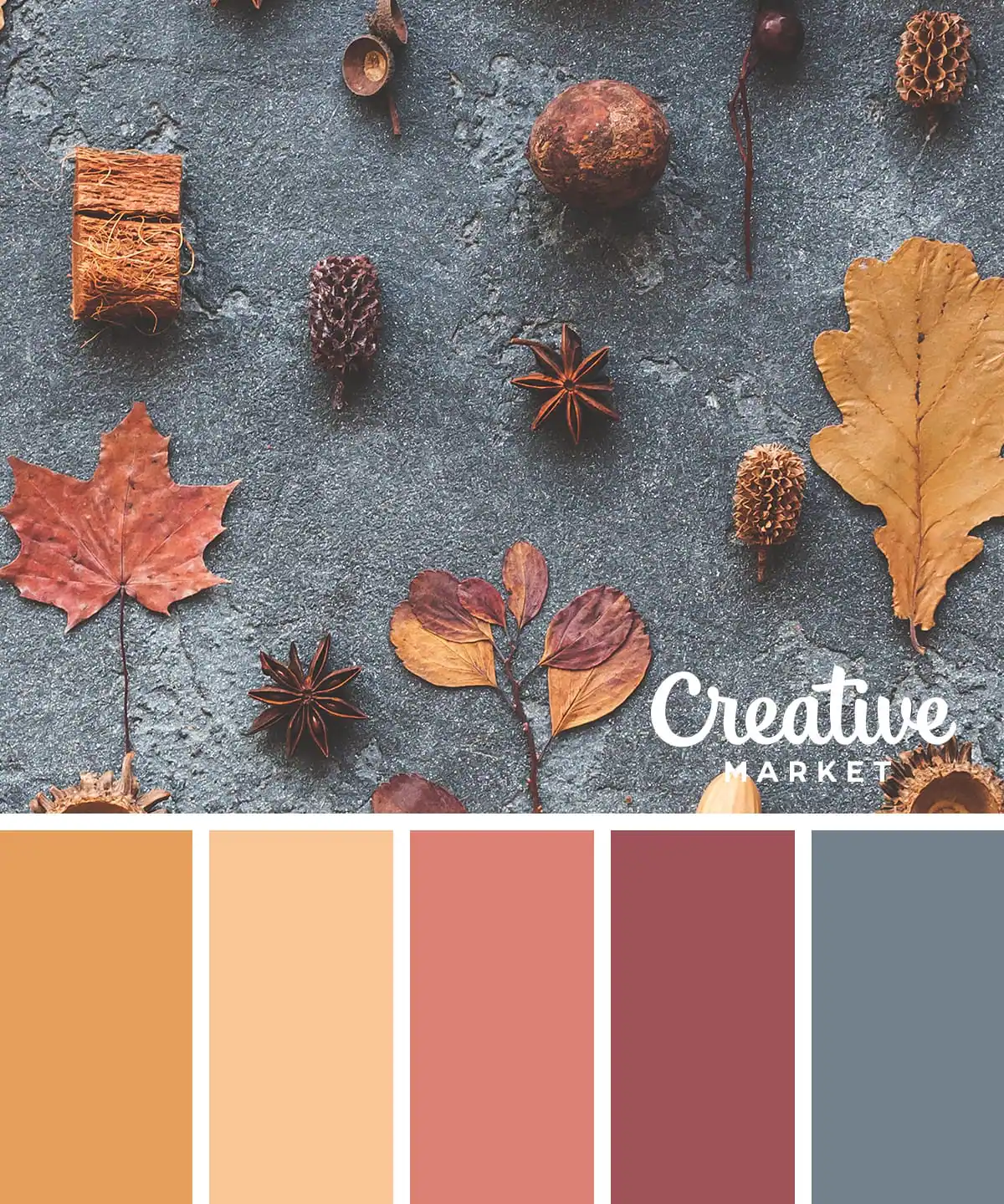
This is the classic autumn color palette, featuring some of the most traditional fall colors. It’s mostly made up of muted tones of orange and pink, set across a backdrop of slate gray.
2. A Bold and Bright Fall Color Palette
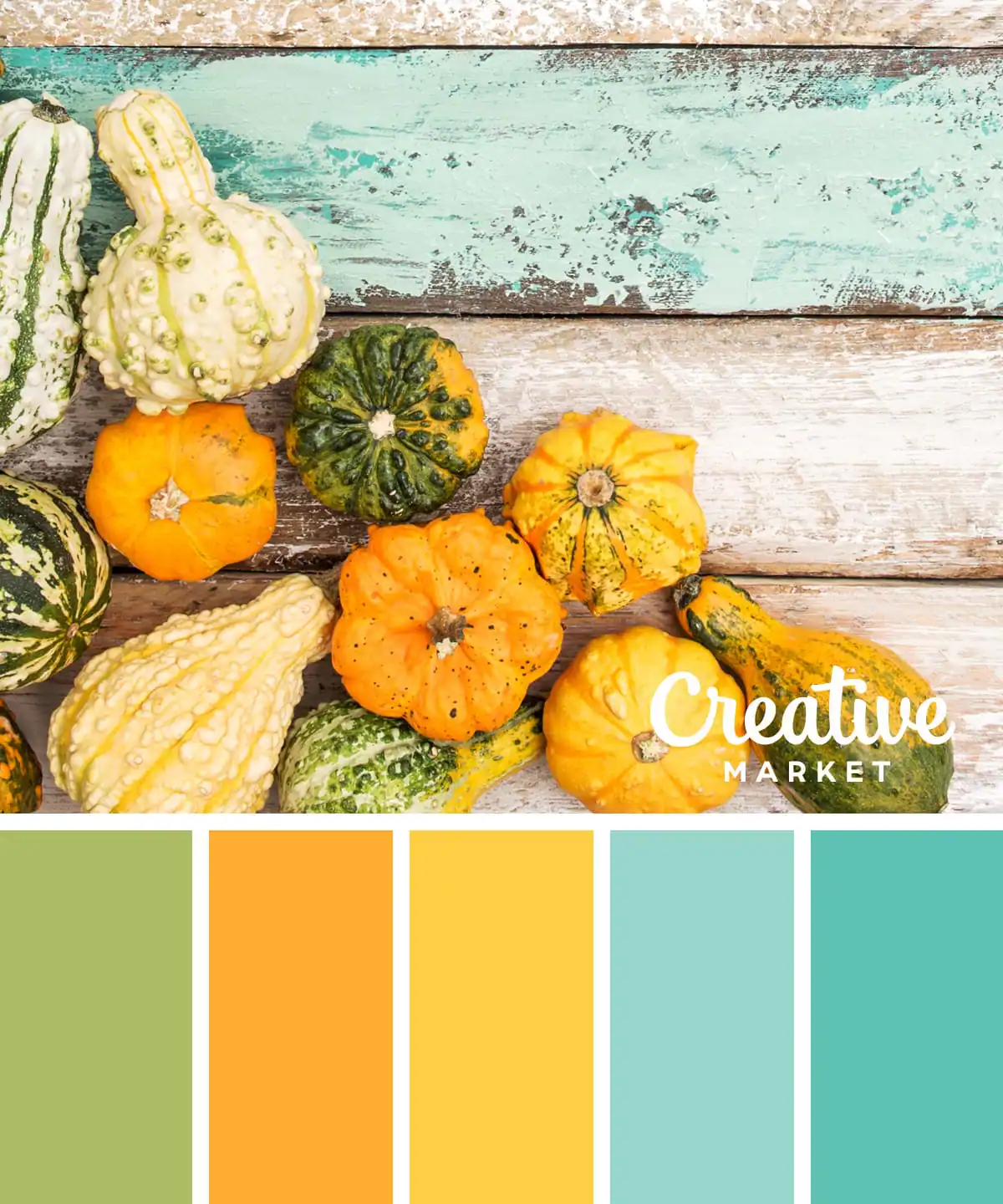
A lot of fall color palettes focus on subtlety, with gentle colors and warmer undertones. But not this one. This bright and bold color palette fall 2024 focuses on lighter shades, like mustard yellow and olive green. Don’t be afraid to play with variations of the traditional fall color palette, especially if you favor something a little more “out there.”
3. A Warm Fall Color Palette
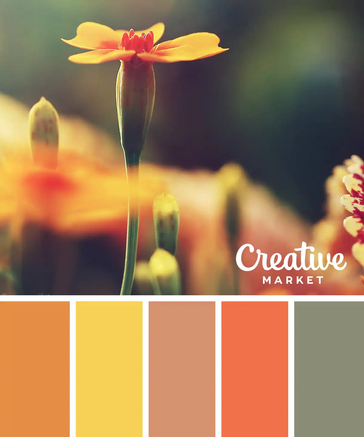
Next up is a warm and toasty autumn palette, inspired by the flowers that flourish in fall. This fall palette is all about warm colors and tones, like golden brown and other bright colors.
4. A Light and Airy Autumn Spectrum Color Palette
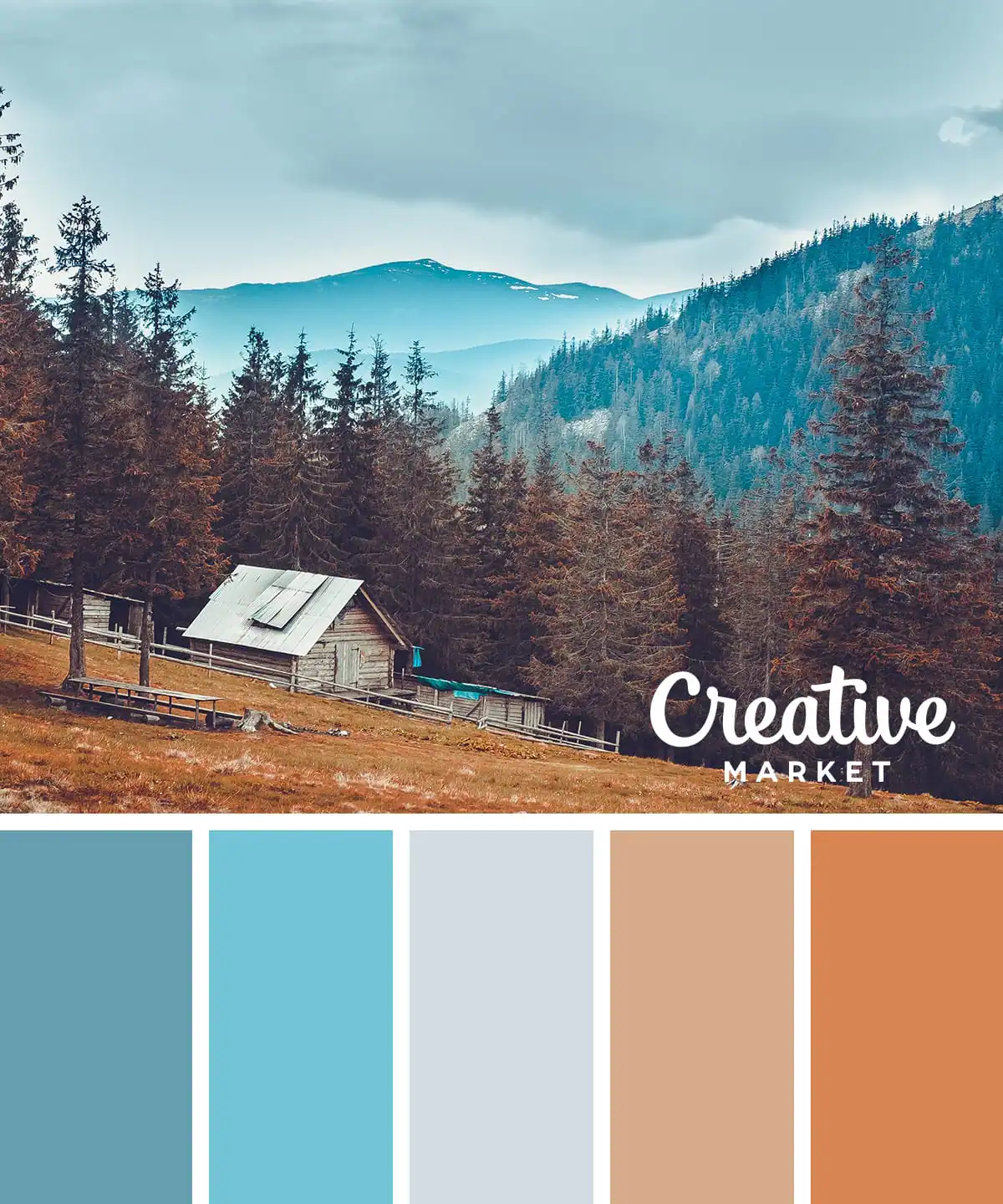
This option offers more of an unconventional color palette for an autumn event or for the home. This colorway incorporates dark blue, shifting to light blue, gray, and into warm tones of the brown family to finish off. It’s a color palette that’s still decidedly “fall” but a little cooler, perfect for transitioning into the winter season.
5. Muted Color Palette of Fall
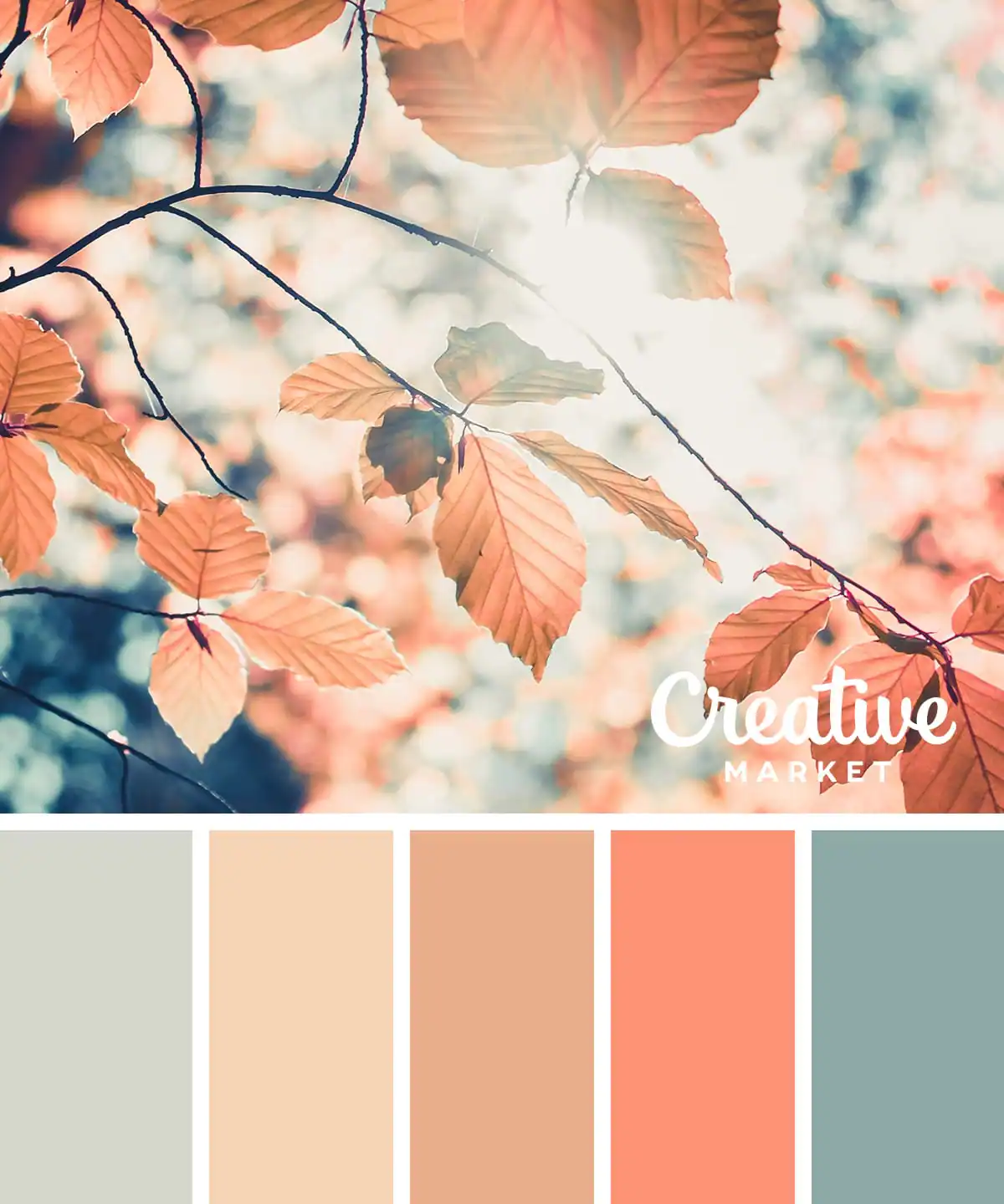
Many of the best fall color palettes tend to be soft and muted, like this one. Eschewing dark autumn colors, it makes use of the lighter hues of the color wheel.
6. Country-Style Color Palette for Autumn
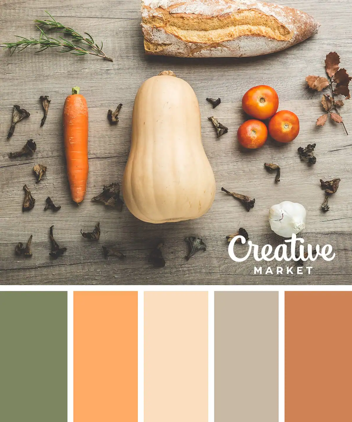
This fall palette features a bold mix of colors, ranging from skin tones shades to intense olive green and medium brown at the end.
7. A Corn-Inspired Fall Color Palette
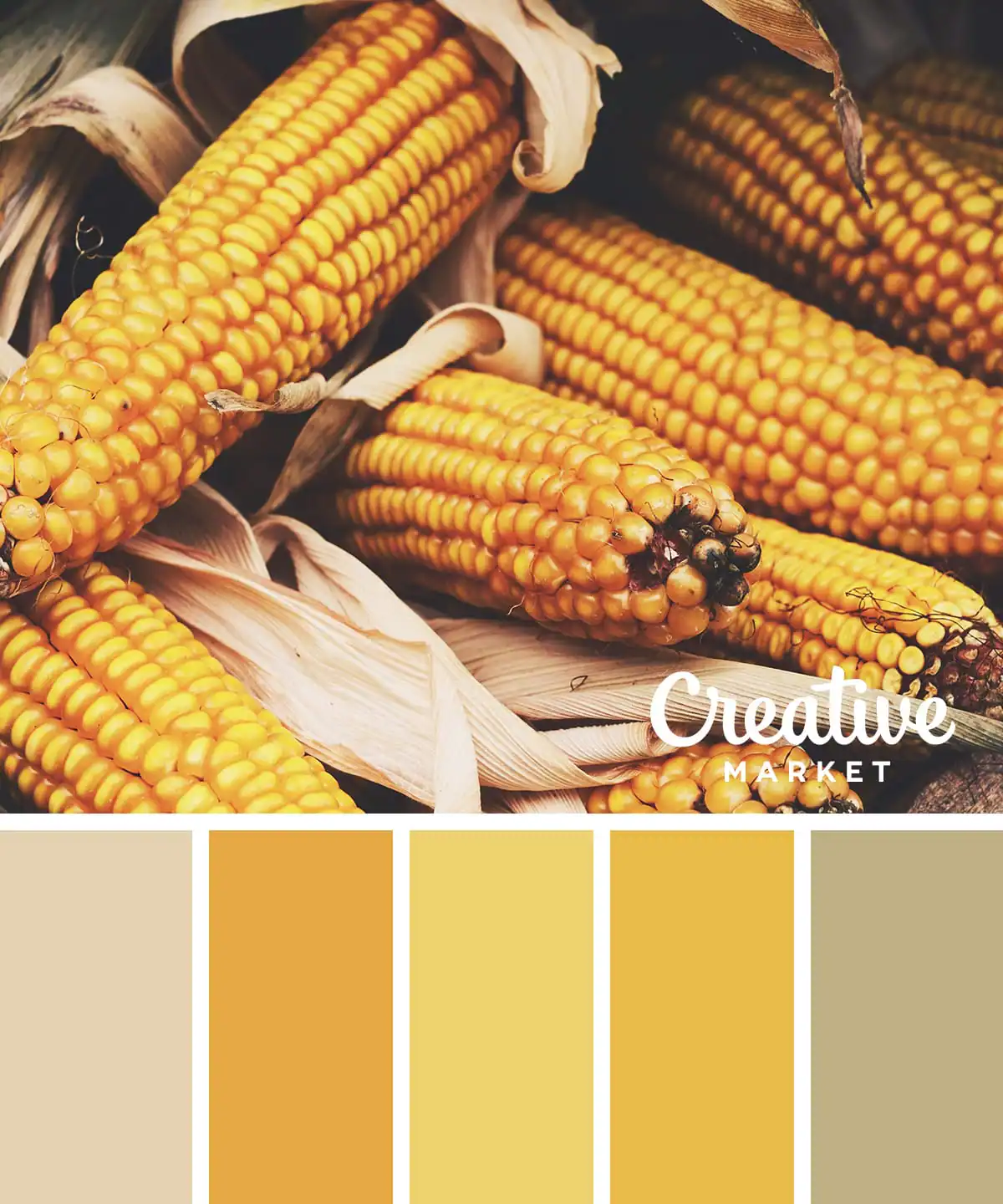
This one is all about the time of harvest. This soft autumn features a great range of complementary shades, all based on the theme of corn. Gold, yellow, and gray blend together nicely, delivering a true autumnal vibe.
8. A Spicy Fall Color Palette
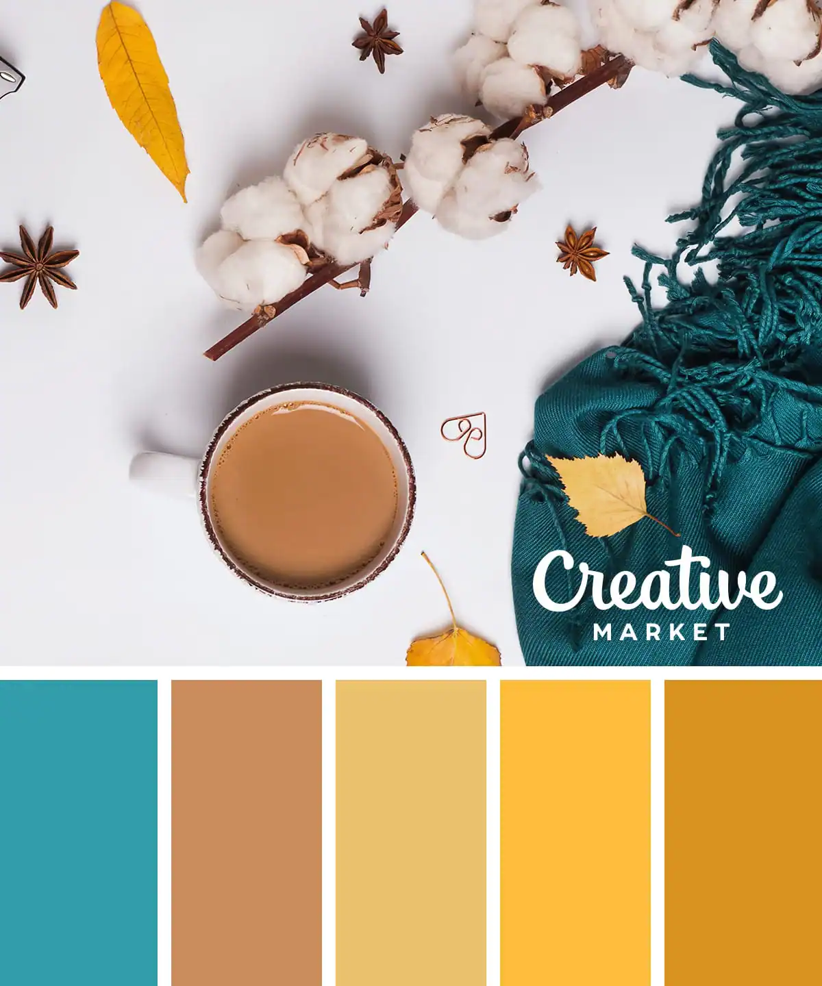
You’ll certainly crave a pumpkin spice latte after looking at this soft autumn scheme, which mixes traditional fall colors, like golden brown, with more wintery elements, like dark blue.
9. The Pastel Fall Color Palette
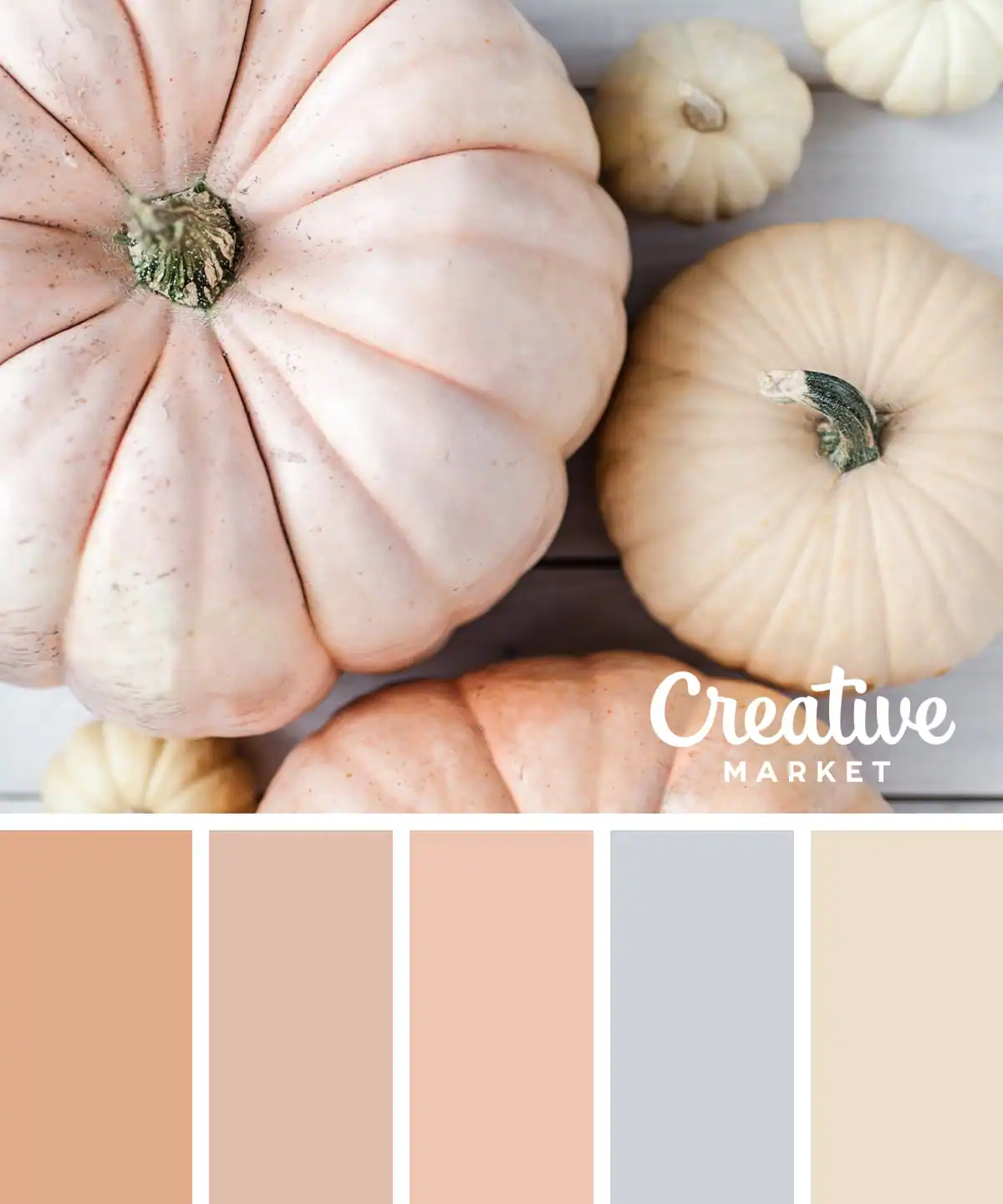
As previously stated, many of the best autumn palettes bring in gentle, muted hues, like this, which is entirely made up of pastel shades of pink, brown, and blue. This palette is perfect if your seasonal type leans a bit more toward spring but you still want to embody the fall elements.
10. Bold Shades Fall Color Palette
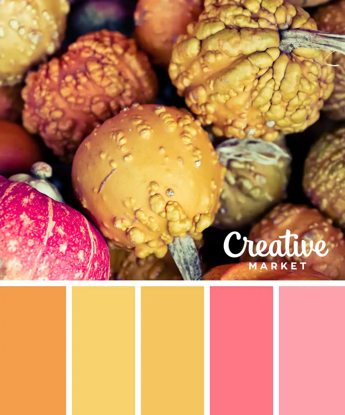
Next up is a bolder and brighter fall color scheme. This one includes jewel tones, like ruby pink, mixed with vivid colors of fall, like orange and yellow.
11. A Soft Autumn Color Palette
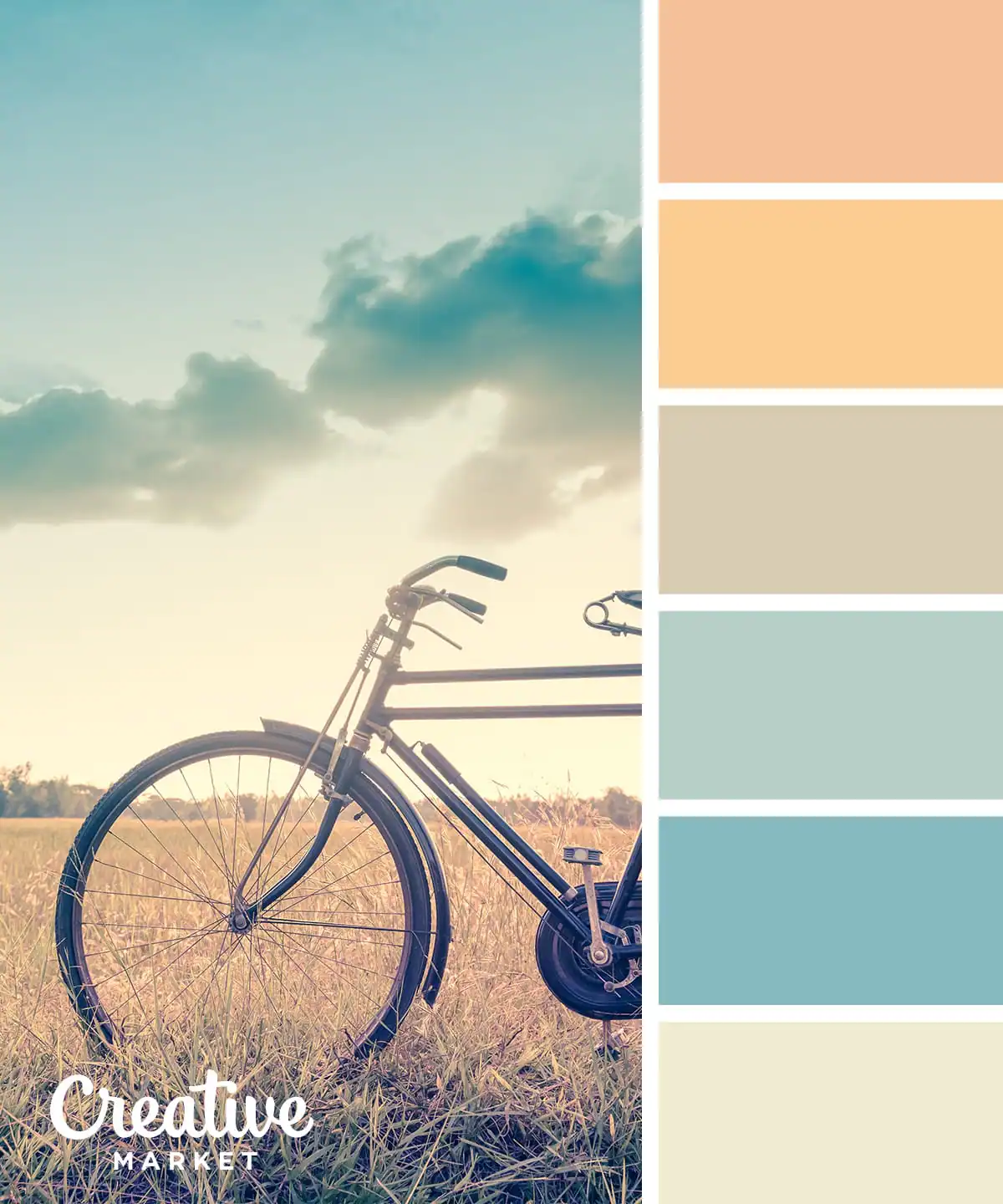
Here’s another example of how you don’t necessarily need dark colors like deep brown or deep green to make great fall color palettes. This one has very light and soft hues, with golden undertones throughout.
12. The Out-of-the-Ordinary Fall Color Palette
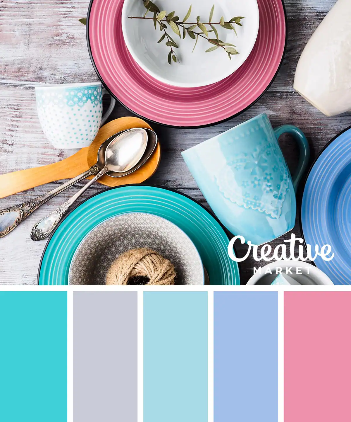
For this option, you’ll find a pretty surprising color palette that doesn’t feature any of the usual colors of fallen leaves or pumpkins. Instead, it’s a mix of blues, with gray and pink to add contrast. It’s bright, poppy, and fun!
13. The Golden Blonde Fall Color Palette
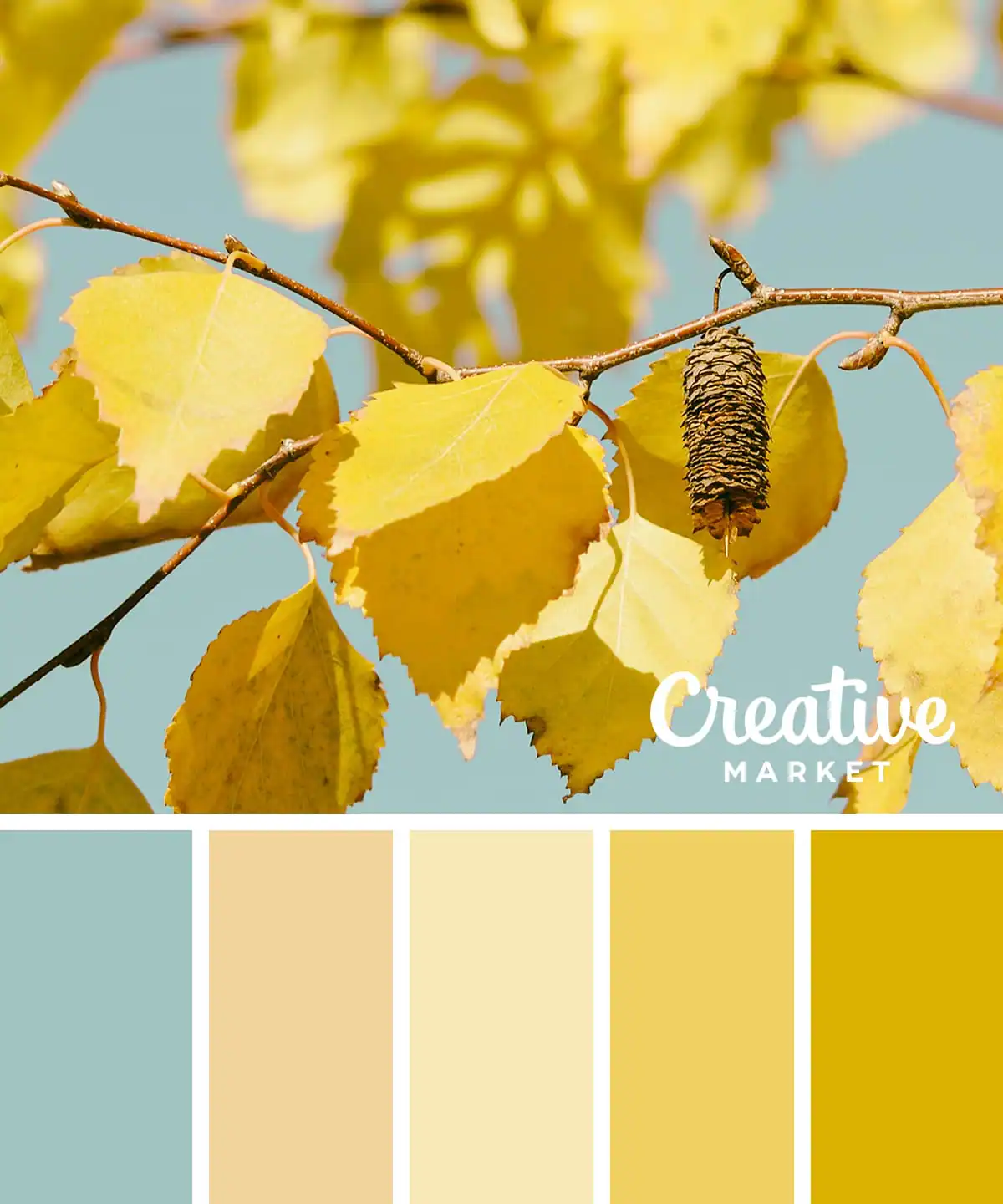
A lot of autumn color palettes take fall leaves as their inspiration, but many focus on rich colors of red and orange. This one takes a lighter touch, focusing instead on similar shades of yellow and gold.
14. The Pretty-in-Pink Fall Color Palette
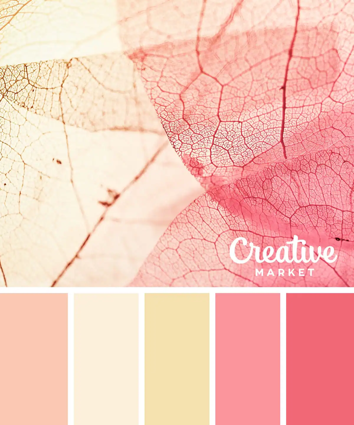
We’ll finish up with this beautiful color palette, which has pink as its central theme. It features no less than three shades of pink, stretching out into red and yellow to add depth.
Traditional fall colors include burnt orange, mustard yellow, rust red, burgundy, olive green, forest green, warm brown, copper, cream, and muted gold. These shades are inspired by autumn leaves, harvest landscapes, pumpkins, and cozy seasonal textures, making them ideal for fall-inspired designs.
A fall color palette is a collection of warm, earthy colors inspired by the autumn season. These color combinations are commonly used in graphic design, branding, fashion, home décor, illustrations, and seasonal marketing to create a cozy, welcoming aesthetic.
Start by considering the mood you want to create. Warm oranges and golden yellows evoke energy and nostalgia, while deep greens, burgundy, and earthy browns create a richer, more sophisticated look. Pairing complementary tones with neutral shades helps create balanced, versatile color palettes.
While classic autumn shades remain timeless, many designers are embracing muted terracotta, moss green, cinnamon brown, dusty plum, golden ochre, and warm neutrals alongside traditional oranges and reds for a more contemporary seasonal palette.
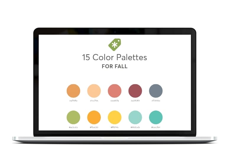
Download our set of color palettes to get their exact hex codes!
Download the palettes








Making beautiful design simple & accessible to all.
View More Posts



17 Comments