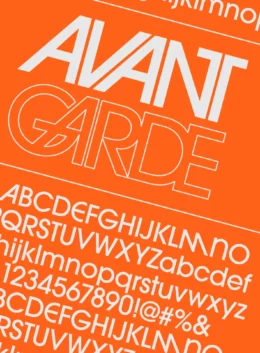
The story of ITC Avant Garde starts with a magazine that gave the font its name. In the 1960s, a then-new type foundry named ITC started work on a sans serif font with a twist – one that would be used for a new magazine created by Ralph Ginzburg. The publisher wanted a unique style for a font that would soon grace the covers and pages of his upcoming Avant Garde Magazine, leading to a pair of designers – Herb Lubalin and Tom Carnase – putting their heads together to come up with some ideas.
Lubalin focused on the upcoming magazine’s logo, utilizing a sans serif font designed on the back of Art Deco inspiration. Sleek and straight lines separated his design from similar fonts, with several of the characters Lubalin created featuring slants where they don’t normally exist, while still keeping the rounded corners you see in typical sans serifs.
Though he wasn’t involved in the creation of the magazine’s logo, Lubalin came in a little later when Ginzburg required a full alphabet for his magazine. Drawing from the logo, he was ultimately the one to create something similar to ITC Avant as we know it today, though the font was still in its formative stages at this point.
It wasn’t until the 1970s – when Ed Benguiat started working on the font – that we started to see ITC Avant Garde Gothic take the form that we see today. He condensed the lettering that Lubalin created, lending the font more versatility, and set the stage for ITC Avant Garde to inspire many fonts that came later, including the perhaps better-known Century Gothic and the lesser-known Tex Gyre Adventor.
Still, it’s the original version that remains a firm favorite, with designers like Matt McInerney often calling upon it to give their pieces a unique flavor. But what if you want fonts similar to ITC Avant Garde, while still having their own sense of personality?
That’s where this article comes in – your guide to 10 fonts (spread across Creative Market and Fontspring) that have a similar look to ITC’s font while still having unique characteristics of their own.
Go Beyond ITC Avant Garde Gothic with These 10 Alternatives
It’s time to find a typeface that tickles your fancy – these are 10 ITC Avant Garde alternatives that come pretty close to the original design.
Frequently Asked Questions
Unfortunately, Google Fonts doesn’t make the original version of ITC Avant Garde available to its users, though it has come up with a couple of alternatives. Specifically, Raleway and Poppins are great alternative choices, with Poppins in particular being very similar to the Gothic version of ITC Avant Garde that Ed Benguiat designed in the 1970s.
Unlike Google, Adobe offers full support for the ITC Avant Garde family of fonts. That won’t come as much of a surprise if you remember that the font was initially designed for display purposes in a print format – that makes it an ideal choice for the creation of digital documents in Adobe that may be printed out for marketing purposes. You can access the font as long as you have a Creative Cloud plan with Adobe, and the company has made it available for both desktop and web use.
An interesting point we didn’t mention in this article’s introduction is that ITC Avant Garde originally came in two flavors – the display and text versions. There are several differences between the two, with the display version of the font featuring more ligatures in the lettering, as well as an assortment of special characters that weren’t available for the text version. Those features were scaled back – aiding legibility in the process – with the later Gothic variant of Avant Garde drawing more inspiration from the text version than the display one.

Download these worksheets and start practicing with simple instructions and tracing exercises.
Download now!








Making beautiful design simple & accessible to all.
View More Posts