



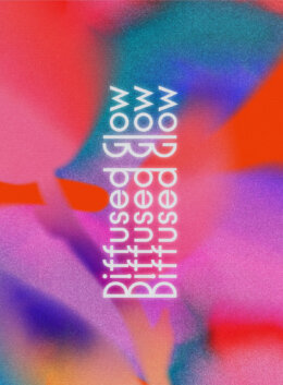
Our visuals are currently overwhelmingly defined by an almost uncanny clarity with hyper-defined detail; so what we are seeing emerge is a growing shift toward something softer; more atmospheric. The diffused glow design trend within this context is the new visual mood; one that moves away from precision and toward a sense of light that feels filtered, ambient as well as in a way, intangible. It reflects a broader cultural inclination toward gentleness and visual ease, where design no longer seeks to assert itself through sharpness, but instead invites the viewer into a calmer experience.
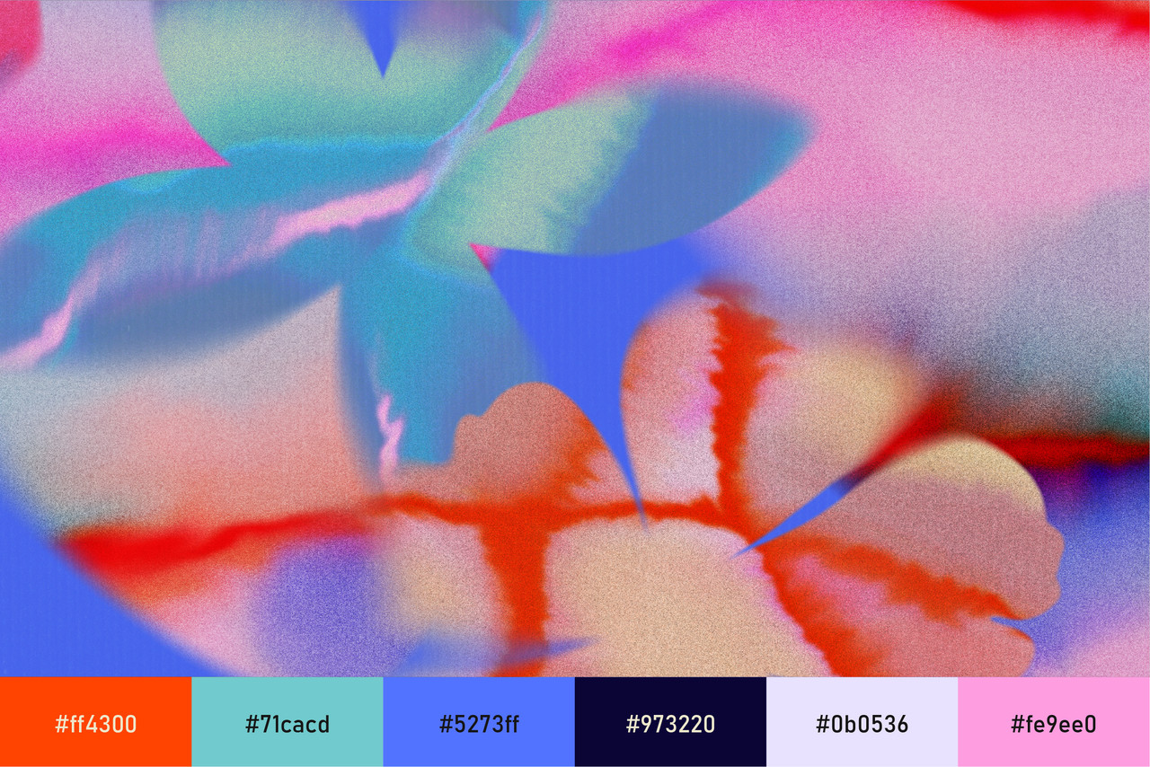
This aesthetic carries a certain emotional weight, often evoking nostalgia, warmth and a soft perception of reality, as though the visuals have been seen through memory rather than through a lens. It feels slightly surreal, allowing compositions to lean towards a form of abstraction where shapes are still recognisable yet softened enough to feel dreamlike.
The Language of Light and Atmosphere
At the core of this style lies a manipulation of light, not as a technical tool, but as an expressive element. Light is no longer directional or sharp, but instead spreads across surfaces in a hazy, almost glowing manner, creating gradients that feel fluid and continuous rather than defined by hard edges.
This results in visuals where colour blends seamlessly, often transitioning between soft pastels, warm blush tones, and gentle iridescent hues that shift subtly depending on composition. These palettes rarely feel static, instead carrying a movement that suggests light passing through translucent surfaces or reflecting across soft textures.
Blur plays a significant role within this aesthetic, though it is not used to obscure, but rather to soften the relationship between elements, allowing shapes to bleed into one another in a way that feels cohesive and intentional. This creates a visual experience that is less about reading individual components and more about absorbing an overall calmer mood than usual.
Softness as a Visual Strength
The appeal of Diffused Glow (also known as Glasscore) lies in its ability to communicate without overwhelming, offering an alternative to the high-contrast, attention-driven design that dominates much of digital space these days. In choosing softness, designers are able to create compositions that feel approachable and calm, while still maintaining visual interest through subtle variation in colour, light, and texture.
Shapes within this space tend to be simplified, often rounded or organic, allowing them to sit comfortably within the softened environment without disrupting the flow of the composition. Edges are rarely harsh, instead appearing feathered or slightly blurred, reinforcing the overall sense of cohesion.
Texture, while present, is understated and often integrated through gradients, grain, or light diffusion rather than through heavy or tactile surfaces. This creates depth without introducing visual noise, allowing the design to retain its clarity while still feeling layered.
Aesthetic Direction and Application
Working with diffused graphics requires a careful balance between restraint and atmosphere, ensuring that the softness does not become indistinct or overly decorative. Composition plays a key role here, as spacing, scale and placement must be considered with precision in order to maintain some kind of clarity.
Colour selection should remain intentional, with palettes that feel harmonious and gently contrasting rather than overly saturated or disconnected. The introduction of light should feel natural within the composition, as though it belongs to the environment rather than being applied as an effect.
Typography within this aesthetic tends to favour simplicity, allowing the surrounding atmosphere to take prominence, though it can also lean into softer, rounded fonts or slightly extended letterforms that echo the fluidity of the visual environment. The key is to ensure that type integrates seamlessly, rather than competing with the overall mood.
Diffused Glow: Where This Aesthetic Works Best
Diffused Glow translates particularly well across digital environments, where screens naturally enhance luminosity and allow gradients and light effects to feel more immersive. In branding, it can create a sense of softness and emotional connection, making it especially suited for wellness, beauty, and lifestyle sectors where atmosphere plays a significant role in perception.
In social media and marketing, this aesthetic offers a way to stand out without relying on intensity, instead drawing attention through subtlety and cohesion. The gentle blending of colour and light creates scroll-stopping moments that feel calm rather than demanding, allowing content to resonate in a more sustained way.
Why Now?
In a design environment saturated with sharp visuals, high-definition imagery and constant visual stimulation, there is a growing desire for design that feels softer, slower and in general something calmer to the eye. The Diffused Glow trend responds to this by offering a visual language that reduces tension, allowing compositions to be experienced rather than consumed.
There is also a deeper emotional layer to this shift; as audiences increasingly gravitate toward visuals that feel comforting and familiar, where softened light and blended colour bring about a sense of nostalgia and quiet reassurance. This aesthetic does not seek to dominate attention, but rather to create a space where design feels less like an interruption and more like an moment.

Download these worksheets and start practicing with simple instructions and tracing exercises.
Download now!







Bestseller design assets for the bold & the brave who are ahead of the curve.
View More Posts


4 Comments