Traditional life, in the sense of the inherited timetable of marriage, mortgage, garden and pension, is fizzling out in a way nobody is especially mourning; what is being held onto instead are two visual notions that came bundled with it. The ‘tradlife’ aesthetic keeps the human touch, all the visible handwork and slightly wobbly craft that suggests somebody spent an afternoon on something with no deadline attached, and it keeps the carefree, faintly dreamlike register that made the old picture look so appealing in the first place, while quietly declining every obligation that used to come with it.
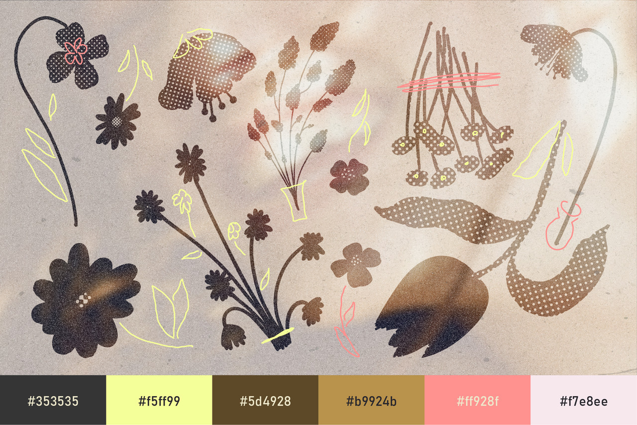
What makes this particular return of whimsical design interesting is the way this trend migrated. It began in a very rural, very traditional kitchen, all scrubbed wood, gingham, pressed flowers and hand-labelled jars – and it graduates, with no apparent difficulty, into a teenage bedroom; a diary with a small unconvincing lock, gel pen on lined paper, glitter stars stuck to a wall and a handwritten typeface that curls.
From the Farmhouse Kitchen to the Teenage Bedroom
The early end of the aesthetic reads as inherited domesticity, cottagecore with the fantasy sanded off it. Butter-yellow and elderflower cream, faded strawberry reds, ink-drawn botanicals that look copied out of a foraging manual, ceramic-glaze textures and typography that mimics recipe cards written by somebody with better handwriting than most.
The later end of the aesthetic swaps the tablecloth for the duvet. The palette warms and sweetens, the drawing gets looser and less accurate, stickers arrive, and the type stops pretending to be inherited and starts looking distinctly like an attempt at cursive by somebody who has just decided cursive is their thing. Both halves share a refusal of the grid and a fondness for things that were arranged rather than laid out, which is why they sit so comfortably in the same mood board without arguing.
The Great 2000s Rewatch
Cinema has (smugly) been responsible for a good deal of this. The current appetite for reviving early 2000s films through sequels and continuations has sent audiences back into the original catalogue, which means an entire generation is currently rewatching the romcoms that surrounded those films; and those films were, visually, absolutely stuffed with whimsy. Hand-lettered title cards, scrapbook inserts, floral bedding, letters written in fountain pen; that particular twee prettiness that the following fifteen years of flat design treated as something to be embarrassed about.
Seen again now, the design of those films looks less amateur and more like a lost dialect. It had ornament, it had handwriting, it had a colour palette that was not tested against a conversion rate, and it assumed viewers wanted character, charm rather than efficiency. Contemporary work borrowing from it tends to lift exactly those qualities: the ornamental frame, the flourish that serves no navigational purpose whatsoever, the deliberate softness of a slightly hazy image.
Whimsical Girlhood, Finally Left Alone
Underneath the visual return sits a cultural correction that is genuinely overdue. Anything loved sincerely and loudly by teenage girls has historically been treated as evidence of poor taste, from the pop album to the pink notebook to the horse drawing to the entire romcom genre, and that reflex is finally weakening. Girlhood is being treated as a legitimate aesthetic source rather than a punchline, which has the effect of setting up a whole generation of women to like what they like without the accompanying flinch.
Design feels this shift immediately, because so much of the visual language now in circulation (the curly scripts, the stickers, the diary pages, the stars) comes directly from that vilified archive. Brands adopting it are not simply being sweet; they are signalling that they have stopped policing sincerity, and audiences read that signal quickly. The aesthetic works best when it is played straight; with no ironic distance and no wink to indicate that everyone involved knows better.
Amateur Hour, Entirely On Purpose
The trend’s defining move is its embrace of the unskilled-looking, and this is where most attempts at whimsical design fall over. The wobble has to be real, or at least convincingly real; uneven letter spacing that follows the logic of a hand rather than a slider, a scanned texture underneath everything so that the file remembers paper. A vector recreation of a hand-drawn strawberry, tidied into symmetry and snapped to a grid, loses the entire argument.
Type does the heaviest lifting, and the most convincing choices are the handmade scripts and the naive monolines that look like they were doodled rather than designed. Colour should stay slightly faded, as though sun has been getting at it: ivory rather than white, jam rather than red, meadow rather than green. Motion carries it well when elements drift and settle rather than snapping into position, since nothing in this world moves with much urgency. One genuinely handmade element per composition tends to be enough to carry an otherwise digital layout, and two is usually plenty; the aesthetic tips into costume very quickly when everything on the page is competing to look homemade.
Why Tradlife, Why Now
The appeal of the tradlife aesthetic is not really nostalgia for a way of living, since almost nobody looking at it wants the labour, the isolation or the rules that came attached. What is wanted is the texture of it; the sense that time was available and that things were made by hand for no strategic reason, delivered without the obligations. It offers the pleasant parts of tradition as a visual language rather than a life plan, which is a considerably easier sell.
Alongside that sits a straightforward exhaustion with competence as an aesthetic. Years of design proving how professional it was has produced surfaces nobody feels much about, and a wobbly line drawn in gel pen now carries more warmth than any amount of hm-ing and ha-ing over a design. Tradlife is whimsical design returning as a working language rather than a guilty pleasure, which is what happens when a culture keeps the daydream and its handwriting; but politely leaves the rest of the farmhouse behind.

Download these worksheets and start practicing with simple instructions and tracing exercises.
Download now!







Bestseller design assets for the bold & the brave who are ahead of the curve.
View More Posts