



Pearson, “The world’s leading learning company,” has a history that dates back to 1724, so it’s no surprise they were looking for a brand refresh. They recently spruced up their logo. Here’s the old one:

And here’s the new one:
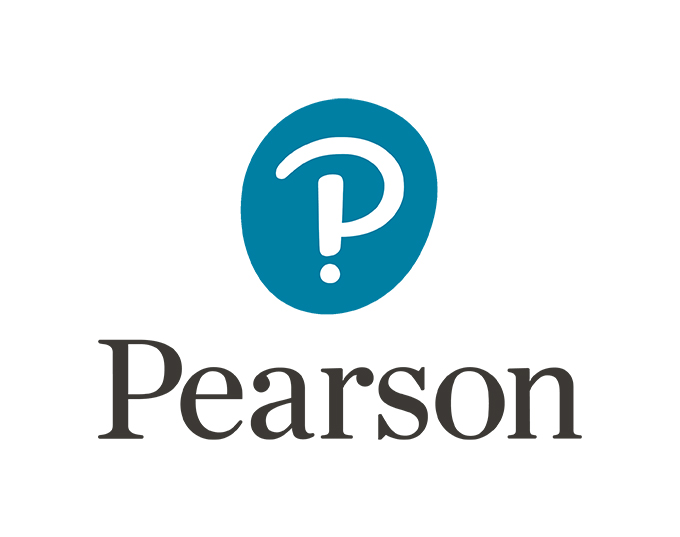
The logo was designed by Freemavens our of London, with identity work done by Together Design.
The most obvious thing to note here is the integration of the Interrobang, a bit of punctuation that only a few grammar geeks may know. It basically combines the exclamation point and question mark to function as “?!” at the end of a sentence, but in one glyph. The video above gives some background on why its inclusion aligns with their brand and mission.
Anyways, here’s what the world at large (or folks on Twitter, anyway) think:
Nice brand – but that ‘thumbprint’ logo is just an interrobang, surely? ? meets ! in new Pearson logo | Design Week https://t.co/rsxM3ziygX
— Slick Attire (@SlickAttire) January 6, 2016
New Pearson logo fuses 3 characters into 1. No, not a $ sign! https://t.co/pLsKU2UKBD #interrobang
— EduShyster (@EduShyster) January 8, 2016
The new interrobang @pearson logo is spot on for them. It says we aren’t sure what we are doing, but we do it loudly! #edtech
— Kevin Reynen (@kreynen) January 5, 2016
@pearson what you *should* be up to is fixing the min-height: 100% issue for Safari on https://t.co/1RRihA1KCT pic.twitter.com/1LOnFKH6S7
— Kevin Reynen (@kreynen) January 5, 2016
My company @Pearson unveiled our new logo today. It represents the excitement and curiosity to learn. #PearsonProud pic.twitter.com/uyoKWbtYdg
— Jamie Shoup (@JamieShoup76) January 4, 2016
What about you? Do you dig the new Pearson logo or should they toss it?
via Under Consideration
Kevin Whipps is a writer and editor based in Phoenix, Arizona. When he’s not working on one of the many writing projects in his queue, he’s designing stickers with his wife at Whipps Sticker Co.

Download these worksheets and start practicing with simple instructions and tracing exercises.
Download now!



5 Comments