Welcome to another exciting edition of Behind the Shop, where we spotlight the creative journeys of the talented individuals behind some of the most captivating shops on Creative Market. Today, we’re thrilled to introduce you to Meg Burk, a font designer with a distinctive, playful style deeply rooted in the Southwest and now flourishing in Austin, Texas. Meg’s journey into type design started with a simple need: to create a font that perfectly suited her design needs. What began as a challenge to create a new typeface every month quickly turned into a full-fledged passion. Now, with a portfolio that includes the beloved Cowboy and Kiwi typefaces, Meg is making waves in the design world with her handcrafted, analog-digital hybrid approach. Join us as we delve into her creative process, inspirations, and the unique blend of influences that shape her work.
What inspired you to pursue font design in the first place? What were you working on before?
My initial foray into designing fonts started because I couldn’t quite find one that fully suited my design needs. Editing one-off letters for brands here or there wasn’t cutting it anymore. The first font I made was entirely in Illustrator with the Fontself extension, and it surprised me in that it was fun for me in an all-consuming way. At that point, I made it a challenge to make a typeface every month for a year… I had to see what I could learn from it. And I never stopped making fonts since!
Before type design was on my radar, I was fully convinced that I would have a career in animation as a character designer. If I look back, though, I was always having more fun drawing letters, words, and icons.
There is something about the puzzle of it – telling a story or conveying a message in the fewest possible strokes or shapes.
With type, I learned that I wasn’t just designing letters, but instead I was designing a system of shapes and sequences that come together to make something interesting and functional.
When creating a new font, where does your creative process start? What inspires you?
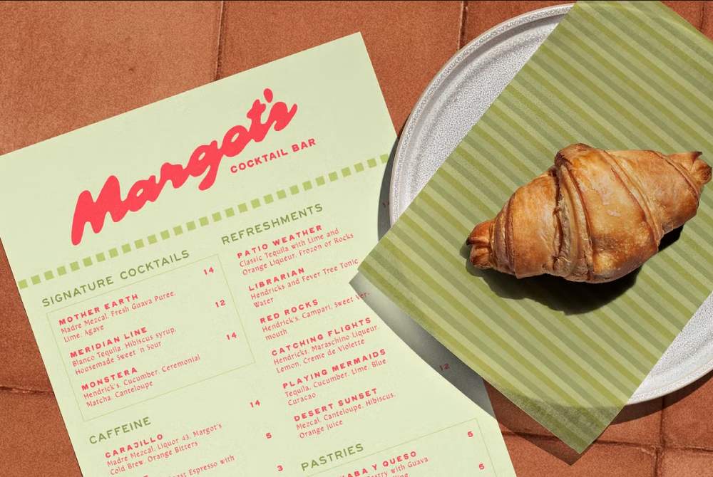
Every idea for a font comes to me in an all-inclusive idea; I already have potential names picked out and ideas for the marketing as well. The inspiration for any of these aspects comes in various forms, but I like pulling from real-life sensations. My first fonts were all inspired by the Southwest, but namely, New Mexico, where I spent a lot of years growing up. I would be inspired by the simplified shape of adobe houses, or the colors of chile, or the steel signs outside of ranch entrances. Now I’m pulling from any theme that I am loving or see on my radar to be trending in the future. Most recently, I discovered that I LOVE guava, so I made a script font that feels like guava tastes, to me.
Once the loose idea is settled, I sketch everything by hand on paper.
Nothing compares to the exploration of the idea in a tangible way.
From there, I digitize it and use a combination of Fontself and Robofont to actually execute the idea!
How would you define your signature design style?
My signature style is very playful in the sense that I prefer not to noodle my designs into “perfection.” Sketches and paintings call to me in that they capture reality in an imperfect way. The strokes say so much with so little. In that way, I enjoy making typefaces that have rounded corners and little wonky aspects. It’s how I see the world: in a gestural way. But maybe that’s also because I needed glasses for a long time and didn’t know, but that’s another story.
There’s a strong handcrafted feel in your typefaces. How do you blend analog and digital steps in your creative process? How long does it typically take you to create a font, from idea to execution?
Every character is drawn first completely by hand, and often on paper. Once I’m happy with the shapes, I use image trace to quickly translate my drawings to vectors. From there I clean up vector points or build new glyphs from scratch on a layer above the sketches. Once the glyphs start to make sense, I use a combination of Fontself and Robofont to build the rest of the typeface.
The time it takes depends on the complexity of the font—something like an uppercase display typeface can take a week. Script fonts like Guava take me months!
I’m working to release fun display fonts on a more frequent basis while releasing more “serious” fonts once or twice a year. I’m always learning more about type design and trying to grow my skills.
How has Texas as a setting inspired your work?
I was born in Albuquerque, then lived in Dallas, and now in Austin. When I moved to Austin, it was intentional. I noticed that many of the businesses I loved had roots in Austin. As a branding designer (oh yeah, I do brands as well as fonts!), I decided to go where the businesses were starting.
Austin has inspired my work in a lot of ways, but the ambition and friendly vibes of the city are certainly a big aspect for me. Also, back in 2022, Western was trending. That was fun for me to lean into, considering I grew up road-trippin’ across the western US and felt deeply inspired and familiar with western themes and stories.
Out of all the fonts you’ve designed, which one is your favorite and why?
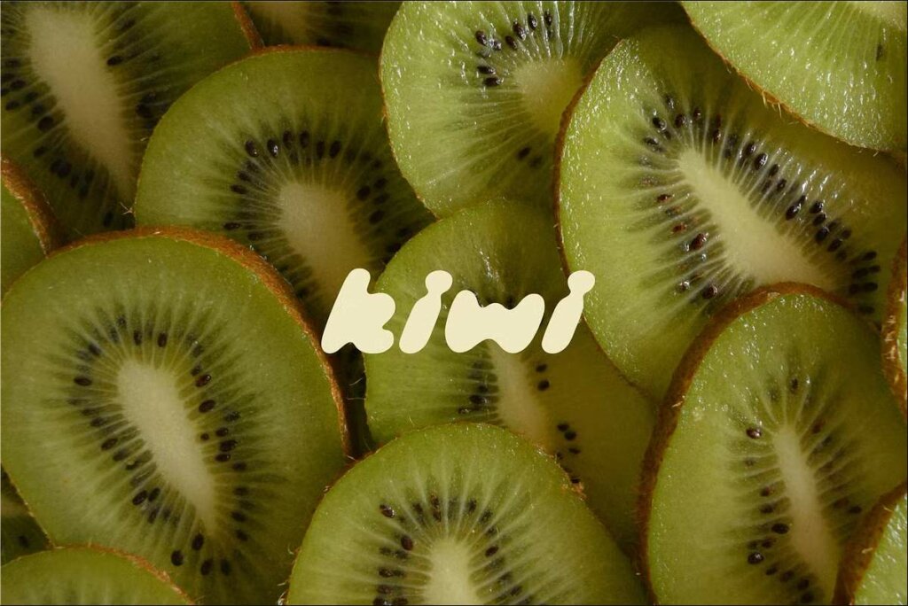
I’m partial to Cowboy and Kiwi, but don’t tell the other fonts! I still use Cowboy in most of my designs. It’s a great secondary font for anything that needs a hand-drawn feel. Kiwi is bubbly and playful, but not in a childlike way. I don’t use it enough, but I really love some of the letters I designed in it. The k’s are my favorite!
What are the top 5 features/quality markers a customer should look for in a great font?
- Check the ratio of the scale of uppercase vs lowercase in the font. One of my FAVORITE script fonts has these super huge uppercase letters, and it drives me crazy. It is hard to use the font if I want to stack words at all.
- Kerning. I spend a lot of time working on the kerning for certain letter pairings. This can make or break a font in its usage. You really want the font to be so easy to plug in and use.
- Numbers. Unless you’re only using the font for a logo, check the numbers. You might need them for menu designs and dates. Make sure you like the vibe of them and that they match the typeface.
- Language support. Consider where the font will be going. Is it on menus that might mention foods with names from other languages? Will your web page be able to be translated by the browsers? Many of my typefaces are just for display in English, but when I am designing for web pages or menus, I seek out fonts that can support the languages I will need.
- In script fonts, I look for OpenType. OpenType allows the font to have coding in it, which allows the type designer to design certain effects that are embedded in the font. If OpenType is on in your design program, the font can easily swap out characters in a script font to make it more playful, randomized, or seamless depending on the needed effect. Think of it like ligatures… but for the entire font. This takes script fonts to entirely new levels!
Links to Learn More and Follow Along
Here’s where you can learn more about me and my work:

Download these worksheets and start practicing with simple instructions and tracing exercises.
Download now!








Making beautiful design simple & accessible to all.
View More Posts