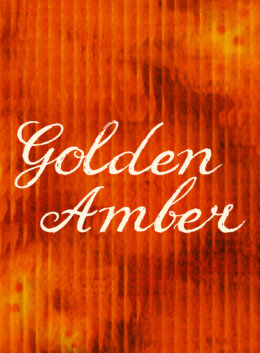
Our new Color of the Season comes with a little midnight magic. This fall, we were inspired by that charming feel of candlelight caught just past dusk. We wanted to capture the warmth of the season and the soft blur of analog film in a single shade of fired sienna, a color that felt equal parts molten and rugged, fiery and calm. We were looking for a brown with aura, grit, and glow, and oh we found it: join us in celebrating Golden Amber (#B63D1D), our new Color of the Season.
Meet Golden Amber
To make sure you’re working with the same color, we’re providing equivalencies in hexadecimal, CMYK, and RGB systems below.
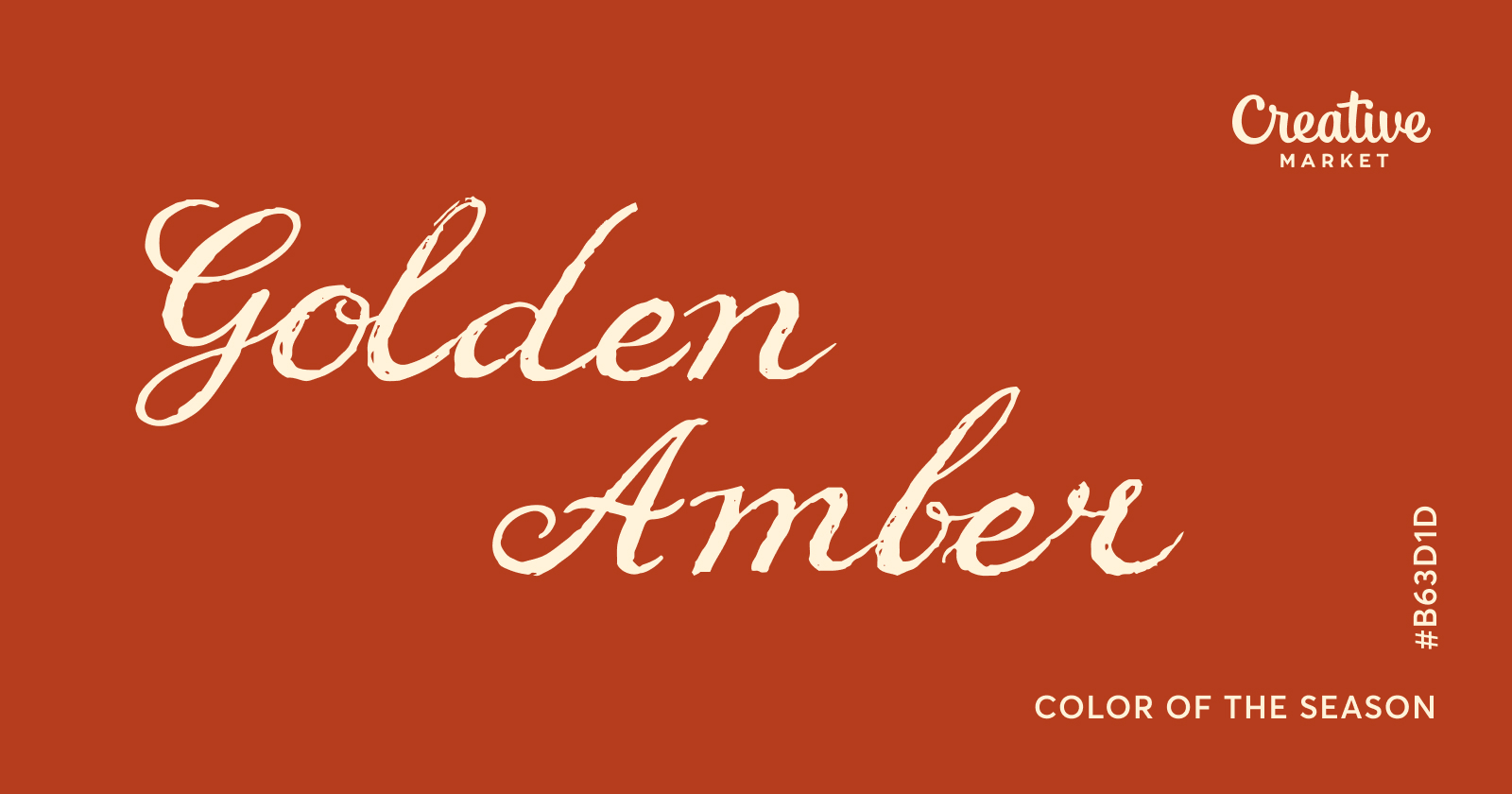
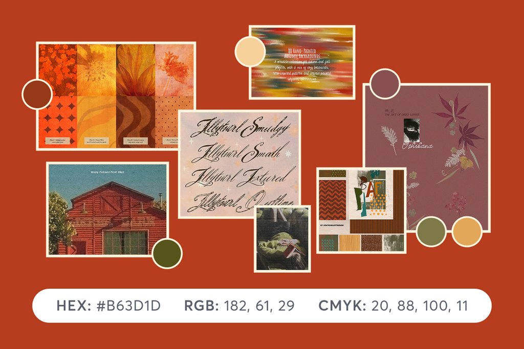
HEX: #B63D1D
RGB: 182, 61, 29
CMYK: 20, 88, 100, 11
Looking for a refresher on the various color codes, what they mean, and their applications? Make sure to check out this article where we explore the differences and technical details you need to know.
How to Apply Golden Amber
Try Golden Amber on editorial covers, food packaging, hospitality identities, seasonal campaigns, posters, or social templates where you want warmth with some filmic character.
Pair it with cream, parchment, mushroom, dusty rose, or deep brown for a hazy harvest palette. Against cobalt, ultramarine, plum, or acid chartreuse, it becomes stranger and more electric. Brass and brushed gold amplify its gemlike side.
For typography, mix Golden Amber with chunky serif faces, soft grotesks, condensed lettering, or expressive scripts. Add grain, halftone, imperfect ink coverage, botanical silhouettes, translucent glass effects, or blurred photography to bring out its retro character. Let it look printed, glazed, burned, developed, or slightly worn around the edges.
Typographically, it works especially well with naive headline typefaces, soft serifs, and humanist sans serifs with open counters. Try oversized lowercase headlines, loose tracking, irregular baselines, or hand cut lettering. Add translucent floral layers, watercolor bloom, paper grain, blurred photography, or botanical linework to highlight its aural haze without crowding the composition.
Technical Qualities and Psychological Associations
With RGB values of 182, 61, and 29, Golden Amber lives firmly in orange red territory. Its hue is around 13 degrees on the HSL wheel, with roughly 73 percent saturation and 41 percent lightness. The result feels dense, warm, and almost material, closer to fired clay or lacquer than a bright citrus orange.
That saturation matters beyond aesthetics. Valdez and Mehrabian found that saturation was strongly associated with emotional arousal, while brightness was more strongly related to pleasure. Their results also suggested that these dimensions can be more influential than hue alone when shaping emotional responses to color (Valdez & Mehrabian, 1994). Golden Amber sits in an interesting spot on that spectrum: highly saturated enough to convey energy, but dark enough to give that energy some depth.
Vibrant Palettes Using Golden Amber
Wondering how to apply Golden Amber in your next project? These palettes complement our Color of the Season and are ready to use. To download the free SVG file, make sure you’re signed into your Creative Market account.
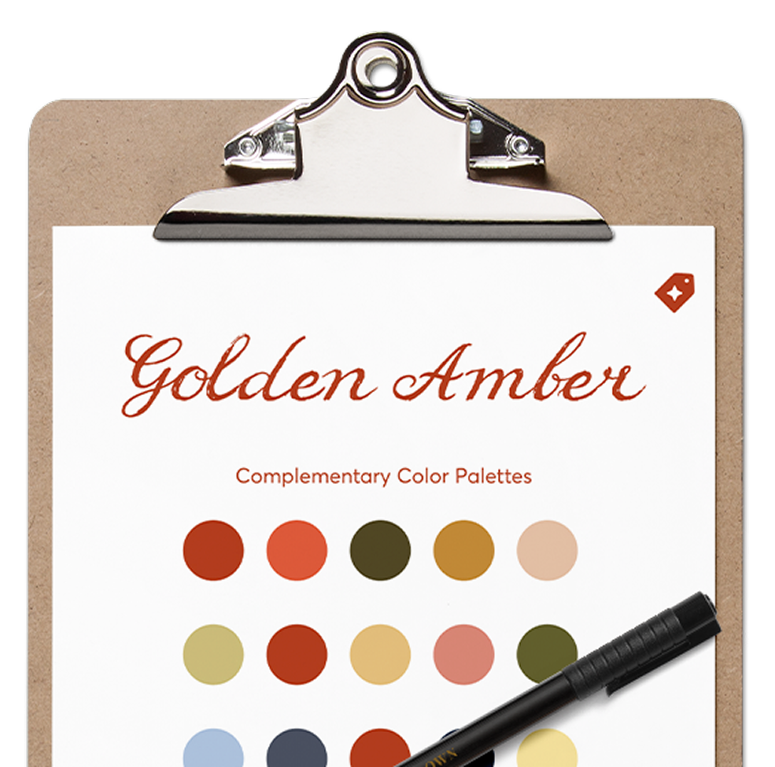
Download our set of color palettes in SVG and start using them in your favorite design app.
Download the palettesOur Golden Amber Collection
We have curated inspiring Creative Market products that are already using our Color of the Season or slight variations of it. Check out the full collection, featuring some of these outstanding assets:
References
Valdez, P., & Mehrabian, A. (1994). Effects of color on emotions. Journal of Experimental Psychology: General, 123(4), 394–409.







Brand strategist. Creating design tools to empower creative entrepreneurs. Author of the Lean Branding book. MA in Design Management from the Savannah College of Art and Design (SCAD).
View More Posts