



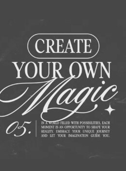
Let’s be honest: pairing fonts is a little like dating. Sometimes they click instantly, and other times… it’s awkward. You can have two beautiful typefaces that just don’t work together. And yet, when they do, it’s like they were always meant to be. The layout feels balanced, intentional, maybe even a little cinematic.
Designers spend years training their eyes for that balance. Knowing which fonts flirt and which ones fight; sometimes also knowing where there’s potential before it’s apparent. This guide will walk you through ten golden rules of font pairing, using some stellar examples from Sam Parrett, whose duos, Amoret Collection, Peach Sangria, New Icon, La Luxes, and True Fate, have become some of the most popular sets on Creative Market. They’re also available as a Cyber-exclusive pack, 30% off this week only.
Grab a cup of coffee. Let’s talk type.
1. Start with a shared mood
Every design has a vibe: romantic, bold, nostalgic, minimalist. Before you pick fonts, define that mood first. Then, look for typefaces that belong to the same emotional family.
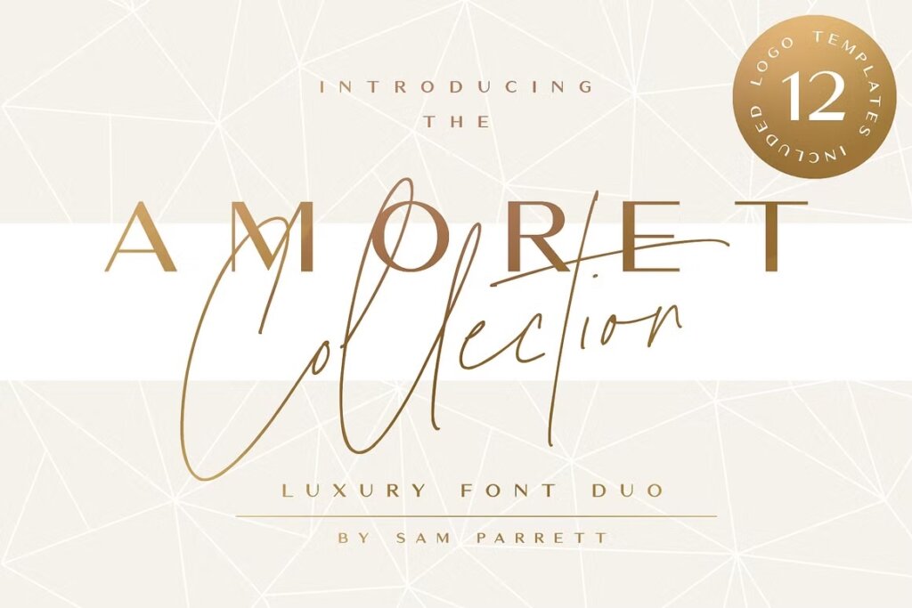
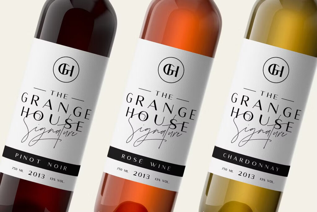
The Amoret Collection captures this beautifully. Its sleek serif and flowing signature script both radiate luxury, ideal for high-end branding or editorial design. Even though one is structured and the other is loose, they share an elegant, aspirational tone, and that shared feeling keeps them cohesive.
🖋 Designer tip: Ask yourself, “If these fonts were outfits, would they belong at the same event?”
2. Contrast is key, but with restraint
Opposites attract in type, too. But the magic lies in measured contrast, not chaos. Combine fonts that differ in form (e.g., serif vs. script) but share personality traits like tone, weight, or spacing.
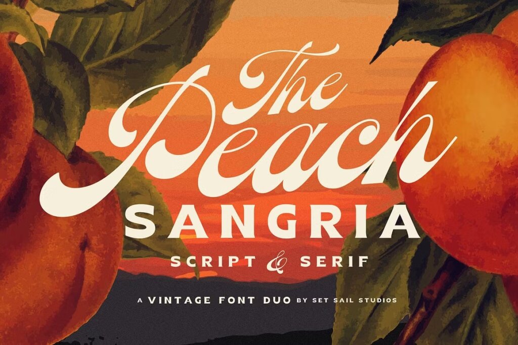
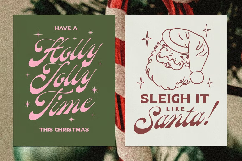
Take Peach Sangria: a playful, vintage-inspired duo that pairs a bold serif with a breezy cursive. The contrast draws the eye, while shared curvature and retro flavor keep it unified. The result feels handcrafted, spirited, and authentic. Like something you would have hand-lettered.
✨ Try this: Use contrast in category (serif + script), but harmony in mood and detailing.
3. Limit yourself to two or three fonts
Think of font pairing like cooking: more ingredients don’t make it better. Professional designers typically stick to two: a workhorse for body text and a showstopper for headings.
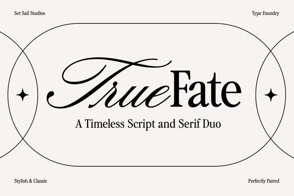
True Fate is a perfect example. Its delicate serif adds sophistication, while its companion script adds a graceful, high-end accent. Together, they feel balanced and purposeful.
🎯 Pro move: If you crave variety, use weights or caps within the same family instead of adding more typefaces.
4. Establish hierarchy with intention
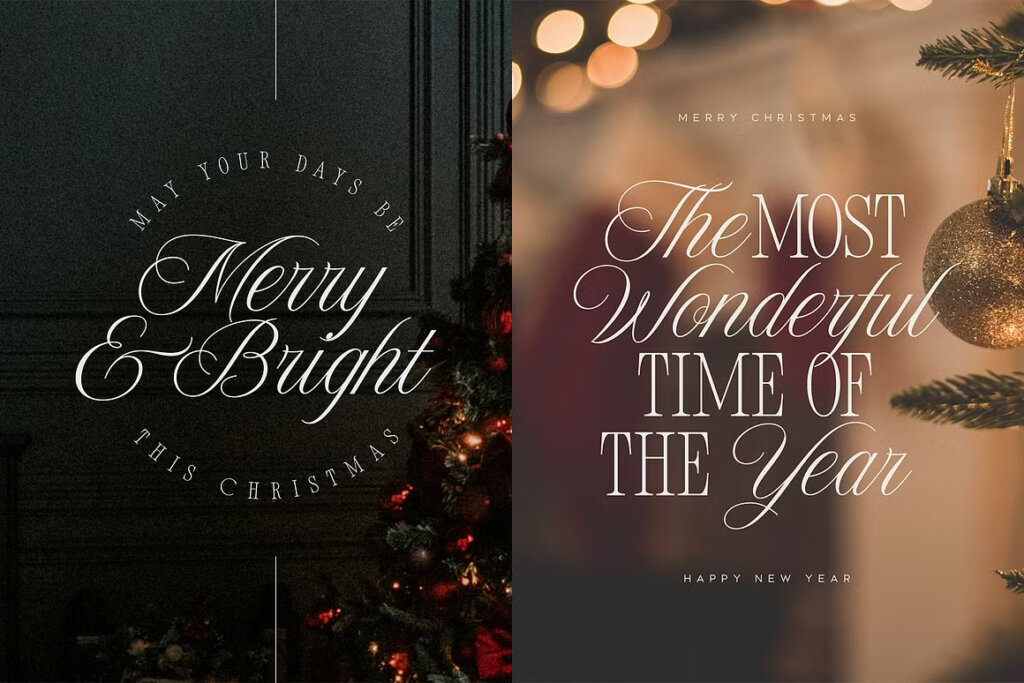
Every piece of text has a role: headline, subhead, callout, caption. Let hierarchy guide your font choices. Pair a commanding display type with something quieter and more readable for supporting text.
The New Icon duo nails this. The unique serif commands attention in large sizes, while the script adds a whimsical accent.
📐 Rule of thumb: Big and bold grabs attention; clean and readable keeps it.
5. Match X-heights
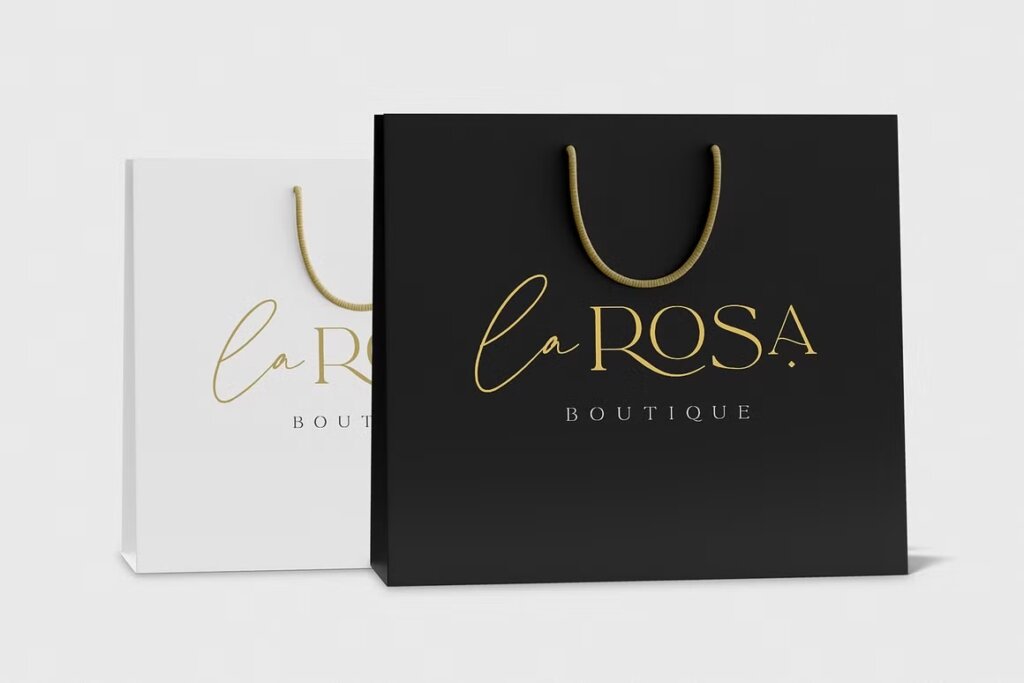
Beyond style, the physical proportions of letters, especially x-height (the height of lowercase letters), matter. When x-heights align, your pairing feels harmonious even across contrasting styles.
Look at La Luxes: its tall serif and cursive signature share similar vertical rhythm, giving your layout natural flow. This subtle alignment creates an invisible order that feels instinctively “right.”
🔍 Test it: Type “x” in both fonts. If they sit at similar heights, you’re on the right track.
6. Let one font be the hero
Choose one hero font that carries personality and a second that quietly supports it. Balance isn’t necessarily about giving every font equal attention; it’s about knowing which font has the visual weight to lead.
In Peach Sangria, the script is the main character while the serif plays a supporting role. In True Fate, the serif leads and the script adds flair.
7. Use color and spacing to refine the pairing
Type pairing doesn’t exist in isolation. Context, backgrounds, and surrounding elements change everything. Adjusting color, letter spacing, or weight can create cohesion between otherwise different fonts.
For example, try pairing the Amoret Collection’s delicate script with a deeper gold serif to reinforce its luxe tone. Small adjustments in kerning or saturation can make a difference here.
🌈 Quick fix: Tighten letter spacing slightly in your serif to match the elegance of a script font, if that’s the pairing you’re trying to make.
8. Mind your medium
What looks stunning in print might fall apart on screen. Always consider where your design lives. Thin scripts can vanish at small sizes, while ornate serifs can feel heavy in digital contexts and make text hard to read.
New Icon performs brilliantly across both because its structure and legibility make it versatile without losing charm. It feels elegant on packaging and crisp on digital mockups.
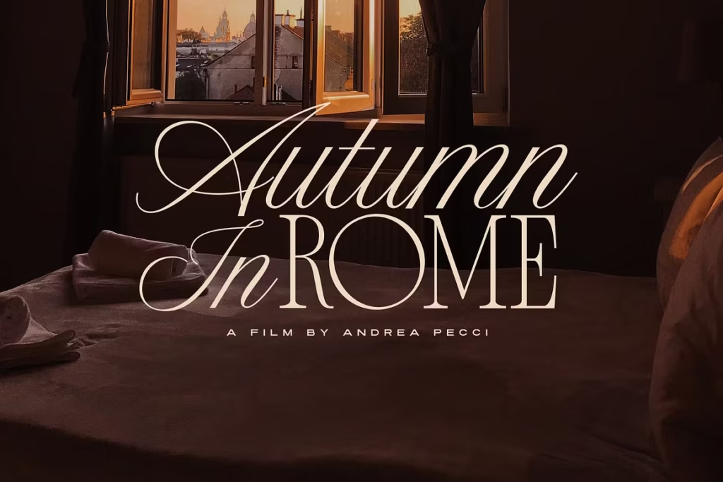
💻 Check it: Zoom out and see if your fonts stay legible and expressive at smaller scales.
9. Test with real copy, not Lorem Ipsum
Fonts interact differently once real words come into play. Test pairings using your actual brand name, tagline, or headline to see how they emotionally connect.
When you use True Fate or La Luxes in a mockup, you instantly sense whether they fit your message. They can reinforce your text’s existing character notes: aspirational, poetic, or confident. Lorem Ipsum won’t tell you that.
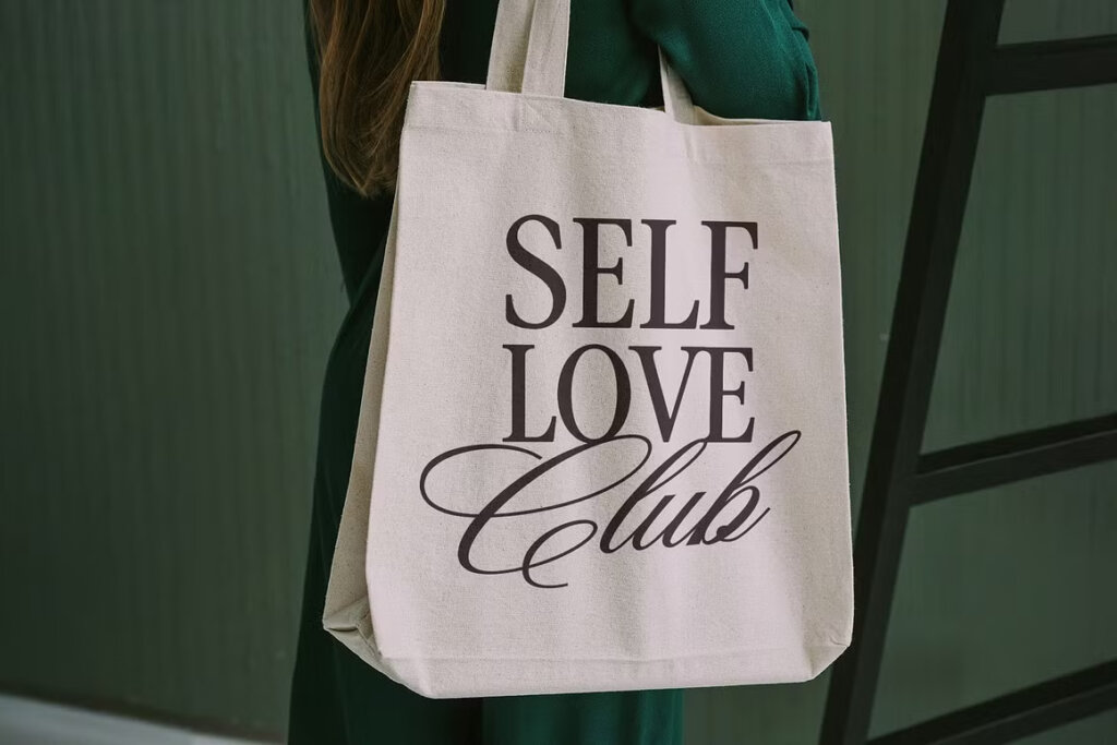
🧠 Why it matters: Emotional resonance comes from language and letterforms working together.
10. Trust your eye & train it
Over time, your eye becomes your best tool. Pay attention to what feels balanced, what draws you in, and what distracts.
Analyze successful font duos and notice how scripts flow into serifs naturally, how every stroke in these variants seems to echo the other. Putting together effective font pairs becomes an instinct rooted in practice; an intuition you develop from truly seeing type.
👀 Practice: Screenshot your favorite font pairings. Dissect why they work: proportions, contrast, texture. Then, recreate them with your own twist.
Ready to build your perfect pair?
If there’s one thing pros know, it’s that type pairing isn’t about following strict formulas, but about finding harmony between fonts that are unique in their own right. Mastering font pairing is about learning to listen: to rhythm, proportion, and emotion. So go ahead. Mix, test, adjust, experiment, and come up with your own rules for this game that is both art and science.
Featured duos to try:
- Amoret Collection: sleek, refined, and luxe
- Peach Sangria: playful, nostalgic, handcrafted
- New Icon: editorial, modern, effortlessly chic
- La Luxes: sophisticated and graceful
- True Fate: timeless and classic
- Simple Serenity: calm and collected

Download these worksheets and start practicing with simple instructions and tracing exercises.
Download now!







Brand strategist. Creating design tools to empower creative entrepreneurs. Author of the Lean Branding book. MA in Design Management from the Savannah College of Art and Design (SCAD).
View More Posts


2 Comments