Have you ever wanted fonts similar to the Grotesks of old, while also delivering a few futuristic touches that make the font suitable for a modern design project?
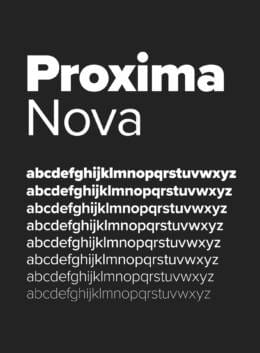
That’s Proxima Nova in a nutshell – a font that its creator says bridges the gap between Akizidenz Grotesk and Future. That creator is Mark Simonson, who came up with Proxima Nova in 2005 with the goal of creating a hybrid of other fonts that would feature the open sans style – making it suitable for digital design projects – while still being a great choice for those who love classical typefaces.
But 2005 isn’t where you’ll find the origins of this sans serif. You can trace those roots back to 1994 with the release of Simonson’s Proxima Sans. That font is now discontinued – Proxima Nova displaced it – but it gives an idea of what Simonson wanted to achieve with his typeface long before he refined it into what it is today.
Since 2005, Simonson has expanded the Proxima Nova character set to the point where it has 1,453 characters – all available in a range of weights and styles from light to bold – that run the gamut from Latin to Greek, Cyrillic, and even Vietnamese. All told, the font family offers 80 variations, including various weights that come with matching italics, making it an excellent choice for almost any application.
But you don’t want Proxima Nova. As much as you might love the font, you’re looking for other alternatives that carry some of its characteristics while being a more perfect fit for the design project you have in mind. That’s where this article comes in.
10 Fonts Similar to Proxima Nova that are Worth Checking Out
Though it’s not quite as versatile as Proxima Nova – it has 18 variations compared to the 80 Simonson offers with his font – Chronica Pro is still a great choice as an alternative as it leans a little more toward contemporary stylings.
Balance is the focus here, with the font being a sleek interpretation of Proxima Nova that will allow you to create a host of marketing materials. Beyond digital features – the font is OpenType compatible – it’s also useful in physical graphical design and for signage. Check out the geometric body and you’ll even start to see some humanistic qualities shining through.
Offering eight weights ranging from Thin to Heavy – along with matching italics for each of those weights, Core Sans A offers the same sort of clarity and legibility you’ll get from Proxima Nova. It’s also part of a wider series of fonts, all of which emphasize neutral shapes and a neo-grotesque style that lends them a certain versatility in print or digital settings.
Perhaps the standout feature of this font is the spacing between the letters. You’ll note this spacing is just a touch more pronounced than in its inspiration, giving you solid space to play with between the characters that makes them stand out. Not ideal for all applications, the font is perhaps best used when the lettering needs to do more talking than the words those letters spell out.
You’ll see the Grotesk influence that so clearly colors Proxima Nova from the moment you see Milliard, though you’ll also see concessions made for increased legibility. Take the open counters on several of the lower case letters – including “a” and “e” – which help to make those letters clearer when used at a smaller scale. As a result, this is a great font choice for books and web content, though it also stands out when blown up for headlines.
The creator calls it “part humanistic and part geometric,” which we feel is a perfect description. This is a Grotesk for the modern age, meaning it’s in perfect keeping with the spirit of Proxima Nova.
Forget about the overly colorful background in the above image and the strange name of the font designer that came up with Antona – this is a font that combines minimalism with legibility to offer a great Proxima Nova alternative for those on a budget.
You get a total of 16 fonts – eight weights each with italics pairings – and will instantly see that this is a clean typeface beyond the slightly garish backdrop used to advertise it. But then, maybe that’s the point. Even with all of that color going on in the above image, the word “Antona” still stands out.
“That’s round,” is probably the first thought that will come to your mind when you first lay eyes on Crossten. And that’s the point – this font does away with the more mechanical and straight-edged aspects of the Grotesks to offer a curvy font that’s perfect for informal use.
It’s versatile, too.
The makers say that it offers extended language support – allowing it to cross over between territories – with the full font family coming with 20 styles. Of course, you don’t have to buy all 20 at once. You can purchase whichever version of Crossten suits your needs separately, keeping your costs low in the process.
The second appearance by Mostardesign on this list is wholly justified once you get a peek at Ariana Pro – it’s a gorgeous font that echoes modern typefaces like Calibri while still having just a touch of the Grotesk. The latter comes in some of the ligatures and concessions that Mostardesign has made to typographical support, such as slashes through the zeros.
Available in nine weights – each with an italic version – this is a font family that’s just at home in mobile apps and websites as it is for editorial use. Just be aware that it’s not the most formal font around – a fact you’ll have to keep in mind if you’re thinking about using it in branding for companies that prefer function over style.
Like Proxima Nova, ENKEL is all about mixing the modern with the classical. In this case, that mixing comes from offering clear geometrical shapes in the lettering – aiding legibility – while still making concessions to the Grotesk fonts that inspired Proxima Nova in the first place. That essentially makes it a neo-grotesque, albeit one that’s at its best when being used for large displays.
You’ll see that the font is ever so slightly condensed, though not so much as to hamper readability. Explore the entire family and you’ll also find multilingual characters and a few accented characters – ideal for creating pieces in French or Spanish. Add that to nine weight choices, all of which are available separately as well as part of a bundle, and you get a versatile font.
“Clean” and “modern” are the words that come to mind when you first see Remoto, which is exactly what the brilliantly named JAM Type wants. They’ve drawn inspiration from some of the most commonly used fonts in the design industry – Proxima Nova being among them – to create a simple font that doesn’t lose itself to stylistic flourishes for the sake of being different.
Consistency is the key here.
And it’s that consistency that makes Remoto so adaptable. It’s legible even at the smallest of sizes, though its beautiful lettering also makes it suitable for being blown up for headlines and posters. So, it’s a modern workhorse – one that is visually engaging no matter where or how it’s used.
The large x-height of Mont means it immediately stands out as a great choice for headlines and marketing materials that call for a more prominent font. But that’s far from its only use – it’s handy for long-form text that needs a little stylization as well. Interesting diagonals are used in the lower case lettering – check out the “n” and “t” in the above image – which also means designers can use the font to create interesting logos.
It’s versatile, too. With 10 weights and over 700 glyphs, it’s a font that can be used across Latin, Cyrillic, and Greek projects.
We wrap up our list of Proxima Nova alternatives with a font that has a slightly strong Grotesk influence. That will prove useful for anybody who wants a more traditional look for their projects, though you shouldn’t sleep on the geometric forms on display here. They’re subtle, with interesting curvature and lines used throughout, but they lend the font an interesting character.
You get 20 styles with the full package – all purchasable separately – as well as Greek and Cyrillic scripts to go alongside the standard Latin.
The font isn’t part of Google’s standard package, which means you may wind up searching for a similar font. In that case, two fonts that are similar include Montserrat – a popular Google font that’s also available in Word – and Muli.
Where Can I Find Similar Fonts to Proxima Nova?
You already have an answer if you’ve read the article – Creative Market and Fontspring offer tons of fonts, many of which share characteristics with Proxima Nova.
Are There Fonts Like Proxima Nova on Adobe?
The original Proxima Nova is available through Adobe’s Creative Cloud. However, there’s a slight catch – you’ll need to load the font directly from your Creative Cloud account to ensure you have a license to use it publicly.
Getting started with hand lettering?
Free lettering worksheets
Download these worksheets and start practicing with simple instructions and tracing exercises.