Categories / News

Spotify's New Green: Better or Worse?

Kevin Whipps Last updated: April 5, 2024 · 2 min read

Branding is a funny thing. Do it right, and people worship what you’ve done. Do it wrong – or what people perceive as wrong – and you’ll get crucified. Now let me introduce you to Spotify.
You’ve heard of Spotify, right? They’re a streaming music service, and they’ve been in the news a lot recently, since Apple’s setting up to take them on with Apple Music. It turns out that Spotify decided to do a little rebranding as well, and tweaked their logo slightly. The issue seems to be the green.
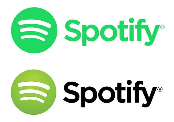
spotify
The old version – referred to as “broccoli” green by Spotify themselves – was a gradient of colors. Using Sip, I’m guessing that the original logo was a gradient from #AACE4B to #7BB546 or thereabouts. As for the new version, that’s #23CF5F all day long.
What have people had to say about it? Well here you go:

What’re your thoughts about the color change?


Kevin Whipps is a writer and editor based in Phoenix, Arizona. When he’s not working on one of the many projects in his queue, he’s looking for fun and irreverent things online to share with his friends.

Lettering Worksheets
Getting started with hand lettering?
Free lettering worksheets

Download these worksheets and start practicing with simple instructions and tracing exercises.

Download now!
Tags:
About the Author
Author
Kevin Whipps

Hi! My name is Kevin Whipps, and I'm a writer and editor based in Phoenix, Arizona. When I'm not working taking pictures of old cars and trucks, I'm either writing articles for Creative Market or hawking stickers at Whipps Sticker Co.

View More Posts


Go to My Shop
Related Articles
31 Comments
  • I feel like someone just through bleach in my eyes. Do not like it one bit. May look cool under a black light though. 11 years ago
  • Absolutely worse !!! 11 years ago
  • This sounds crazy but it's really unsettling to me. But even though I updated my desktop app, it didn't change so hopefully I can keep it this way. It did change on my phone though. 11 years ago
  • CANNOT stand the new color!! I open it up really quickly just so I don't have to see it for too long. It hurts my eyes. 11 years ago
  • The new color is fresher and bolder for sure. Actually, I prefer it from the puke green gradient, as it has personality- loud and in your face. What I still can't stomach is their sound logo - the three lines seem amorphous and blobby: someone's joke. 11 years ago
  • I think the colour, while jarring, seems more appropriate to the brand somehow. (on the other hand, the slightly off kilter waves bug me more than any colour they could dream up ever would...) 11 years ago
  • Anonymous
    I like the new one better. It looks "cleaner". 11 years ago
  • I like it. A lot more contrast. On a side note, did anyone notice Grooveshark got pulled down? There's a funny message on the home page about how they didn't know that they had to acquire licenses to distribute music. 11 years ago
  • I like it in one color. It's just a bit bright, but I just took a look at Spotify's site and the logo there is slightly darker than the one showed in this article so maybe they've adjusted it. Or maybe the color in this article was wrong in the first place. :) 11 years ago
  • It's not the colour that bothers me, it's the lines. Do they seem off to anyone else? Especially the smallest one. 11 years ago
  • I like it. Spotify has a lot of EDM, House, Party music listeners and I feel the neon-ey color fits these genres. Although there are times when it feels like someone saved their old logo as CMYK by accident. 11 years ago
  • Growing up on the East Coast, this new green reminds me too much of the marine green paint used on the decks of fishing boats! Haha, funny how colour has such an emotional connection. Aside from the colour, I never liked the logo anyway. The "wifi" symbol, to me always looked a bit incongruous. The bottom line should be slightly shorter and thicker than what it is. Just my two cents though. 11 years ago
  • @Chelsea Coates: Ha, I read your comment after posting mine! Glad to see I'm not crazy on the logo looking off. :) 11 years ago
  • It's definitely not the worse thing that could have been done. That said, I do prefer the older green although this new green gives off a "glowing" kind of look on any device which is kind of cool. I just wonder if it was absolutely necessary to go through the process of tweaking the green slightly. I would imagine that have larger things to deal with at this point. @Chelsea Coates I cannot unsee that bottom line now... 11 years ago
  • I thought my screen was broken when I first saw it! 11 years ago
  • I definitely don't like the new one, it's too bright, hurting my eyes :-D 11 years ago
  • It's so bad that it has to be good :D I'm such a sucker for minimalism so in my opinion that new one flat color is way better than original, but ouch that color hurts my eyes on a black background. It works much better on white. In overall I think it's a bit too bright, but otherwise a good move for a more fresher look. Like people said, that Wifi logo pretty much sucks in all aspects. Even some simple S would do a better job imho. 11 years ago
  • I like the idea of no more gradient but not sure i like the new green. I decided to build my own version for just for fun :D https://dribbble.com/shots/2111219-Spotify-redesign?list=users&offset=0 11 years ago
  • It looks pretty good on a white background but I definitely do not like it at all on a black background. 11 years ago
  • Too bright and in your face - not classy at all - looks like something geared toward elementary kids with the bright "kid like" hue.... HATE. IT. 11 years ago
  • I think they should have gone somewhere in the middle. Removing the gradient was probably a good idea, though. But I looked at Andres Clavijo's version on Dribble... and I like that one. Andres, you should totally send that to them! 11 years ago
  • Thanks @Tracy Trathen ! May be one day i´ll get the chance to see my redesign at my phone :P 11 years ago
  • I think that wifi logo there should go to recycle center. Maybe something like this in place: https://dribbble.com/shots/2112370-Spotify-redesign-concept 11 years ago
  • . . . I love it . . . more of a unique color. 11 years ago
  • I like it -- it's mint! 11 years ago
  • It's like the Wolff Olins olympic logo controversy all over. I do like marmite design (love it or hate it reaction provoking), at least it gets non-designers talking and realising that there are conscious decisions being made behind the scenes about how things look (even if they aren't necessarily good ones...). 11 years ago
  • Who in the right mind came up with this really bad idea? Right in the middle of perceived attention due to Apple PR efforts to launch a competitive site. Who, really? 11 years ago
  • The last shade of green was more friendly to the eye of the user, that's all, is not that de the new one y bad, it's just that the last one was warm, and friendly this one it's not, it's more cool professional shade of green :) Well, that's my opinion 11 years ago
  • Love it. Has that radar look over it that serves the name well. 11 years ago
  • Yeah, not really a fan of the new color. I understand why they would switch to a flatter design, but I think they could have kept the original green. 11 years ago
  • Here is an app which allows to revert color back: http://garmoshka-mo.blogspot.com/2015/07/revert-spotify-icon.html Though may need to revert it each time after spotify upgrade 11 years ago