
TBWA Just Rebranded With Ink Splatters and Pen Strokes: Why Handmade Brand Identities Are Back



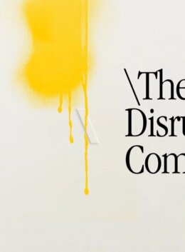
Every now and then, a rebrand captures something that’s already bubbling beneath the surface of design. TBWA’s new global identity caught our attention for exactly that reason.
Instead of introducing another ultra-minimal logo or expanding an endlessly modular design system, the agency has leaned into something far more tactile: ink splatters, pen strokes and hand-rendered marks.
It looks a little more sketchbook than style guide, and that’s the point.
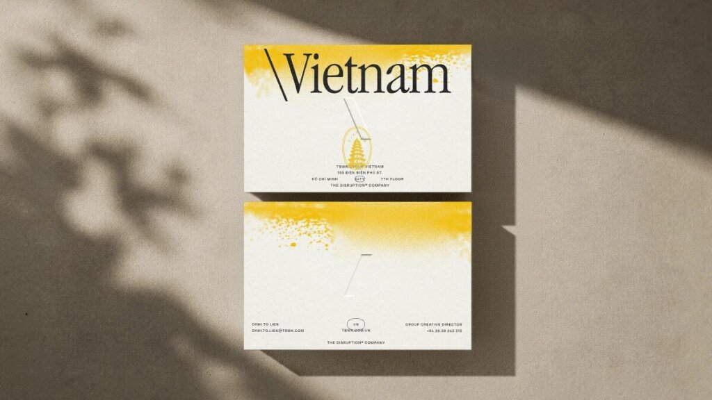
(Source: Marketing-Interactive, TBWA unveils new global visual identity | Marketing-Interactive)
Handcrafted aesthetics have always been around, yet they somehow feel more relevant than they have in years. Lately, they are making a comeback to emphasize the human character in design.
Have you noticed branding getting a little messier?
We’ve found ourselves bookmarking more work that leaves a few rough edges behind.
Perhaps it’s a serif with a little wobble, scanned paper behind crisp type, or brush marks that aren’t meant to stay inside the lines.
The TBWA rebrand feels like it belongs to that conversation.Rather than overpolishing every mark, this rebrand lets the creative process show through. You can picture the pen touching paper, real textures from a handcrafted branding process, and those messy marks that are essential telltale signs of human-driven design.
Maybe we’ve reached peak polish
For the last decade, branding has largely moved in one direction: cleaner and cleaner.Simple logos, cleaner layouts, and design systems built to work seamlessly across every screen imaginable. That approach isn’t going anywhere, but it has now become familiar to a point where it feels generic.
Then generative AI entered the picture, making polished, pristine visuals faster and easier to produce than ever before.
Which raises an interesting question: If everyone has access to perfect gradients, flawless vectors, and endlessly clean layouts, what makes creative work feel distinctive?
Maybe it’s the ink bleed, the rough pencil line, or the texture of the paper. All of those details are suddenly telling us something about the origin of the work.
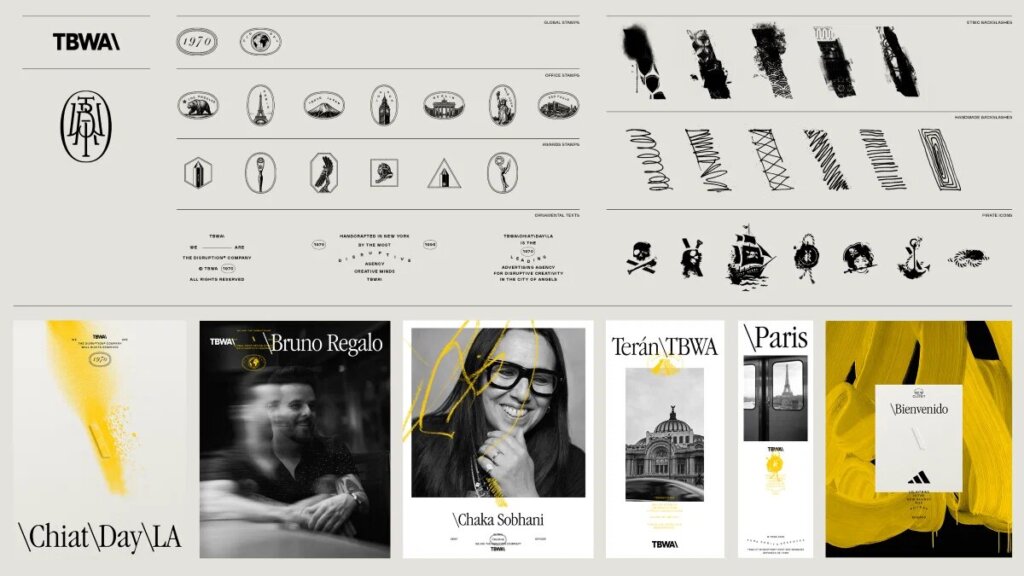
(Source: Marketing-Interactive, TBWA unveils new global visual identity | Marketing-Interactive)
The little inconsistencies that remind us someone was sitting on the other side of the work, making decisions as they went.
Craft has become part of the story again
One of the things we love most about design is that trends rarely come back exactly as they left.
Nostalgic references are part of the picture, but the more interesting trend here is the resurgence of craft itself.
We’ve been seeing it everywhere lately: illustrated packaging, expressive serif typography, hand-drawn icons, grainy textures – evidence that someone enjoyed making the thing you’re looking at.
Even when the finished project lives entirely on a screen, those details change the way it feels.They slow you down and invite you to look a little closer.
And in feeds where everything competes for attention in exactly the same way, this shameless sense of authenticity is a powerful quality.
It’s showing up at Creative Market too
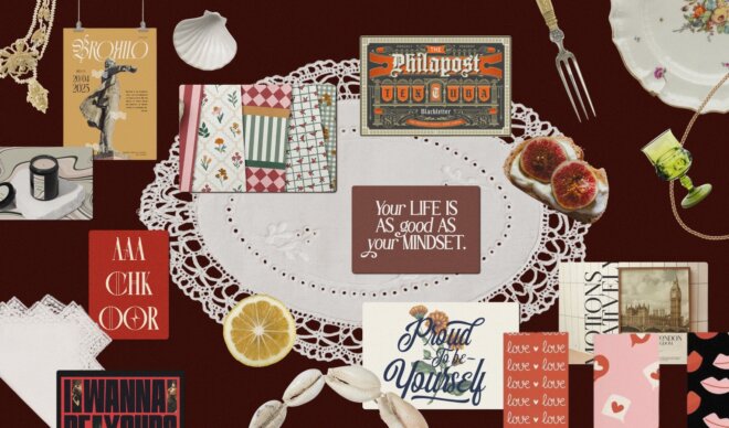
We’ve noticed the same shift across Creative Market.There’s a noticeable interest for assets that introduce a bit of texture into otherwise clean layouts. Paper brushes, expressive serif families, and scanned ink marks all seem to be finding their way back into designers’ toolkits.
Sometimes it’s as simple as introducing a subtle grain overlay, choosing typography with a little more movement, and ultimately resisting the temptation to smooth every edge.
A reminder to leave a bit of personality behind
One of the reasons the TBWA rebrand has stuck with us is how confident it feels in its choices.
It would have been easy to refine every edge and smooth every brushstroke. Instead, the identity leaves room for a bit of unpredictability, and maybe that’s what makes it memorable.
As more designers explore texture, expressive typography, and handmade illustration, we’re reminded that some of the most compelling work doesn’t hide the process. Judging by what we’re seeing across the creative community, this is only the beginning.

Download these worksheets and start practicing with simple instructions and tracing exercises.
Download now!



Creative Copywriter | SEO Strategist | Concept Developer I've helped brands translate ideas into compelling stories that drive engagement and deliver results. My expertise spans creative copywriting, SEO content strategy, concept development, editorial writing, and brand storytelling.
View More Posts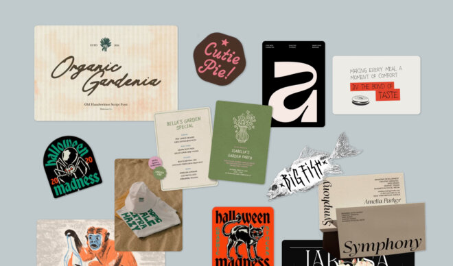


1 Comments