
Traditional Style and Modern Typefaces Come Together In These Unique Tattoo Designs



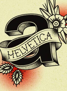
Let’s talk about tattoos and type. I have a lot of friends with them, and, in what may be shocking for you to hear, I have quite a few of them myself. Most of mine are either related to some personal tragedy or incident in my life, or just a giant octopus, but I’ve thought a lot about getting something design-related recently. And when I found out about TypeTatts, a project by Brazilian designer Will Jr. on Behance, I was hooked. The clash between the traditional tattoo style and the modern font design makes these tattoos a unique approach to body art. Frankly, I may have a new ink idea or two.
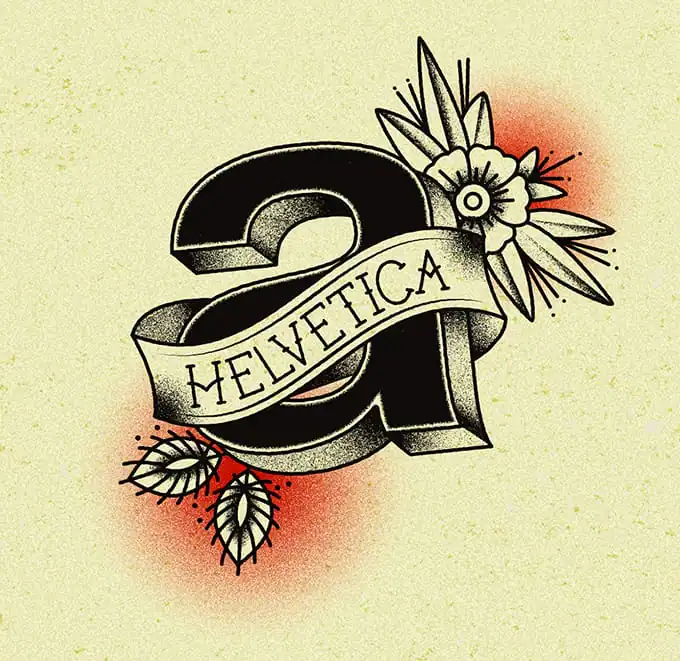

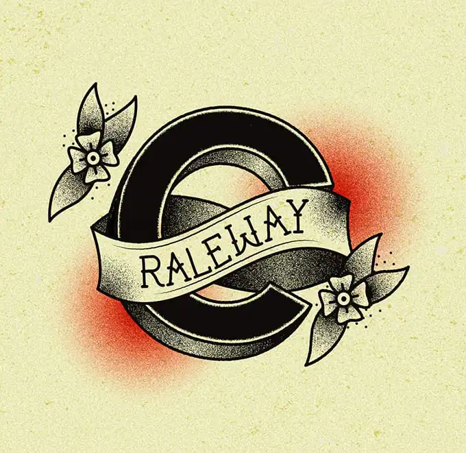
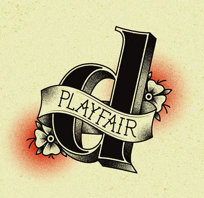
The idea is to combine old school tattoo art with modern day (and some older, but still classic) typefaces into one cool design. It’s almost like Sailor Jerry meets Helvetica, which is quite literally one of the designs. When it’s all put together, it looks pretty sweet.


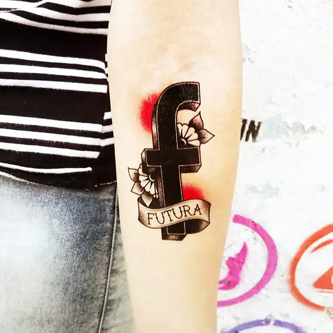
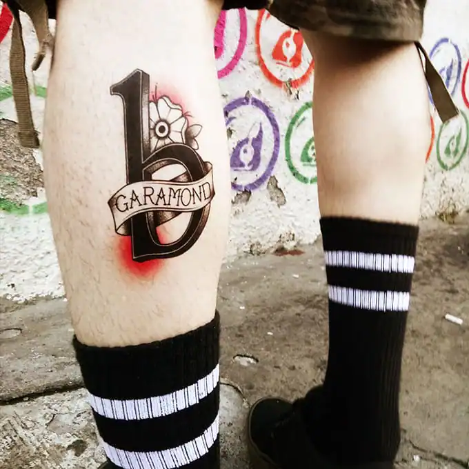
That said, I sure am glad that none of these are Comic Sans. That would’ve been a mistake.
via Design Taxi

Download these worksheets and start practicing with simple instructions and tracing exercises.
Download now!






Hi! My name is Kevin Whipps, and I'm a writer and editor based in Phoenix, Arizona. When I'm not working taking pictures of old cars and trucks, I'm either writing articles for Creative Market or hawking stickers at Whipps Sticker Co.
View More Posts




6 Comments