The Art and Science of Typeface Design: Insider Takes from Rain Foundry’s Carl Rain


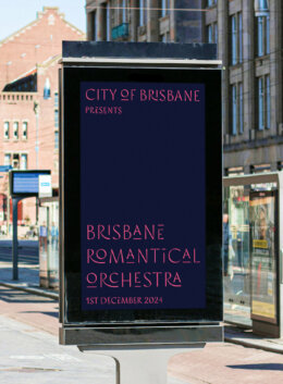
A passionate typeface designer, Carl Rain brings a unique blend of artistry and technical skill to his creations through Rain Foundry. In this interview, Carl takes us through his journey from a weekend developer to a celebrated type designer, sharing insights into his creative process, inspirations, and the future of type design. Whether you’re an aspiring typographer or simply fascinated by the world of fonts, Carl’s story is sure to inspire.
What inspired you to design typefaces in the first place?
In my nascent years as a developer on the weekends, I did a small type design class by Faber&Lo. In the class, I drew a geometric and really got passionate about it. Later on, I started doing calligraphy, reading typographic and type design theory before I would attempt to draw a single glyph on a font creation app. Thenafter I would tinker around with the nodes. What led me to become a type designer was the idea of creating a legacy for myself and earning money while drinking a nice cold brew, loafing in my loafers.

When creating a new typeface, where does your creative process start?
Firstly, I’d have to find a prime reference and several secondary references. From there, I’d draw some roughs and after that tinker with the nodes.
Typefaces are everywhere! In the street, on a poster, in a library, on a book, and on a menu. Anywhere and everywhere. Whatever I see and like, I’ll amalgamate and interpret as such.
An example of this is Pinecone, where I bought a poster abroad and was drawn to the floral ornaments.

How would you define your signature design style?
I tend to draw typefaces in a fundamental and expressive way. Calligraphic stresses (angled stress), narrow joins and some idiosyncrasies on certain glyphs. This is so that it isn’t dry when you read it.
There’s a dreamlike, escapist character to your fonts: how did that come about?
The dreamlike characteristics stem from my background in music (I compose pieces for the piano). In composing pieces you impart expression and give it purpose. This is applied throughout all my typefaces. For the most part, I have a theme for each typeface and where that goes, the design shall follow. I’m not into rote following of periods or styles, I just draw and interpret as I see to my liking. I find it yields fantastic results!
Out of all the typefaces you’ve designed, what is your favorite family?
As of writing this and what’s currently in Creative Market it would be Conacher. The typeface infuses geometric properties with penciled illustrations. I use it in my business documents and it really brings something dry to life.


I also find that Rosewater and Cardamom are a perfect socket for the font meta on Creative Market. Elegant and airy, yet imparts a certain strength to a design.


What typefaces are you working on right now?
I’m primarily working on expanding the weights on my existing fonts. For this year there will be a few new fonts on my end. As of writing, I’m putting final touches on the upgraded version of Cardamom. It should be up (hopefully when this interview is up). I’m going to potentially add back Saffron (with more weights and higher contrast) and create a new typeface called Coriander which I have ideas brewing in my head. Look forward to those typefaces down the road.
What kind of brand do you envision using your typefaces?
For me, I feel a brand that needs that expression in their designs. Perhaps in cookbooks, graphic design, architecture, gardening and lifestyle books, menus, business cards, and artistic, illustrative, and painterly website portfolios. I would like my typefaces to give that feeling of elation when you first see something that feels completely novel.
If you had to help a brand select its primary font, what would be some of your criteria?
- Purpose: What is the purpose of the brand?
- Tools: Does the font contain the right weights, glyph sets, and italics?
- Aesthetics: Is it visually attractive?
- Ubiquity: Is it somewhat arcane that it can be a differentiator?
How do your web development and type design skills come together?
Coding skills and type design are quite similar to an extent. With code, you are telling the computer what to do and with type design, you put the nodes into the place. Giving it instructions to produce a result. Where it diverges is when you impart your own flavour to a typeface and that’s where the design comes along. Creating typefaces is primarily engineering with the kerning, spacing, tempering the cohesion and contrast of the glyphs. The design is what you make of it.

What advice do you have for aspiring type designers?
I actually did a light lecture on this, where I explained the arduous process in creating typefaces. If you want to take the journey, here are the books and tools I used to get to where I am:
Primary books
- Learn Calligraphy: Margaret Shepherd [Calligraphy (Learn the roman, Foundational and italic scripts)]
- Designing Type: Karen Cheng [Type Design theory]
Auxiliary books
- How to create typefaces from sketch to screen: Cristóbal Henestrosa, Laura Meseguer, José Scaglione
- Italic – What gives Typography its emphasis: Hendrik Weber
- Counterpunch: Fred Smeijers
Software
- Glyphsapp: https://glyphsapp.com/
Some final words from Carl
I’d like to say thanks to Creative Market for this interview. Hopefully to whomever reads this would enjoy my typefaces and use it for future projects. Follow me on Instagram. I’m pretty active there and post work-in-progress typefaces, typeface analysis, tier lists, opinions on typeface related things and other things. That’s my piece, and until next time.

Download these worksheets and start practicing with simple instructions and tracing exercises.
Download now!