



Chalkboard typography is always eye-catching, because almost everyone has personal experience with the medium of white chalk on a blackboard. You can still remember the sensation of having that piece of chalk in your hand, and the artistry of chalkboard designs draws on those sense memories. It’s hard to even imagine how an artist could create the elaborate pieces that we’ve gathered here. These works have the unique textural appeal of white on black, even though modern digital techniques allow the font and background to be transformed into any color. Here are ten stunning examples of chalkboard typography, drawn from the huge variety of graphic possibilities that thismedium offers:
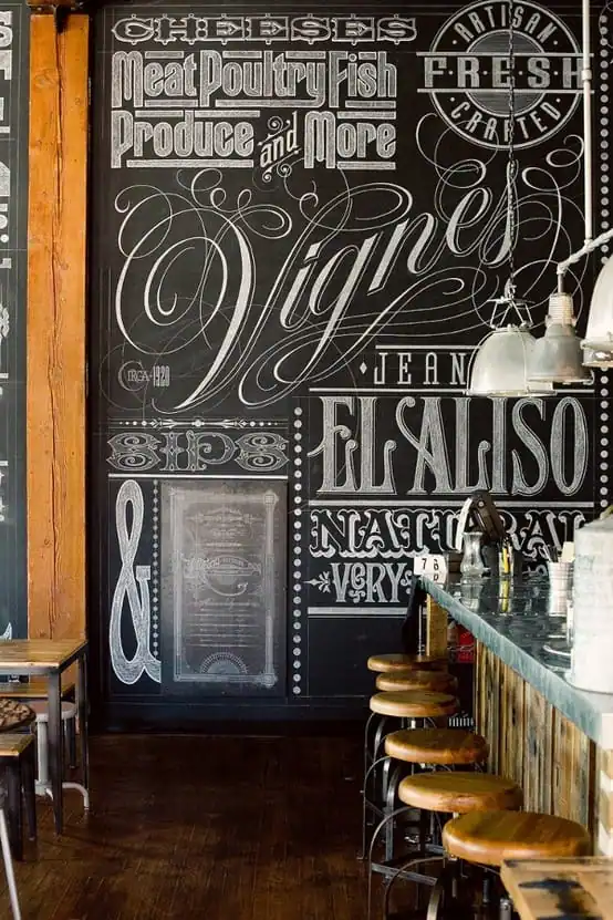
This photo shows an actual chalkboard inside a bar. Obviously the artist who created it is taking the opportunity to display his or her mastery of classic letter-formation and design. The rich elaboration of this wall art truly creates the entire atmosphere of the room.
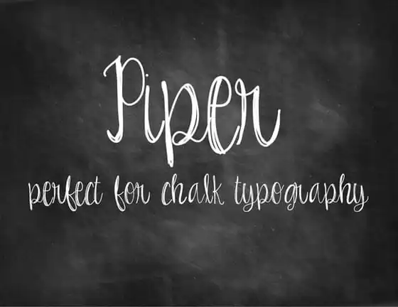
For a fresh contrast, chalkboard fonts can also represent the simplest and most personal hand-lettering. In this font entitled Piper, you can relate to each stroke of the piece of chalk. Simple messages from the heart often deserve the most spontaneous typography.
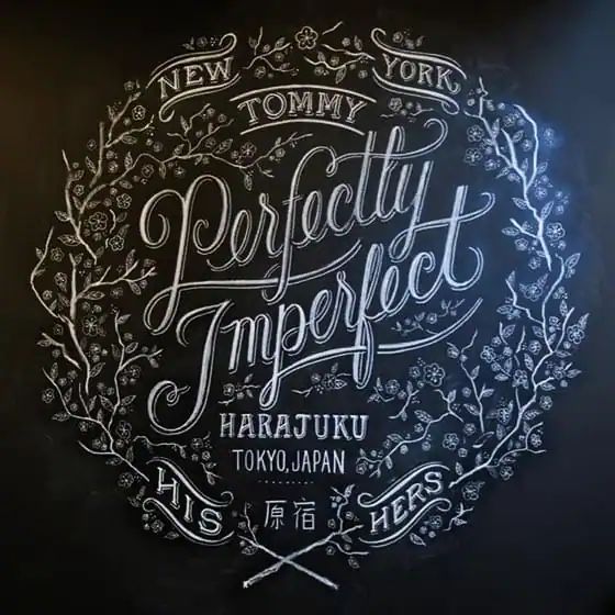
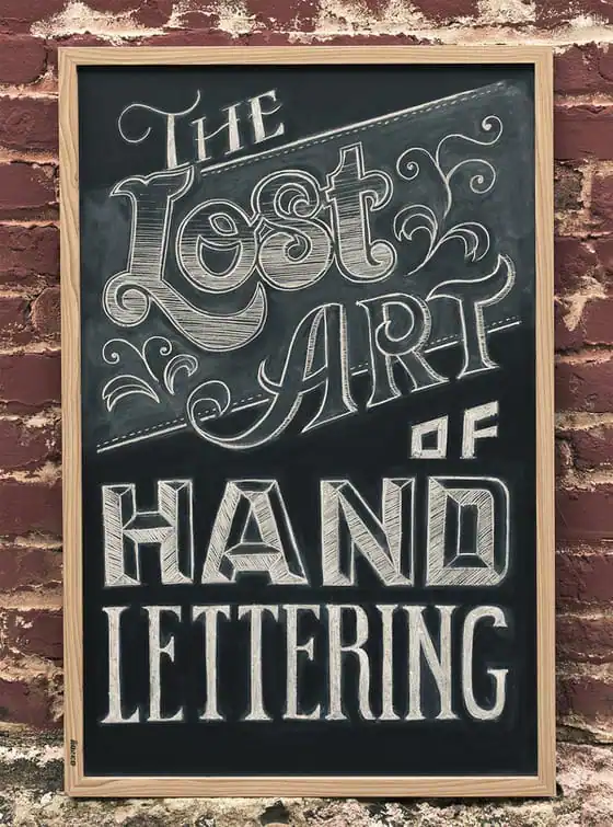
This wall sign showcases the design artistry that often accompanies chalkboard work. It’s not simply a lettering style; instead, a chalkboard provides an entire working space which can be filled with drawings that emphasize the impact of the words.
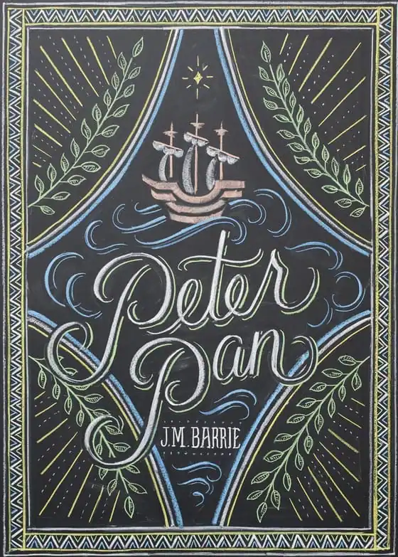
Dana Tanamachi is a chalkboard artist, and her book cover for Peter Pan is a delicately lovely example of pastel-colored chalk design. Her website shows some of her other covers for this line of Penguin children’s books, together with her working sketches.
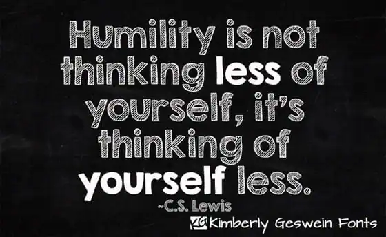
Here’s a font that demonstrates the way in which chalkboard letters can offer different tones depending on how solidly they are filled in. When displayed against a contrasting background, the “stripey†letters appear pastel and chalky, whereas the solid letters give a bolder look without adding extra bulk.
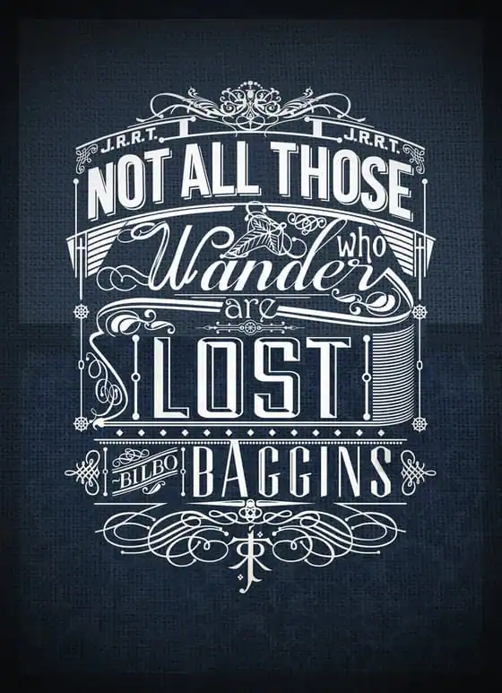
Something about the chalkboard medium draws artists who base their work on lettering, and then end up with a finished product that is far more than merely a sign. This artist starts with a quote from “Lord of the Rings†and adds some exquisite flourishes to create a work of art for walls or t-shirts.
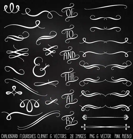
Creating your own chalkboard-style images is easy when you have access to some of the basic graphic building blocks. Chalkboard flourishes and scrolls can be individually chosen and then integrated into larger works.
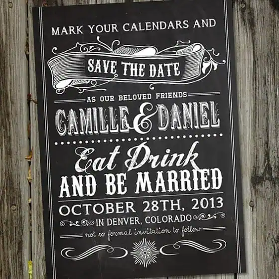
Because chalkboards were actually used in vintage bars and restaurants, they lend themselves well to old-fashioned fonts. This save-the-date wedding invitation makes lovely use of the chalkboard style to convey a formal yet rustic feel.
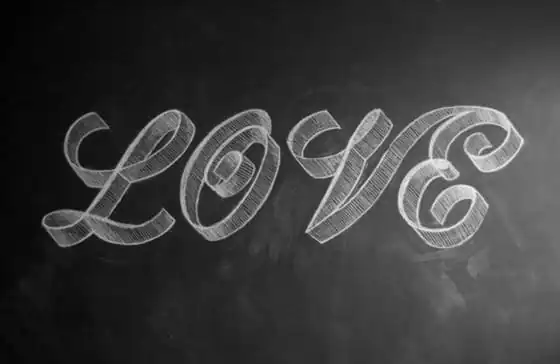
The simple artistry of these chalked letters stands apart from some of the more elaborate designs – and yet the sense of depth and dimension created here is unmatched. The shading and ribbon-like curves of these letters truly shows how expressive this medium can be.
Finally, here’s a fascinating step-by-step answer to that question you can’t help asking yourself as you browse these amazing displays of artistry: How do they do it?
++++++
Now that you’ve been inspired by these examples of chalkboard typography, imagine what you may be able to create for your next event brochure or invitation!

Download these worksheets and start practicing with simple instructions and tracing exercises.
Download now!





I'm a recent graduate of the University of San Francisco with a degree in Biology and a passion for the creative arts. I love building websites, trying new things, and I have a passion for social media.
View More Posts


6 Comments