
What’s the Difference Between Leading, Kerning and Tracking?
Adjusting leading, kerning, and tracking are key to typesetting, since they affect how spacing makes your text look proportional and readable. Here’s a comprehensive breakdown of each term and how you can adjust it all in Photoshop and Illustrator.



Adjusting leading, kerning, and tracking are key parts of the typesetting process, since they affect how spacing makes your text look proportional, polished, and readable. Whether you’re working in Adobe Illustrator, experimenting with custom typography, or learning basic typography through a font tutorial, understanding these concepts is essential for creating an optimal reading experience.
Before you become famous for creating the next best typeface or your own font family, you have to learn the fundamentals of typography and typesetting. From the era of the printing press and metal type to today’s digital systems and desktop publishing software, arranging text has always been central to effective communication and graphic design.
The first step to perfecting any font style is understanding how leading, kerning, and tracking influence line spacing, word spacing, readability, and overall page layout. These essential typography terms help designers, art directors, and publishers shape everything from magazine spreads and brand identity systems to website layouts and printed publications.
Leading
Leading is an essential part of the typesetting system that determines how text is spaced vertically in lines. For content with multiple lines of readable body text (like this article), you’ll want to ensure the distance between lines creates a comfortable and readable flow for your readers.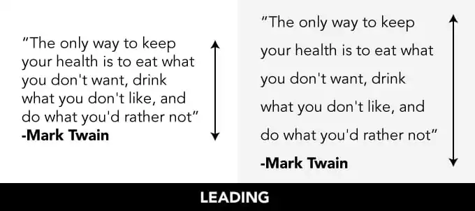
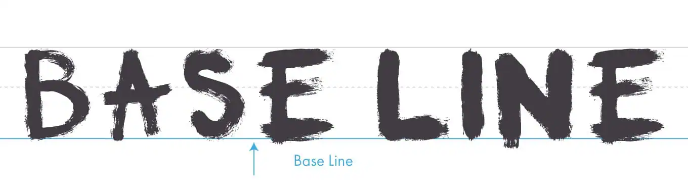
The leading is measured from the baseline of each line of text, where the letters “sit.” Descenders — the parts of certain characters that fall below the baseline, such as a lowercase “g” — and ascenders, like the taller portions of the letter “H,” both influence how spacing should be adjusted.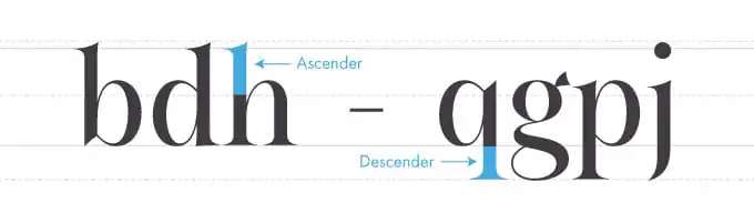
Traditionally, leading should be approximately 20 percent greater than the chosen font size, though different typefaces, layouts, and design projects may require different spacing approaches depending on readability goals and publication format.
How to Adjust Leading in Photoshop and Illustrator
To adjust leading in Photoshop or Illustrator, open the Character palette under Window → Character (or Type → Character in Illustrator), then modify the leading field beside the font size controls.
Before making adjustments, highlight the text you want to edit. Designers often tweak leading alongside other formatting elements like page margins, word spacing, and alignment to create balanced and visually pleasing layouts.
These tools are standard features in modern desktop publishing software and are used daily by designers, typesetters, and publication teams around the world.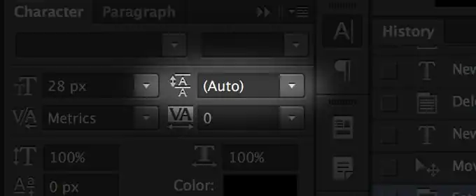
Kerning
One of the most important aspects of successful kerning? Maintaining proportional spacing between each letter while taking into account serifs, decorative glyphs, and stylistic flourishes. This process requires a trained eye and attention to detail, especially when working with expressive serif fonts or custom typography systems.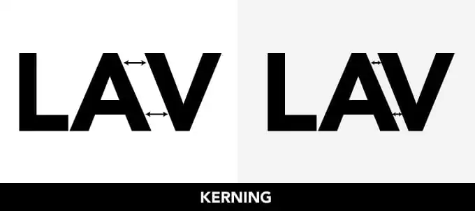
Good kerning improves readability and creates a smoother reading experience across headlines, logos, and editorial design work. It’s an especially important skill for designers creating logos, packaging, publications, or cohesive brand identity systems.
How to Adjust Kerning in Photoshop and Illustrator
You can adjust the kerning of a font in Photoshop and Illustrator through the same Character palette that you use for leading. The kerning field is below the type size. It’s generally easier to use shortcuts for kerning, however. Place the cursor between the letters you want to kern and hold down the option key. Use the directional arrows to move the letters right or left until they’re perfect.
Save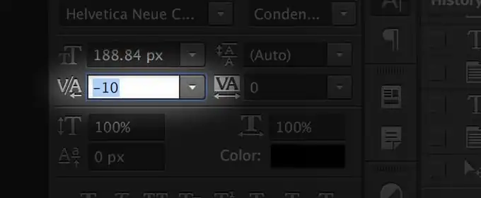
Think you’re a master kerner? Try this awesome kerning browser game and test your skills.
Tracking
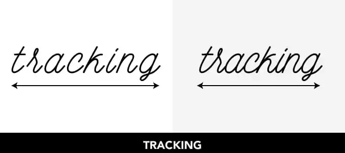
Tracking is often confused for kerning, but the concept is a little different. Tracking involves adjusting the spacing throughout the entire word. Once you’ve determined the right spacing between each letter, tracking can be used, with great restraint, to change the spacing equally between every letter at once.
Tracking is generally used to fill a space that’s larger or smaller than currently suits the type’s parameters or to make a single word seem airy and impressive. You should be very careful when changing the tracking, as it can quickly lead to difficulty in reading.
How to Adjust Tracking in Photoshop and Illustrator
In the character palette in Photoshop and Illustrator, you can change the tracking by adjusting the number in the field below kerning. As with kerning, you can select the text you wish to alter and hold down the option key, pressing the directional arrows to adjust.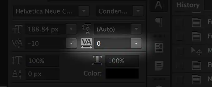
Know Your Terms
Whether you’re designing a website or a typeface, it’s worth knowing these concepts and how to wield them to improve your typography. And we haven’t even mentioned font formats, which are essential for a designer’s everyday work. Curious? We explained everything you need to know about OTFs and TTFs here. Are there any design terms that have tripped you up in the past? Let us know in the comments below. If you’re feeling extra confident, please join our 7-day challenge to become a typography expert.
Products Seen In This Post:

Download these worksheets and start practicing with simple instructions and tracing exercises.
Download now!








Making beautiful design simple & accessible to all.
View More Posts





11 Comments