



is a typographer and illustrator living in Santiago, Chile. He also owns the Creative Market shop, Rodrigo Typo.
 What creative area(s) do you focus on the most Rodrigo?
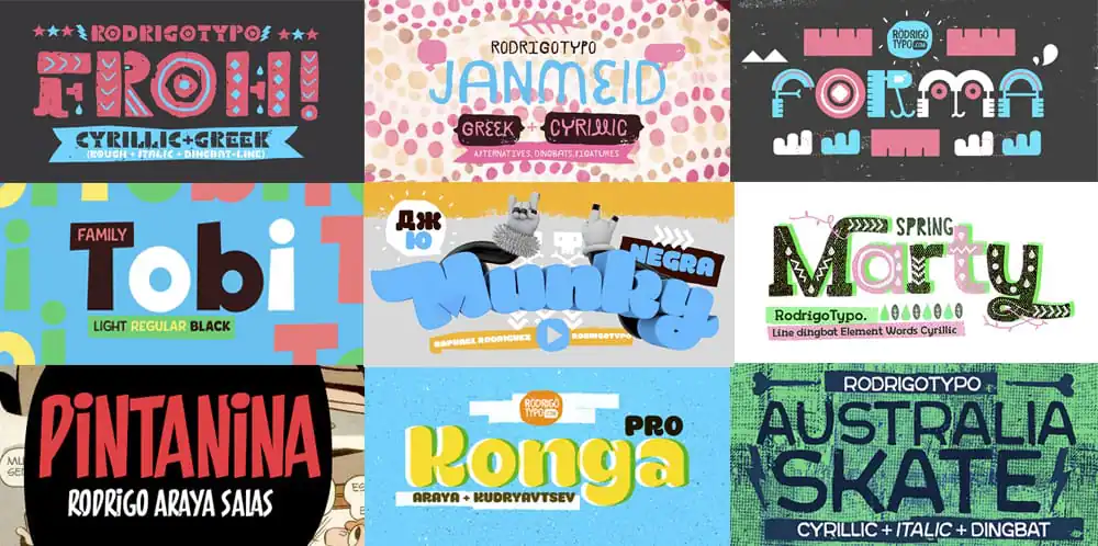
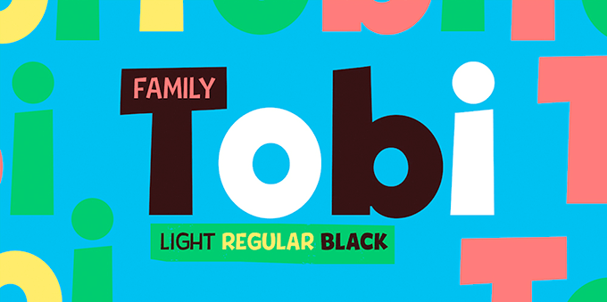
I spend most of my time designing typography, mostly for titles. You can see some examples of my work in my Creative Market shop, Rodrigo Typo. I especially enjoy focusing on typography for kids or teens, where i can mix in illustration. I have a passion for typography and illustration, so i’ve worked hard to become specialized in both of these areas.
What creative area(s) do you focus on the most Rodrigo?
I spend most of my time designing typography, mostly for titles. You can see some examples of my work in my Creative Market shop, Rodrigo Typo. I especially enjoy focusing on typography for kids or teens, where i can mix in illustration. I have a passion for typography and illustration, so i’ve worked hard to become specialized in both of these areas.
 Would you say the road to becoming a typographer and illustrator has been an easy one for you, or has the journey been difficult?
I’ve always put 100% effort into my work. I wanted this and I trust myself and my abilities. To be candid, my designs were horrible when I first started out. It was clear that I wasn’t prepared at that point, but I’ve learned and grown.
What contributed the most to that growth?
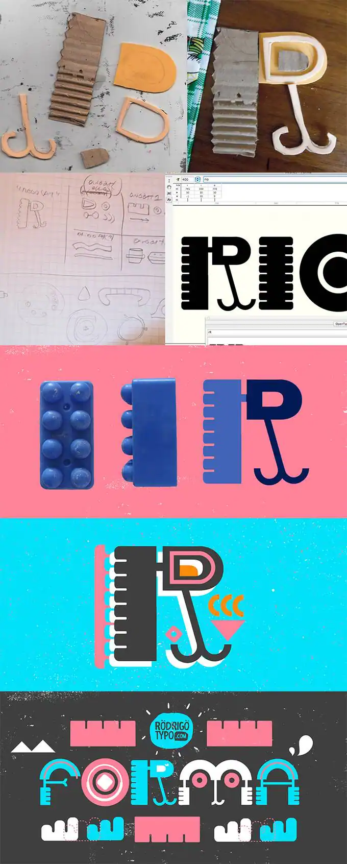
I actually started out on my own (that’s why some of my first worked sucked so much haha), because I didn’t have the option to study typography in college, classes in that area didn’t exist. It didn’t take long for me to realize I needed to learn typography in the right way. So, I finished college and began studying for a magister at Chile’s Catolica University. Catolica is one of the best universities in my country and they had everything I needed, including great typographers. I learned a lot, and in 2013 I studied illustration which helped me gain an appreciation for things like mixing different elements and textures.
Would you say the road to becoming a typographer and illustrator has been an easy one for you, or has the journey been difficult?
I’ve always put 100% effort into my work. I wanted this and I trust myself and my abilities. To be candid, my designs were horrible when I first started out. It was clear that I wasn’t prepared at that point, but I’ve learned and grown.
What contributed the most to that growth?
I actually started out on my own (that’s why some of my first worked sucked so much haha), because I didn’t have the option to study typography in college, classes in that area didn’t exist. It didn’t take long for me to realize I needed to learn typography in the right way. So, I finished college and began studying for a magister at Chile’s Catolica University. Catolica is one of the best universities in my country and they had everything I needed, including great typographers. I learned a lot, and in 2013 I studied illustration which helped me gain an appreciation for things like mixing different elements and textures.
 You’ve also taught design as a professor yourself. Can you tell us a little bit about this process and why you decided to do this?
I never expected that i would end up teaching, but it has been really fun. It’s a great experience for the students, because they’re learning to develop digital typography that they can sell. They can make a living with that! This is an important area of design that was difficult to access and learn about while I was in school.
You’ve also taught design as a professor yourself. Can you tell us a little bit about this process and why you decided to do this?
I never expected that i would end up teaching, but it has been really fun. It’s a great experience for the students, because they’re learning to develop digital typography that they can sell. They can make a living with that! This is an important area of design that was difficult to access and learn about while I was in school.
It’s so great that you’re giving back and helping to make the world of typography more accessible to the next generation.
What did your typography journey start to look like after attending Catolica?
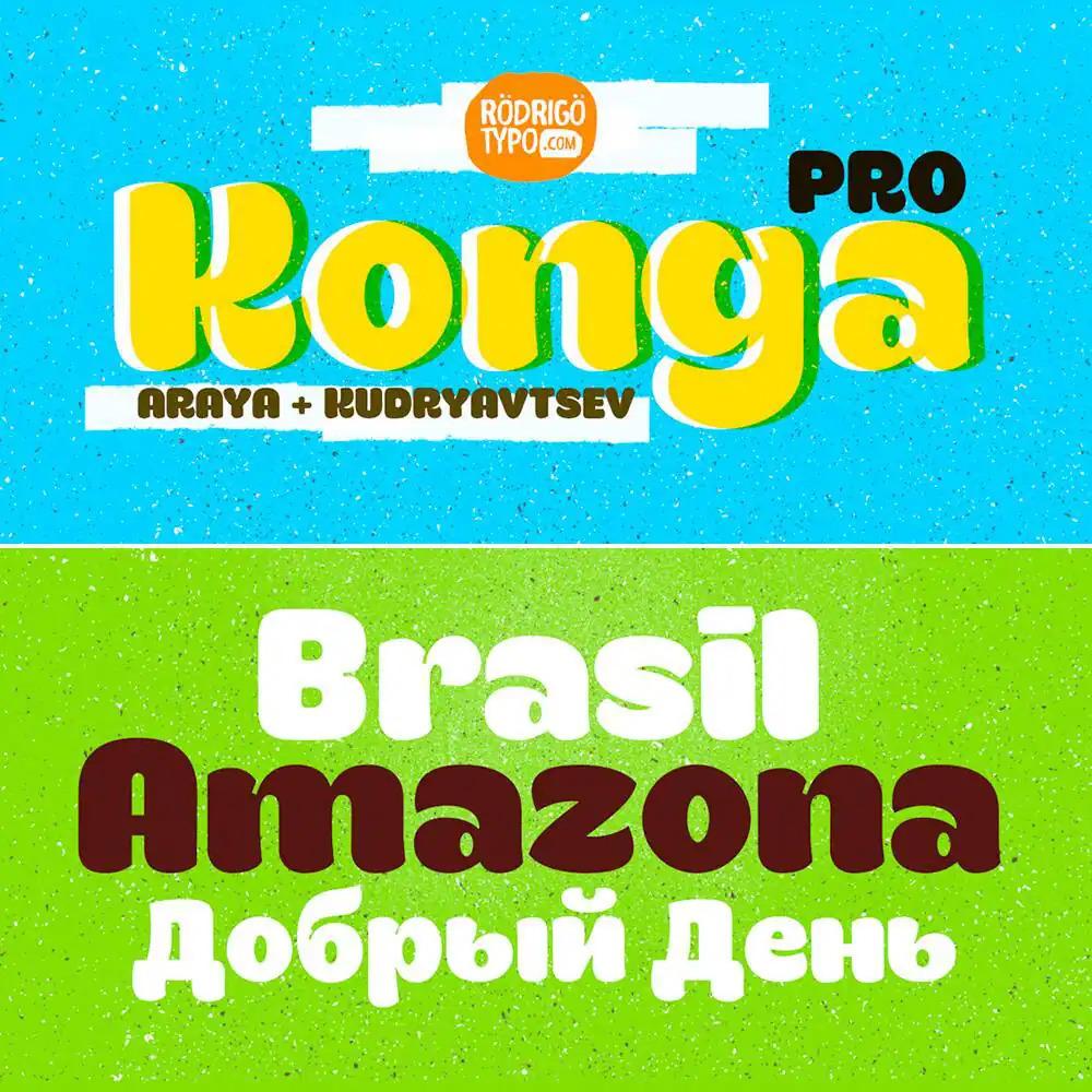
My first typography work focused on dingbats. The next step was typography for titles. From the start, I was always interested in childlike typography design. I enjoy chubby typography, sans serifs, and anything with a handwriting style. I found myself being inspired by the titles in magazines and comics, and, strangely enough, the titles on candy products were something that often stood out to me. I was interested in finding a way to create similar fun sensations.
Those interests and inspirations definitely show up in your work in awesome ways. Your typography is always so fun and upbeat!
So, from there, did things start to take off?
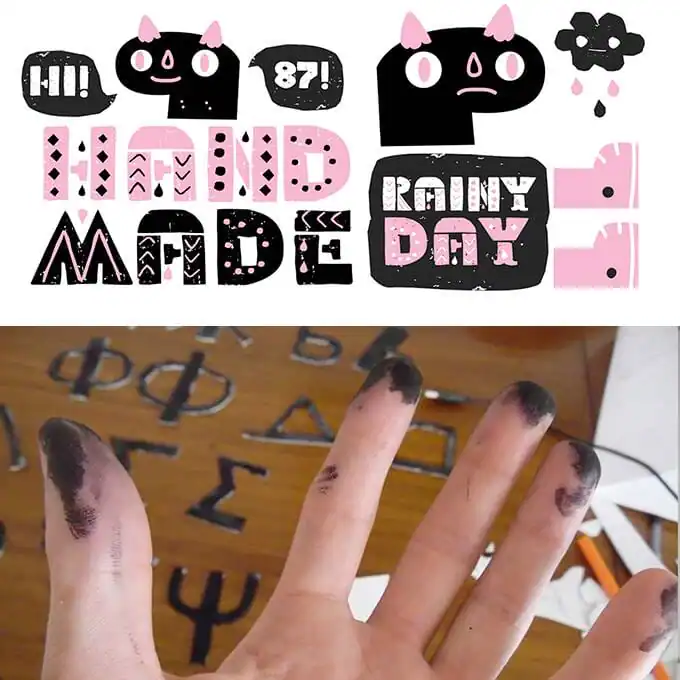
I suppose you could say that. Soon, without even thinking much about money, I started to sell my creations. Before I knew it, people from other countries were contacting me about my work. I remember one day getting a call from an individual in Sweden who was interested in purchasing my typography; that motived me a lot. In fact, I was motivated enough to learned the Russian alphabet and starting using it in my typography. It’s an amazing feeling and something so special and to see that your work can be used and enjoyed by people around the world, even if those people use and speak a different language. Overall, like you said, I feel like people really like my work because it’s fun. I represent myself in my typography, each piece reflects a piece of my personality.

Download these worksheets and start practicing with simple instructions and tracing exercises.
Download now!



I’m an ex-schoolmarm who is excited about all things creative. Photography makes me smile and when I find a new-to-me dress that fits just right, it makes my day.
View More Posts


17 Comments