
25 Best Movie Fonts for Cinematic Designs
From Jurassic Park to Star Wars, movies are made unforgettable with a little help from the lettering used for various promotional materials. Want to see your own design up in lights? Then ready yourself by grabbing these awesome movie fonts!



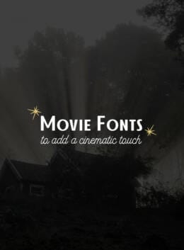
There’s something about the right typeface that can make a design feel like it belongs on the big screen. A dramatic serif can hint at an epic story, a rough display font can set up a horror film, while a futuristic face can transport you straight into another galaxy.
The best movie fonts do more than spell out a title. They establish mood, suggest a genre, and give the audience a sense of the story before they’ve seen a single frame.
Whether you’re designing a movie poster, title sequence, book cover, album artwork, or a campaign with a cinematic edge, these fonts can help you create that feeling. From vintage Hollywood-inspired lettering to horror, sci-fi, fantasy, and modern display styles, here are 25 fonts worth putting in the opening credits.
What Makes a Good Movie Font?
Think about some of the most memorable movie titles. You can probably picture the lettering before you remember every detail of the poster. That’s because film typography is part of the storytelling.
A good movie font should feel connected to the world you’re creating. A period drama might call for an elegant serif, while a sci-fi story could benefit from geometric or futuristic lettering. A horror title might need something rough, distorted, or just slightly unsettling.
Readability matters, too. Movie titles need to make an impression quickly, particularly when they’re competing with photography, illustration, or a busy poster composition. Look for fonts with enough character to stand out, but enough clarity to keep the title easy to read.
And don’t be afraid to think beyond the obvious. A handwritten script can give an indie film warmth and personality, while an unexpected vintage typeface can make a contemporary project feel wonderfully nostalgic.
The key is to choose a font that adds to the story rather than simply decorating it.
1. Dickens — Best for Dramatic Movie Titles
With its serious serif character and unmistakably cinematic presence, Dickens feels made for the title card. It has the kind of traditional personality that can suggest mystery, history, drama, or an epic story waiting to unfold. Try it on movie posters, opening titles, book covers, or any project that needs a little gravitas.
2. Midnight Baby — Best for Indie & Romantic Cinema
Loose, expressive, and a little imperfect, Midnight Baby has the warmth of something written by hand. Its after-dark character makes it especially appealing for romance, indie cinema, music-inspired designs, and stories with a more intimate feel. It’s a great reminder that cinematic typography doesn’t always have to be dramatic.
3. Brunson — Best for Bold Film Titles
When the title needs to do some of the heavy lifting, Brunson brings a stronger visual presence. Its bold character makes it a natural fit for posters, title cards, branding, and designs where you want the typography to be noticed immediately. Think big story, big title, no need to whisper.
4. Atelier Grande — Best for Vintage Hollywood
Atelier Grande brings a romantic vintage-script feeling that wouldn’t look out of place on an old cinema marquee. Its sweeping letterforms work beautifully for period-inspired posters, romance, fashion, and classic-Hollywood aesthetics. Use it when you want your design to feel a little glamorous and a lot more nostalgic.
5. True Crime — Best for Horror & Thriller
Some fonts make you think of a movie. True Crime makes you wonder what happened. Its rough, messy display style is particularly suited to horror movie posters, thrillers, mystery projects, and true-crime-inspired designs. It’s unsettling in exactly the right way and far more memorable than a standard distressed typeface.
6. Wicked Tape — Best for Experimental Cinema
Made to look like real strips of masking tape, Wicked Tape takes movie typography somewhere much more tactile. The result feels handmade, imperfect, and deliberately unconventional. It’s a particularly fun choice for experimental film posters, indie projects, music artwork, title cards, or any design where polished isn’t the point.
7. Speltale — Best for Retro Horror
Speltale has that wonderfully eerie quality of a typeface you’ve seen somewhere in a dark corner of cinema history. Its retro-gothic serif forms make it a natural fit for horror, supernatural stories, thrillers, and vintage-inspired movie posters. There’s plenty of atmosphere here without resorting to the usual dripping-blood approach.
8. GILDED — Best for Classic Cinema Glamour
If your cinematic reference point is less midnight horror and more golden-age glamour, look to GILDED. Its neo-vintage character has an elegant, decorative quality that lends itself to classic cinema, luxury branding, fashion, and Art Deco-inspired designs. With a broad family of styles, you can also build more typographic hierarchy without leaving the same visual world.
9. Quinbuilt — Best for Retro Movie Posters
Quinbuilt brings an easygoing retro character to the screen, with the kind of lettering that feels right at home on vintage posters, title cards, and nostalgic designs. Its script style is especially good for stories with a playful, romantic, or throwback mood—think old cinemas, road trips, summer nights, and good stories from another era.
10. Sleeve Notes — Best for Analogue & Music-Inspired Cinema
With its handwritten, analogue feel, Sleeve Notes looks like it could have been pulled from a record sleeve or scribbled onto the back of an old cassette. That makes it a natural fit for music documentaries, indie films, coming-of-age stories, and designs inspired by the tactile charm of the pre-digital era.
11. Tokyo Brush — Best for Gritty, Urban Films
Rough around the edges and full of movement, Tokyo Brush gives movie typography an energetic, hand-painted quality. It’s a strong choice for action posters, street-inspired stories, music projects, and urban designs where perfectly polished lettering would feel out of place. Use it big and let those brushstrokes become part of the composition.
12. Bestan — Best for Sci-Fi Titles
Take your title somewhere beyond Earth with Bestan, a futuristic display font with a distinctly technological edge. It’s an easy fit for science-fiction movie posters, space adventures, gaming, technology concepts, and anything built around the idea of the future. When your story involves distant worlds, your typography should probably travel there too.
13. Astroy Galaxy — Best for Space & Futuristic Designs
Astroy Galaxy leans into the more adventurous side of futuristic typography. Its space-age personality can give titles an instant sci-fi atmosphere, whether you’re working on a film poster, fictional universe, game concept, or futuristic brand. Pair it with a restrained sans serif for supporting text and let the main title do the world-building.
14. Brohoney — Best for Modern Drama
For something more understated, Brohoney brings a contemporary serif sensibility to cinematic design. Its polished character works particularly well for drama, romance, editorial projects, and sophisticated movie posters where the typography needs to feel considered rather than theatrical. It’s a good choice when subtlety is part of the story.
15. Diabolus — Best for Gothic & Fantasy Films
Dark, dramatic, and slightly otherworldly, Diabolus brings Gothic character to a movie title without relying on the usual horror clichés. Its serif forms lend themselves beautifully to fantasy, supernatural stories, period pieces, and darker film concepts. Use it when you want your typography to suggest an ancient world, or something lurking just beyond it.
16. Coven — Best for Fantasy Horror
Coven feels like it already has a story attached to it. Its rough, hand-drawn display character is a natural fit for fantasy films, folk horror, dark folklore, and supernatural stories. It has enough personality to carry a movie title on its own, especially when you’re after something atmospheric, mysterious, and a little unsettling.
17. Scary Things — Best for Horror & Thriller Posters
Scary Things takes a sharper approach to horror typography. Its pointed serif details create tension without overwhelming the rest of the design, making it a strong option for horror movie posters, thrillers, mystery titles, and dark editorial work. Sometimes a few unsettling details are all you need to make a title feel wrong in a very good way.
18. Horus — Best for Historical & Mythological Films
Inspired by the visual language of Ancient Egypt, Horus brings a sense of history and mythology to the page. Its serif family can work beautifully for films about ancient civilizations, gods, legends, archaeology, or epic adventures. It’s a particularly useful choice when the typography needs to make a world feel older, bigger, and steeped in history.
19. Poster Bold — Best for Movie Posters
Some titles need to be seen before they’re read. Poster Bold has that immediate, attention-grabbing quality that makes it a natural candidate for movie posters, promotional artwork, event graphics, and oversized headlines. Keep the surrounding design relatively simple and give the type room to make its entrance.
20. Alchemion — Best for Historical & Occult Cinema
With roots in the ornate world of old books and alchemical texts, Alchemion brings a sense of mystery and history to cinematic typography. It’s an intriguing fit for period dramas, fantasy adventures, occult stories, and films with an old-world atmosphere. Think dusty libraries, secret symbols, forbidden knowledge, and titles that look like they’ve been waiting centuries to be discovered.
21. Lunaris — Best for Elegant Movie Titles
Elegant without feeling overly precious, Lunaris brings a polished serif character to cinematic typography. Its range of styles makes it useful for everything from dramatic movie titles to sophisticated posters and editorial layouts. Try it for romance, period drama, fashion films, or any story that calls for a little more refinement.
22. Batherga — Best for Romantic Cinema
With its flowing signature-style lettering, Batherga has the effortless charm of a handwritten movie title. It’s a natural fit for romance, weddings, fashion, lifestyle films, and nostalgic stories where a personal touch matters. Use it sparingly against a simple background and let those sweeping letterforms create the atmosphere.
23. Greatsby — Best for Classic & Editorial Films
Greatsby has the polished character of a classic editorial serif, making it an easy choice for sophisticated movie posters, period-inspired projects, and title treatments. It can bring a sense of occasion to the screen without becoming too theatrical—ideal when your cinematic style is more prestige drama than blockbuster spectacle.
24. Just Because — Best for Playful Movie Titles
Not every movie needs to take itself seriously. Just Because brings a playful, expressive quality to display typography, making it a fun choice for comedy, animation, children’s stories, coming-of-age films, and upbeat poster designs. Its SVG treatment also gives you room to experiment with texture and color when building a more illustrative title.
25. Whinstone — Best for Bold Cinematic Impact
When you want the title to arrive with a little more force, Whinstone delivers a bold display presence. Its strong letterforms can anchor movie posters, action concepts, sports stories, and dramatic campaign work, while its Cyrillic support makes it especially useful for projects aimed at multilingual audiences. Make it big, give it space, and let the title lead.
Did these movie fonts inspire you to create your own blockbuster?
Projects are more fun when you have trusted content you can always pull out anytime. Creative Market makes it possible thanks to independent creatives around the world. Whether it’s for personal or commercial use, you can bet you’re getting great handcrafted content every time.
Don’t forget to keep an eye out for FREE goodies each week! From templates, fonts, to stunning stock photos, Creative Market is your best friend to making sure your toolkit is always stocked with unique resources.
The best movie fonts for posters should capture the mood of the film while remaining easy to read at a glance. Bold display fonts work well for action and drama, while serif, script, distressed, and futuristic styles can help establish specific genres and eras.
There isn’t one universal movie-title font. Film titles are typically designed around the genre, story, era, and visual identity of the movie. Serif, sans serif, script, condensed, and custom display fonts can all work as movie title typography.
Cinematic fonts are typefaces that help create the visual mood associated with film and storytelling. They can range from elegant serif fonts and vintage scripts to dramatic horror lettering, futuristic sci-fi type, and bold display fonts designed to command attention.
Horror movie fonts often use distressed, Gothic, sharp, irregular, or hand-drawn forms to create tension and unease. Fonts such as True Crime, Speltale, Scary Things, and Coven demonstrate different approaches, from retro horror to rough, supernatural, and thriller-inspired typography.
Futuristic display fonts are a natural choice for sci-fi movie posters because their geometric or technological forms can immediately suggest space, technology, and imagined futures. Bestan and Astroy Galaxy are examples of fonts that can create this kind of futuristic atmosphere.

Download these worksheets and start practicing with simple instructions and tracing exercises.
Download now!





We create fonts, graphics, and produce aesthetically pleasing photos.
View More Posts


9 Comments