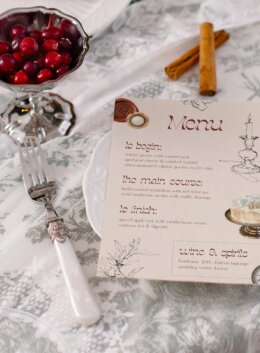
Some nights deserve linen napkins, candlelight, and a printed menu that sets the tone before the first sip is poured. This Design It Yourself tutorial walks you through creating a timeless dinner menu with the quiet sophistication of a well-traveled host. Deep neutrals, aged paper tones, and delicate ink sketches: an aesthetic that feels just as fitting for a late-autumn feast as it does for a New Year’s toast.
This time around, we’re creating a print piece that belongs beside fine china, cranberry sprigs, or flickering tapers, whatever your table looks like this time of year! With just a few assets and some design intuition, you’ll craft a menu that feels collected, intentional, and completely at home in a season of gatherings.
Step 1: Download Your Assets
We’re using Manoir: Royal Mixed Media Pack by NatPurple (a Cyber-exclusive available this week only), The Retro Font Collection by Tropical Type (on sale during this year’s Cyber Sale), and Toile De Noel Christmas Mockup by Muse Mockups for presentation. Together, these assets create a layered, tactile atmosphere inspired by old-world stationery and heritage decor.
Step 2: Set Up Your File in Illustrator
Open Adobe Illustrator and create a new document. Set your artboard to 5.5 x 8.5 inches, the perfect half-letter size for printing at home. This scale feels refined without overpowering a place setting.
Step 3: Build the Background
From Manoir, choose a subtle paper texture and apply it as your background layer. Change the blending mode to Multiply or Overlay and reduce opacity until you get a soft, aged tone. This trick helps your design print beautifully on regular paper—no special cardstock required.
Step 4: Add Illustrations with Character
Layer in fine line illustrations from Manoir—think candle holders, leafy borders, or a flourish across the top. Keep them minimal, and position them near the edges to frame the text elegantly.
Step 5: Choose Typefaces That Tell a Story
For your title and section headers, use Sunshower Dreams from The Retro Font Collection. It brings a hint of old-world ornamentation while staying crisp. For the menu descriptions, pair it with Hunter, a refined serif that keeps your text legible and grounded.
Step 6: Introduce Real Objects for Warmth
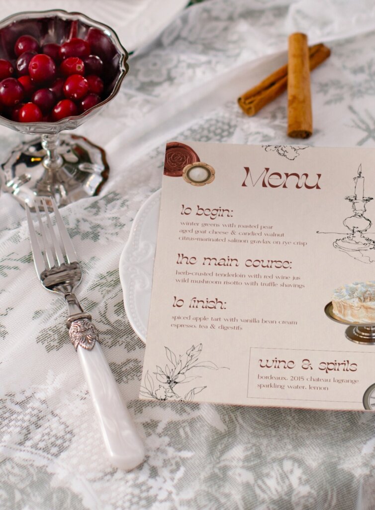
Now it’s time to add Manoir’s photorealistic elements—a wax seal, a pocket watch, maybe a dessert plate or button. These pieces introduce subtle texture and connect your design to the tactile world. Arrange them with care so they guide the eye rather than compete with your text.
Step 7: Unify the Palette
Sample a warm brown hue from the wax seal or dessert and use it across your typography. A single color family ties the design together while complementing both silverware and candlelight.
Step 8: Frame the Finishing Touch
For a balanced composition, place your Wines & Spirits section in a thin, right-aligned frame. It creates rhythm and gives your menu a distinct sense of hierarchy.
Step 9: Bring It to the Table
Use Toile De Noel Christmas Mockup to display your finished design among fine linens and festive greens. The scene transforms your digital layout into an experience you can almost feel, ready for any gathering where good taste meets good company.

Download these worksheets and start practicing with simple instructions and tracing exercises.
Download now!








Making beautiful design simple & accessible to all.
View More Posts