



The month of August showed us a variety of new logos and re-designs that featured the latest logo trends from 2013. We’ve seen everything from a trend toward basic elements to badges incorporated in logos this year. Now that we’ve moved into September, we’re going to take a look back at some of the logos released in the past month and see what’s trending in the latest designs.
Logo Trend: Back to Basics
New Colorado Logo Design
The state of Colorado has decided to rebrand itself with a new logo design and slogan that states “It’s our nature.” The new logo will be featured everywhere from signs and letterheads to tourist stops and business cards. The logo’s design is very basic and features a green and white color scheme with a simplistic depiction of a mountain.
Admittedly, this logo design has been met with a lot of controversy and people have stated that it’s design is almost too simplistic. What do you think?
New YouTube Logo Design
Recently, the company YouTube has been showcasing a newer, simpler logo design on it’s Facebook and Twitter accounts, as well as it’s mobile app. This logo design is definitely following the trend toward minimalism and like the Colorado logo above features only two colors (red and white). As of yet, the company has not officially announced a re-brand or re-design, but it definitely looks like things are changing!

Logo Trend: Badges
New ABC Board Logo Design
The Alcoholic Beverage Control board has decided to modernize their logo this year, by incorporating the trending badge design element into it’s logo. According to the ABC’s administrator, “We’ve got antiseptic looking stores, they’re not as friendly looking as we’d like them to be. They all look alike. In a way that’s good, but you want to create an image of warmness.†Their re-branding efforts are meant to change the look and feel of the company.
New KRCW Logo
This radio station decided to create a new logo that followed the growing trend of using badges and insignia designs in logos. In addition to featuring a badge design the logo also features a bit of a grungy or vintage feel to it, as well as a simple two color scheme.
Logo Trend: Text Only
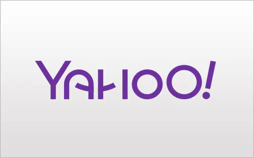
The New Yahoo! Logo
Have you noticed that recently every time you visit the Yahoo! homepage, the letters of the word “Yahoo!” have had a different design? Well, this is part of Yahoo’s 30 days of change campaign, where every day for thirty days they highlight a different logo design. On September 4th, 2013 the company will announce and showcase their new official logo. This is an interesting idea, and certainly generates a lot of buzz around the company’s new logo. Here are some of the recent designs over the last few days:


Trending Logo Designs
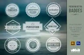
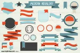
In love with these logo designs? If you’re looking to rebrand, develop a new logo, or just want some inspiration. Check out these resources from Creative Market to help you create awesome logos using the latest trending designs.


Download these worksheets and start practicing with simple instructions and tracing exercises.
Download now!





I'm a recent graduate of the University of San Francisco with a degree in Biology and a passion for the creative arts. I love building websites, trying new things, and I have a passion for social media.
View More Posts


17 Comments