



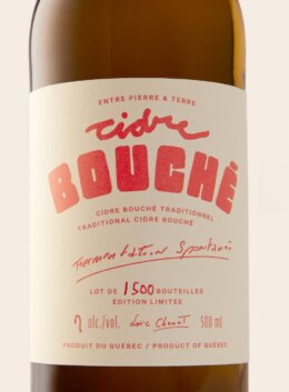
A great wine label gives you a little taste of what’s inside before the cork is even pulled. Maybe it’s a bottle with a storied past, a small-batch red from an independent vineyard, or a crisp white with a distinctly modern identity. The typography helps set the scene.
The best wine label fonts do more than look good on a bottle. They give a winery personality, help its name stand out, and bring a sense of place to the overall design. A classic serif can feel rooted in tradition, while expressive lettering or a pared-back sans serif can take a wine brand in a completely different direction.
Whether you’re designing a premium wine label, building a winery logo, or giving a new vintage its own look, the right typeface is a good place to start. We’ve rounded up 21 fonts and lettering styles to explore, from old-world favorites to contemporary faces with plenty of character.
1. De Martega
De Martega pairs tall, refined letterforms with a slightly organic character. It gives designers a way to reference classic wine label typography while creating a more contemporary identity for a boutique winery or premium release.
2. JUST Serif
Sculpted serifs and a broad range of weights make JUST Serif an adaptable choice for a contemporary winery identity. Its flexibility is useful when the same typography needs to move from a prominent bottle name to website headings and other brand materials.
3. Thrustline
Thrustline draws on vintage packaging and sign painting, with flowing strokes and expressive ligatures. It offers a more energetic alternative to formal calligraphy for a wine label that wants some old-school character without feeling too delicate.
4. Majestic Romale Luxury
With high-contrast strokes, graceful curves, and a selection of ligatures and alternate characters, Majestic Romale offers plenty of room to refine a winery name. Use its more expressive details to give a premium label character, while keeping secondary text quieter and more functional.
5. Spanish Archer
Spanish Archer brings a distinctive twist to traditional display serifs, with letter combinations that connect and overlap to create a custom-lettered feel. It’s a compelling option for a winery wordmark or a bold front label where the name itself is part of the design.
6. Bramwell
Give your wine label a little old-world charm with Bramwell. This vintage serif has a handcrafted, slightly imperfect finish that feels right at home on heritage-inspired packaging, vineyard branding, and labels with a story to tell. It’s a lovely option when you want classic typography with a more personal touch.
7. YJ Sunday Butter
Some wine brands call for a softer touch. YJ Sunday Butter pairs classic serif proportions with relaxed, hand-drawn details, bringing warmth to winery logos and boutique wine labels. Its character feels considered without being too formal, making it a fresh alternative to more traditional luxury typography.
8. Darkones
Looking for wine label fonts with a darker edge? Darkones brings bold blackletter styling and expressive swashes to the table. Its strong, dramatic character could suit a distinctive red wine, a limited-edition release, or packaging that steps away from the usual vineyard aesthetic. Use it where you want the name to make a statement.
9. Bustra Script
For a wine label with a little movement, Bustra Script Pro offers an expressive script direction. Its flowing lettering can bring personality to a winery name or signature-style wordmark, especially when paired with a clean serif or sans serif for the smaller details. A good fit for branding that feels polished but not stiff.
10. Ghosthey
Ghosthey gives traditional blackletter a more modern, unapologetic feel. With decorative alternates, ligatures, and swashes, it offers plenty of character for wine packaging that wants to stand apart from the crowd. Try it for a bold winery logo or an unconventional label, keeping supporting text simple for balance.
11. Rumble Brave
A little vintage drama goes a long way. Rumble Brave combines serif, script, and decorative styles, with rough, outlined, and dimensional options for building a more detailed label. It’s a versatile choice for heritage-inspired wine branding, especially when you want the typography and ornamental details to feel like part of the same design.
12. Laredo
Bring a little rugged character to your wine packaging with Laredo. Its Western-inspired display style lends itself to labels with a rustic, independent spirit, from small-batch reds to vineyard brands with a strong sense of place. Pair its distinctive lettering with restrained graphics to keep the finished design feeling intentional rather than overworked.
13. Cherry Merlot
Cherry Merlot brings handwritten elegance to wine label design, balancing fluid ink-like strokes with a confident, contemporary feel. It’s a natural choice for a romantic red, a boutique winery, or a special-release bottle that calls for something more expressive than a standard serif. Let the script take centre stage and keep the rest understated.
14. Colosso
For wine labels that don’t shy away from personality, Colosso brings a bold, tactile take on display typography. Its collection of textured, all-caps styles draws on vintage printing and handmade lettering, making it an interesting choice for contemporary wine brands, punchy label headlines, and packaging that feels a little less polished and a lot more individual.
15. A Summer in Paris
A Summer in Paris has the charm of real handwriting, with alternate letterforms and ligatures that let you give each word its own rhythm. Use it to add a personal touch to a wine label, rosé branding, or a seasonal release. Its relaxed, romantic character works especially well when the layout has room to breathe.
16. Whimsical Handwritten Font Trio
A handwritten font trio gives you room to play with a more personal style of wine packaging. With three treatments to explore, this collection could work for a playful rosé, a small-batch label, or a winery identity with a softer, more romantic side. Mix the styles thoughtfully so the design feels cohesive rather than crowded.
17. Magloria
Magloria adds a playful flourish to handwritten typography, with swirly alternates that bring extra personality to a winery name or wine label headline. Its romantic, feminine feel could suit a rosé or a boutique bottle with a softer identity. Pair it with a straightforward supporting font to keep the finer details easy to read.
18. Boheld
Can’t decide between a classic label and something more modern? Boheld includes six variations, spanning serif, sans serif, bold, condensed, and inline styles. That range makes it useful for exploring different wine branding directions or building a label system with a consistent feel, from the main wine name to supporting headings.
19. American Oak
Inspired by the typography found on aged spirits bottles, American Oak pairs elegant scripts with rugged serif styles and vintage scratchboard illustrations. Although it leans into whiskey and bourbon branding, the mix offers plenty of inspiration for heritage-style wine labels, especially when you’re after a rich, established look with room for decorative detail.
20. The Sterling Bros
The Sterling Bros brings a handcrafted vintage serif to wine packaging, with rough, stamp, and stencil styles that give the lettering different levels of texture. It’s a strong option for heritage-inspired winery branding or a label with a slightly weathered finish. Switch between the styles to find the right balance of character and legibility.
21. Glaston
For a more romantic take on wine label typography, Glaston brings flowing calligraphy, decorative swashes, and elegant letterforms to the mix. It suits premium bottles and boutique winery branding that call for a softer, more luxurious touch. Use its expressive lettering for the main name, with a simpler font for the practical details.
Final Thoughts
The best wine label fonts are the ones that feel right for the wine, the people behind it, and the story the bottle needs to tell. A classic serif can establish a sense of heritage, a modern typeface can bring a fresh perspective, and expressive lettering can make a smaller producer feel unmistakably individual.
Experiment with a few different directions before committing. Sometimes the most memorable label comes from pairing an unexpected typeface with a simple layout and letting the name of the wine do the talking.
The best fonts for wine labels depend on the wine’s personality and the brand’s audience. Classic serif fonts work well for traditional and premium wineries, while modern sans serifs can give a label a cleaner, more contemporary feel. Handwritten scripts and textured display fonts are useful for artisanal or playful brands. Choose a typeface that reflects the wine and remains easy to read at its final size.
Neither is universally better. Serif fonts can suggest tradition, craftsmanship, and refinement, while sans serif fonts often feel clean, contemporary, and direct. The right choice depends on the winery’s positioning and the rest of the visual identity. You can also combine the two to create contrast between the wine name and supporting details.
Start by defining the personality you want the winery to communicate. Consider whether the brand should feel traditional, luxurious, approachable, contemporary, or unconventional. Then test a few typefaces using the actual winery name. Look at how the letters work together, whether the name remains recognizable at small sizes, and how the font looks alongside the label’s colors and graphics.
No. Font usage depends on the license attached to the specific product. Before using a font for wine packaging, confirm that the license covers your intended commercial use, production volume, and any digital applications involved. If you’re creating a logo or wordmark, check the relevant terms rather than assuming every font license permits every use.
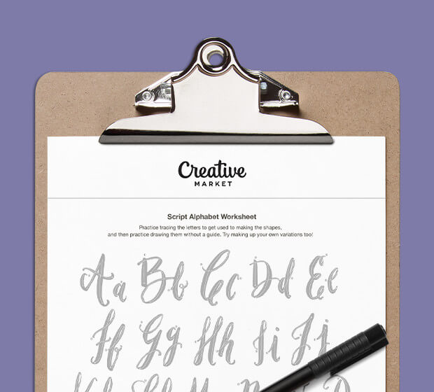
Download these worksheets and start practicing with simple instructions and tracing exercises.
Download now!





2 Comments