
Featuring Amaretti Typeface by Nicky Laatz, Lace & Grace by AnMark, Cherry vibe Mixed media collage by 60secondsArt, Wax Seal Mockup Set by Avelina Studio, and Christmas Mixed Media Pack by Purple.


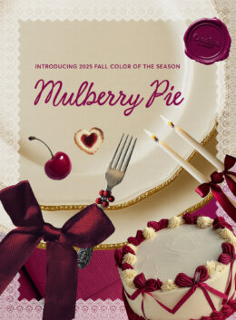
There’s something about this hue that slows you down. It’s wine on the porch, wax pooling near a flickering wick, or that moment when you look up from a book and realize the sun’s already set. Meet Mulberry Pie (#8B0E4E), our new Color of the Season. A rich, deep red with a blue base, this hue lives between red’s urgency and purple’s mystery.
Mulberry Pie feels like the hush of shared stories around a dinner table. Paired with other deep hues, it leans into the literary, the introspective, and dark academia. Paired with earthy neutrals, natural textures, and celebratory metallics, it’s neighborly warmth, gatherings with loved ones, and Fall rituals that feel sacred, even if they’re small.
Meet Mulberry Pie
To make sure you’re working with the same color, we’re providing equivalencies in hexadecimal, CMYK, and RGB systems below.
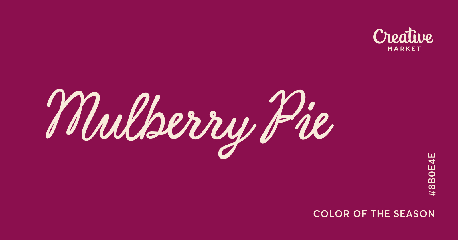
HEX: #8B0E4E
RGB: 139, 14, 78
CMYK: 0, 90, 44, 45
Looking for a refresher on the various color codes, what they mean, and their applications? Make sure to check out this article where we explore the differences and technical details you need to know.
How to Apply Mulberry Pie
Here’s where Mulberry Pie really shines: pair it with muted neutrals like stone, cream, or dusty olive, and it instantly feels grounded. Throw in an electric contrast like chartreuse, teal, or gold, and this color lights up. This transforms Mulberry Pie into a centerpiece that radiates energy and depth, especially in layered editorial layouts or layered poster design.
On the type side: reach for a serif with presence. Transitional or high-contrast serif fonts are especially great fits here. Bonus points if there’s texture involved: Mulberry Pie pairs well with a little grit. Use it in headlines, editorial spreads, even product labels where you want a dash of literary drama. Mulberry Pie feels right at home alongside bookish, academic letterforms and textured overlays that evoke printmaking or risograph aesthetics. Use it for headlines, pull quotes, or even drop caps: anywhere you want visual interest with a touch of intrigue.
Technical Qualities and Psychological Associations
With a hex value of #8B0E4E, Mulberry Pie sits confidently in the deep magenta zone. Its blue undertone balances red’s assertiveness with a cooler restraint, lending it both emotional depth and visual versatility. From a color theory perspective, it behaves like a jewel tone: intense, saturated, and expressive. This makes it ideal for focal points, typographic statements, or atmospheric backdrops in your design work.
Psychologically, reddish purples like Mulberry Pie have been shown to evoke sensations of luxury, introspection, and even spiritual elevation. Studies suggest that hues in this range can prompt complex emotional responses, tied to both passion and melancholy, depending on saturation and context (Saito, 1996). Mulberry Pie’s richness makes it perfect for designs that aim to feel substantial. Think editorial spreads, holiday campaigns, and cultural storytelling.
Vibrant Palettes Using Mulberry Pie
Wondering how to apply Mulberry Pie in your next project? These palettes complement our Color of the Season and are ready to use. To download the free SVG file, make sure you’re signed into your Creative Market account.
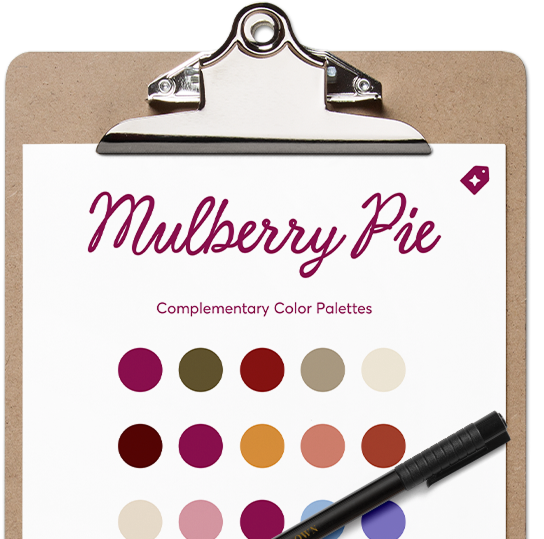
Download our set of color palettes in SVG and start using them in your favorite design app.
Download the palettesOur Mulberry Pie Collection
We have curated inspiring Creative Market products that are already using our Color of the Season or slight variations of it. Check out the full collection, featuring some of these outstanding assets:







Brand strategist. Creating design tools to empower creative entrepreneurs. Author of the Lean Branding book. MA in Design Management from the Savannah College of Art and Design (SCAD).
View More Posts




1 Comments