



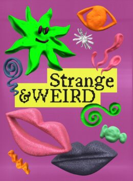
There’s something emerging in the design world that isn’t interested at all in being beautiful and a clean aesthetic. But it’s not quite horror, either. It lives in the gap between unsettling and playful; a nostalgic place (especially for millennials) where cartoon faces have weird smiles, clay shapes are too mashed up and the tone of voice feels like it’s trying to tell us something with the subtext.

This is Strange & Weird: a trend that is resurrecting the late 90s and early 2000s aesthetic of cartoons initially made for children but with a subtext (both visually as well as spoken) built for the adults. Uncanny, slightly off, and somehow uncomfortable (not that any of us could figure out why at the tender age of 10). It pulls from childhood visuals but distorts them, bringing that offbeat, too-loud-to-ignore energy into contemporary creative work.
At First Glance
At first, it seems cheerful; bright colours, handmade textures, wobbly illustrations. But it holds your attention with its eerie mood; unblinking eyes, wrong proportions, strange mashups of motifs. It’s exactly those visuals that this trend plays with—they feel familiar but are slightly off. It’s not outright horror, but there’s something about the shapes, textures, or expressions that makes you pause. You’re not sure why it feels strange; you just know it does.
Visual Rules That Don’t Behave
This of course isn’t just about bizarre characters or unsettling textures; it’s also about breaking the rules of visual logic. This trend deliberately ignores the traditional expectations of composition, balance, and clarity. Elements are often placed too close together or spaced far apart in a way that feels off-kilter. Designs might lean into awkward layering, irregular symmetry, or layouts that feel like they were built without a grid at all.
Powered by Creative MarketTypography is especially affected. Letterforms may be cartoonified, distorted, reversed, or abruptly switched between styles. Type might feel oversized or comically small in the wrong places. The result isn’t chaos for its own sake; it’s discomfort that’s been deliberately engineered.
Humor as Horror
The best way to explain this trend is that it’s funny; until it isn’t. A smiling clay sun, a bubble-letter typeface, a squishy mascot. They all carry a hint of menace, like they might turn on you.
This is the ‘juice‘ of Strange & Weird: it thrives in subverting what we normally see as wholesome. In a culture oversaturated with clean, safe branding, this kind of warped humour is magnetic. It breaks the algorithm because you can’t skim past it; it demands a reaction – even if that reaction is “wait, what did I just look at?”
That tension creates a visual punchline that never quite lands, and that unresolved feeling sticks with you longer than anything polished ever could. It’s the design equivalent of a Furby: glitchy, cute and too alive.
Where to Use It
Strange & Weird is already creeping into all kinds of creative projects; and for good reason. Here’s where it’s working best:
- Streetwear graphics: This trend is a natural fit for streetwear, where visual statements need to be both bold and culturally specific. You’ll see melting smiley faces, gum-textured characters, or deliberately awkward mascots splashed across hoodies, tees, and patches; turning wearable items into mini visual protests against clean design.
- Packaging design: Particularly in niche food and beverage brands, this aesthetic is used to instantly differentiate from the crowd. Think labels that feel like zines; cans with eerie cartoon characters. It grabs shelf attention not by being beautiful, but by being weird enough to make you look twice.
- Poster design: Perfect for underground art events, experimental music nights, or any gathering that wants to attract a subcultural crowd. These posters use warped typography, mismatched textures, and chaotic layering to signal that whatever’s being advertised won’t be a typical night out.
- Social content: TikTok and Instagram are full of uncanny inspired animations and memes; claymation loops, googly-eyed graphics, surreal digital mascots. These visuals interrupt the scroll with their discomfort and stand out in feed designs that otherwise look the same.
- Zines & DIY publishing: Here, the trend feels like a natural extension of the culture; raw, expressive, and unconcerned with commercial appeal. Hand-drawn chaos, misspelled slogans, and misaligned elements are part of the charm, not a flaw.
Why Now?
We’re at a saturation point. The world has had a decade of pristine branding; neutral colours, refined typography, and visuals so clean they slip out of your memory as quickly as they entered it. We need something completely off kilter now to even stop and look at something, so designers are starting to intentionally break composition rules, distort familiar visuals, and use odd juxtapositions to create a sense of unease that lingers.
This trend is essentially a culmination of all those weird graphics you screenshot and sent to friends saying “okay, enough of internet for me today”. It’s emotionally loud, chaotic, and doesn’t care if you like it; only if you notice. And culturally, it exactly mirrors where we’re at: incredibly nostalgic for that childhood simplicity – but painfully aware of the current weirdness of the world.

Download these worksheets and start practicing with simple instructions and tracing exercises.
Download now!






Bestseller design assets for the bold & the brave who are ahead of the curve.
View More Posts


3 Comments