



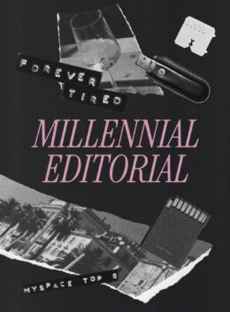
There’s something eerily comforting about watching the aesthetics of your teenage bedroom resurface with reverence instead of irony. A new trend has been taking shape in the last couple of seasons and is looking to continue long term; Millennial Editorial. This is a trend that doesn’t just borrow from the Y2K aesthetics, but amplifies its mood. Less about lip gloss and lava lamps, and more about internal monologues, torn paper, and that intense shade of melancholy only millennials can brand as aspirational.
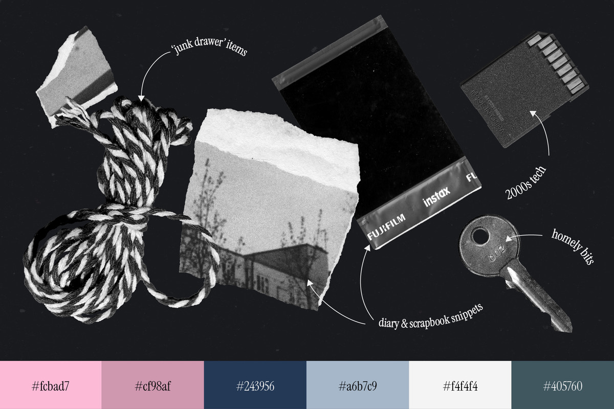
At first glance, Millennial Editorial looks like what happens when early Tumblr diarists grow up and learn InDesign. It’s a trend steeped in reflective sincerity: collage-heavy layouts, hand-scrawled affirmations, and lo-fi scans arranged with the precision of someone who absolutely did not throw that together in five minutes (even if it looks like they did).
The Rise of Aestheticized Oversharing
While Y2K was all pop, Millennial Editorial is more indie. It pulls visual DNA from early 2000s culture; zine typography, indie lit mag layouts, teen angst film posters. It then reassembles them into something solid and deliberate. Think captions that read like therapy notes; serif headlines that look like they were taken straight out of an indie magazine, and quotes that oscillate between self-deprecating and spiritually sincere.
You’ll recognize the vibe: one part visual diary, one part visual essay. And it’s everywhere; from packaging graphics that look like they were scribbled on a napkin, to social feeds that read like curated existential crises. There’s no singular format, but there is a rule: scrapbook, but grown up.
Design Language: Scraps, Scans, and Self-Awareness
Millennial Editorial leans into fragile texture; crinkled vellum overlays, masking tape graphics, scribbled thin paper. These are not just decoration, but emotional cues. A crumpled note isn’t just vintage; it’s vulnerable. Use assets like scanned receipts, old keys, and ripped notebook paper to conjure a world that feels lived in.
Typography plays the role of narrator here. Pair serious looking, quiet serif fonts with blocky, collage type (embossed, debossed, paper collage letters) and unintelligible handwritten notes – however, make sure they all have an intentional, mindful space.
Where to Use It?
This trend is especially potent in contexts where brands want to feel emotionally intelligent and culturally fluent. It’s less about standing out visually, and more about resonating psychologically.
Packaging: Create the feeling of found objects; labels that resemble diary entries, product info taking a back seat, almost like being written in the margins. Think scanned layers, overlapping notes, textures that look like they were printed during a blackout. This is perfect for cosmetics, skincare, stationery, or anything “emotional” by nature.
Social content: Break the grid, visually and emotionally. Each post can stand alone like a mini page from someone’s journal. Use muted tones, overlays, and hand-drawn marks. Bonus: add in some affirmations that sound like advice from your best friend back in 2005.
Branding: This trend works well for brands that lead with emotion; wellness, lifestyle, personal brands, creative tools. Use the aesthetic not just to style the identity but to set a tone: moody, reflective, slightly nostalgic. Instead of sharp logos and high contrast color palettes, think soft serif wordmarks, handwritten notes, collage-inspired iconography. Lean into texture in both digital and print; dusty overlays, tactile mockups, and brand storytelling that feels more like a diary than a press release.
Why Now?
Millennial Editorial also arrives at a curious cultural moment. We’re post-irony but not post-anxiety. The world’s a mess, and rather than pretend everything is polished, this aesthetic leans into the honest clutter of human experience. It’s digital scrapbooking for those who grew up writing HTML on LiveJournal and are now building pitch decks for wellness brands.
This wave of nostalgia isn’t about going back; it’s about taking the visual leftovers of a generation. The receipts, the margin notes, the emotional debris; laid out like evidence.
Designers who embrace this aren’t just trend-chasing; they’re story-keeping. So dig through your old folders, get those collage packs, and let your next project look a little bit more moody, millennial – and human.

Download these worksheets and start practicing with simple instructions and tracing exercises.
Download now!






Bestseller design assets for the bold & the brave who are ahead of the curve.
View More Posts


1 Comments