



It’s hard to change anything without expecting the community to have some kind of opinion, and when the company doing the changing is Google, everyone has something to say.
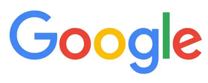
Oh wait – you haven’t heard yet? Yes, Google changed their logo. The process of changing their branding is detailed online, but you’re not here for that, now are you? Nah. You want to see the funny things that the Internet said. Don’t worry, I’ve got your back.
My favourite thing about the new #Google logo announcement was who they got to present it. pic.twitter.com/eTwRoH9WKz
– Joe Martin (@JoeThreepwood) September 1, 2015
I’m so thrown off! Everything looks topsy turvy now. #Google https://t.co/eKLTCrXA1w
– Piya Sinha-Roy (@PiyaSRoy) September 1, 2015
Introducing #Google‘s new #logo.
#GoogleDoodle
[#skynet #TerminatorGenisys #Terminator #meme] pic.twitter.com/XtKQWpy5Ua
– Andrea F. Cecchin (@AndreaFCecchin) September 1, 2015
New logo for #Google! http://t.co/cqstOU9d04 #sanserifforthewin via @WIRED pic.twitter.com/zo7d4lJqnr
– Sonny Gast (@SonnyGast) September 1, 2015
Google has a new logo! Love it!! #Google #Googlelogo pic.twitter.com/8G58xujTYm
– Pradeep Singh (@pradeepdotco) September 1, 2015
I HATE IT RT @JoeIngeno #Google‘s New Logo – First Update in 16 Years http://t.co/a7BZZOLXWl
– DarkSkintDostoyevsky (@daniecal) September 1, 2015
Looks like #Google shot the serif pic.twitter.com/lYbIe89R1U
– iOG (@floatingboat) September 1, 2015
Shuddering to think how much #Google paid some branding person to type their new logo. http://t.co/X4vkk1R6Nq
– James Savage (@SavLocal) September 1, 2015
the new #google logo pretty much illustrates that the more folks use Google, the more infantile they become Goo Goo. sigh Why hide it?
– Larry Rosenthal (@LarryRosenthal) September 1, 2015
Classic designer pointing and designer looking shot on the #Google rebrand. @ucllc pic.twitter.com/DSfrSpNcVq
– Michael Raisch (@RaischStudios) September 1, 2015
So where do you stand on Google’s new logo? Love it or hate it?
Kevin Whipps is a writer and editor based in Phoenix, Arizona. When he’s not working on one of the many projects in his queue, he’s looking for fun and irreverent things online to share with his friends.

Download these worksheets and start practicing with simple instructions and tracing exercises.
Download now!






Hi! My name is Kevin Whipps, and I'm a writer and editor based in Phoenix, Arizona. When I'm not working taking pictures of old cars and trucks, I'm either writing articles for Creative Market or hawking stickers at Whipps Sticker Co.
View More Posts


9 Comments