Instagram changed its logo this month, and designers have thoughts.
The platform has replaced the familiar cursive wordmark it has used for the past decade with a new version that sits somewhere between handwriting and print. The camera icon is staying put, while the wordmark gets a more stylised treatment with some very distinctive curves and connections between letters.
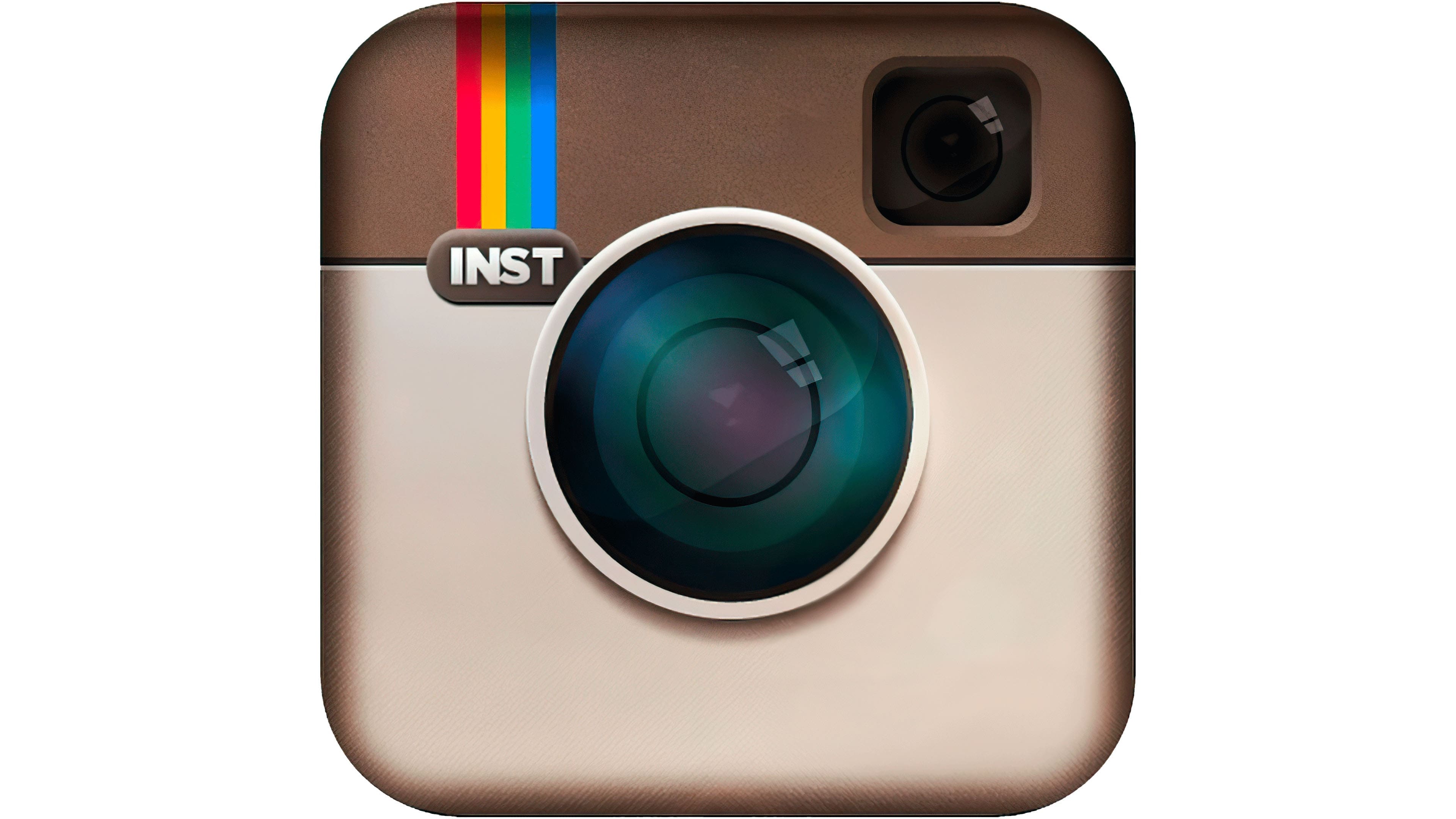
Instagram’s original identity had a certain looseness to it. The first logo, designed around the launch of the app in 2010, referenced a vintage Polaroid camera. It made sense for a platform built around playing with photographs, filters, and sharing little moments with friends.
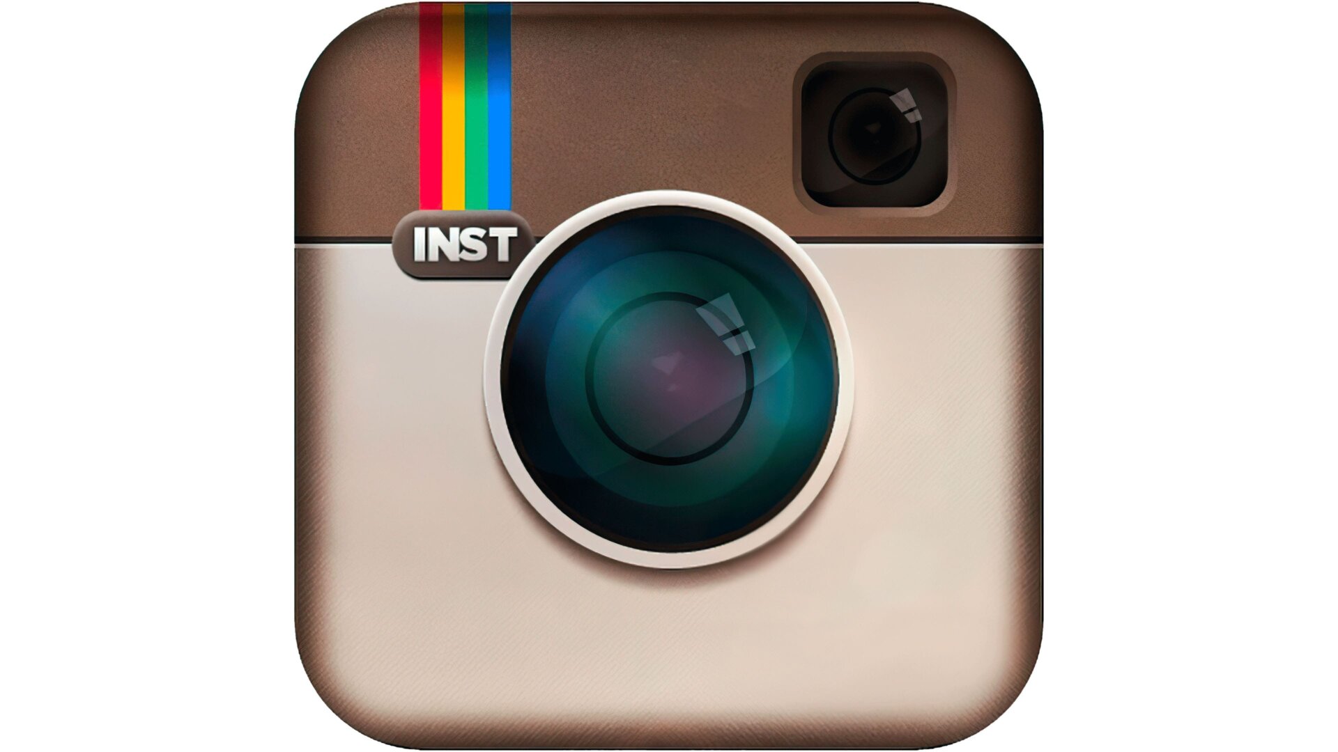
(Source: Instagram-icon-Logo-2010-2011.jpg (3840×2160) )
Then came the 2016 redesign: the now-iconic gradient camera, a much flatter visual language and a completely different era of Instagram.

(Source: Instagram-Logo-PNG.png (768×432) )
That change was controversial, too. Ten years later, though, the gradient camera is one of those marks you can recognise almost instantly.
This latest refresh seems to be reaching back towards some of that earlier personality. The wider identity includes an updated Instagram Sans alongside two new typefaces, Instagram Pen and Instagram Mono. Instagram says the system is intended to put creativity and self-expression back at the centre of the brand.
A new mark with old memories
The thinking behind the redesign was considerably more deliberate. Instagram worked with design agency Koto to rethink a wordmark that had remained largely unchanged for more than a decade. The challenge was to make it feel appropriate for the Instagram of today without losing the familiarity that had made it so recognizable in the first place.
Koto describes the process as a balancing act between familiarity and change. The team explored hundreds of variations, including handwritten forms and calligraphic gestures, while looking closely at the small imperfections that gave Instagram’s original wordmark its personality. Every curve and connection was considered, with the designers asking how much could change while the mark would still feel unmistakably Instagram.
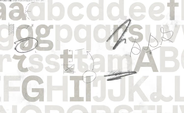
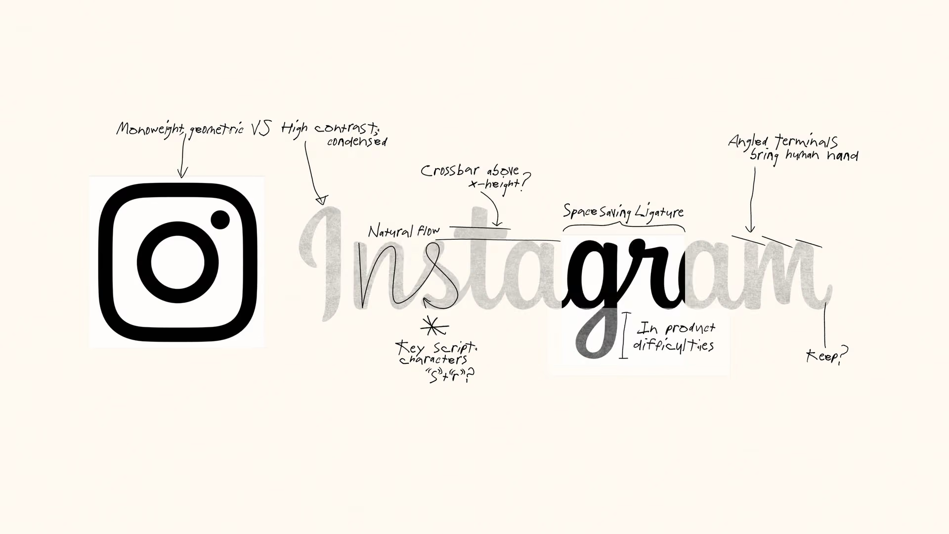
(Source: Instagram | Koto )
That led to a wordmark that sits somewhere between the old and the new. Most of the lettering is cleaner and more restrained, but elements of the original script remain including the distinctive treatment of the “r” and “g” connection, which Koto refined as a nod to Instagram’s earlier wordmark. The intention, the agency says, was to preserve a sense of authorship and personality rather than create something that felt purely optimized or generic.
Instagram’s own design team describes the thinking in similar terms: the new mark is intended to feel simpler and bolder while retaining a handmade quality, with the script acting as a reference to individuality and personal expression. The broader identity has been developed around that same idea, putting creativity and self-expression at the center.
So while the “Instagzam” jokes may be an unavoidable part of the rollout, they aren’t really the whole story. Behind the slightly polarizing letterforms is a fairly careful attempt to answer a familiar branding problem: how do you evolve an identity people already know without making it feel like an entirely different brand?
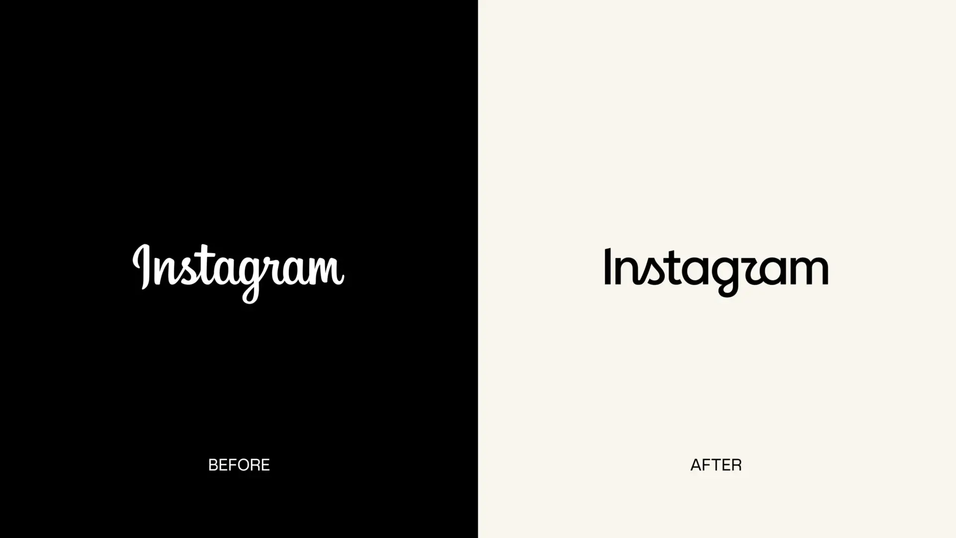
(Source: Built to celebrate creativity: the new Instagram brand identity )
“The craft was a given – but this project also took a lot of heart, grit and thoughtfulness which the Koto team delivered in spades. We appreciated your attention to details, experimentation, patient collaboration… and also, it was a lot of fun.”
– Cynthia Pratomo: Director of Brand Design, Meta
But, what makes a brand feel authentic?
This is something we’ve been thinking about a lot at Creative Market.
The work that tends to catch our attention isn’t always the most technically impressive piece on the screen. It’s usually the slightly wonky lettering, the illustration with a strange little detail, the texture that looks like it came from an actual piece of paper.They also make a brand easier to recognise.
Instagram’s new identity is reaching for some of that personality through its typography. The company has described the new wordmark as a way of bringing elements of its original identity forward, while its updated type system is designed around creativity and self-expression.
That’s an interesting ambition for a platform whose entire visual world is built around other people’s creativity.
And then there’s the AI problem
Instagram is one of the biggest places online for AI-generated images, videos, and graphics. Its own feed now sits alongside an enormous volume of synthetic content, much of which shares the same polished, hyper-finished quality.
So when people look at the new Instagram wordmark and say it feels like “AI slop,” they’re responding to something bigger than a questionable letterform. They’re reacting to a visual culture where newness has become incredibly easy to manufacture.
That’s where handmade design comes in
We’ve seen a growing interest in work that shows a little more evidence of the person behind it.
At Creative Market, you can see that interest across everything from handwritten fonts and vintage typefaces to Procreate brushes, paper textures and illustrated graphic packs. These resources give digital projects a starting point with a little history and personality already baked in.
The new wordmark will probably settle down. People will get used to seeing it. The jokes will disappear into the endless scroll, just like they did with previous Instagram redesigns. But the conversation around it is useful for designers.
We’re living through a period where creating something visually polished has become remarkably easy. That changes what we value in design.
Instagram is trying to make its identity feel more expressive at a time when the internet is becoming increasingly automated.
That’s a pretty good reason for designers to be thinking about where their own fingerprints show up.

Download these worksheets and start practicing with simple instructions and tracing exercises.
Download now!



Creative Copywriter | SEO Strategist | Concept Developer I've helped brands translate ideas into compelling stories that drive engagement and deliver results. My expertise spans creative copywriting, SEO content strategy, concept development, editorial writing, and brand storytelling.
View More Posts