



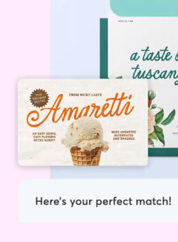
You know that feeling: you’re three hours into a project, the layout is coming together, and then you hit the font selection wall. You type something hopeful into the search bar, scroll through hundreds of results, and slowly lose all conviction about what you were even looking for.
We’ve all been there. And honestly, it’s one of the more frustrating parts of the process, because choosing type matters. It’s the voice of the entire project, and getting it right is the difference between work that feels considered and work that feels like it just… happened.
So we built something to help with that, and you can test it out here.
Introducing our new smart search for fonts
Our new smart search lets you describe what you’re working on in plain language and get back a shortlist that actually makes sense. Think of it less as a search engine and more as talking through your brief with a colleague who has really good taste and an encyclopedic knowledge of type.
We’re rolling out our new font search as a beta, and we’re excited to get it into your workflow early. If anything feels unclear, off target, or you want a feature that would make font picking faster, please share. Have thoughts? Click “Share Feedback” to let us know. We read every note and use it to keep improving the experience for your design projects.
Instead of filtering by category and weight and hoping for the best, you can say things like “I need something that feels stable and technical for a fintech dashboard” and get recommendations that understand what you mean.
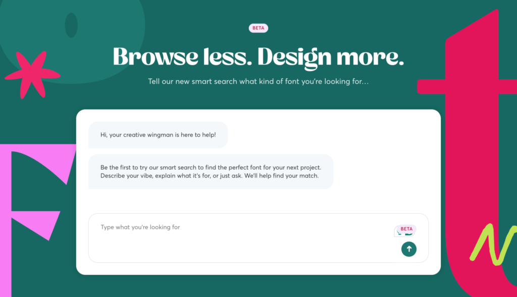
How to get great results
The tool reads your prompt like a mini creative brief. The more context you give it, the sharper the recommendations. Here’s what works well:
Tell it about the project. What are you designing? A brand identity? A mobile app? Packaging? This immediately narrows the field in useful ways.
Describe the feeling, not just the look. “Assertive but warm” gives the tool a lot more to work with than “bold sans serif.” Try to articulate the emotional vibe you’re going for.
Mention where the type will live. A display face with hairline serifs will sing on a large-format poster and completely disappear on a phone screen. Placement and use cases matter, and the tool accounts for that.
Say what you don’t want. Sometimes the fastest way to a good shortlist is elimination. “No scripts, nothing geometric, nothing that reads as corporate”. These kinds of constraints are incredibly useful.
Include practical details. Budget, audience, brand context; anything that would be in a real brief belongs in your prompt.
The perfect prompt recipe
The secret to unlocking the best of this tool is moving past literal keywords. Don’t just tell the chat what you want to see; tell it what you want the design to do. When you prompt like a designer, you’re providing the “why” behind the aesthetic.
If you want a reliable structure, try something like this:
“I’m designing [project] for [audience]. I need typography that feels [tone]. It’ll be used for [placement]. Avoid [what you don’t want]. Budget is [range].”
Don’t overthink it. The tool is flexible and conversational prompts work just as well as structured ones.
Aim for these four elements to get the most polished results:
- Project: What are you designing? Share context on your audience and brand style
- Tone: The emotional read. Is it assertive, quiet, or sharp?
- Placement: Where will the type live? (Hero headlines, UI labels, packaging)
- Constraints: Budget limits and what to avoid
Let’s cover each of these in more detail:
1. Project: start with the job-to-be-done
Context is the ultimate filter. A font that works for a high-energy fitness app will fail a mindful skincare brand. By defining the project, you allow the AI to prioritize technical requirements like x-height for legibility or stroke contrast for impact.
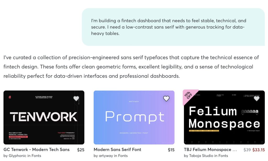
- For example: “I’m building a fintech dashboard that needs to feel stable, technical, and secure. I need a low-contrast sans serif with generous tracking for data-heavy tables.”
2. Tone: describe the vibe with precision
Avoid generic words. Instead, lean into the physical qualities of the letters. Are they sharp, rounded, calligraphic, or brutalist?
- For example: “I’m designing an identity for an architectural firm. I need a monospaced headline font that feels structured and precise. I want sharp, intentional angles.”
3. Placement: define the hierarchy, use case, and medium
Type performs differently depending on its environment. A display face with intricate, hairline serifs will disappear on a mobile screen but look striking on a physical poster. Mentioning the placement helps the tool suggest assets with the right optical sizing.
- For example: “I’m laying out a limited-edition zine. I need a high-contrast display serif for oversized headlines that feels dramatic and slightly edgy.”
4. Constraints: set limits to facilitate refinement
Sometimes, telling the tool what not to do is the fastest path to a shortlist.
- For example: “I’m looking for organic, fluid typography for a sustainable food brand. It should feel approachable and grounded. No geometric shapes, no rigid grids, and absolutely no scripts. I want something that feels hand-rendered but polished.”
Finding stunning font pairings
The tool is especially handy when you already have one half of a pairing locked in. Try something like:
“I’m using [font name] for headlines. Suggest a text companion that feels [tone] for [use case].”
For example: “I’ve got a bold display face for headlines. I need a quiet sans serif for UI labels and captions: neutral shapes, strong legibility, nothing that competes.”
Follow-up questions: how to ask for more
One of the best parts: you’re not locked into a single prompt. You can steer the conversation as you go.
Ask for more options in the same direction. Tighten things up: “same project, but softer curves and less contrast.” Add new constraints midway “actually, nothing with a double-story g.” This tool is meant to work well with some back-and-forth.
Word bank: A cheatsheet for better prompts
One of the hardest parts of prompting isn’t knowing what you want; it’s finding the right language for it. You can picture the font in your head, but translating that into words that actually get results takes a specific vocabulary.
Here’s a reference organized by the kind of feeling or function you’re chasing. Mix and match across categories. The best prompts usually pull from two or three.
Mood & emotion
| Feeling | Power words | Use for |
|---|---|---|
| Warm & approachable | friendly, inviting, rounded, soft, open, humanist, casual, conversational, playful, gentle | Consumer brands, children’s products, community platforms, food & beverage |
| Serious & authoritative | commanding, formal, stately, classical, dignified, institutional, weighty, anchored | Law firms, finance, government, academic publishing, luxury heritage brands |
| Calm & refined | restrained, airy, mindful, serene, understated, quiet, delicate, unhurried, contemplative | Wellness brands, high-end hospitality, skincare, meditation apps, galleries |
| Bold & energetic | assertive, punchy, loud, kinetic, high-impact, urgent, confrontational, unapologetic | Sports brands, music, streetwear, event promotions, editorial covers |
| Edgy & unconventional | idiosyncratic, raw, gritty, subversive, lo-fi, experimental, irreverent, offbeat | Indie publications, counterculture brands, art collectives, zines |
Visual character
These describe the physical qualities of the letterforms: shapes, strokes, and construction.
| Aspect | Power Words | What It Does |
|---|---|---|
| Weight & contrast | high-contrast, low-contrast, hairline, heavy, ultra-light, ink-trap | High-contrast brings drama; low-contrast reads as stable and modern |
| Shape & construction | geometric, humanist, grotesque, neo-grotesque, rounded, angular, square, organic, fluid | Geometric is related to rational. A humanist vibe is related to calligraphic warmth. Grotesques are no-nonsense workhorse fonts. |
| Terminals & details | sharp terminals, ball terminals, rounded terminals, flat-cut, teardrop, blunt, tapered, flared | Sharp terminals feel intentional and modern; ball terminals feel friendlier |
| Texture & feel | hand-rendered, calligraphic, brush, engraved, stencil, distressed, polished, mechanical, crisp | Carries a tactile quality, especially useful for packaging and editorial |
Function & technical needs
When the type has a specific job to do, these terms help the tool prioritize the right technical features.
| Context | Power Words | Use For |
|---|---|---|
| Data & UI | tabular lining numerals, monospaced figures, generous x-height, even color, strong legibility, clear at small sizes | Dashboards, financial reports, data tables, form fields |
| Long-form reading | comfortable reading rhythm, moderate x-height, open counters, low stroke contrast, generous line spacing, even texture | Books, articles, documentation, email newsletters |
| Display & headlines | high-contrast, optical sizing, tight spacing, display-optimized, ink traps, dramatic weight range | Posters, hero banners, magazine covers, packaging |
| Systems & scale | large family, multiple widths, variable weight axis, optical sizes, extensive language support, tabular and proportional figures | Design systems, multi-platform brands, enterprise UI, editorial publications |
Spatial & structural qualities
These describe how the type occupies space and relates to its environment.
| Aspect | Power Words |
|---|---|
| Density & spacing | generous tracking, tight spacing, condensed, wide, compressed, extended, open, airy, compact, economical |
| Proportion & rhythm | tall ascenders, short x-height, even proportions, narrow, wide-set, uniform width, varied rhythm |
| Texture on the page | even color, light texture, dense, open, transparent, heavy on the page, disappears into the background |
Negative constraints
Sometimes the most useful thing you can tell the tool is what you don’t want.
| If You Want to Avoid… | Try Saying |
|---|---|
| Generic corporate feel | “Nothing corporate,” “not another tech sans” |
| Trendy or fleeting styles | “Avoid anything trendy,” “skip anything that feels dated” |
| Overly decorative type | “No scripts,” “no novelty faces,” “nothing ornamental” |
| Rigid or mechanical feel | “Not geometric,” “avoid rigid grids,” “nothing too engineered” |
| Sterile or lifeless tone | “Not too clean. I want some character,” “nothing clinical” |
| Softness or roundness | “Avoid rounded shapes,” “no soft edges,” “keep it sharp” |
Give it a try!
With our new smart search tool, you’re giving yourself more room to be intentional about type selection. If you’ve ever lost momentum staring at a wall of font options, this is built for you. Use it to get to your shortlist fast, then do what you do best: evaluate the options, set the hierarchy, and exercise taste to make final selections.

Download these worksheets and start practicing with simple instructions and tracing exercises.
Download now!








Making beautiful design simple & accessible to all.
View More Posts


2 Comments