Categories / News

McDonald's Has New Packaging — Are You Lovin' It?

Kevin Whipps Last updated: April 10, 2024 · 1 min read

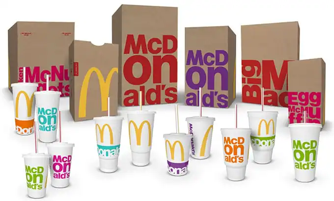
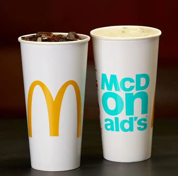
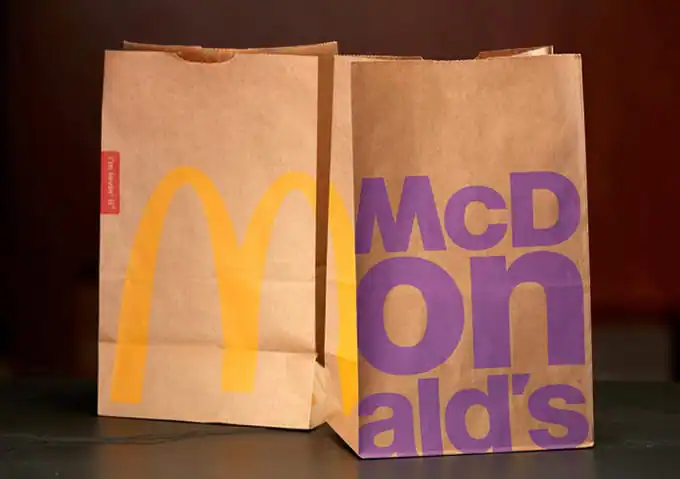
Ever seen Super Size Me? If not, here’s a spoiler: Guy eats McDonald’s and only McDonald’s for a month, and bad things happen to his body. Ever since then, I avoid McDonald’s as much as possible, although I will admit that I cave on occasion because french fries. Anywho, McDonald’s has decided to revamp the look of their packaging, and these are the results:
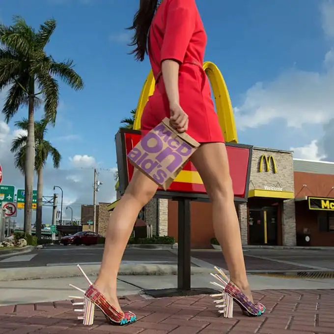
(I could spend 20 minutes talking about those shoes, but I’m going to leave that one alone.)
Now your opinions on McD’s don’t have to match mine, but what do you think about that packaging, huh? For me, the big stand-out feature is the “ON” in the middle of McDonald’s. That, and Helvetica. Lots and lots of Helvetica.
With that said, I’m now craving a large french fry like it’s my job, so I need to take a moment to chain myself to my chair so I don’t go out and eat 40 boxes of them.
via FastCo Design and Creative Bloq


Kevin Whipps is a writer and editor based in Phoenix, Arizona. When he’s not working on one of the many writing projects in his queue, he’s designing stickers with his wife at Whipps Sticker Co.

Lettering Worksheets
Getting started with hand lettering?
Free lettering worksheets

Download these worksheets and start practicing with simple instructions and tracing exercises.

Download now!
About the Author
Author
Kevin Whipps

Hi! My name is Kevin Whipps, and I'm a writer and editor based in Phoenix, Arizona. When I'm not working taking pictures of old cars and trucks, I'm either writing articles for Creative Market or hawking stickers at Whipps Sticker Co.

View More Posts
Go to My Shop
Related Articles
23 Comments
  • In my opinion, the company should be focusing on their employees, quality of food and not marketing. 11 years ago
  • Since "ON" alone is a word, the line break design fails a bit. It now reads as McD - on - alds. Makes me wonder if Mcdonalds is going to be partnering with mlb ALDS this year. On a side note Mc nuggets and mcmuffins are now known in my office and house as mcmus and mcnus now. 11 years ago
  • I hate to say I like it because I do not eat there but... It certainly has good appeal to the style maven in most of us. If I weren't snowed in, I'd go out and get a hash browns today. I feel $1. is more than enough to spend on trouble. 11 years ago
  • I spent a couple of years working as an Art Director on the UK McDonalds account around 8 years ago. In fact, that shot of the Big Mac with the soft focus glass of coke in the background – that was one of mine and it's still in use now. Now, onto these – they seem to have go back 25 years. And where are the clam shells? That's the true test of packaging. And what happens when they want to do their bi-monthly or monthly offering (Monopoly, Gt. Tastes of wherever etc') and where is the flurry cup?! 11 years ago
  • The font is not Helvetica. The x-height is too tall and the punctuation isn't the same. I like the clean and bold but agree that the break in the name is terrible. 11 years ago
  • I guess you don't get royalties on your great shot Sean? I'm a graphic designer more print than web and I know that the hardest photography job is retail so good stuff Sean. My speciality is layout design. Isn't most advertising just rehashing itself every decade or whatever? Otherwise I'm okay with the design but would work on the "on" for sure too. The big mac and egg mcmuffin bags I do really like. 11 years ago
  • Maybe it's because I'm not a trained designer, but the ON thing didn't stand out to me until you all pointed it out. In fact, I don't think I even attempted to read the bag at first glance. McD's could put arches only on their bag and we'd all know exactly where it came from. Since they don't necessarily need the wording for branding purposes, I'm wondering if the super sized ON was intentional. Maybe they were going for a, "It's ON!" reading. 11 years ago
  • The line break in their name is brilliant, in my mind. Their name is the main line: McD. We all call them Mickie D's and McD is brand recognition and salivation response to those fries. ON works because it feels energetic and the word implies being "on" e.g. ready, right there and hitting the right note. The bold colors and crisp letters have the potential to become iconic. The problem will still rest, though, with the product. Great design doesn't make up for bad cholesterol. 11 years ago
  • Its beautiful design, it just doesn't say food to me-- at least, not the kind of food you get at McDonalds. It feels very retail-- like a line of McDonalds apparel at Target. 11 years ago
  • Not a fan of the big "on" either, but the rest of it I like. It feels fresh and fun to me. 11 years ago
  • I am not a fan of the new design. I think the letters should be small enough to appreciate their forms in an unbroken line OR they should be supersized so that only ONE letter is on the bag. e.g. "M" for the bag the meal goes in. "D" for the drink cups. "F" for the fries, etc. You can appreciate the letter form better as a standalone graphic. As it is now, it just looks badly arranged, with no thought to how the letters act with each other. I'm not a fan of illiteracy. I don't like using pictures instead of words as the only means to label something, but I admit I still want something illustrating the bags and packaging. Even if it's just a line drawing like an icon, it would lessen the disappointment of the typeface. 11 years ago
  • From a branding perspective, the packaging doesn't make sense. For the past several years, McDonald's has been trying to transition over from a greasy fast food chain to a more refined fast-casual restaurant under the McCafe brand. This new packaging with the bold san-serif just doesn't fit with the McCafe branding.... it's almost reverting back to the old, greasy fast food feeling. It's confusing and it reminds me a lot of 7-eleven's Big Gulp cups - and gosh knows 7-eleven is not refine. From a purely design stand point, I like it. Yes, the ON stands out the most, but in a way that screams "McD's... it's ON! Let's go!" It's very action-oriented and playful. I also like how the letters fill up so much of the space. 11 years ago
  • FAIL on all levels, you can't give bad food a nice package and hope that it will taste better. 11 years ago
  • Anonymous
    Clearly shows that this is year of using double line text designs :D I think they are inspired by logos trends! I like the idea but have to bring something more like KFC I guess. 11 years ago
  • All I can see on the Egg McMuffin bag is 'gun' 11 years ago
  • Not lovin' it, although I've seen worse. But there is something about the shoes. 11 years ago
  • curious what the motive is here with the rebranding. But, maybe that's marketing in itself. I really don't want Mcdonalds most of the time.. but after talking about their new branding route... it's a better chance I would want to stop and pick up a couple McChics 11 years ago
  • Without really looking closely, I noticed the ON right away...and the first thing that came to mind was "Yeah..ON, as in its gonna STAY ON you". 11 years ago
  • Please note that the "M" in "Mc" is not Helvetica. Or it is an upside down Helvetica "w". Either way... just bad design. Who did this? 11 years ago
  • I like the big letters and bold colors but the font not too much. I don't like the use of 2 different Ms. The shoes are fun but eating McDonalds that body is fake xD 11 years ago
  • It's weird that they are using two different sans serif fonts. the "M"s are different. And I agree with everyone above, the break up of "McD-ON-alds" is awkward. But I do like the clean look of the design. 11 years ago
  • It took me forever to realize it but the shoes are wrapped in strips cut from the bag. But then again, I'm not a shoe afficionado, so rarely look at them. 11 years ago
  • I worked there through high school and actually grew to love the food even more—especially the grilled chicken sandwiches and caramel frappes. YUM! As for the new design I like it. It goes with the minimalistic theme that has populated most companies now, and McDonald's still has their own quirky twist with the vibrant colors and bold font. I'm lovin' it! 10 years ago