



As designers, we see hundreds, if not thousands of fonts on a regular basis, so we know that there are a multitude of options to choose from when you’re working on a project. Don’t want to use something overplayed and common? You’re sure to find at least 10 other fonts that will accomplish the same goal if you look hard enough. But then there are designers – or, I suppose I should say “designers” – that use fonts for one reason or another, and they just don’t make sense. Or they’re ugly. Or they make you want to hurl up your gluten-free bagel and chai latte, you know what I’m saying? So we judge them. And if you’re one of those designers out there that uses these fonts, you should know what the rest of us think of you. We may not say it out loud, but we’re thinking it, that’s for sure.
Copperplate/Bank Gothic: You’re an aspiring architect who was hit in the head with a frying pan
Buddy of mine is a very talented photographer, and he’s known for taking crazy shots of celebrities that often appear on the cover of major magazines. And, because he’s an impressive guy, he designed his own logo, and he did it all with Bank Gothic.
Look, I get why people use Bank Gothic. It’s usually included with their computer, it’s simple, and it looks fairly clean. But the thing is, it’s so overdone. I saw it this weekend while going to grab pizza at this open-air mall that used to be swanky, and every piece of signage in the place was done in Bank Gothic. This is a place where $30k-millionaires can spend all of their time and money, and the font used as promotion might as well have been done in Microsoft Word.
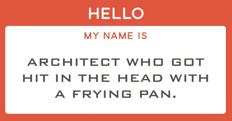
Now the sister font here is Copperplate Gothic, which is famous for many things, but most notably its appearance in American Psycho. You remember the scene: Christian Bale bragging about his “new card.” “Good coloring.” “That’s bone.” And then Paul Allen’s business card comes out, and Bale loses his mind. So yeah, Copperplate Gothic isn’t awesome, no matter what Patrick BATEMAN thinks.
Comic Sans: You’re in the K-5 education system
Holy crap do teachers love Comic Sans. My son is in kindergarten, and almost all of his school paperwork is done in Comic Sans, and for a kid that’s just six years old, that’s kind of fine, I guess, even if it puts my teeth on edge. But when you walk around the school, there are signs everywhere done in the same font, and it’s so excessive that you have to wonder if it’s the standard font for the school. There are fifth graders who go there. These are impressionable young minds that will shape our future and we’re cramming Comic Sans down their throats like animals. ANIMALS!

But assuming you’re not using the flawed logic of a school district, and you think that Comic Sans is a legitimate font, then you’re just out of your mind. I mean, sure, I could lean on the fact that you could be working on an actual comic, but all you have to do is check out Comicraft right here on Creative Market, and you’ll see that official comic book letterers use legit typefaces to do their work, not the same font that Microsoft Bob made popular.
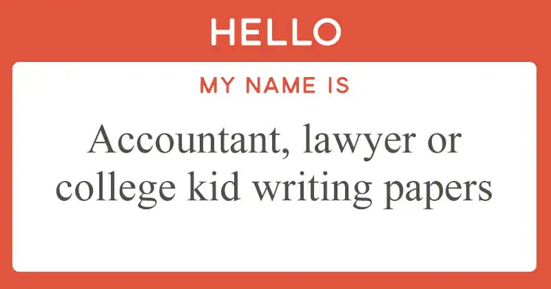
Times New Roman: You’re an accountant
Now don’t get me wrong, Times New Roman has its place. If you’re an accountant, lawyer, or a college kid working on a paper, then Times New Roman will work out just fine. No sweat. But it’s just so … boring. It’s the default font for so many different applications, which means that you bump into it all the time, whether you want to or not. And since it’s so popular amongst teachers because of its relative uniformity, those kids graduate and continue using that same boring option because it’s already drilled into their heads. And what with there being so many other great serif fonts to choose from … ugh. Just … ugh.
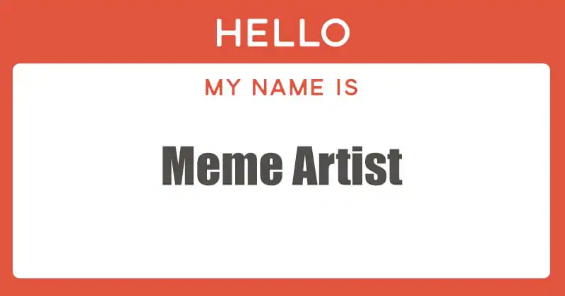
Impact: Your only purpose for editing images is to make a new meme
If you want to create a meme – you know, those pictures of cats with funny text above them – then you need to use Impact. Specifically, you’ll want Impact in white with a black stroke, but we won’t get too technical. And being that meme building is somewhat of a thing, Impact has traveled through the world like a virus, infecting every picture along the way. I actually know people who ask me how they can edit a photo without Photoshop (“Hey, do you have a cracked version of Photoshop that I can get?”) just so they can make a meme. That’s it. They want their 5 minutes of Internet fame, and this is their path.
Is there any other reason to use Impact? A legitimate one? Take your time. I’ll wait. No really, I’ll wait here until you can tell me one, because sure, it’s blocky with kerning tighter than a turtle’s tochas, but why use that when you have other options?
Mistral: You’re a time traveler from 1992
I used to build custom cars and trucks back in the day, and there was one car club that used Mistral as the basis of its logo. They ended up upgrading in the early ’00s, but I still see that old-school logo here and there, and it brings back fond memories of the 1990s.
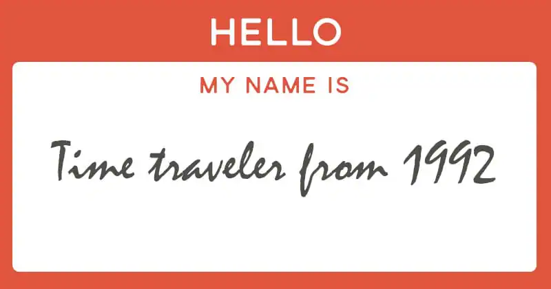
It’s now over 20 years later, and it’s time to give up Mistral. But just the other day, I was reading a blog post by a buddy of mine, and he was talking about starting a new company that made modern furniture. Then he showed off his new logo, and I almost spat my drink out all over my laptop. There it was, Mistral, representing this brand-new, cutting-edge furniture company. To me, all it said was that there’s no way that shop could produce anything modern, because if they think that Mistral is a cool font right out of the box, then their furniture must be all covered in shiny black lacquer or something.
Now I will say that when it comes to fonts like this, Mistral and Brush Script sit hand-in-hand on an awful swing, but Mistral takes the top prize.
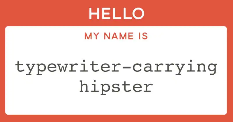
Courier: You’re either a wannabe screenwriter or you’re a typewriter carrying hipster
You don’t see Courier too often in designs, but when you do, it stands out like a sore thumb. That’s because it’s the standard font for screenwriters (Courier 12 pt, to be specific), and they’ve actually figured out an entire system based on the way scripts are laid out and typeset. No seriously, one page of script is approximately one minute of screen time (give or take), so using a monospaced font like Courier makes sense. But in your designs? No. Just stop it right now, because that’s not a good idea at all. It’s meant for body text, not headers and designs.
In addition, because it looks like it came out of a typewriter, there are font hipsters that want that antique-y feel and so they use it in their designs. Again, that’s just silly. If you’ve got a design that utilizes many of the techniques that are only possible because of digital tools, and you slap Courier on it, then you’re doing things wrong.
If you want something better, you might want to look at Courier Prime, designed by screenwriter John August. I use it myself whenever I’m doing some copy editing work, because its monospaced nature makes it easy to find two spaces in a row, which is a pretty common problem. But I never use it for headers in designs, because I wasn’t dropped on my head as a child.
Serenity Now
So what kind of judgments do you make against people who use these fonts? Are the egregious offenders or should they just get a pass?

Download these worksheets and start practicing with simple instructions and tracing exercises.
Download now!






Hi! My name is Kevin Whipps, and I'm a writer and editor based in Phoenix, Arizona. When I'm not working taking pictures of old cars and trucks, I'm either writing articles for Creative Market or hawking stickers at Whipps Sticker Co.
View More Posts



24 Comments