



These days, your website acts as the major hub for advertising and providing information about your business. If you have a small business, it’s likely that your website is actually the number one most important element in your efforts to build your brand and increase your audience. It should serve the dual purpose of conveying the necessary information about your company while also enabling your customers to have an enjoyable user experience. Here are 5 common mistakes that small businesses should take caution to avoid in their web site design.
1. Design Overload
It can certainly be fun to design a website but it’s never a great idea to cram in all the bells and whistles that will fit to make your website as flashy as can be. The new trend is leaning toward lean design, the idea of streamlining your site down to its most basic principles. This makes the information easy to find and very clear to that your customer base won’t experience any frustration when navigating your site.
2. No Call To Action
Have you ever been to a website that looks great but you’re not sure what you’re supposed to do on it? Once customers reach the homepage there should be a VERY clear next step, i.e. contact us, click here to buy, etc. If you don’t have at least one call to action on your homepage, you’re not getting the most out of your website.
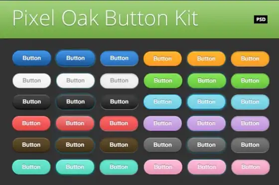
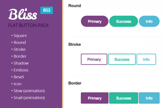
Create an awesome CTA (call to action) with these trendy and nice buttons:
3. You haven’t updated your content since the 90s
Websites that are started to grow musty and cobwebbed aren’t going to get any traffic. Make sure you update the content on your site often, at least once a week, to prevent it from growing stale. Users can sniff out a site that hasn’t been touched in months or years and this is a huge turn off.
4. You’re not focused on your target audience
Your website may be awesome, but if it doesn’t appeal to your target market, you’re doing your self a huge disservice. Different colors, placements and designs will have hugely different results with different audiences. If you’re trying to reach teenage females, for example, your website should have a very different design than if your audience is 65+ men.
5. You aren’t connected to social media
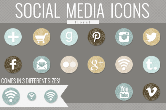
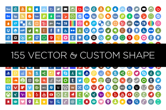
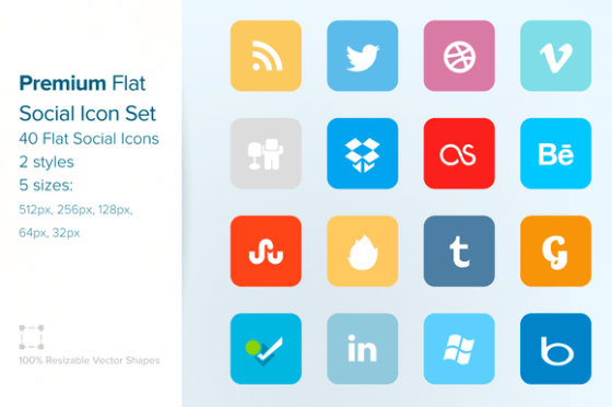
Use your website to boost your social media presence. It’s easy to do, you can just add buttons onto your page that will connect your customers directly to your social media handles. This way you aren’t missing out on the chance to offer your customers more information and interact with you on a social level.
Ready to get started? Check out these incredible icons to showoff your profiles on your website.
+++++
Web design is a crucial part of growing a small business. Don’t let these mistakes keep you from maintaining happy customers and increasing your audience!

Download these worksheets and start practicing with simple instructions and tracing exercises.
Download now!





I'm a recent graduate of the University of San Francisco with a degree in Biology and a passion for the creative arts. I love building websites, trying new things, and I have a passion for social media.
View More Posts

9 Comments