Categories / Trends

What Do You Think of the New Pizza Hut Logo?

Creative Market Last updated: March 29, 2024 · 2 min read

I’ll be honest, when I think of good pizza, Pizza Hut is not exactly the first place that comes to mind. The brand is looking to refresh its image though with a new logo, new menu, and new website. Let’s take a look and see what we think!

Pizza Hut Logo: Old vs. New

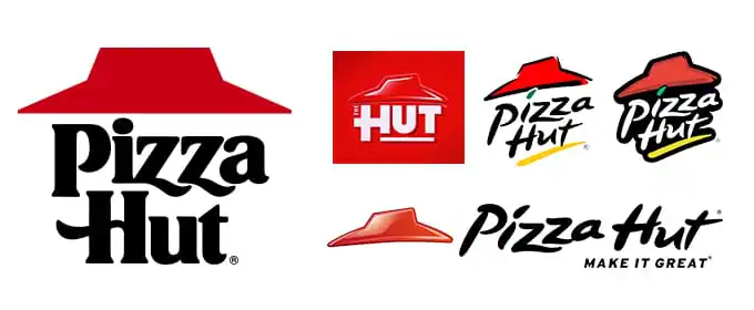
We’ve seen quite a few Pizza Hut logo iterations over the years, from the classic original to the short-lived “The Hut” experiment. In the past decade or so, Pizza Hut’s brand updates are more tweaks than major overhauls, with each iteration arranging essentially the same items in new ways.
New-Pizza-Hut-Logo
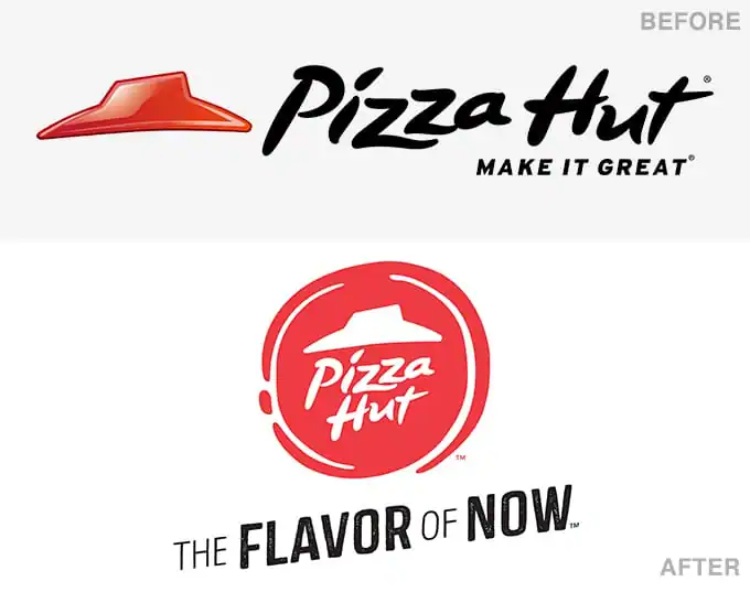
The new brand rollout takes a nod from current flat logo trends and ditches the glossy look in favor of a flat, round image that almost has a rubber stamp or wax seal feel to it.
New-Pizza-Hut-Logo
Once again, it’s not exactly a total refresh. The type treatment and familiar nod to the classic building shape are all roughly the way we’ve known them for years, they’re simply reversed out on a red circle now.
As you can see, they’ve also ditched the “Make It Great” tagline in favor of “The Flavor of Now”.

Website and Packaging

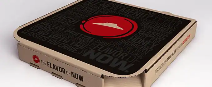
Along with all this comes the obligatory website and packaging updates. In these you can spot the simplified version of the circular logo, which just uses the “Hut” shape and scraps the lettering.
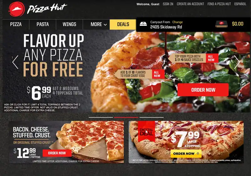
New-Pizza-Hut-Logo
New-Pizza-Hut-Logo

The New Brand Direction

As every good designer knows, a brand is much more than a logo or website. So what’s Pizza Hut’s new brand personality? What’s changing other than the aesthetics?
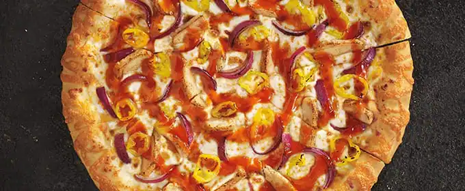
Pizza Hut is betting everything on the idea that you want more options for your pizza. In fact, it’s a little overwhelming. There are ten crust flavors, six sauces, and four “flavor drizzles” (not the best title) to choose from.
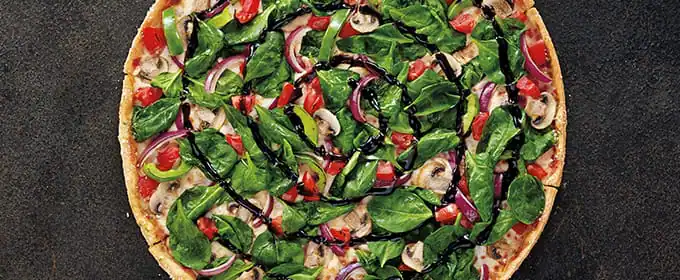
New-Pizza-Hut-Logo
New-Pizza-Hut-Logo
Like every other fast food chain on the planet, Pizza Hut is trying to figure out how to market its product to health-conscious consumers. Its answer is a new line of “Skinny Slice Pizzas,” which contain 250 calories or less per slice.

What Do You Think?

What are your thoughts on Pizza Hut’s new branding and menu? Do you think it’s good enough to boost Pizza Hut’s image and crush the competition? Let us know in the comments below.

Lettering Worksheets
Getting started with hand lettering?
Free lettering worksheets

Download these worksheets and start practicing with simple instructions and tracing exercises.

Download now!
About the Author
Author
Creative Market

Making beautiful design simple & accessible to all.

View More Posts

Go to My Shop
Related Articles
24 Comments
  • I'm not really feeling the new logo, I actually preferred the old one. I think (for me) the issue is that Pizza Hut feels a bit cheap and run down. The new logo doesn't do anything to me to combat that, and the type doesn't work at all with the red icon. I guess it's fitting that Pepsi owns Pizza Hut, as the Flavor of Now tagline reminds me of a 90's-ish version of a Pepsi slogan. I think the changes that need to happen to Pizza Hut go well beyond a new logo - they need to figure out how to get out of the shadow of their former selves (when they were huge in the 80's and 90's), and really establish themselves as a brand that is offering something unique to the market, and not just chasing what more popular brands are currently doing. This feels very reactionary instead of innovative. 12 years ago
  • Reminds me of one of the logos i sell here: https://creativemarket.com/creativenauts/3123-Japanese-Restaurant-Logo 12 years ago
  • I don't like the overall messiness of it. But, I guess that's more of a preference thing. I like clean, sleek logos. I get they are trying to make it look like pizza sauce, but I think it would look less messy if they chose a better typeface. 12 years ago
  • I love the New Box! 12 years ago
  • Looks good. Fun and playful. I like their approach. 12 years ago
  • I do like their new box and the simplicity of the new logo. 12 years ago
  • I like the new logo. Looks more fun. 12 years ago
  • Flat hand-drawn logos rulez the world ;) They understood it, too! Really love the font there! 12 years ago
  • I'm a nostalgic but I like the first flat logo... So '80 12 years ago
  • Make It Great was a better tagline. The Flavor of Now is extremely generic. I like the new logo better than the old one but still not a fan of their Pizza Hut font. The original logo is a close 2nd. 12 years ago
  • I never knew what that red hat on top was, now they use it on its own... it makes less sense. 12 years ago
  • @Marta Docampo yep, when we were kids, all the buildings looked like this: http://goo.gl/vtDsSb 12 years ago
  • Thank you for your link, @Josh Johnson, that is really clarifying... the fact that I live in Spain, and we have Pizza Hut here but the buildings are not and have not been like that, certainly, and if they are not like that anymore in USA either... why do they keep the Hut roof thing in the logo? It doesn't make much sense anymore for the new generations. 12 years ago
  • @Josh Johnson brings back memories of eating Pizza Hut and watching Full House. Ahh memories. 12 years ago
  • Looks like a little flying saucer; should appeal to nerds everywhere! 12 years ago
  • I feel like the design is a bit of a turn off. It's too commonplace and far too dry. I believe the most recognizable features of Pizza Hut were it's colors- red, yellow and black- and the hat. I feel like they lost the youthful ambiance upon getting rid of yellow from the design. Seems pretty ironic since they claim to be rebranding to suit the preferences of the new generation. 12 years ago
  • FIRST LOGO WAS ALWAYS THE BEST... EVERYTIME THEY BEEN CHANGING IT GOES WORSE AND WORSE 12 years ago
  • The hut is a US-centric reference with no bearing in the UK and it's an 80's style of building. Maybe that's why they aren't breaking free of their 80's and 90's fame? I also feel the black and red is too strong for pizza boxes. 12 years ago
  • The ORIGINAL, initial logo is the ONLY one I see that captures a "hut" lol. The other stuff look more like hats. 12 years ago
  • Veneer is everywhere nowadays! 12 years ago
  • May be a bit oversimplified and detached. 'Pizza Hat'? 12 years ago
  • Don't like the graphics of new logo - looks bit clumsy and dumpy and unbalanced. Seems as if the designer has not finished the work completely and missed the final (fine) tuning... :) New box looks nice though... 12 years ago
  • I totally thought "Pizza Hat." I much prefer the original, way back when logo. The new logo has become so detached from its original inspiration (a hut or house, symbolized by a simple roof shape) that it no longer references it. This is an example of design by people who can no longer see what they are working on with fresh eyes, i.e. the eyes of people who might actually see it for the first time and think, Pizza Hat? I guess it's intended to be just a subtle update to the design, already recognizable to their customers, to something with a bit more spontaneity. Isn't the idea to order pizza usually a spontaneous decision made on impulse in most cases? It goes with the new logo which appeals directly the "I want what I want and I want it now" generation, already used to instant gratification. The more I look at it, the more I can see how well-researched the design is. I object to the box, simply on environmental grounds for the amount of ink they need to print the entire box cover in black. What a waste, and for what? A slightly more upscale feel? Not worth it. 12 years ago
  • I personally love it, it looks simpler but great. Love the dominant minimalist red colour. make it more fun and also love with the new packaging ! 12 years ago