



Rebranding is a natural part of a company’s life. You don’t wear the same stuff you did in high school, so why should a business keep the same image in maturity that it had at the beginning?
More and more companies are engaging in rebranding campaigns. 20th century companies are beginning to hit their midlife crises, and as with people, that means lazy attempts to catch up with current trends. For a man, that might mean studying Urban Dictionary for too long and hitting up women his daughter’s age on OKCupid. But for a company, it means slapping on a flat-design logo and hiring that man to call their Twitter followers “bae”. That’s why most bad rebranding campaigns are of the trying-to-fix-what-ain’t-broke variety.
Sometimes it seems like certain designers are going above and beyond to screw up a rebrand. That’s why we’ve collected some of the worst rebranding disasters since Jefferson Starship, and classified them as either “Too Bland”, “Too Weird”, “Good Idea, Bad Execution” or “Bad Idea, Bad Execution”.
Too Bland
1. Gap’s 100 Million Dollar Gradient
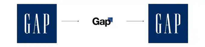
Kicking off our list of branding failures examples: the famed fashion brand, Gap.
Gap used the same logo for longer than most graphic designers have been alive, so the decision to try out a new one was at least understandable. What I can’t understand is why Gap decided to replace the iconic stretchy serifs of their original logo with Helvetica and a little gradient box capable of pleasing nobody. And wait, it cost how much?
The outcry after their surprise unveiling of this new logo from loyal customers was so bad that the company decided it had to return to the original after just one week. Lesson learned: If your current look works, a redesign should enhance it or put a new spin on it, not turn it into a tasteless mush.
2. Mastercard’s Color Blob New Logo That Simply Didn’t Work
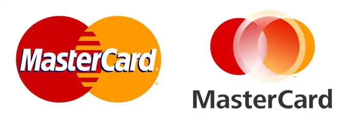
In an era of all-flat everything, it’s nice to see someone still trying to use gradients, but, you know… not in the worst way possible. Surprised they didn’t toss in a few lens flares to finish it off.
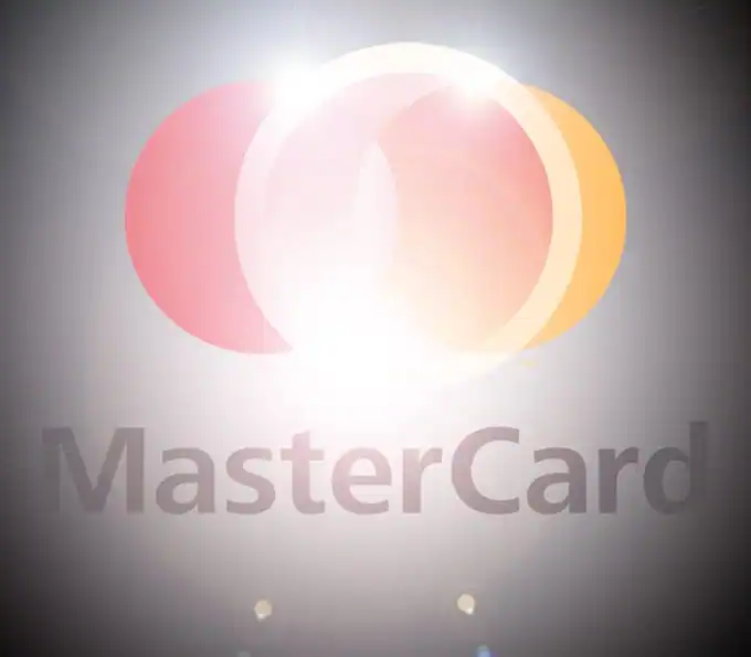
Worst of all, it’s not centered right. If you didn’t notice that before, you will now. In fact, it’s all you’ll see. Your eye is twitching.
Any new logo should have meaning. This one’s just a lazy redraw of the old logo without its good qualities.
3. NBC Universal’s Text Box
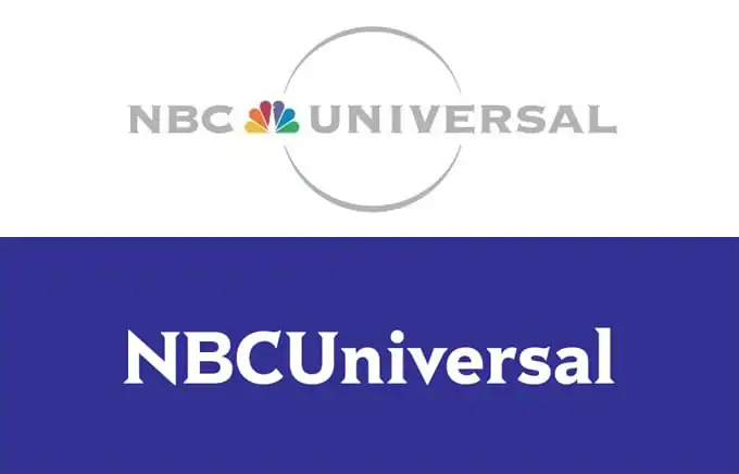
A loaf of white bread in text form, NBC Universal’s new logo looks like it took all of two minutes in MS Paint. In fact, even a design that literally took two minutes in MS Paint would look better if you paid attention to spacing.

See?
This is a clear example of a rebranding campaign gone horribly wrong. The original logo was bold, almost iconic, forming a huge part of the brand’s visual identity. The new terrible logo design, meanwhile, is bland, basic, and sure to bore both a new audience and existing customers alike.
4. Best Buy Doesn’t Even Try
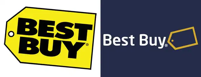
Best Buy’s logo encapsulates what they are: a big blocky building full of reasonably priced stuff. Their short-lived one from 2008 encapsulated jack squat. No meaning or purpose could be extracted from that chunk of flat design blandness.
5. The Buccaneers’ Vector Trace
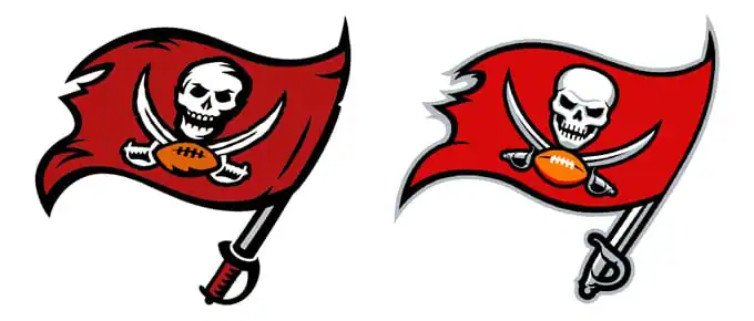
Maybe I just can’t resist the urge to get in a dig at my home city’s team, but their new logo is completely devoid of the original’s hand-drawn character and grit.
They at least tried to maintain consistency with this logo change, sticking with the same core values and iconic logo they’ve always had while attempting to add some modernity to it.
Unfortunately, it looks like something a first-year design student came up with in Illustrator on hearing the print shop next to the Chinese take-out will do a custom tee for 1/5 of the price of a jersey.
6. Whatever Sony Calls This
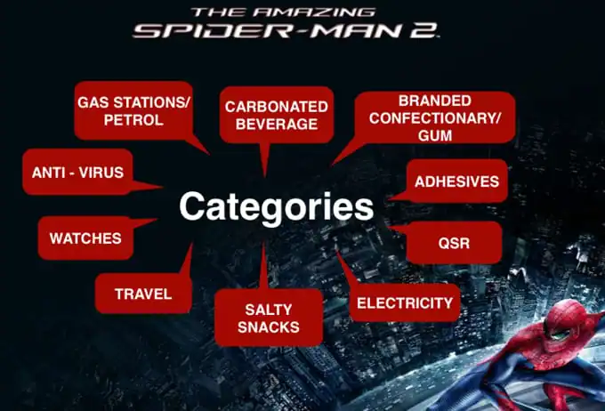
Every now and then, in the world of marketing, you come across something that makes you think “they got college degrees for THIS?†Recently, the internet got a glimpse of Sony’s branding strategies that explain why movies not based on 80’s cartoons will soon be a thing of the past – because they see film not as art or even entertainment, but “an ecosystem of content and brand initiatives.â€
Too Weird
7. Cottbus, Germany’s… Uh…
![logo_cottbus-595x347[1]](https://d3ui957tjb5bqd.cloudfront.net/uploads/2015/10/09051453/logo_cottbus-595x3471-1.jpg.webp)
Going for complete abstraction isn’t a good idea for a logo. And neither is making something this complex. If you can’t draw it from memory, you should at least think twice about it.
8. Anything PricewaterhouseCoopers has Touched.
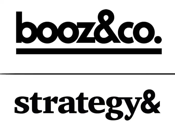
When professional services company PricewaterhouseCoopers, an odd name itself, dropped their consulting wing, it was left looking for a new name, it found “Monday.†Not even Monday Consulting. Just Monday. It didn’t last very long, possibly because no one could Google it.
But, as evidenced several years later, they didn’t learn: when you buy a company called Booz & Co, then the “Booz†guy leaves, it’s pretty easy to come up with something better. How about… Anything? Well, almost anything. It’s pretty impressive that PricewaterhouseCoopersCalifragilisticexpiolodocious managed to pick one of the worst ones possible: “Strategy&â€.
What comes after the ampersand? Nothing but disappointment. They said they picked it because the company adds value to their brand, but that’s misunderstanding how ampersands work on a basic level.
9. That Whole New Coke Brand Identity Thing
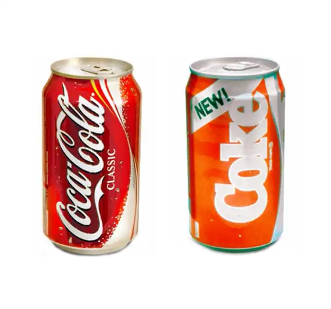
I didn’t want to do New Coke. New Coke jokes are the “What’s the deal with airline food?†of design articles. But due to that same ubiquity, paradoxically, no article on massive design failures would be complete without it.
In a way, Coca-Cola is admirable for its willingness to keep throwing flavors at the wall and seeing what sticks. After all, when you’ve already built the world’s most iconic brand, why let it stagnate?
And according to many customers, the new version of Coca-Cola tasted better than the original. That’s obviously good news for boosting brand loyalty and brand value, too. But the problem here is that they tried to fully replace it. However, people like what they like, and taking it away from them because you think your new thing is better isn’t a solid strategy.
Good Idea, Bad Execution
10. Yahoo Changes Very Little In Its Rebranding Process
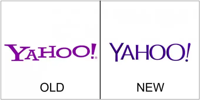
If any site needed a rebranding effort, it was Yahoo. From their boxy and cluttered web design to their AOL-ish compulsion to do a thousand jobs at once, everything about the site screams “90’sâ€. (Except for the opinions of Yahoo News commenters, which scream “20’sâ€)
They are the internet’s ultimate jack-of-all-trades-but-master-of-none, a throwback to the days when you went to one site for email, news, and your horoscope because loading another one would take an hour. So, why didn’t their rebranding attempt address any of that?
Instead of finding what they do best and rebranding themselves with a focus on that, Yahoo just changed their visuals, as if that was all it took to attract a new base and bolster their brand reputation. That’s putting a body kit on a car with no steering wheel, then wondering why it doesn’t turn heads when you fail to pull it out of the garage.
11. Seattle’s Best Blood Drive
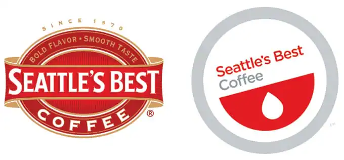
Overlaps with “too blandâ€. The idea to simplify Seattle’s Best’s busy old logo into something more iconic was a good one, but they ignored basic color and shape symbolism – when people see red and a drop, they think “bloodâ€, even if the drop itself isn’t red.
A simple wrong color choice completely wrecked their rebranding efforts, making this one of the most visually disappointing rebranding failures of all.
12. DeviantArt Instantly Loses Brand Recognition

This would be a decent logo for a company that starts with a Z, but as a D and an A, it comes off looking very forced. Not to mention the ongoing debate over whether it’s plagiarized, being almost exactly the same as Platzkart.ru‘s.
13. Dr. Pepper’s Testosterone Overdose
![dr-pepper-10[1]](https://d3ui957tjb5bqd.cloudfront.net/uploads/2015/10/09051515/dr-pepper-101.jpg.webp)
Problem: men aren’t buying enough diet soda, possibly because it has too womanly a stigma attached to it. Solution? If you’re Dr. Pepper, you make a Powerthirst ad, but without the charming silliness. Dr. Pepper 10 ads could have been funny if they hadn’t started the campaign out by declaring the soda “NOT FOR WOMEN†and pulling stunts like posting a flash game on their site where players shoot at makeup and other symbols of femininity. The ads alienated one gender and made the other not want to try it for fear of looking like the idiots the company thought they were. So treat your viewers with some respect instead of dumbing down for them.
14. Pepsi’s Dan Brown Novel
Pepsi’s new logo doesn’t look bad, per se, it’s just not different enough to justify the million-dollar price tag.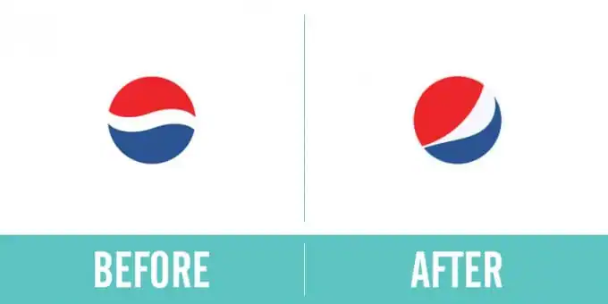
Image from Canny Creative
So that’s what they tried to do with its absurdly overwrought design document, a collection of nonsense about the golden ratio, the cartesian coordinate system, “energy fields in balance,†the “Hindu tradition of numerical harmony as spatial organizer,” the Mona Lisa…

The moral? Don’t convolute your design decisions. It’ll only end one way: a total rebranding failure.
Bad Idea, Bad Execution
15. Heeeeeere’s Happy!
![1400614252-0[1]](https://d3ui957tjb5bqd.cloudfront.net/uploads/2015/10/09051532/1400614252-01.jpg.webp)
“Your mascot proposal, Steve?â€
â€It’s a human being sealed for eternity in a smiling cardboard prison, in constant agony but unable to scream, only his eyes and teeth left as reminders of what he once was.â€
“Bold. I like it. But he needs a motivation. Does he want to bring in new customers? To motivate kids to eat healthier? That’s popular these days.â€
“To blink, sir. He wants nothing more than to blink.â€
When McDonald’s debuted this creature last May, reactions to the new brand image were uniformly negative, even among the target demographic: younger consumers. We’re not sure if they tested this with their target audience first – but if they had, you think they’d have learned kids don’t like being reminded of what happens to those who defile Mayor McCheese’s tomb.
The lesson here could be that It pays to know your audience, but we can’t imagine any demographic embracing that foul thing.
16. The Z’>Z Olympics
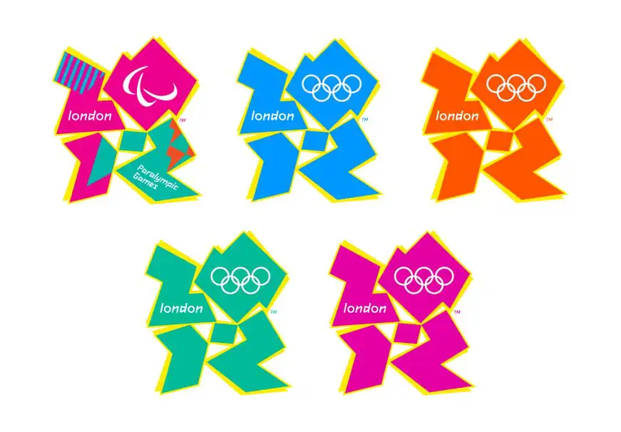
The problem with London’s universally hated Olympics logo is that it’s too bland and too weird simultaneously – it’s abstract, but when you boil it down, it’s just the year. There’s no interesting concept behind it: it’s, in the words of Moe Szyslak, “weird for the sake of weird.â€
Wiggity Wack
Corporate culture and street culture are direct opposites, but they keep trying to blend them. So much that bizness attempts to get swaggy with 2day’s kids and their dank memes deserve their own #section.
17. The Sci Fi Channel Skips the Research
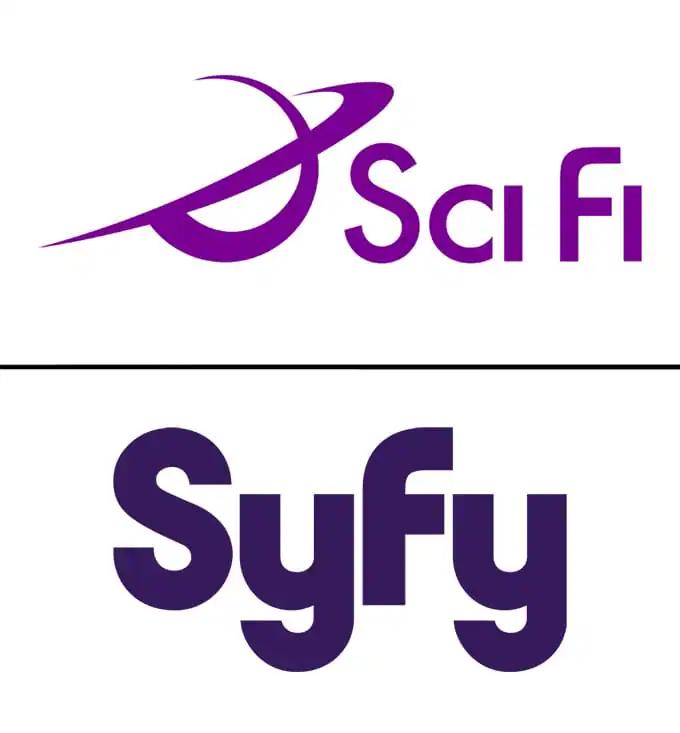
Nothing’s cooler than alternate spellings – if it’s 1997 and you’re selling a cereal shaped like skateboards and dinosaurs. Unfortunately, it was 2009, the Sci Fi network was a TV channel, and they accidentally renamed themselves after a slang term for syphilis. The lesson we can take away from this is to keep context in mind. Whether no one bothered to Google the term or they knew what it meant but figured no one would notice, apparently, they’d never met the internet.
18. Vegemite’s Install Fails
Crowdsourcing your design decisions can be a decent way to connect with your audience, but picking the right idea can be just as hard as coming up with it yourself. When Kraft’s Australian wing wanted to name a new sandwich topping, they held a nationwide competition and received almost 40,000 entries. But unfortunately, they handed the list to an exec who said “name it after the most popular thing you can think of. You have three seconds.â€
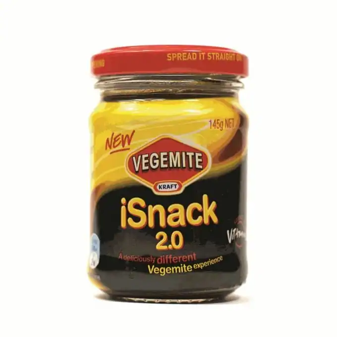
Maybe the biggest problem with this is that it’s false advertising. The iSnack was a Luddite-friendly mixture of Vegemite and cream cheese: sound quality was awful, it had very little memory, and the only touch function was the ability to lick it off your fingers. The only thing it had in common with Apple is that its maps app worked just as well.
If we’re going to learn a lesson from this, it’s that coopting a trend for the sake of it and forgetting all about your brand’s values in the process is never a good idea.
19. O.co No Go
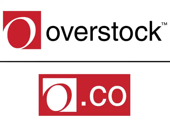
Even more gratuitous and unnecessary than that “It’s all about the O†commercial was that time Overstock spent millions to become O.co, a term not even the laziest texter would’ve thought of to refer to them. Of course it flopped, due partially to the use of a ridiculously short URL with a non-standard extension. In general, we prefer when our URL’s are words, not the emoticon for a scared cyclops with a beauty mark.
20. Friday’s Takes a Bad Pun Way Too Far
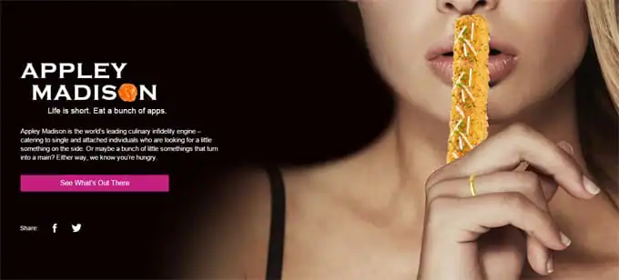
This is perhaps where my bias is showing. This campaign was launched just a few days ago, so it hasn’t had time to pull results yet. But it says a lot that, as of the time I’m writing this, Googling its name in quotes (“Appley Madison”) brings just 18 results.
This is a bold move by Friday’s, at the least – one that’s either going to be a sleeper hit or quickly buried in the tryhards’ graveyard. But personally, I think it’s an example of how not to do “edgy†advertising – tasteless piggybacking on a lurid news story that has nothing to do with your field.
Summing Up: What We Can Learn From Rebranding Disasters
Rebranding is necessary from time to time. Companies can’t just stay the same forever. That’s a surefire way to stagnate. They have to evolve, grow, change. But they have to do it the right way, maintaining their brand elements and not alienating their customers along the way.
Unfortunately, the brands above got it all wrong!
Whether it was picking the wrong color scheme, changing too much, too soon, or coming up with a new logo that was simply too boring, bland, or downright bizarre, they made decisions that actually harmed their brand identity, rather than helping it.
To avoid making the same mistakes in your own rebranding efforts:
-
Be original in your design.
-
Don’t chase trends just for the sake of it.
-
Simpler and more basic isn’t always better.
-
Think about what your customers love about your old logo.
-
Ensure your new logo is easy to understand and interpret.
-
Convey your brand’s values and visual identity through your rebrand.
Products Seen In This Post:

Download these worksheets and start practicing with simple instructions and tracing exercises.
Download now!




C.S. Jones is a freelance writer, artist, and photographer.\r\n\r\nIn the past, he co-founded an art gallery and worked at a product photography studio. These days, he does photo tutorials (and gigs), online copy, and content marketing for a living. He also writes about webcomics at Webcomicry.com…
View More Posts

18 Comments