



Hero images (or headers) are often the first things your users will focus on when loading up your website. It’s important for your hero image to be useful and engaging, as it’s the best shot you have at convincing a visitor to take a certain action or stick around on your site. Your best approach is to create a hero image that is visually appealing while communicating your message. One practical way of achieving this is by using scene creator kits to create your hero images.
What are Scene Creator Kits?
Simply put, scene creator kits give you all the ingredients you need to make your own stunning graphics. It’s just a case of piecing everything together the way you want. The kits are essentially a big collection of graphical elements all based around a certain theme, that have been meticulously ´cut out’ and set up in a consistent style allowing you to just drag and drop them into your work. Shadows are often preserved on transparent layers so the elements keep a level of realism wherever you place them.
Using Scene Creators to Improve Hero Images – Design Challenge #1:
I set myself the challenge of creating a few hero images using a single scene maker kit. I’ll start with designing a custom hero image for a fictional Bakery, and we will see how easy it is to create an impactful hero image simply by using scene creators.

Before: Bakery Example
In this ´before’ mockup I’ve made, we start off at a good point – the hero area is not bad by any means, there is a nice and clear explanation of what the website site does and a simple call to action button.
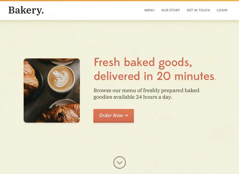 There is nothing too wrong with this at all, it’s just not very interesting or compelling, and while it certainly looks nice, we can still make some very quick edits to help make better use of the hero background and create something that is a bit more visually interesting while providing clear context about the service offered.
After: Bakery Example
After a few small edits, mostly just dropping in pre-made elements we have a completely different vibe and we’ve got something far more compelling for our hero image. In almost no time we’ve added texture, depth, and a lot of helpful context to our hero image. As long as you pick the right kit, and use the right elements, it’s very easy to achieve a similar result just like this.
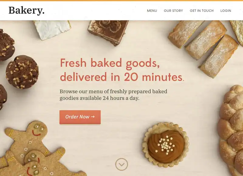 Let’s take a quick look at how each improvement was made one by one:
Tips for Effectively Using Scene Creator Kits
1. Find The Right Scene Creator Kit
Finding the right scene creator kit to fit your needs is important for your final result, luckily there are a lot to choose from, but you’ll have to search around a little and choose one or more kits that are relevant for your hero image. I went for one simply called Scene Creator by Ceacle for my example, as it offers a variety of different ´scenes’ across a number of different niches which will come in handy for a number of different hero images, but also has the key bakery items we were using for our example mockup.
Design Challenge #2
Here’s another quick mockup I made using the same Scene Creator kit. The theme of the website in this example is web design services, so this time we pick out design-related objects. As before we’re aiming to draw attention to the content block by framing it with the relevant elements, and as you can see we achieve a similar result as before in no time at all.

Before: Design Services Example
Again this is a fine hero image by itself, in some cases it might be exactly the sort of thing you want to use, but the abstract shapes and flat background don’t do a lot to provide any context, by using another ´scene’ from the same kit we can instead populate the hero image with items relating to design to help re-enforce what it is this fictional company provides.

After: Design Services Example
Again we make use of some subtle background texture, we frame our call to action and keep lots of white space between the elements we drop onto the scene. In just a few minutes we’ve injected a lot of character and depth to the hero image and as you can see from the video below it was only a case of dropping in a few elements and seeing what worked where.

Video Timelapse
As you can see the process is pretty straightforward and we get beautiful hero images as a result. There are a lot of different styles you can achieve with these kits, but something as simple as this can work very well for a number of different uses. It’s something we see used in web design very frequently because it does such a good job of catching and guiding attention.
Using Gradient Maps with Scene Creator Kits – Challenge #3
One final method I wanted to explore for using Scene Creator kits was the effective way of combining them with Gradient Maps. This method allows you to fill your hero area with more items, as we will later introduce contrast between the foreground content and background visuals with the gradient maps and some other fills & adjustment layers.
 For this final design challenge we will reused the same hero image from before, then we introduced a lot more scene elements to fill the space more fully. Once we do this we then need to look at how to remedy the busy background and flatten it out.
Basic Steps to Achieve This Style
In this process GIF you can see how the busy and crowded scene transforms into a fun and usable background once we add some important layer adjustments. It’s also an effective way of injecting your brand colors into the hero area. Here’s how I achieved this look.
 1. Lighten Text & Content
The first step I took was changing the text and button to white, as I knew I wanted to make the background darker.
2. Darken Background & Add Colour with Layer Adjustments
After that, we added some basic layer adjustments to achieve the final look. If you wish to do the same, navigate to your layers panel, and look at the small toolbar at the bottom for an Icon labelled “Add New Fill or Adjustment Layer†bottom right of the panel and look for “Levels†– then also add “Gradient Map†and “Gradient†fills with the same icon.
1. Lighten Text & Content
The first step I took was changing the text and button to white, as I knew I wanted to make the background darker.
2. Darken Background & Add Colour with Layer Adjustments
After that, we added some basic layer adjustments to achieve the final look. If you wish to do the same, navigate to your layers panel, and look at the small toolbar at the bottom for an Icon labelled “Add New Fill or Adjustment Layer†bottom right of the panel and look for “Levels†– then also add “Gradient Map†and “Gradient†fills with the same icon.
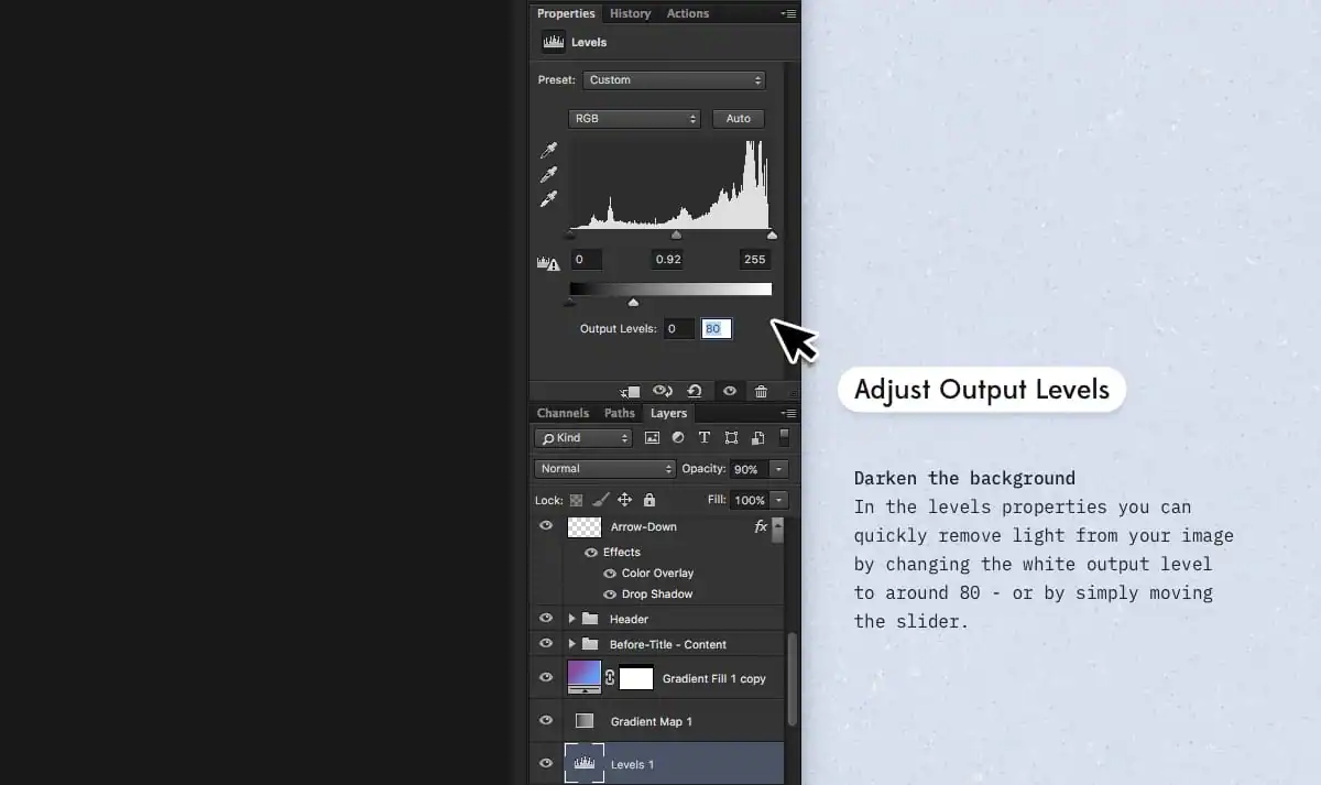
 2a. Levels
Once you’ve added these adjustments, we need first create contrast by darkening everything in the background. One effective way of doing this is by simply editing the Output levels via your properties panel (with the Levels adjustment selected) – In my case, I simply moved the slider to around 80. This darkened the entire image and gives us lots of contrast.
2a. Levels
Once you’ve added these adjustments, we need first create contrast by darkening everything in the background. One effective way of doing this is by simply editing the Output levels via your properties panel (with the Levels adjustment selected) – In my case, I simply moved the slider to around 80. This darkened the entire image and gives us lots of contrast.
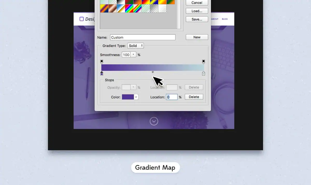
 2b. Gradient Map
There aren’t any set values here that you can use. These colors are going to need to vary based on the style you want, but the image below shows the values that I was working with, as you can see a simple duotone approach works fine, using two colors from the existing branding. Explained: The gradient map essentially replaces dark and light values in your image with the colors selected in your gradient map. Shadows become the color on the left, and highlights transform into the color on the right.
2b. Gradient Map
There aren’t any set values here that you can use. These colors are going to need to vary based on the style you want, but the image below shows the values that I was working with, as you can see a simple duotone approach works fine, using two colors from the existing branding. Explained: The gradient map essentially replaces dark and light values in your image with the colors selected in your gradient map. Shadows become the color on the left, and highlights transform into the color on the right.
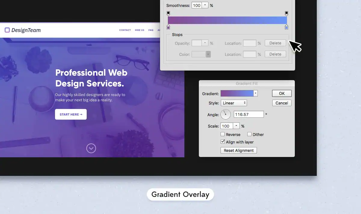
 2c. Gradient Overlay
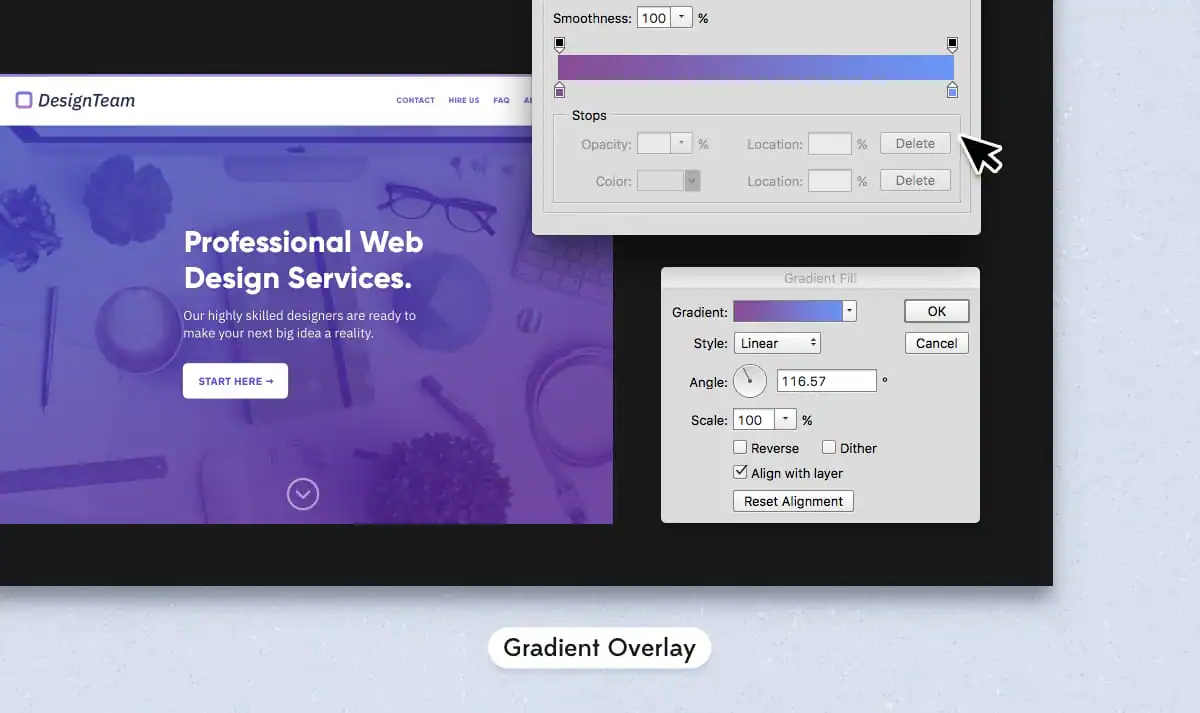
Once we’ve got our gradient map applied everything should be looking nice and you might be good to go, if things do begin to look a little flat you can lower the opacity of your effects ever so slightly and introduce a gradient overlay. I added this overlay with a lighter blue and pink color and set it at a slight diagonal angle and set the blend mode to ´Soft Light.’
The best thing you can do to get a similar style working for you is to experiment with colors, contrast and layer opacity to achieve different results following a similar method, and hopefully you can find something that fits.
2c. Gradient Overlay
Once we’ve got our gradient map applied everything should be looking nice and you might be good to go, if things do begin to look a little flat you can lower the opacity of your effects ever so slightly and introduce a gradient overlay. I added this overlay with a lighter blue and pink color and set it at a slight diagonal angle and set the blend mode to ´Soft Light.’
The best thing you can do to get a similar style working for you is to experiment with colors, contrast and layer opacity to achieve different results following a similar method, and hopefully you can find something that fits.
Explore More Scene Creator Kits
Hopefully, these little design exercises provided an insight into just how simple it can be to build compelling hero images (and other graphics) just by using a simple kit scene making kit. Every example I created for this post was pieced together just using 4 scenes of the available 50 scenes in the Scene Creator kit that we used, but many other great kits are out there with an equally impressive set of ready-made elements, here are just a few of my favorites:
Powered by Creative Market
Products Seen In This Post:
A fun, friendly, FREE guide to build a stellar brand identity.
Download now!







Try some of my FREE goods: https://liammckay.lemonsqueezy.com - Designer with a love for beautiful Icons, Textures, Brushes and WordPress Themes.
View More Posts


6 Comments