Categories / Shop Center

Bad or Rad: Aquafina

Kevin Whipps Last updated: April 10, 2024 · 1 min read
Pinterest

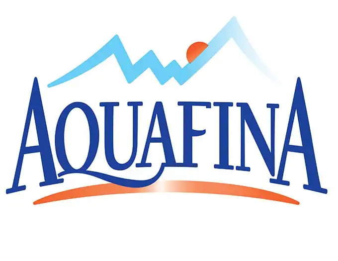
You probably don’t drink enough water. I mean, nobody does, right? So when you reach for your next sip of some non-alcoholic clear liquid, it might be from an Aquafina bottle. The more than 20-year-old Pepsi company changed its logo for the first time in years. Here’s the old one:
According to Brand New, this new design was done in-house by the people at Pepsi Co:
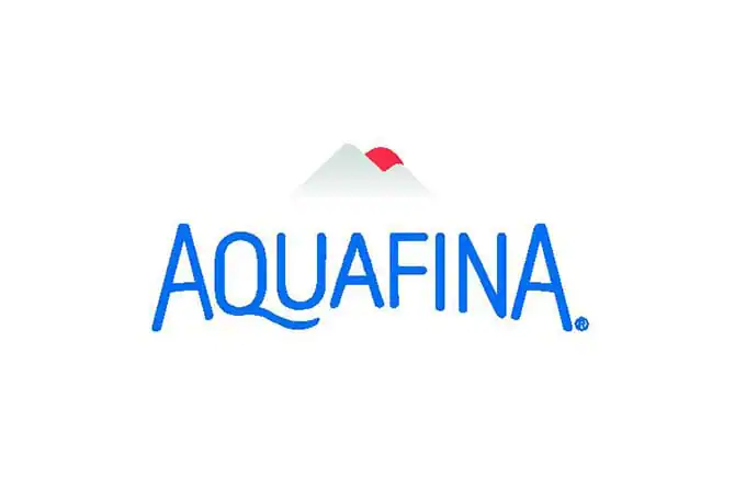
So what do you think? On the one hand, having the same logo for 22 years – particularly when it looked like Aquafina’s previous version – means that a refresh was probably beyond due. But on the other, do you change a brand’s logo just for the sake of change? Let us know!

Lettering Worksheets
Getting started with hand lettering?
Free lettering worksheets

Download these worksheets and start practicing with simple instructions and tracing exercises.

Download now!
Tags:
About the Author
Author
Kevin Whipps

Hi! My name is Kevin Whipps, and I'm a writer and editor based in Phoenix, Arizona. When I'm not working taking pictures of old cars and trucks, I'm either writing articles for Creative Market or hawking stickers at Whipps Sticker Co.

View More Posts


Go to My Shop
Related Articles
12 Comments
  • I think it was fine the way it was. But people close to it probably get bored. I understand that, but then I think it underscores the point made in the blog; don't change for the sake of change! 10 years ago
  • The word mark is ok I guess. A bit on the hipster/trendy side for a mass market product likely wont age well for this kind of product. The icon is really meh though it may look better on the label than a white BG. As presented I'd say Bad. 10 years ago
  • Why, for the love of God, do people still think it's okay to do a major brand identity in-house, especially when the in-house talent is clearly lacking? Also, who in their right mind still uses gradients in logos? Just looking at it you can picture your brand identity fading into nothingness. A gradient, especially those from full to null, are the perfect metaphor for their own futility. 10 years ago
  • Hmm bottle wise I think it looks fine. I dont know how well it'll age thoug 10 years ago
  • I simply don't understand this trend toward generic, lackluster, underwhelming logo redesigns. 10 years ago
  • New logo or not, their water still tastes disgusting. Wish they'd work on that instead. 10 years ago
  • let's wait and see how the bottles look as a whole. blue bunny just changed their look and it has done wonders, in my opinion. makes me want to eat a lot more ice cream, and i'm not that into ice cream! I always consider the whole picture, so i'm excited to see what they've done as a whole. Aquafina and Dasani are my water drinks of choice, so let's see what happens now. as long as they don't change the flavor...i couldn't handle that! here's to updating and to change, whether we like it or not! 10 years ago
  • Like the others, my initial reaction is, "ohh nooo". But I'm sure it'll look good on their bottles. But really though... gradient mountains? You don't "update" gradient mountains to a different style of gradient mountains. 10 years ago
  • Damn what a shame. I agree with some comments above, it was so much unique and original before, now it's just dull and generic. 10 years ago
  • Hmm. I think that the gradient and font used in the original logo was a bit outdated. The clean and simple, but rustic look of the new logo still mimics the long standing brand identity created with the old logo but with a modern twist. So I think it is well done. Too simple and perhaps trendy?... Possibly, yes, time will tell. As for hiring an in-house designer, I am sure Pepsi does not hire their in house creatives lightly... They are Pepsi afterall, so I'm betting this went through some high levels of approval first. Ya... I think I dig it. 10 years ago
  • Terrible. I agree with Daniel above. 10 years ago
  • Anonymous
    Gradients? really? 10 years ago