Categories / Inspiration

33 Epic Design Fails That Will Make You Cringe

Kevin Whipps Last updated: April 10, 2024 · 2 min read

We all make mistakes. And when one of them happens to slip by the goalie, we all hope they don’t end up being publicly shamed. With that said, everybody loves poking fun at other people’s mistakes, and that’s why we’re bringing you some of the latest design fails that we’ve found across the web for you to mock shamelessly – assuming one of them isn’t yours, of course.

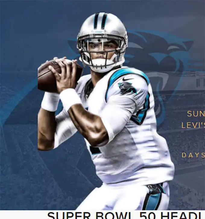
Who needs a right elbow, anyway?
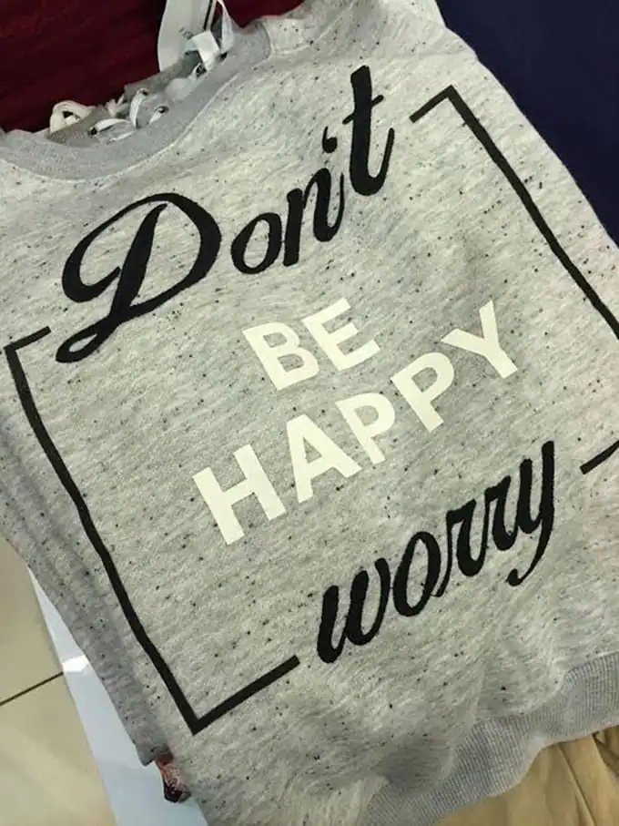
Don’t be happy, worry?
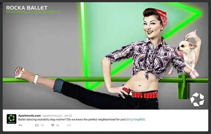
That leg looks a little long, right?
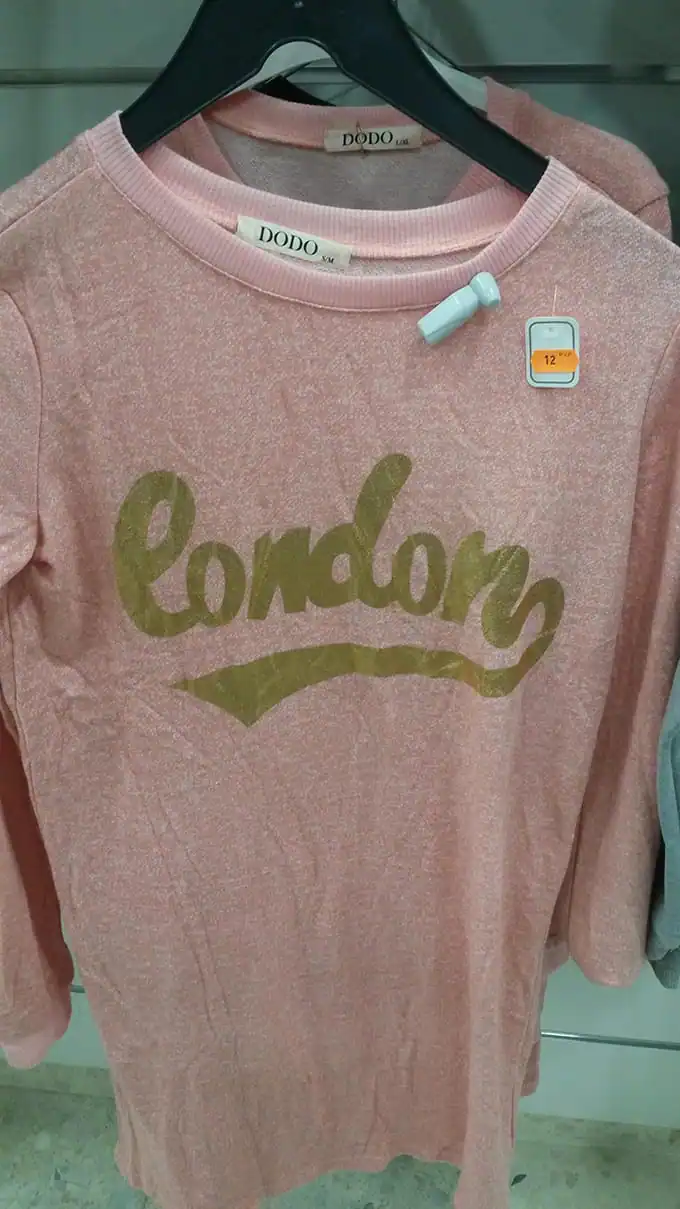
I think this is supposed to say “London,” but …
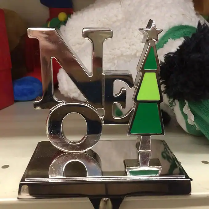
One? Noe? Noetrees?
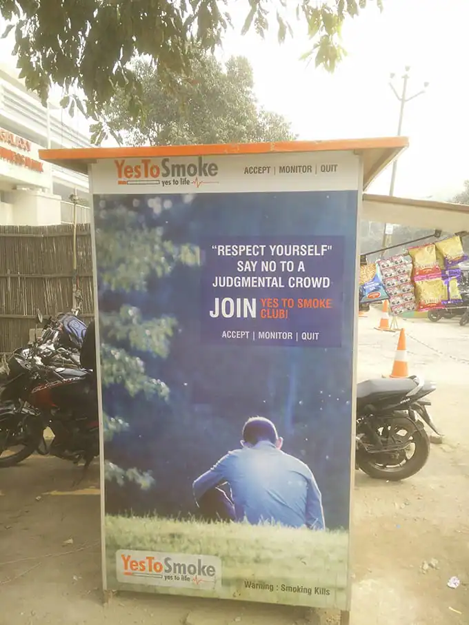
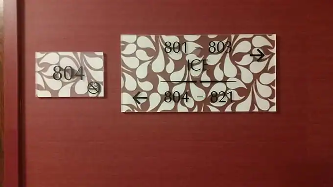
Smoke to Live
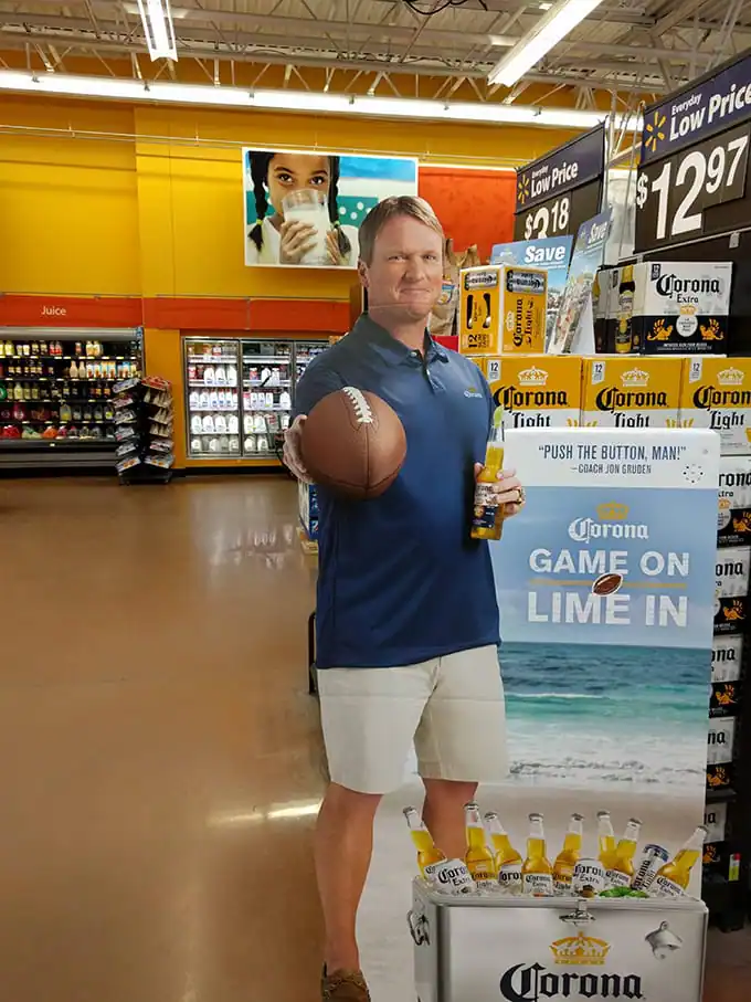
This man does not have any arms. Clearly.
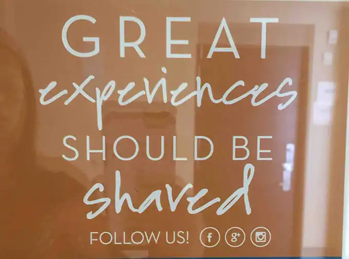
Experiences are often shaved.
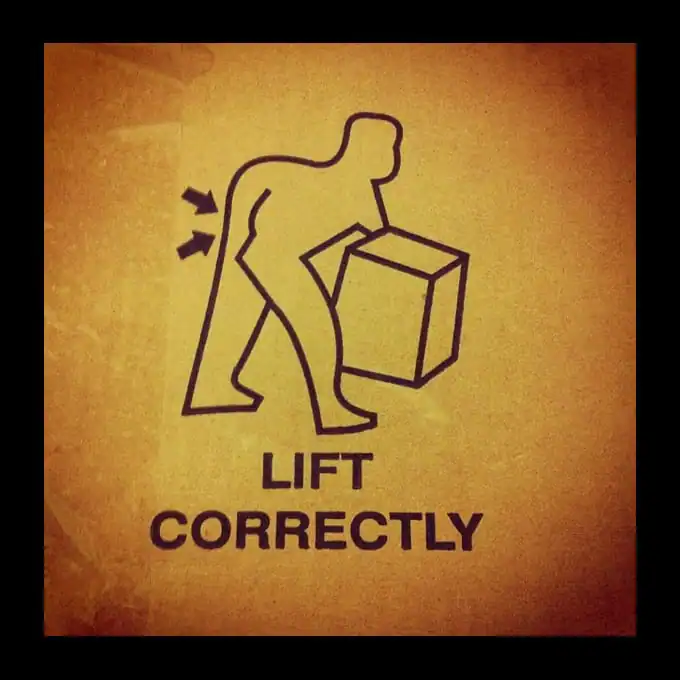
Lift what correctly?
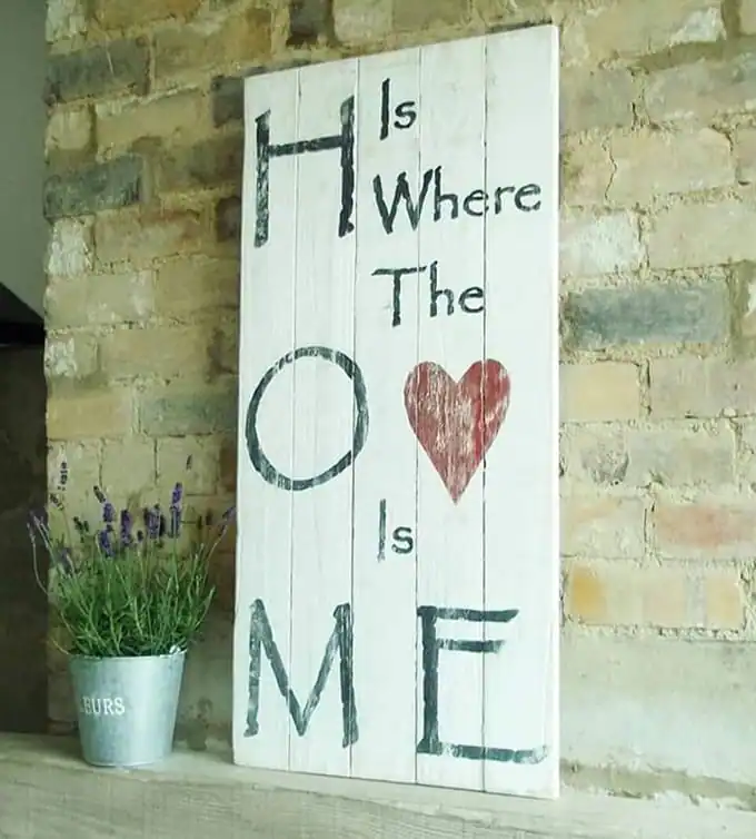
So I’m supposed to read this how now?
SO. MUCH. ARM.
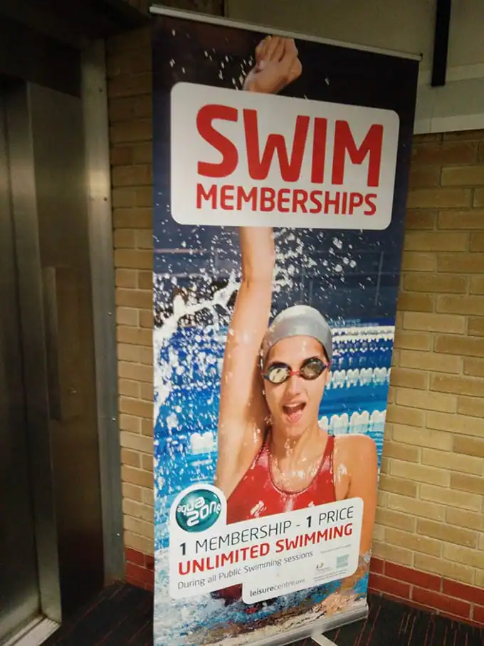
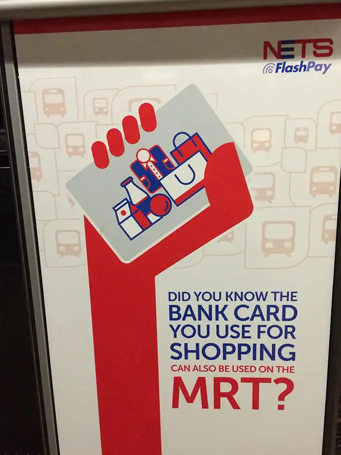
This is why copy editors are important:
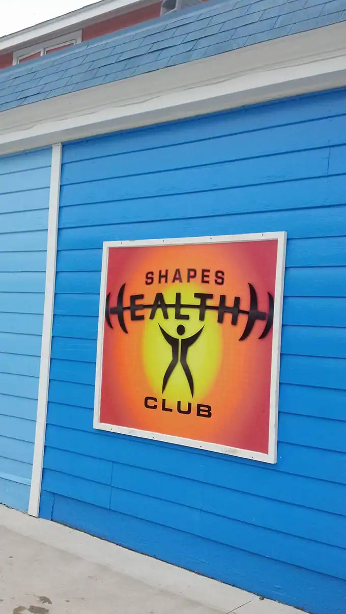
Proporations are important:
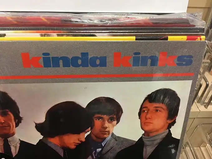
Highlighting the “K”s was probably a bad idea:
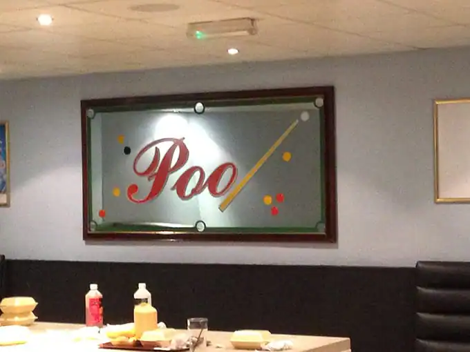
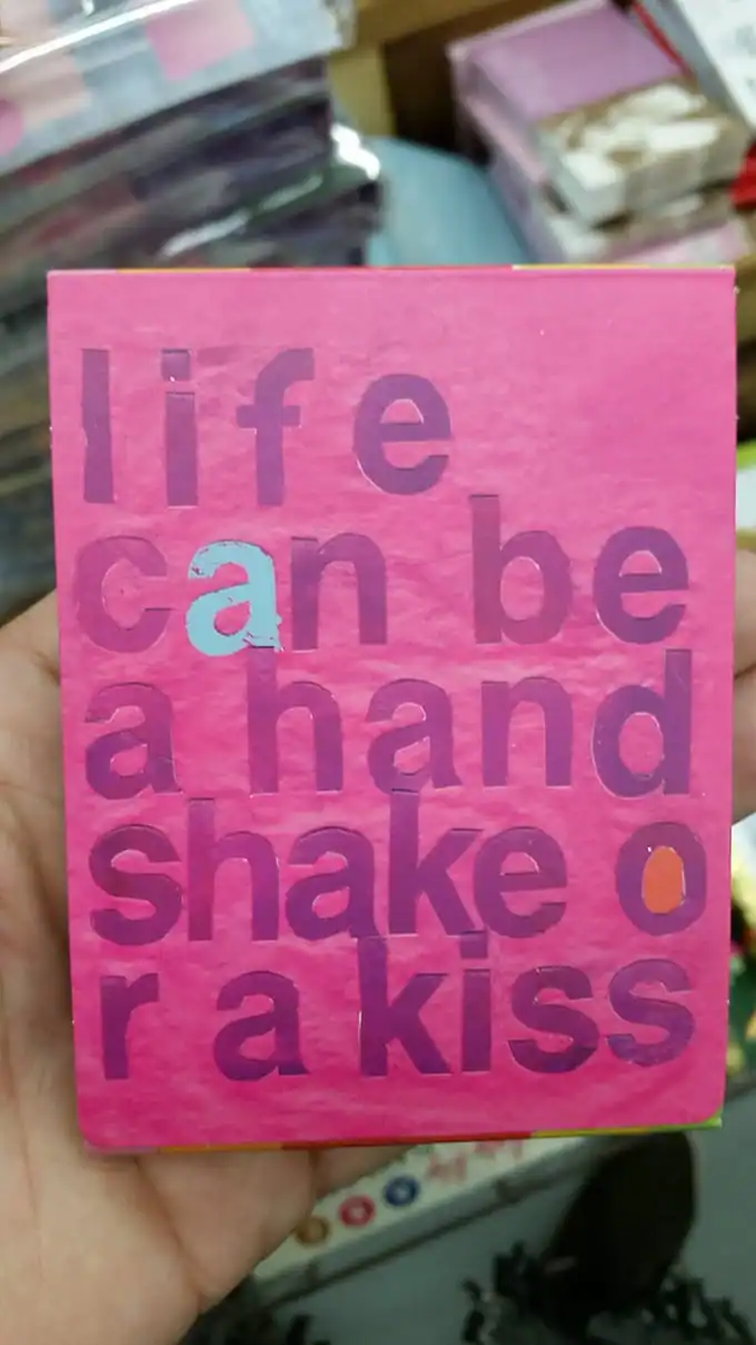
Everybody does it, but hopefully not at the table:
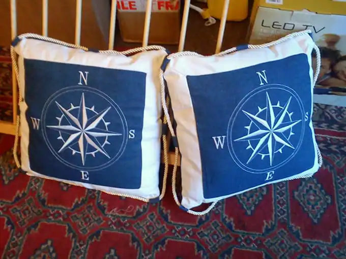
PSST: THAT COMPASS IS POINTING NORTHWEST:

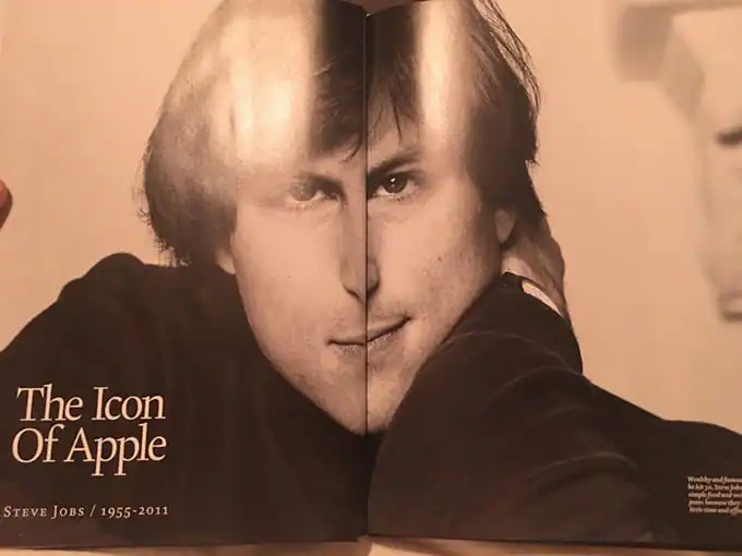
Always design around the gutter:
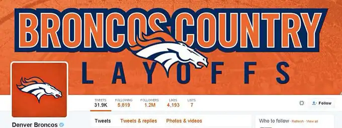
People are losing their jobs in Denver:
Never Soggy Eat Waffles:
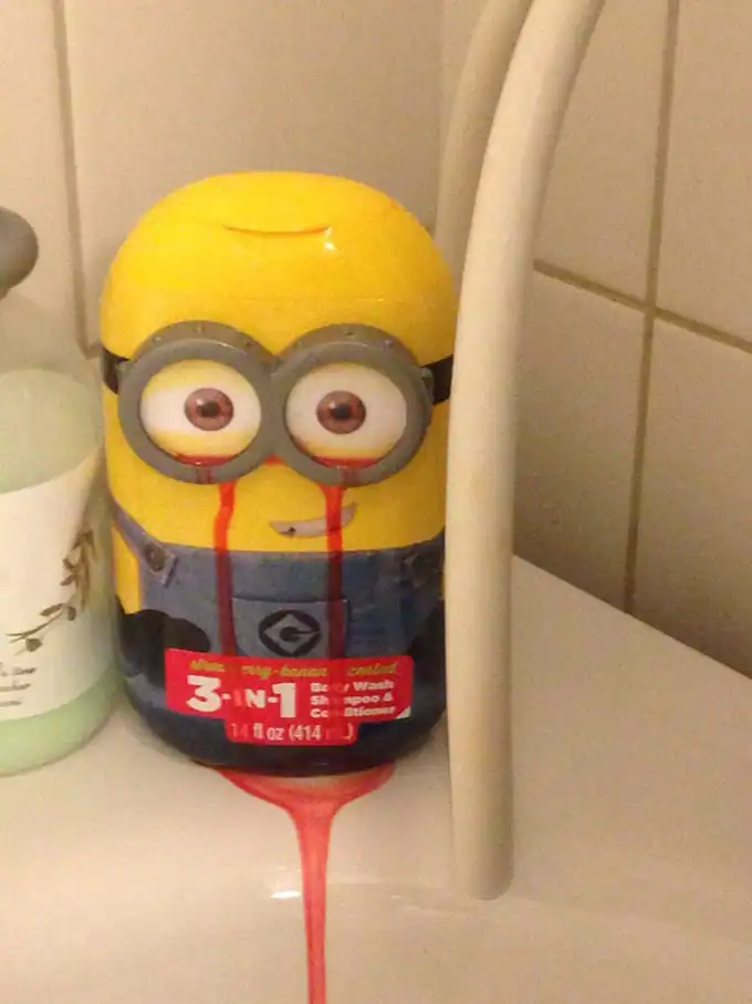
Always fun with children:
Kerning and leading optional:
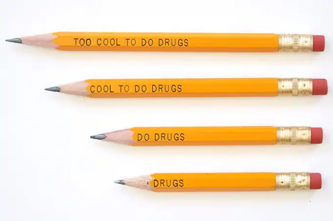
Who sharpens pencils, anyway?
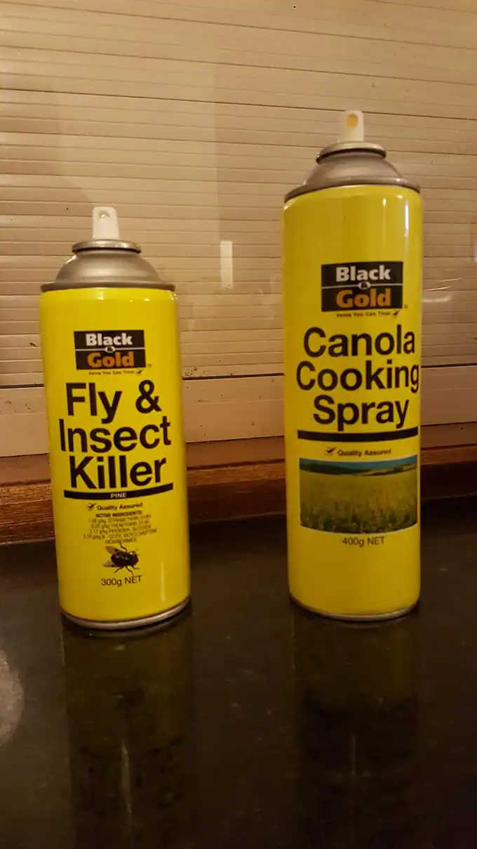
Nobody will mix up these two:
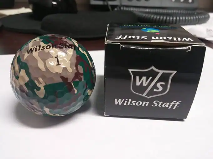
So what am I looking at exactly? I can’t find it:
Watermarks are fun:
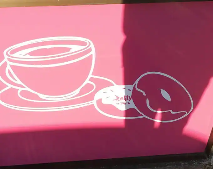
Clear instructions:
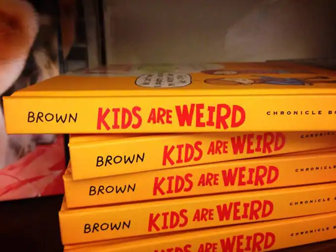
The author and title should be spaced out a bit more:
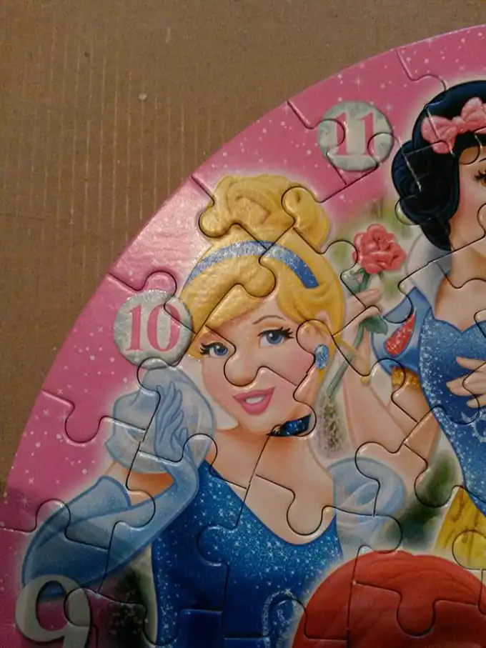
Nice nose:
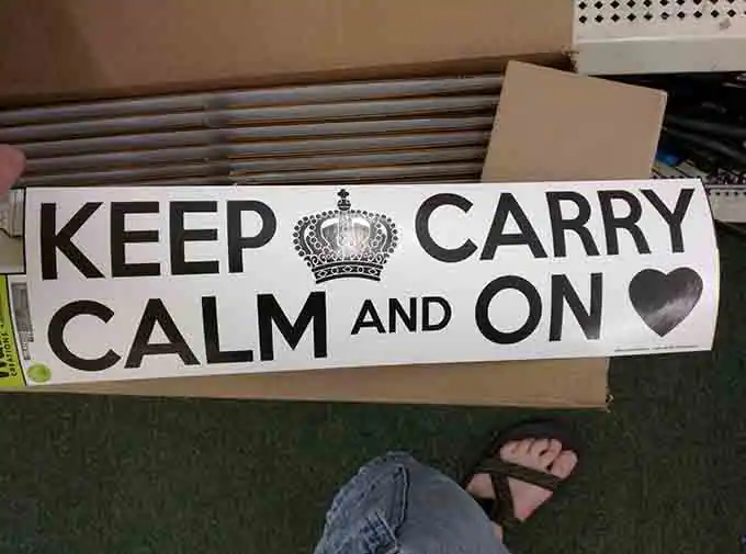
Keep Carry and what now?
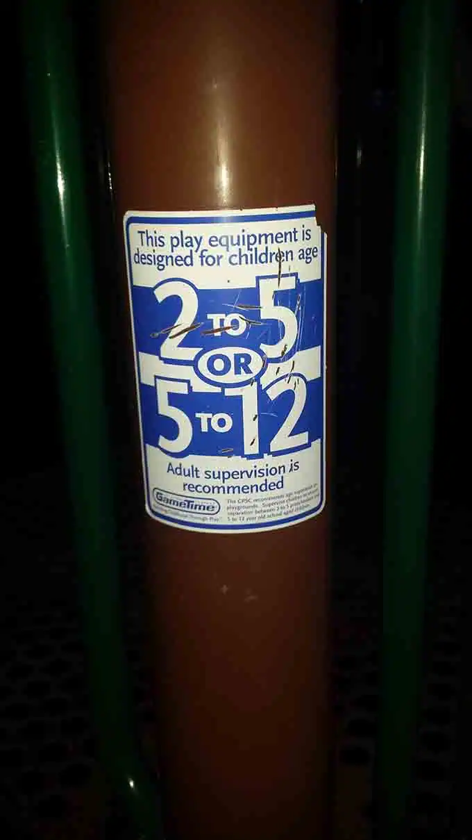
Oh well my kids fit into this range for sure:
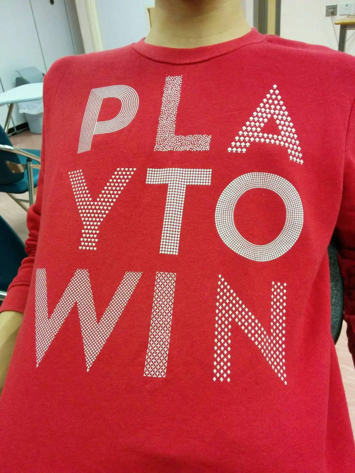
If I knew what “PLA” was, maybe:
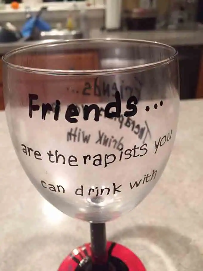
Yeah, “therapists” and “the rapists” are exactly the same thing:
Camelcase save me now!
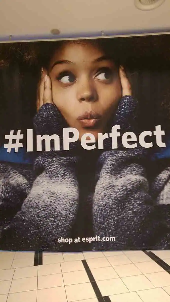
via Bored Panda and /r/Crappy Design


Kevin Whipps is a writer and editor based in Phoenix, Arizona. When he’s not working on one of the many writing projects in his queue, he’s designing stickers with his wife at Whipps Sticker Co.

Lettering Worksheets
Getting started with hand lettering?
Free lettering worksheets

Download these worksheets and start practicing with simple instructions and tracing exercises.

Download now!
About the Author
Author
Kevin Whipps

Hi! My name is Kevin Whipps, and I'm a writer and editor based in Phoenix, Arizona. When I'm not working taking pictures of old cars and trucks, I'm either writing articles for Creative Market or hawking stickers at Whipps Sticker Co.

View More Posts
Go to My Shop
Related Articles
24 Comments
  • Hahahahaha, these are great! I have one to add but doesn't have a cringe factor: I have a Halloween hand towel that says "spoky" instead of "spooky". 11 years ago
  • The puzzle is hilarious! 11 years ago
  • Not sure 2 is a design fail though? Surely a messed up manufacturing problem? And as for 5 - if you're keeping cooking oil next to fly spray anyway, you probably deserve to mix the two up once in a while. Loved the rest though! 11 years ago
  • I love the aussie brand Black&Gold even more because, they don't hide their value at all...if you take out letter B and G is actually Lack&Old...A M A Z I N G almost like Ink Loyd. 11 years ago
  • Haha, great. 11 years ago
  • Yikes! 11 years ago
  • What's wrong with the one with the cup and donuts? 11 years ago
  • @Alex Anze Getty images stamp is still on the donut 11 years ago
  • These are great. Alex, on the doughnut image you can see the Getty watermark that the designer hasn't noticed/removed after Live Tracing. 11 years ago
  • Haha looked at the Coffee & Donut image rather fast and thought it read "Betty's Donuts" or something similar, so I didn't Getty it at first.... tada 11 years ago
  • What did that poor little minion see in the shower that made his eyes bleed like that? 11 years ago
  • One of local shops sells necklace pendants with a clipart picture on it and.... nice BIG words: PLACE TEXT HERE. Printed with resin over it...And phone covers with bright pictures of famous landmarks and a small banner saying - 'This is where your message goes'. Nobody seems so notice this... 11 years ago
  • I dont get the puzzle one.. am I thinking too hard? 11 years ago
  • You mean the first example? N S E W ? 11 years ago
  • @Diana Fadal the round cut out of the puzzle piece looks like her (rather big) nose. 11 years ago
  • This made my day! 11 years ago
  • Not sure I see the fail in 13 but loved the rest of them. Especially the "Friends are [the]rapists you can drink with." *cringing for days* And of course the "[Brown] Kids Are Weird" cause I'm brown and this is too accurate despite being a mistake hahaha 11 years ago
  • There is a road sign along my walk route that says "SLOW KIDS PLAYING" ... must be an awful lot of challenged kids on that block! :) 10 years ago
  • I don't get the last one :/ 10 years ago
  • What's wrong with the last one? 10 years ago
  • I'm more annoyed at the back-to-front apostrophe on #2. The last one: if you make it all lower case, what does it say? 10 years ago
  • Necro'ing this thread hard, but the Northeast Region shirt is correct. That is what a compass looks like if you are walking northeast, because the needle always points north, and if you walk just right of north, you're walking northeast. 8 years ago