Categories / Inspiration

Jeb vs. Hillary: Which Logo is Worse?

Kevin Whipps Last updated: April 5, 2024 · 2 min read

OK, let’s get this out of the way: this isn’t a political blog, and we’re not pundits trying to sway your decision one way or the other. But what we are is a design site, and when politics and design collide, we’ve got to talk about it, right?
Two of the popular candidates for the 2016 election are Hillary Clinton and Jeb Bush – Jeb, being the brother of the last republican President, George Bush Jr., and the son of former President George Bush Sr., and Hillary being the former United States Secretary of State as well as the wife of former President Bill Clinton. Needless to say, both candidates are extremely well known and need a strong brand to represent them through the upcoming campaign.
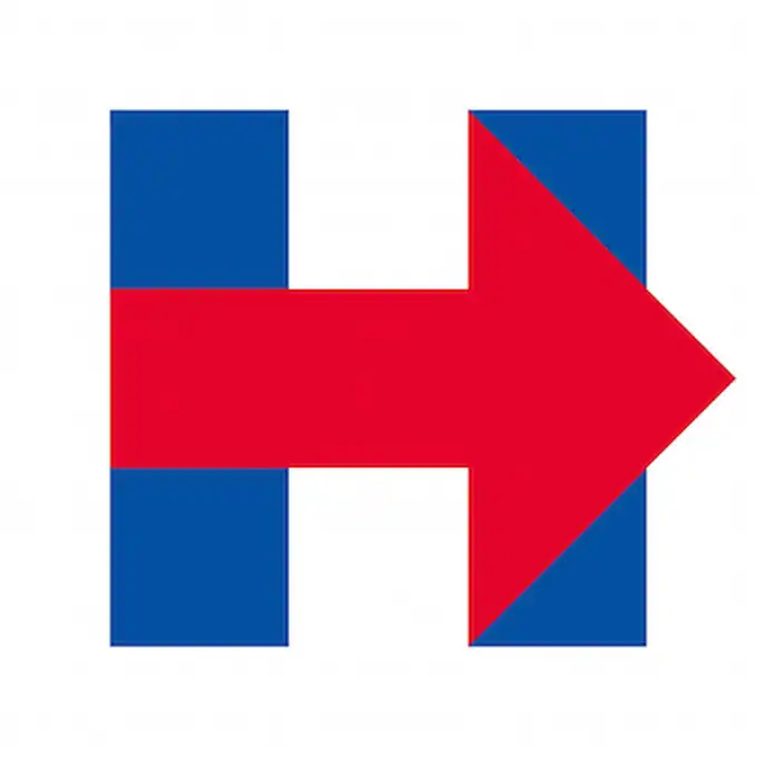
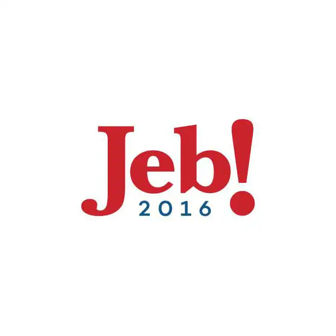
Now the two have shown off their official logos, and both are trying to beat out (in a design sense, anyway) the Obama logo that set the bar high 8 years ago. And there’s one other key point: while Hilary’s logo is brand new, Jeb has been using a variation of his logo for the past 20 years. So what do you think? Which logo works, and which one is a dud? Or do they both suck?

Hilary Clinton
Jeb Bush

Kevin Whipps is a writer and editor based in Phoenix, Arizona. When he’s not working on one of the many projects in his queue, he’s looking for fun and irreverent things online to share with his friends.

Lettering Worksheets
Getting started with hand lettering?
Free lettering worksheets

Download these worksheets and start practicing with simple instructions and tracing exercises.

Download now!
Tags:
About the Author
Author
Kevin Whipps

Hi! My name is Kevin Whipps, and I'm a writer and editor based in Phoenix, Arizona. When I'm not working taking pictures of old cars and trucks, I'm either writing articles for Creative Market or hawking stickers at Whipps Sticker Co.

View More Posts
Go to My Shop
Related Articles
15 Comments
  • Ugh, the shades of red and blue in Hilary's vibrate. 11 years ago
  • Some marketing firm got $20,000 for either logo, so really the joke is on us. 11 years ago
  • Which is worse?!! How the... I mean its just that... well, they both suck pretty darn bad. 11 years ago
  • Jeb's is horrendous... Hilary's isn't so bad. I think it at least has a little meaning to it, as in the arrow is moving us forward. 11 years ago
  • Jeb's logo looks like all of the old instant messaging platforms had a little logo baby. 11 years ago
  • @Jeffrey Smith only $20,000? Don't forget this is politics! The Jeb! logo reminds me of an early 90's TV show logo perhaps, or a restaurant like Denny's. I think the goal was to convey a friendly and approachable attitude - something people tended to like about his brother. I hope we have a few options run this year that aren't all in the family... 11 years ago
  • I think Hillary´s is worse, I find it aggressive, as @Sean Coady said, color vibration makes me feel sick. Jeb´s is not good too, but it´s kinder 11 years ago
  • Jeb's logo does look outdated. Hillary's would be more effective if that arrow was negative spaced. Remove the colours and you can't see the arrow 'pointing forward'. Hillary's logo is a solid square and therefore she must have solid foundations to work from. Jeb's logo offers no stimulus to the eyes and looks more corporate and may not attract the middle or lower class American. 11 years ago
  • Jeb's logo looks like Yahoo's logo. The problem is that they honestly don't care, in the end it's their connections who help them win. 11 years ago
  • The Logos of both of them are not appealing. Designed one logo http://www.wdipl.com/. Need to have some creative logo which suits the brand. Web designers can well understand that. 11 years ago
  • I think they're equally bad. Hillary's make me feel angry because the colours just aren't working and you can tell Jeb's has been around while. 11 years ago
  • I must be missing the boat on campaign branding these days, because I just can't seem to see what it is in these logos that makes them worth the expense. @Jeffrey Smith I guarantee that neither of these cost just $20k. Hillary's came from Pentagram, so we can safely assume a six-figure fee for that one. I'm just failing to see the appeal in these. Jeb's is a variation of the same logo he's used since 1994, and that alone I would have thought would have ruled it out as a possibility for a campaign all these years later. The Obama campaign kind of flipped political branding upside down and pulled us out of the creative rut presidential candidates have been in for decades. The Obama logo showed us that branding in politics didn't have to be boring and stiff. In 2012 we saw that same mentality adopted by other candidates. I thought that maybe we were past the days of pulling stale design concepts from the political branding playbooks of the 1990s. Apparently I was wrong. I don't see "progression" in either of these logos. The arrow is supposed to indicate that, but it's about as subtle as actually setting the word "progress" right into the logo. I'm still waiting to see a logo from any candidate in the 2016 presidential election that is really interesting or inspiring. 11 years ago
  • Woah Jeb. Let's rethink this now. 11 years ago
  • I like Hillary's logo better. It has a more iconic and memorable look. Not to mention it looks like more time and thought was put into it. 11 years ago
  • i'm going to go with jeb! 2016 being worse. i bet that took all of 2 minutes to scroll through what fonts were on the computer and piece that poo together. hilary knocked off fedex so that's pretty bad too... 11 years ago