



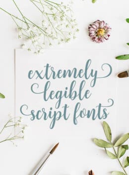
Legible fonts are typefaces whose letter shapes and spacing make each character easy to distinguish at a glance. Finding a striking script font isn’t hard these days: the market is full of talented creatives uploading their very best work for the rest of us to use. For designers and other creatives, that makes choosing a script font that looks expressive and still communicates clearly the real challenge.
Whether that audience is your family, close friends, or the world at large, choosing a legible script font is a prerequisite for success. If readers can’t understand what you’re saying, the visual appeal of the font stops mattering. That’s why this guide starts with the difference between legibility and readability, explains what makes script fonts easier to read, and then points you to 30 especially legible script fonts for Cricut and more.
Let’s start by discussing what legibility actually is.
Legibility vs. Readability in Legible Font Typography
There’s a lot a designer can do to improve how text is read and perceived by the human eye – even if he/she has no control over the original typeface’s design, shape, and spacing. As you’ve probably seen, we can play around with aspects like overall letter spacing (tracking), individual letter spacing (kerning), line spacing (leading), line length, color, size, among many others, and adjusting them helps determine what is most readable for users in a given layout. These types of interventions affect the text’s readability, since they all take place as the type is being arranged on the page.
Now, here’s where your type choices become incredibly important: legibility is a font-specific factor – something that makes the characters easy to distinguish from their very design, and its key characteristics include x height, lowercase letters, open forms, letters, serifs, stroke widths, strokes, curves, and contrast. In a way, it’s like readability except for the fact that (unless you designed the font) you have no control over it. Larger x-heights improve legibility of lowercase letters, while high stroke contrast or thin strokes can become harder to read at small sizes.
Things like ligatures, how tight the characters are originally spaced, how the sharp edges facilitate or hinder the reading experience, among others. This is especially important on digital screens and websites, where humanist typefaces are often preferred for digital legibility. Luckily, there is one thing you can do to enhance legibility: choose the right fonts!
For example, Arial is one of the most readable options, Georgia works well on screens and paper, Verdana is especially legible for digital marketing and small sizes, Open Sans has a wide style, Lato offers balanced spacing that suits clear words in reports and body text, and Times New Roman and other serif fonts are helpful for print or long-form reading materials. So that’s where we’re going next, but remember that testing is essential so designers can test combinations, notice subtle details, and compare differences before choosing the wrong font for a project.
30 Extremely Legible Script Font Fonts
By definition, script fonts are fluid, varied, and connected, and a script font’s style, personality, and handwriting or calligraphy often determine whether it remains legible. These features make it challenging to achieve a level of legibility when designing such a font, since flowing strokes, curves, and contrast can look elegant, classic, modern, traditional, or bold, but may reduce readability when overused in body text.
As designers, we want to work with font families that assist the communication function of our text. Script fonts usually work best when combined with a simpler typeface for body copy, while script is often reserved for headlines or display use. Fonts that carry the message in an engaging, clear, and even exciting manner should also reflect and convey the project’s tone, whether for branding, logos, invitations, greeting cards, posters, or print pieces. Tall letters, a hand drawn feel, and personal details can add appeal, but designers should still test how the words display across websites and technical information contexts. Here are thirty examples of script fonts that provide great legibility, despite their fluid nature:
3. Palmello
4. The Hamptons
6. Wild Soul
8. Holiday
9. Poem Avenue
10. Pink Queen
11. Fantase
12. Beach Bound
14. Milkshake
15. Hello Bride
16. Reserve
18. Marilyn Wilde
19. Bristleback
20. Fresh Lemonade
21. Bestie In Crime
22. Lovely Stories
23. Onehart
24. Naterium Retro
25. Morning Ritual
26. BeyondSweet
27. Candlescript Pro
28. Quiet Luxury
30. Monoline Script
A legible script font typically features clear letterforms, consistent spacing, moderate flourishes, and smooth connections between letters. Fonts with excessive swashes or tightly connected characters can become difficult to read, especially in longer passages.
Yes. Legible script fonts work beautifully for logos because they create a distinctive, memorable identity while remaining easy to recognize. Choosing a readable script ensures your logo looks great across everything from business cards to websites and packaging.
Start by considering the tone of your project. Elegant scripts suit luxury branding and wedding stationery, while relaxed handwritten scripts work well for lifestyle brands, packaging, and social media. Above all, choose a font that’s readable at the size you’ll be using it.
While the terms are often used interchangeably, script fonts are generally inspired by cursive writing or calligraphy, whereas handwritten fonts mimic natural everyday handwriting. Script fonts often feel more polished, while handwritten fonts tend to look casual and organic.

Download these worksheets and start practicing with simple instructions and tracing exercises.
Download now!




6 Comments