
How to Turn a Font into a Faux-Lettered Logo, With Typographer Simon Walker



Ever heard about faux lettering? This popular trend has been picking up steam in the last couple of years, and consists of tweaking digital typography to achieve the “hand lettered look”. You’re probably familiar with it: rugged, irregular shapes that are the total opposite of pixel perfect. Custom typographer and designer Simon Walker joins us today to share his lettered branding work, his new font shop, and a few simple steps to use digital fonts to create a hand drawn effect without having to draw letters from scratch.
Meet Simon
Simon Walker has designed hand lettered logos for several brands, and has had the chance to work with companies like Nickelodeon, American Eagle, Vanity Fair, Brené Brown, Nike, and Target.
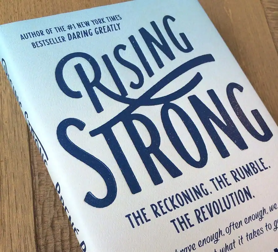
Work for Brené Brown
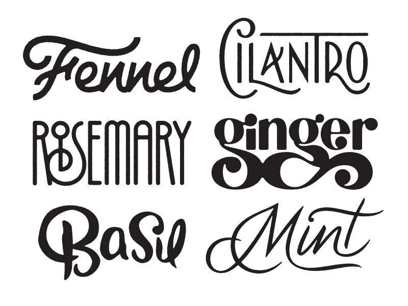
Work for Anolon Cookware
What is custom typography and how did you get started?
“Custom typography” is a term that tends to get used interchangeably with “custom lettering”. In the broadest sense they both mean kinda the same thing to most people; however, I tend to think of “typography” as concerning fonts and font layout, whereas “lettering” (particularly custom lettering) is more about the production of one-off, bespoke lettering projects for individual clients. On the other hand, “hand lettering” always seems to me to indicate looser, more freeform styles of lettering, like calligraphy or brush scripts created literally by hand. I try and do it all, but in general I consider myself mostly a custom letterer.
I got started many moons ago as a teenager when I developed an interest in graffiti. Something about the way letters and words could morph into pure art – and yet still retain something of their essential letter-ness – fascinated me. As my general art skills developed over the years, my fascination with letters stayed with me until it developed into a full-time obsession about ten years ago.

What is the inspiration behind your type-centered designs?
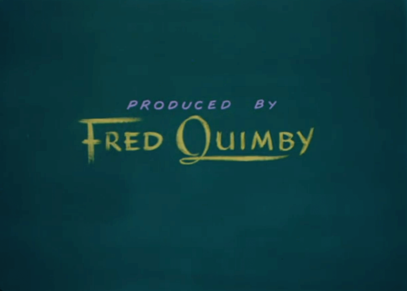
I’m primarily inspired by vintage lettering of all kinds. If I had to pick one specific vibe that’s most inspiring to me, it would be the funky deco-ish work of Herb Lubalin (as well as his compadre, Tom Carnase). But I’m equally enamored of old books and movies, for sure. I am always having to pause classic movies to take shots of the screen when something beautiful appears, like on a shop window or book cover or something. Most recently I paused in the middle of the credits for Tom & Jerry where it says “Produced by Fred Quimby” – such a killer, classic piece of lettering.
What has been your favorite project with a brand thus far? Why?
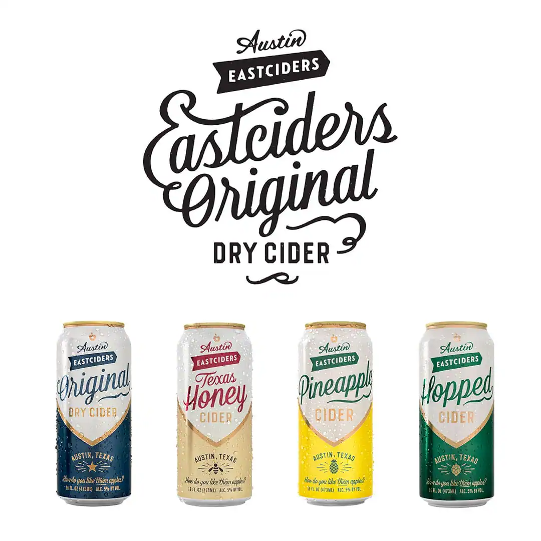
I think that has to be Austin Eastciders. The guy who started the cidery had such a specific vision for his brand, and the relationship was so collaborative and fun that we couldn’t help but come up with a successful look for the business. I rarely get to work on so many levels of a brand from the ground up. And of all the projects I’ve worked on, Eastciders has been most kind to me in terms of driving more business my way.
Tutorial: Turning a Font into a Faux-lettered Logo
After learning about Simon’s detailed work we obviously wanted to try our hand at faux lettering. We asked him to share a series of simple steps to turn a solid font into a one-of-a-kind logo with that hand-lettered vibe. Here are some brief directions for step-by-step font customization:
Step 1
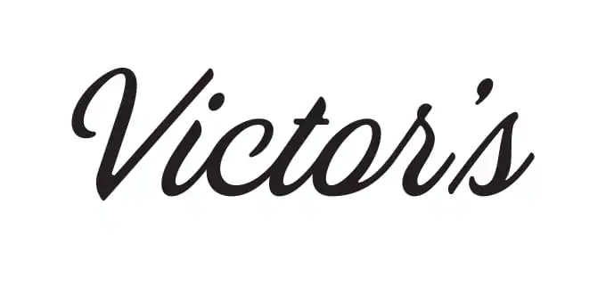
Type out the word you want to customize in Adobe Illustrator and convert the font to outlines (Type → Create Outlines). In this example, we are using a display script font called Blackbike.
Step 2
Find a section of one (or more) of the letters that might lend itself to some visual playfulness – preferably the initial cap, if possible. Remove the section you want to replace.

Step 3
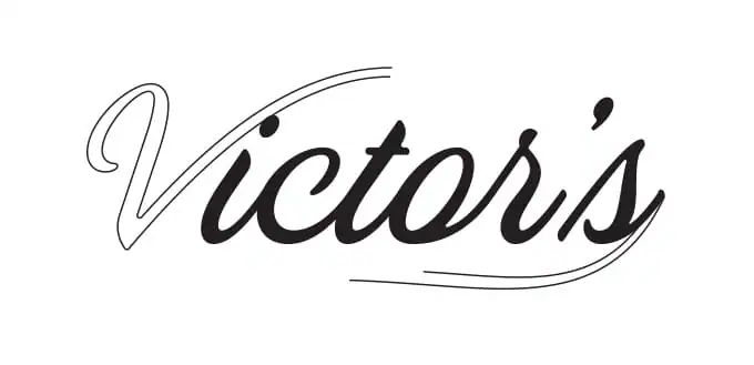
Draw/vector in your extensions.
Step 4
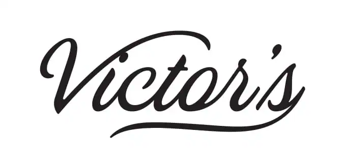
Close off and fill in your letter-forms.
Step 5
Arrange secondary lettering around your new customized logo.
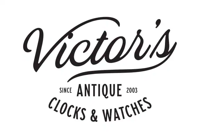
Pin the Final Result

Ready To Try Custom Typography?
We’d like to thank Simon for sharing his story and inspiring us to experiment with typography and branding. If you’re working on a design project and want to bring in that additional layer of ruggedness and legacy, tweaking digital type can result in impressive wordmarks that feel handcrafted. Are you feeling ready to tackle this project? Let us know in the comments section below.
Products Seen In This Post:

Download these worksheets and start practicing with simple instructions and tracing exercises.
Download now!







Brand strategist. Creating design tools to empower creative entrepreneurs. Author of the Lean Branding book. MA in Design Management from the Savannah College of Art and Design (SCAD).
View More Posts


9 Comments