
The Best Magazine Fonts for Design: Editorial, Crisp & Memorable
If you're designing magazines, you want to use fonts that are clear, easy to read, and recognizable.



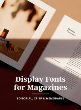
If you’re designing magazines, you want to use fonts that are clear, easy to read, and recognizable. Font choice should align with the magazine’s audience and theme to enhance visual communication and appeal.
Ciera Holzenthal Last updated: May 11, 2026 · 6 min read
The best magazine fonts feel recognizable, readable, and visually memorable across everything from magazine covers and feature spreads to digital articles and branded editorial pages. Legibility is crucial for both print and digital covers and articles, achieved through character sharpness, design precision, and consistency across different media formats. Keep scrolling for magazine fonts perfect for editorial layouts.
While there are plenty of free magazine fonts and free fonts available online, investing in a professionally developed font family often gives designers access to expanded OpenType features, multilingual support, alternate characters, and more versatile typography systems for commercial projects.
When selecting font families and utilizing OpenType features, always check the licensing terms for commercial use, as many fonts are free for personal use only. Proper licensing is necessary before deploying fonts in commercial publications or marketing materials.
This collection of fonts from Creative Market designers are excellent choices for any magazine, catalog, or print publications: they’re crisp, clean, and unforgettable.
Seriously Nostalgic Serif
Seriously Nostalgic is an eighties-inspired serif font family designed to bring bold editorial personality to modern magazine design.
The font appears striking and sophisticated in magazine layouts, making headlines and feature spreads stand out with its distinctive character. Featuring complementary italics, condensed styles, and varying contrast levels, the collection makes it easy to create eye catching magazine covers, display headings, and nostalgic branding projects
The Silver Editorial – 18 Fonts Pack
A sophisticated 18-font serif collection inspired by the bold elegance of eighties magazine typography. Fully redrawn with 9 weights, expressive italics, alternates, and ligatures, the font family blends nostalgic editorial charm with modern refinement for magazine design, luxury branding, websites, and advertising projects.
The Astoria’s Editorial Serif
Inspired by classic publishing and retro signage, Astoria’s Editorial Serif draws its inspiration from historical editorial design and artistic movements, giving it a distinctive character ideal for magazine layouts. Its crisp serifs, balanced proportions, and polished OpenType features create a recognizable typeface that feels both timeless and contemporary across print and digital projects.
Classical Typeface
Classical Typeface is a sophisticated serif font designed with timeless proportions and clean editorial styling. Inspired by classic typography, the typeface brings elegance and clarity to logo design, branding, packaging, magazine layouts, and modern web design projects.
McKenzie Headline Nineties Font
McKenzie Headline captures the unmistakable energy of late 1980s to early 1990s editorial design — bold, confident, and built to be seen. This carefully crafted serif duo distills the essence of vintage print media into a crisp, condensed type system with a matching italic that adds rhythm and attitude.
Darline Font Duo
Darline Font Duo is a refined serif and script pairing designed to bring effortless balance and elegance to modern typography. The serif family includes Light, Regular, and Bold weights, while the accompanying script introduces expressive variations ranging from clean forms to aged, slanted styles.
Eighties Comeback Serif
Eighties Comeback is a bold retro-inspired serif collection influenced by 70s and 80s magazine advertising, designed to bring nostalgic energy into modern magazine design. From condensed display styles to expressive wide letterforms, the family delivers eye catching typography that feels playful, confident, and unmistakably vintage while remaining flexible for contemporary creative use.
Magice Berries – A New Modern Serif
Magice Berries is a modern serif font that blends whimsical charm with refined editorial elegance. With soft curves, high contrast strokes, and expressive ligatures, it brings a stylish, magical feel to magazine design, branding, packaging, and logos. Carefully balanced for readability and personality, it’s a versatile typeface that adds a fresh, sophisticated touch to both print and digital creative projects.
Juliette – Modern Elegant Serif
Clean, polished, and timeless, Juliette brings a sophisticated serif style that works seamlessly in both print and digital design.
With graceful proportions, over 250 glyphs, multilingual support, and a full set of uppercase, lowercase, numbers, and symbols, it delivers both versatility and sophistication across logos, magazine covers, website headers, and commercial creative projects.
True Fate – Script & Serif Font Duo
True Fate is a carefully crafted font duo pairing a timeless script with a classic editorial serif. The script brings elegant roundhand-inspired calligraphy with a refined modern flair, while the serif draws from nostalgic headline typography for a versatile, polished editorial feel. Used together or individually, True Fate delivers a balanced mix of contrast and harmony.
The Picnic Club – 11 Fonts
The Picnic Club is a nostalgic serif font family inspired by 80s design, blending retro character with modern editorial style. With its warm vintage feel and clean contemporary structure, it delivers expressive typography that works across both nostalgic and modern design visions.
Heartbreak Eighties Retro Serif
Heartbreak Eighties is a bold retro serif inspired by glamorous 80s magazine design, blending soft edges with confident, eye-catching proportions.
Packed with swashy OpenType alternates and an oblique style, the font brings expressive versatility while remaining highly readable. Its vintage character and modern polish make it perfect for creating standout headlines with a distinctly retro, fashion-forward feel.
Nisanbel
Nisanbel is a modern sans serif typeface designed with clean structure, subtle contrast, and soft curves for a refined editorial feel.
Supporting over 90 languages, Nisanbel is a polished, contemporary type system built for global, professional design use across print and digital projects.
The strongest magazine fonts do more than simply decorate a page… they help shape how readers experience the publication. Typography influences how audiences recognize your brand, move through articles, and connect emotionally with the overall design system.
The right typography can completely transform a publication, turning a simple layout into something memorable, polished, and visually appealing. Whether you decide to download premium fonts or experiment with free magazine fonts for personal projects, choosing a sophisticated typeface with strong editorial characteristics can dramatically enhance your magazine design.
Once you’ve chosen the perfect font family, you can continue enhancing your editorial projects with photography, illustrations, branding assets, and creative resources to build a publication that feels both modern and unforgettable.
Products Seen In This Post:
The best magazine fonts are readable, versatile, and visually strong. Serif and modern serif typefaces are often preferred because they improve legibility while adding editorial personality. Many designers choose font families with multiple weights, ligatures, and OpenType features to create structured magazine layouts for covers, headings, and articles.
Yes, there are free magazine fonts available online, but they often have limited features. Premium font families typically offer better consistency, more weights, and advanced OpenType features, making them more suitable for professional magazine design, branding, and commercial use.
Magazine covers usually use bold display serif fonts or modern serif typefaces with strong contrast and personality. These fonts help create eye-catching headlines that stand out while still matching the overall editorial theme and brand identity.
When choosing magazine fonts, consider readability, font family versatility, licensing (personal or commercial use), and whether the typeface includes multiple weights and OpenType features. It’s also important that the font matches the magazine’s theme, audience, and visual style.
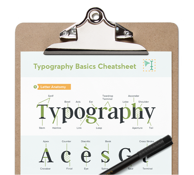
Grab this handy cheatsheet summarizing some of the most important typography terms.
Download the PDF






Welcome! I'm Ciera, I help passionate creatives, small businesses and bloggers attract their ideal customer through strategic branding and cohesive visuals like the marketing templates you see here!
View More Posts


3 Comments