Categories / News

Bad or Rad: New Zealand's New Flag

Kevin Whipps Last updated: April 10, 2024 · 1 min read

A few months back, New Zealand held a contest to select the design of it’s new flag. The country voted and has officially selected this silver fern design by Melbourne-based architect Kyle Lockwood:

Here’s what the old one looked like:
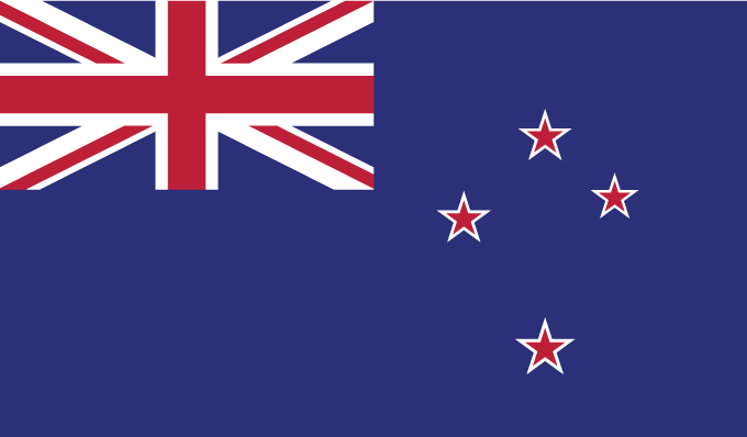
The Guardian released a video about Kyle Lockwood’s process and the decisions made:

What do you think? Is this a bad decision or a rad one?


Kevin Whipps is a writer and editor based in Phoenix, Arizona. When he’s not working on one of the many writing projects in his queue, he’s designing stickers with his wife at Whipps Sticker Co.

Lettering Worksheets
Getting started with hand lettering?
Free lettering worksheets

Download these worksheets and start practicing with simple instructions and tracing exercises.

Download now!
About the Author
Author
Kevin Whipps

Hi! My name is Kevin Whipps, and I'm a writer and editor based in Phoenix, Arizona. When I'm not working taking pictures of old cars and trucks, I'm either writing articles for Creative Market or hawking stickers at Whipps Sticker Co.

View More Posts


Go to My Shop
Related Articles
25 Comments
  • Anonymous
    uh.... 11 years ago
  • Excellent n many ways...! ALBERTO ORTEGA / CRDENTIALS: Designer for 35 yr and have designed a PRESIDENTIAL LOGO for my country MEXICO. 11 years ago
  • I couldn't tell if he was using sign language as he spoke as well. **confused** 11 years ago
  • I just don't like how too detailed it is. 11 years ago
  • I think it's sad to erase part of its heritage like that. 11 years ago
  • I love it! It often takes courage to embrace change. I understood this flag re-design to be about pride in their nation's history....past, preset and into the future. 11 years ago
  • Let me just make it clear. This is not a done deal yet. In an effort to waste as much taxpayers money as possible there's two lots of voting going on. This first round was for people to decide which of 5 designs they would want to see as a replacement. The next vote is where we decide if we take the replacement or keep the old. There's a lot that didn't vote in this first round as there was no option to mention that you wanted status quo. So it could get interesting with the next vote. Either way there'll be a few million dollar thrown away that could have gone to much better causes. 11 years ago
  • Just to clarify - this isn't the new flag yet. There is going to be another referendum and all polls are predicting that the original flag will stay. 11 years ago
  • It's a disaster - the whole process has been a mess, steered by a committee of the Prime Minister's chums without a single designer involved. Somehow despite spending $29m the government has missed explaining to the public what flag design is. One quality design has emerged called "red peak" - http://aotearoaflag.tumblr.com/. it looks like a flag and sums up ideas related to our nationhood without trying to be too literal, and the design community and pretty much everyone thoughtful about culture has swung behind it . But the public has been stuck on either not changing (ie sticking with a heavily British flag indistinguishable from Australia's) or Lockwoods ugly, overly detailed mashup. The cynic in me says well... democracy sucks, but mostly it's a lesson in what happens where there is no understanding of design, design process, let alone flag design. 11 years ago
  • the final referendum is in March... 11 years ago
  • I think the design on the fern is a bit too crafty. Call me old-fashion but I think it would look better as a seal/coat of arms sort arrangement - like the eagle on the Mexican Flag. This just kinda... smacks of something someone whipped up on paint... nice in its own right, but not really something I could see being flown across a nation. I like the concept though, it could just use a few more drafts. The black against the silver is kind of interesting; reminds me of the Maori designs. Not sure if that's what he's going for, but if that's what he means by "our history", it's really cool that he gave the Maori a shout-out in his flag -- even if it is subtle. I don't know, maybe I'm imagining it. 11 years ago
  • Not to mention this is one of two almost identical Kyle Lockwood designs which made it to the final five. Lets see what happens in the next referendum 11 years ago
  • I didn't vote for any of them and in the final vote I'll be voting against changing it to this cartoon. Hideous idea to change it. The designer doesn't even live here. 11 years ago
  • I get the feeling after reading Tim's comments and looking at the link he posted the government there doesn't even want the change to go through. It wouldn't surprise me if we find out that the vote was skewed in a way so come March people have no option but to vote for no change. 11 years ago
  • I even kinda like it although the Red Peak one was my fav. 11 years ago
  • Thank you Tim for sharing the extra link! I'd say the "First to the Light" flag has a much stronger case behind it design-wise while still retaining a lot of historical references. I'd hate to see what the US would do if this ever came up. 11 years ago
  • Thank you Tim Gummer! I really agree, the flag in the link is much much better and well designed in its simplicity! 11 years ago
  • I don't like it at all, too detailed. I however love the one Tim linked to! It's really nice :) 11 years ago
  • Back to the drawing board as far as I'm concerned. As many of you have commented, Flags are (or should be) a simplified representation of culture and heritage. Not a 'logo' based design. The silver fern should not be there at all. That has been developed as an icon representing sporting teams. The heritage of NZ is a blend of British sovereignty and Maori culture. Surely a simplification of the Union Jack somehow blended with Maori Koru motif, in red back and white could be the answer we are all looking for. I guess another ex-pat Kiwi, like myself will have to take the reigns…. again… …and what gives, having an Aussie design a Kiwi flag! What The!!!! 11 years ago
  • I like it. Much better. 11 years ago
  • Thanks Tim Gunner! This one is a winner!! http://aotearoaflag.tumblr.com/. 11 years ago
  • http://aotearoaflag.tumblr.com/ this one is way better, but it does need to adjust the blue to have clear distinction when in smaller size. 11 years ago
  • I came here specifically to point out that this hasn't been decided yet. But was VERY pleased to see a few others have already jumped in to say that. We have yet to vote on whether or not we actually want to change the flag... such a stupid backwards way to do things. 11 years ago
  • Red Peak is a flag. The other is overthought, it only makes full sense when explained. 11 years ago