



or dark mode is an aesthetic choice offered on many popular websites and apps that you access today, across all device sizes. Instantly recognizable, dark theme is an alternative to what we’ve usually seen when we access our favorite websites or apps: the dark-on-light color scheme, which was originally designed to simulate the appearance of ink on paper. An obsession of sorts of late among user interface designers, night mode (as it’s also known) features a light-on-dark display where fonts are white (or a light color) and backgrounds are black. This design trend has turned traditional web design on its head since interfaces have traditionally been created with white backgrounds in mind. The end result of dark theme is an aesthetic that’s sleeker, sharper, and is said to be friendlier to your eyes (although there’s debate about this), which apparently enhances legibility and readability and, by extension, also the user experience of your website or app.
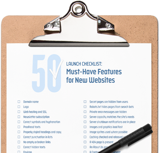
Check off these items before you go live and make sure that your visitors get the best possible experience.
Download your checklistThe Principles Behind Dark Theme
Certain taboos in design are celebrated in this design trend. Therefore, feel free to look at dark theme as web design’s version of Bizarro, the fictional DC comics supervillain who’s a twisted mirror image of Superman. However, unlike Bizarro, this style is actually appealing to look at.
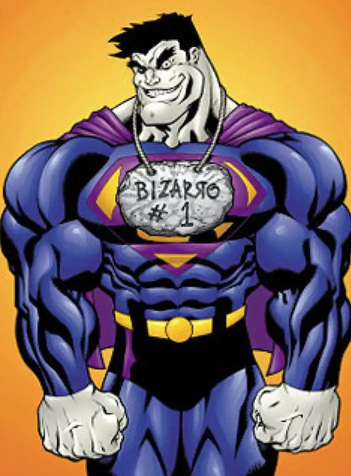
Image Credit: DC Comics
In dark theme, every convention that you’ve been used to since you started visiting sites and apps has been flipped around:
- Instead of being black, typography is now bright
- Instead of being startlingly white, backgrounds are now dark
- Instead of the bright glare of screens attacking your pupils and causing you to squint, screens are now more soothing and tolerable (especially at night)
We’ve just hit on another one of dark theme’s major principles: it actually goes easy on your eyes (according to its proponents). If you’ve ever been annoyed by or had a physical reaction of aversion when you had to stare at a bright screen thanks to the traditional dark-on-light display, you now have a choice (especially at night).
Achieving sufficient contrast for legibility and readability is said to be at the heart of the dark theme design trend–as is the case with the original dark-on-light interface. However, there’s no consensus on whether or not dark mode actually succeeds in reducing the strain on your eyes from looking at webpage after webpage for hours on end.
For instance, Popular Science spoke with user-interface designers at Twitter and Reddit, concluding that dark mode is indeed gentler on your eyes than the traditional interface of black-on-white. This is especially noticeable when night falls, and the contrast of a bright background lighting up your environment is all the more prevalent. UK computer scientist Silas S. Brown, who works at Cambridge University and has CVI or cortical visual impairment, also concludes that eye strain from screen glare is reduced thanks to this design trend.
On the other hand, you have scientific research that contradicts their opinions. Studies like Positive Display Polarity Is Advantageous for Both Younger and Older Adults–by Cosima Piepenbrock, Susanne Mayr, Iris Brock, and Axel Buchner from Germany’s Institut fur Experimentelle Psychologie, Heinrich-Heine-Universitat–conclude:
“Dark characters on light background lead to better legibility and are strongly recommended independent of observer’s age.â€
The takeaway, then, is that using a dark theme is a matter of preference, although it is more visually attractive than the plain, white backgrounds we’re all used to.
Make up your own mind by having a look at some of the many dark themes from our marketplace:
- This new style inverts traditional color schemes
- There’s no conclusive evidence that it produces less eye strain (though you may feel like it reduces eye fatigue)
- It does save battery life on specific phones
- It is sharp and dramatic from an aesthetic standpoint
The History of Dark Theme
Even the history of this design trend is obscured by contention, just as the claim that it reduces eye strain. If we look to the tech world, this recent trend likely began with Twitter. The social media website and app first experimented with a light-on-dark color scheme for Android phones back in 2016. While the company’s been criticized for not offering its users a sufficient night mode, it lost ground to other big tech brands that rolled out their own dark themes in subsequent years:
- Wikipedia
- Facebook’s Messenger
- Google Chrome
- Apple’s Mojave OS
- Microsoft Outlook
- Gmail
- YouTube
- Apple’s Safari
- Google Maps
- Feedly
- Firefox
Let’s expand our horizons and look further back than the apps that today dominate our screens and lives.
If we travel back in time to 1991, some of us would be using Apple’s System 7 OS, which was called CloseView and–you guessed it–offered a dark theme.
If we think outside of just operating systems, then we have even earlier examples of this style. For instance, old-school video and photo-editing software, which required a neutral-colored background, could be considered a very early form of dark theme. And let’s not neglect to mention very early computer monitors that had that soulless green-on-black appearance (green fonts on a black background).
This segues into an eye-opening revelation: dark mode can also be considered a retro trend of sorts because it is a throwback to the early days of programmers plugging away on computer terminals, where light-on-dark displays have always been present in code editors.
As far as the Internet is concerned, it’s only going to pick up steam from here on out. Look for more of your favorite web destinations to display this inverted color scheme in the months and years to come (until the next, hot web design trend).
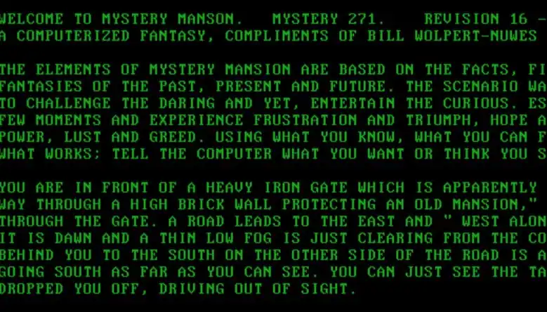
Image Credit: Newton.FreeHostia.com
As a side note, we can’t ignore the origins of the traditional, dark-on-light approach to interface design. Understanding its roots helps to shed light on why this inverted color scheme is such a jarring adjustment for many users. Put simply, we’ve been ingrained to absorb content via a dark-on-light approach since virtually the first humans roamed the earth. Historically, we’ve been writing dark-on-light since paper was first invented in China back in 100 B.C. Going back farther than that, we also were writing dark-on-light when Neanderthals were painting with red “ink†on bright cave walls some 64,000 years ago.
The Design Characteristics of Dark Theme
It seems like there’s always a new design trend that captivates the web every so often. If we go back 10 years or more, we remember once-beloved aesthetics like skeuomorphism (that’s on you, Apple) that, however, quickly fell out of favor as soon as huge tech companies like Apple withdrew their support for it. In place of skeuomorphism, more minimalist design trends like flat design entered the picture, which is still the standard in many interfaces that you use and enjoy today. Of course, Material Design, which is Google’s handiwork and a good example of flat design, is apparent in many of the company’s product and service offerings. With dark theme now giving the other trends a run for their money, it’s high time that we identify what makes it unique in its own right:
- Light-on-dark design dynamics
- An inverted color scheme that’s not always straightforward (for example, some dark theme layouts feature grayscale fonts instead of pure-white fonts on black backgrounds)
- A lot of negative space
- Neutral colors
- Softer, soothing color hues and tones
- Stark contrast
- Dramatic overtones
- Mysterious, even cryptic evocations
- Energy conservation
It would be incorrect to simply call this style a darker version of what we’re normally used to seeing since there’s more going on than just a straightforward, visual, color-scheme inversion. With a dark theme, you get an entirely different UX, leading to actual changes in user perception on the same website or app.
Have a look at another round of dark mode themes from our marketplace to see if you can spot these design characteristics:
Stunning Examples of Dark Theme
The Internet is replete with a plethora of dark themes, so let’s have a look at our favorite selections.
Twitter iOS
The one that started it all, this social-media giant makes the look available to its users via a small lightbulb icon on the bottom left of your mobile screen. Tap it once to switch between dark-on-light and light-on-dark. The icon is accessible when you swipe left from the home, search, notifications and messages screens. Interestingly, the only colors that are not inverted and stay consistent are the blue color for links, tagging and hashtags that are part of tweets and the green color that indicates retweets. Everything else is pretty much a complete flip from the traditional white backgrounds of Twitter.
Google Chrome Desktop
For the desktop version of Chrome, it’s easy to turn your entire UI into a dark theme. It takes a few steps, but all you have to do is first get the Dark Mode add-on from the Chrome webstore and enable it for your browser. Once added, you can toggle between white and black backgrounds as your heart desires (though, sometimes, it also takes a website refresh to activate).
The impact of dark theme on a desktop, especially if you’re on a 27-inch iMac is very dramatic, to say the least. Due to the size of the desktop, the amount of screen real estate that’s pitch-black is much more in absolute terms than on a much smaller mobile screen. Depending on what site you’re navigating when you switch to this mode, the change can be quite the challenge to get used to.
 Essentially, everything except the colors of the titles and URLs of SERPs (search engine results pages) inverts.
Not everything is smooth sailing, however. Clicking on the “About this result†question mark for Featured Snippets (those big boxes at the top of the SERPs) in dark theme simply shows…a black page.
Essentially, everything except the colors of the titles and URLs of SERPs (search engine results pages) inverts.
Not everything is smooth sailing, however. Clicking on the “About this result†question mark for Featured Snippets (those big boxes at the top of the SERPs) in dark theme simply shows…a black page.
Wikipedia iOS
Wikipedia is available on this style on desktop, tablet and mobile. For our purposes here, we’re going to look at the iOS version of its app.
Switching to dark theme takes only a few taps: 1) On the main Explore screen, tap on the gearwheel in the top-right corner, 2) in Settings, tap Reading preferences, and 3) tap on dark.
 It has to be pointed out that Wikipedia offers an even darker “black†mode, which essentially turns your background in the app to pitch-black rather than just dark. Overall, you can switch between Default (which is white), sepia (a dimmer white), dark and black.
One benefit rendered by this aesthetic, at least in this app, is that it makes borders and edges easier to see right away. This helps tremendously when scrolling down columns and looking across rows for encyclopedia entries because you can see where one ends and the next begins with more clarity.
It has to be pointed out that Wikipedia offers an even darker “black†mode, which essentially turns your background in the app to pitch-black rather than just dark. Overall, you can switch between Default (which is white), sepia (a dimmer white), dark and black.
One benefit rendered by this aesthetic, at least in this app, is that it makes borders and edges easier to see right away. This helps tremendously when scrolling down columns and looking across rows for encyclopedia entries because you can see where one ends and the next begins with more clarity.
YouTube Desktop
Accessing dark theme on the desktop version of YouTube is straightforward. You have to be signed into your account. Once you’re signed in, just click on your picture in the top-right corner to reveal the dropdown menu. The dark theme option is sixth from the top: Click on it to open up a smaller informational card that has a toggle for turning the aesthetic on and off. This mode is available on mobile and tablet as well, although you have to turn night mode on and off separately for each device.
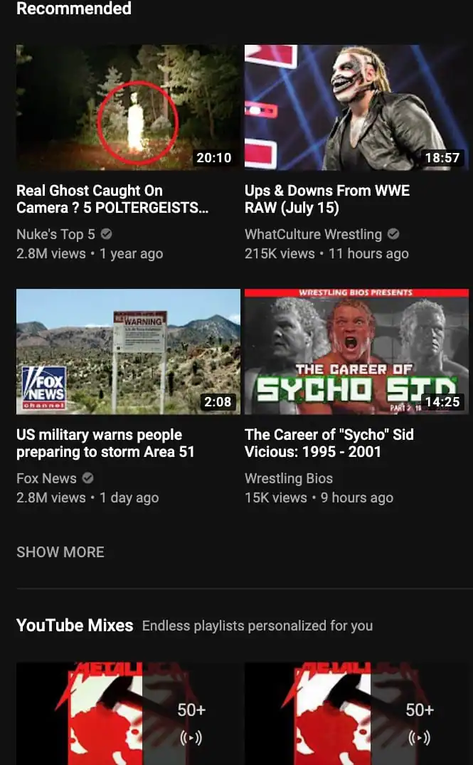 Visually, YouTube is a platform that uses a card-based layout to sort the plethora of videos from its library on its interface. Due to the contrasting colors displayed in the thumbnails for each video, it’s actually easier to tell where one card for each video ends and the next one begins when dark theme is turned on.
With the original, white backgrounds, the spacing between the cards isn’t sufficient enough to always quickly make it clear where one video ends and another begins.
Visually, YouTube is a platform that uses a card-based layout to sort the plethora of videos from its library on its interface. Due to the contrasting colors displayed in the thumbnails for each video, it’s actually easier to tell where one card for each video ends and the next one begins when dark theme is turned on.
With the original, white backgrounds, the spacing between the cards isn’t sufficient enough to always quickly make it clear where one video ends and another begins.
Gmail Desktop
Turning your UI black for reading emails takes a bit of getting used to. In fact, this is an example of a situation where going to a dark theme is more challenging for legibility and readability than staying with the lighter background. In Gmail’s night mode, the typeface for text isn’t pure white (it’s more along the lines of gray), which is harder to read against an all-black background than when the dark text is put on top of a gray background (as is the case with the default color scheme). To be fair, though, Gmail’s default background is dimmer than pure white, which explains this issue.
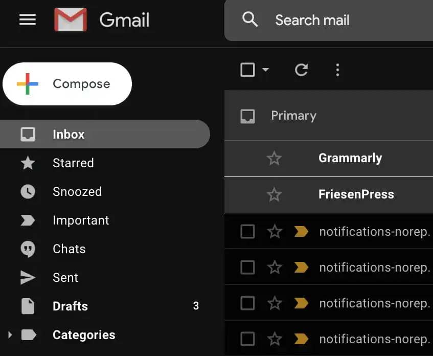 One noticeable change is that colors for important emails, labels and attachments stand out more aggressively on this black background.
The Pros and Cons of Dark Theme
By now, you’ve probably clued into the fact that this new style is a mixed bag. No one doubts that it’s sleeker than the plain, white backgrounds we’re used to, but there’s definitely debate about which color scheme is actually better for the all-important basics such as UX. After all, a trend can look as attractive and unconventional as possible, but if it has problems with usability, then it’s not going to last for long and may even be abandoned altogether (like what happened with the aforementioned skeuomorphism). With that in mind, here’s a quick rundown of the pros and cons of the dark theme aesthetic. Pros
- Increases the dramatic element of any design
- Perfect for an interface where the environment matches the activity (for example, navigating Hulu in dark theme at night when deciding what show to watch)
- Makes colorful content such as cover art stand out more aggressively
- Helps to focus the user’s attention with greater strength
- Generates emotion better than a white background
- Supports information architecture as well as design hierarchy
- Is ideal when the content on a site or app is relatively minimalistic
- Optimizes the feeling of luxury and prestige
- Not well-suited for data and copy-heavy interfaces
- Not ideal when using a lot of different content all together, like video, pictures, copy, data tables, dropdown menus, web forms, etc.)
- Harder to pair colors for copy against a black background, so that legibility and readability are easily maintained
A Design Trend for Specific Uses
Dark theme is currently enjoying its time in the limelight. Though it emerged a few years ago already, it’s been picking up steam of late, as more and more big tech platforms all across the web offer their users the option to go dark. Initially intended to help you reduce eye strain from the effects of staring too long at your screens, this style hasn’t been conclusively determined to help in that regard. Two areas where there’s no dispute about its impact are in the aesthetic department and battery-life arena. Still, that won’t stop big tech platforms like Reddit and Twitter from claiming that their dark themes do just that. At the end of the day (or night), it comes down purely to personal preference, like so many things with design trends. If you enjoy a more dramatic and sharper feel to your interfaces, activate this style on your devices. If you’re happy with the traditional, white backgrounds, keep using those!

Check off these items before you go live and make sure that your visitors get the best possible experience.
Download your checklist


Marc is a copywriter and marketer who runs The Glorious Company, a marketing agency. An expert in business and marketing, he helps businesses and companies of all sizes get the most bang for their ad bucks.
View More Posts



6 Comments