
Design Fails: 10 Times Typography Ruined the Day
If typography design fails make you cringe, you've come to the right place! Here are 10 humorous typography mistakes that prove that some people just don't care about things like kerning and font choice.



Typography, the art and science of displaying letters to make the written word read well and also visually pleasing, is a fickle beast. While you naturally don’t expect design fails to happen when you arrange type for graphic design, they occur with enough frequency to make you shake your head.
Don’t these brands and people review their designs before making them public for all to see? Sadly, the answer is no, but that’s good news for all of us who have a sense of humor.
Typography design fails catch you by surprise, just when you least expect them to. Maybe it’s those letters that just happened to suffer from too little kerning, or perhaps it’s that wordmark logo that just wasn’t thought out well enough in advance.
Whatever the reason, these font fails proved to be mighty embarrassing for their creators. Let’s relive this awkwardness all over again with 10 times typography ruined the day.
1. Our Food’s Really Not That Bad…I Swear!
Opening a restaurant is one of the hardest business misadventures you’ll ever get yourself into. All you have to do is look at the countless examples of restaurants gone bad on shows like Robert Irvine’s Restaurant: Impossible and Gordon Ramsay’s 24 Hrs. to Hell and Back to appreciate this inarguable fact of life.
In all fairness, the failing restaurants on those shows usually suffer from a mix of bad:
- Food
- Service
- Execution
That’s why it’s downright refreshing when a restaurant’s problems can be blamed exclusively on its poor typographical choices, for a change.
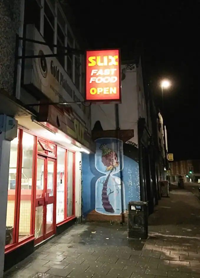
Image Credit: imgur
As far as design fails go, this one’s going to be quite difficult to live down. When the name of your restaurant already implies that your food sucks, though, it’s going to be hard convincing people to even set foot in the door.
Clearly, this is an example of a wordmark logo that should’ve first been rigorously reviewed by the restaurant’s brand team prior to being immortalized forever in its signage.
2. Just a Little Bit of Tracking Can Help You Stop Squinting so Hard
If something’s hard to read, your natural reaction is to immediately squint your eyes to try and make sense of what you’re struggling to read. Sometimes, it works; other times, you’re just screwing up your face for no good reason.
One of the primary causes of words being hard to read is when the letters are simply too close together. This squished-up effect makes it appear as though what you’re looking at is just one, big unit instead of individual characters deliberately strung together to create a word and a meaning.
The solution to design fails like this is simple, of course. It’s called tracking. In non-typographer terms, it’s essentially letter-spacing, ensuring that the spaces in between each character in a word are the same. This generally creates a pleasing effect and gives your brain enough room to make out each letter.
It’s understandable when someone just starting out in typography fails to understand this, but what about when the entire design team behind a powerful brand in the art world totally gets this wrong?
That’s exactly what happened a few years ago to The Met–aka, the Metropolitan Museum of Art–New York City’s storied art museum that’s now celebrating its 150th year in 2020.

Image Credit: Vulture
In 2016, it unveiled its new wordmark: an insanely jumbled-together series of letters that spelled out “The Met,†but which looked all squished together and connected by ligatures.
Unsurprisingly, the reaction was almost universally negative to this travesty of a design fail, which just goes to show you that even prestigious brands aren’t immune to typography disasters.
3. Irony Is Such a Cruel Mistress
Few things in life are funnier than irony, when an intended meaning is immediately contradicted by the way in which it’s expressed. Irony comes in all shapes and sizes, yet it’s particularly biting when conveyed through the written word. This is what makes it such a vital element of some design fails.
The Sliding Door Company is a worldwide manufacturer of beautiful, interior glass doors for all sorts of purposes. However…when you visit one of their locations, you’ll see that you’re entering through a regular doors on hinges that you have to pull (not slide) open! Naturally, they can’t avoid this, but it still creates unintentional humor, especially when you see the company’s wordmark logo proudly emblazoned on their entry doors.
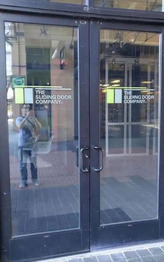
Image Credit: imgur
In the picture above, one passer-by thought it was funny enough to take a snapshot, and we can’t blame him.
4. Stock-Photo Madness Make Memorable Design Fails
Stock photos are ubiquitous. As graphic designers, web designers, illustrators, content marketers, and other creatives, we’re all familiar with them. We’ve likely had to use them many times over in various projects in which we were involved.
We’re also familiar with how easily they can be exploited for comedic effect, such as that cliché image of several businesspeople dressed in stiff business attire, all shaking hands and smiling widely in a very contrived way.
In this next example, that’s not where the typographic fail occurred. Rather, it occurred because someone didn’t remove the problematic watermark before using the stock photo in their café’s wall mural.
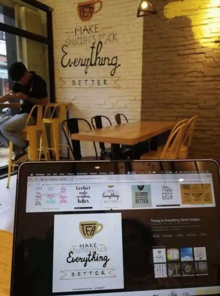
Image Credit: imgur
In this unknown café, notice how the Shutterstock watermark still rudely interrupts the flow of the messaging (which is to say nothing of the obvious typo, to boot!).
If only the owner would’ve actually paid for the image and removed the watermark, so we could all properly contemplate the profound, eternal truth of how “tea make everything better…â€
5. Heinous Vertical Font Arrangement
Typographers understand that, sometimes, the frame in which you’re working is too narrow to properly accommodate a long phrase. In order to deal with this and avoid design fails, mindful typographers usually reduce the size of the font or maybe even use a different typeface altogether.
However, others–presumably non-designers (at least we pray they’re non-designers)–think they can get away with just stacking a longer phrase’s letters on top of each other to get the meaning across, just the same. The end result is usually a visual train wreck.
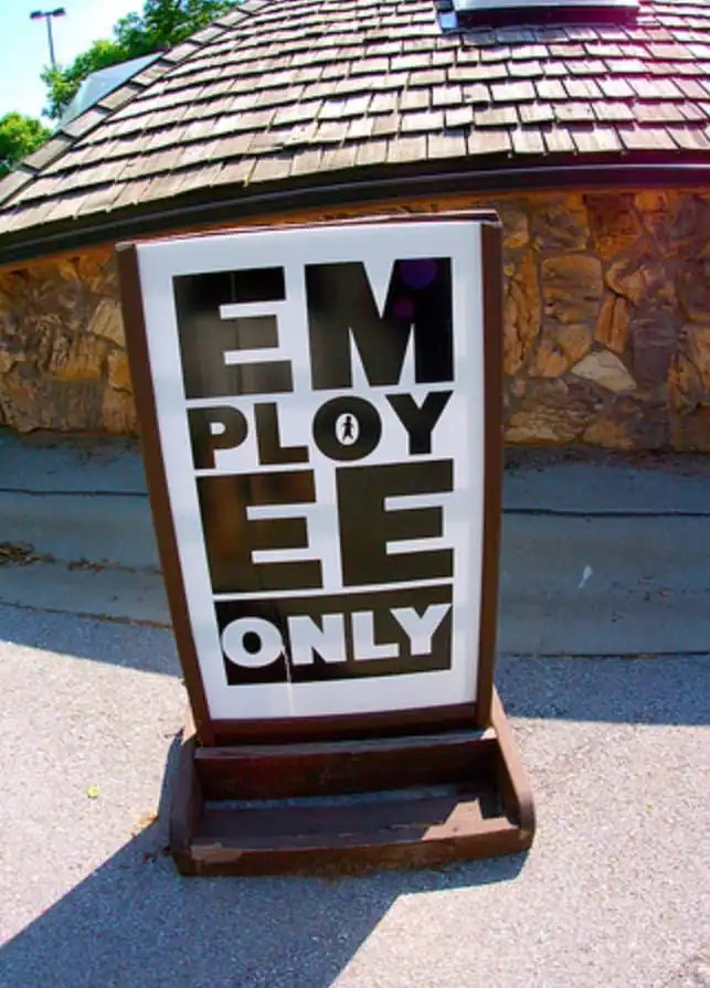
Image Credit: ECC Art 41 – Blogspot
In this case, someone thought it was perfectly acceptable to vertically stack the common phrase “employees only†(in this case, employee only), using slab fonts and without proper hyphenation.
People who see the sign are instead treated to a sign-based word salad that, upon first glance, makes it almost impossible to understand. Is it stylized? Is it some type of attempt at shock or maybe even Andy Warhol-esque pop art? Your guess is as good as ours.
6. Maybe Going With That Horror-Movie, Blood-Red Font Wasn’t the Best Idea…
Ah, clowns. We love ´em. We hate ´em. Some of us are totally scared of them, in which case we’re suffering from something called coulrophobia.
If there’s a consensus at all about clowns, it’s nonetheless that they’re ideal for children’s birthday parties. In fact, you could say that they go together with children’s birthday parties like love and marriage…or like a horse and carriage. You get the point.
Sometimes, though, clowns don’t always have their typography and branding down pat, so to ensure effective messaging. And who can blame them? After all, they have more important things to do, like making balloon animals, but this leads to font design fails that needn’t have happened.
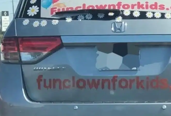
Image Credit: imgur
Check out the font used in the URL for this clown business. While the typeface used above in the car’s rear glass is fun and innocent-looking with its bubble letters…the font used for the same URL just underneath the car’s license plate looks like it would be a better fit for a teen-slasher horror movie.
This is also an example of what happens when your branding is off, as the color and style of the typography evoke images of gore–not really the theme of fun and play that you’d expect at a children’s birthday party.
7. But Your Pizza Will Still Be Delivered in 30 Minutes or Less (if We Feel Like It)
If you’re running a pizza joint, you face a lot of competition. That’s why any opportunity to advertise your specials is such a big deal. An opportunity to use large signage next to a busy road seems like the ideal opportunity…but only if it’s used effectively.
This particular Pizza Hut didn’t seem to get the memo on how crucial it is to nail roadside advertising.
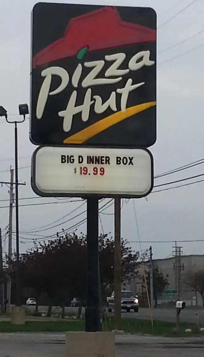
Image Credit: imgur
While it very well may be a “healthy†dinner option with a lot of protein and carbs, this location’s “Big D Inner Box†offering actually doesn’t sound very…appetizing. And they’re charging $20 for that? Seriously?
This raises two, very important questions:
- What’s a Big D?
- What’s an Inner Box?
If only the employee putting up the sign cared about–drumroll, please–kerning!
This letter-spacing mistake between the D and I could easily have been fixed to avoid this embarrassment and potentially many lost orders of their delicious Big Dinner Box.
8. Let’s Just Do Some Cardio Instead
Many of us have wanted to lose weight at some point or other in our lives. Maybe it was for health reasons; maybe it was to just feel better about ourselves. Whatever the reason, losing weight is always a good goal to have.
If you’ve ever tried to lose weight, you know that there are a whole host of different diets, programs and a whole cornucopia of exercise regimens that promise you you’ll succeed. Some of them sound too good to be true.
Miraclesuit is a company that manufactures slimming swimwear, so you can look and feel 10 pounds lighter.
In Calgary, apparently, they call this line of swimwear something a little bit different than down in the States.
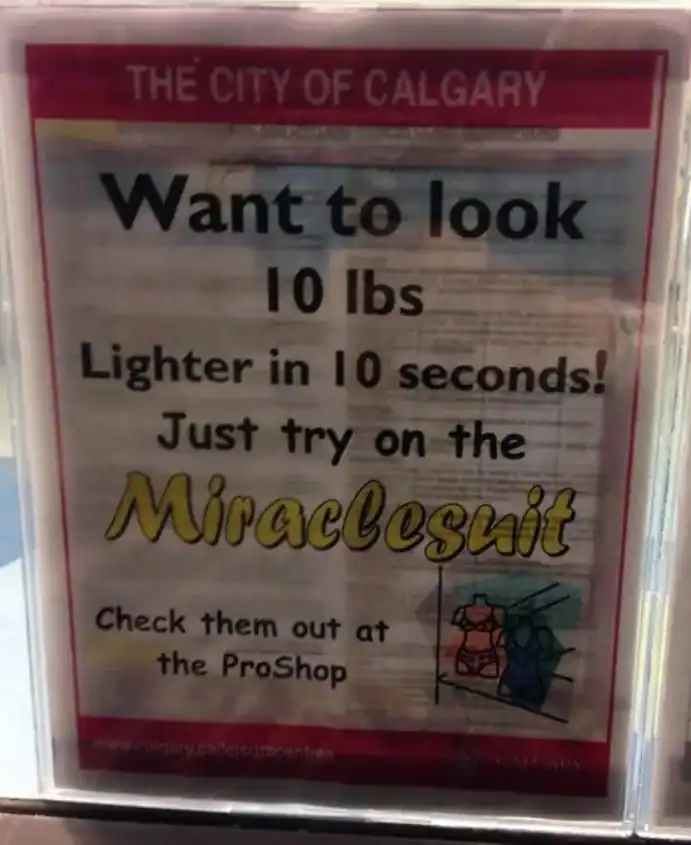
Image Credit: Buzzfeed
Meet the Miraclesnit–guaranteed to cause irritation of some sort.
Here, the clear culprit is the choice of font for what’s supposed to easily read “Miraclesuit.†The font’s script-based aesthetic makes it very easy to mistake the lowercase u for a lowercase n, totally butchering the meaning of the word. If the bowl in the lowercase u wasn’t so sharply diagonal, then it wouldn’t come up so high and imitate the shoulder of a lowercase n.
Design fails like this could be avoided with some understanding of font anatomy
9. An Atrocious Acronym Attempt
Acronyms are a popular typographical device that can be very snazzy and memorable, thus making them sharp, mnemonic devices, too. Again, though–only if used correctly. If they’re not, look out! They are design fails just waiting to happen…
Here’s an example of a well-known acronym:
Self
Contained
Underwater
Breathing
Apparatus
Note how SCUBA is its own word that’s formed from the initial letters of each of the words in the acronym. It’s easier to remember SCUBA than self-contained underwater breathing apparatus.
In all fairness, coming up with an effective acronym can be challenging. The longer the word, the harder the acronym will be to create, as well. However, none of this should be an excuse for trying too little and then coming up with an acronym that’s just a bunch of random words forced into the arrangement to create a very contrived acronym.
While SCUBA works well as an acronym, the word “karate†doesn’t fare so well, at least not in our following example.

Image Credit: imgur
A train wreck of an acronym, this is what happens when someone just arbitrarily forces words into the starting word, with no relation or connection to anything. Bonus points for the silhouette of the karate man “kicking†the uppercase T!
While this is probably a sign for self-defense classes of some sort, the use of typographical design fails like this one is likely to inspire more laughter than actual confidence in fending off attackers.
10. Mooooo!
In another epic example of how typographical design fails can afflict brands both unknown and large, this one proved to be embarrassing to Chanel, the billion-dollar, French luxury company known for perfumes, high-end clothing, and other glitzy things.
It also illustrates how scripts can be a dreadful contributor to making things less readable, if you’re not paying attention to the specific type of script that you’re using, as Chanel did in this design fail.
In advertising that eluded to its founder, Gabrielle Bonheur Chanel (nicknamed “Cocoâ€), Chanel produced a slew of posters with the phrase “I Love Coco.†They even hash-tagged it, making it easy to share on social media. So far, so good, right? There’s certainly nothing wrong with that phrase, both from a branding and marketing perspective. It alludes to its founder and is short and easy to remember.
So what’s the problem?
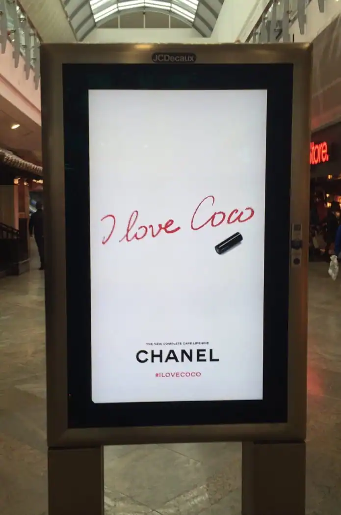
Image Credit: Gavin Olukoju
Well, for starters, it actually reads: “I Love COW.â€
The way that the stem of the lowercase c connects to the lowercase o–by failing to completely close off what intends to become the bowl of the lowercase o–makes the last two letters read like a w. Also, the fact that this ad is so clean and minimal, with its massive use of white or negative space, draws more attention to this already glaring typo. It is design fails galore.
As a result, people looking at the ad think that Chanel is suddenly promoting the dairy industry–and its new line of cow-inspired clothing–in a big way.
Remember to Always Review Your Typography Before Launch
We hope you’ve enjoyed our journey through some of the most cringe-worthy typography messes in recent history. Of course, the secret to avoiding these design fails–and most of them could’ve easily been avoided–is to simply review your font selections before your design goes live.
It’s really not that much work. Just review a few, key things like the kerning, tracking, readability, legibility, and spelling of your message.
The other side of the coin is that, sometimes, you can’t avoid design fails because there will always be those who insist on creating and displaying bad design (Karate-acronym sign, we’re looking at you!).
Hopefully, though, these examples all served as wonderful teachable moments for you, so that your designs never find themselves as featured subjects in any terrible-typography listicles such as this one.
Products Seen In This Post:
Designer life got you down? We designed this coloring book to help you laugh, relax, and celebrate the things that make our craft unique.
Get your book


Marc is a copywriter and marketer who runs The Glorious Company, a marketing agency. An expert in business and marketing, he helps businesses and companies of all sizes get the most bang for their ad bucks.
View More Posts




11 Comments