



A logo design checklist allows you to prioritize and ensure that your brand design communicates exactly what you intend. Far too many businesses fail to invest enough thought into their logos, with consistently bad results.
Brand identity is something you should take seriously because it is the foundation of a business’ relationship with its target audience. Once this demographic gets to know a brand in a certain way, it’s hard to rework this impression in the marketplace. That’s why planning out what elements your client wants in their brand identity suite will set you up for success as your logo design shapes how the brand is viewed by the public.

A fun, friendly, FREE guide to build a stellar brand identity.
Download now!Here are the 20 essential items to include in your logo design process:
Consider All the Types of Logos
The best place to start as you conceive your client’s brand identity is the different kinds of logos at your disposal. These are the directions in which you can take your logo design concept:
- Wordmarks — All-text logos that feature eye-catching and stylized typefaces; ideal for new companies to help build brand identity and recognition
- Emblems — Logos that feature text inside of the overall design (icon or badge); ideal for established brands, as these tend to be more visually complex
- Brandmarks — Logos that feature no text, but only symbols or icons; good for brands that become more popular over time
- Lettermarks — Initials-only logos that don’t use words, but, rather, abbreviations; well-suited for brands with long names that don’t transition well to a simple icon
- Combination marks — More ambitious logos that include both symbols or icons and text; great for brands that need instant name recognition, but also visuals for a stronger impact
Research Your Client’s Target Audience
Information about your client’s target audience is critical to new logo success. Knowing for whom you’re designing the emblem as part of the broader brand identity gives you the pertinent data to make the design more:
- Relevant
- Applicable
- Meaningful

For instance, if you’re crafting a new symbol for a kid’s brand, you wouldn’t want to use serious colors like blacks and other neutral tones. You’d likely go with something brighter and livelier.
Image Credit: Ezra Comeau-Jeffrey
Find out more about your target audience by:
- Asking your client
- Researching the industry
- Conducting surveys of the target audience
Draw Sketches of Your Logo Idea

Strong logos start with simple sketches. This is the brainstorming, early phase of your creative journey. The beauty of sketching is that it lets you do a brain dump of your visual ideas right onto a sheet of paper. You can then easily revise and change the details as you go.
Image Credit: @plqml | @feliperizo.co
Of course, you can refine your new logo afterwards using a program like Adobe Illustrator. Sketching, though, is ultra-important since it’s the starting point of the tangible process of logo design.
Create a Black-and-White Version of Your Logo
Let’s start with a curveball right off the bat: creative professionals and designers should definitely go to great lengths to include a monochrome version of their logo. This may grab you by surprise since the costs of printing in color have come down considerably and black-and-white seems so old-fashioned.
Here’s why you shouldn’t write off a black-and-white version of your new logo:
- They’re ideal for uses like textiles, 3D printing, embroidery, receipts, and laser engravings, which rely on special machines that don’t have a color feature
- You can fax and or copy a black-and-white logo without worrying about the color fading
- In collaborations with other brands (like corporate sponsorships), logos could be presented in monochrome to prevent anyone in the partnership from standing out
The bottom line is that you’ll create a much, much better impression on behalf of your client if you can furnish them with a black-and-white version of the new design.
Ensure That Your New Logo Design Is Versatile
We hear the word “versatile†thrown around so much in design considerations, but what does it actually mean? Versatility is a direct reference to the utility–or the number of uses–of your new creation. Never forget that the icon you’re designing for your client needs to be seamlessly integrated in a host of different ways, such as:
- On various surfaces (T-shirts, ballcaps, water bottles, etc.)
- In different sizes (billboards, business cards, websites, apps, etc.)
- On both vertical and horizontal banners
- Next to other brands’ logos (partnerships, collaborations, etc.)
Therefore, a logo that features versatility is one that looks great and communicates the same brand values on a giant billboard right beside the freeway as it does online, in any screen size and on any device.
The mark of a stellar designer is having foresight and thinking several steps ahead to visualize how and if your new logo will actually work in a myriad of contexts. Failure to do so means that your client’s logo may look great on a large-sized billboard, but then perhaps have so much complexity that it’s hard to properly appreciate once it’s shrunk down digitally to fit on a website.
Give Consideration to Shape
Logos are by nature all about shapes. Whether it’s just one, specific shape that’s front and center, as with Target’s circle motif, or shapes form the basis of the broader logo design, as with McDonald’s “M†being formed by two arches, shape is the building block of your new logo.
Shapes are so vital to your client’s brand identity that, even if you’re using lettermarks or wordmarks, your fonts will still be heavily influenced by forms.
Develop the Concept

When we speak about brand identity, we mean what separates your client’s brand from the rest of the field in the crowded marketplace. The new logo needs to tell people what your brand’s values and personality are in clear-cut ways. Your logo must reflect your target audience’s preferences, which you will have gleaned from market research that you performed at the very start of the process.
Image Credit: Patrik Michalicka
To help with the development of your client’s brand, ask yourself:
- Is it serious or humorous?
- Is it for a high-end or cheaper product or service?
- It is meant to be trendy or classic?
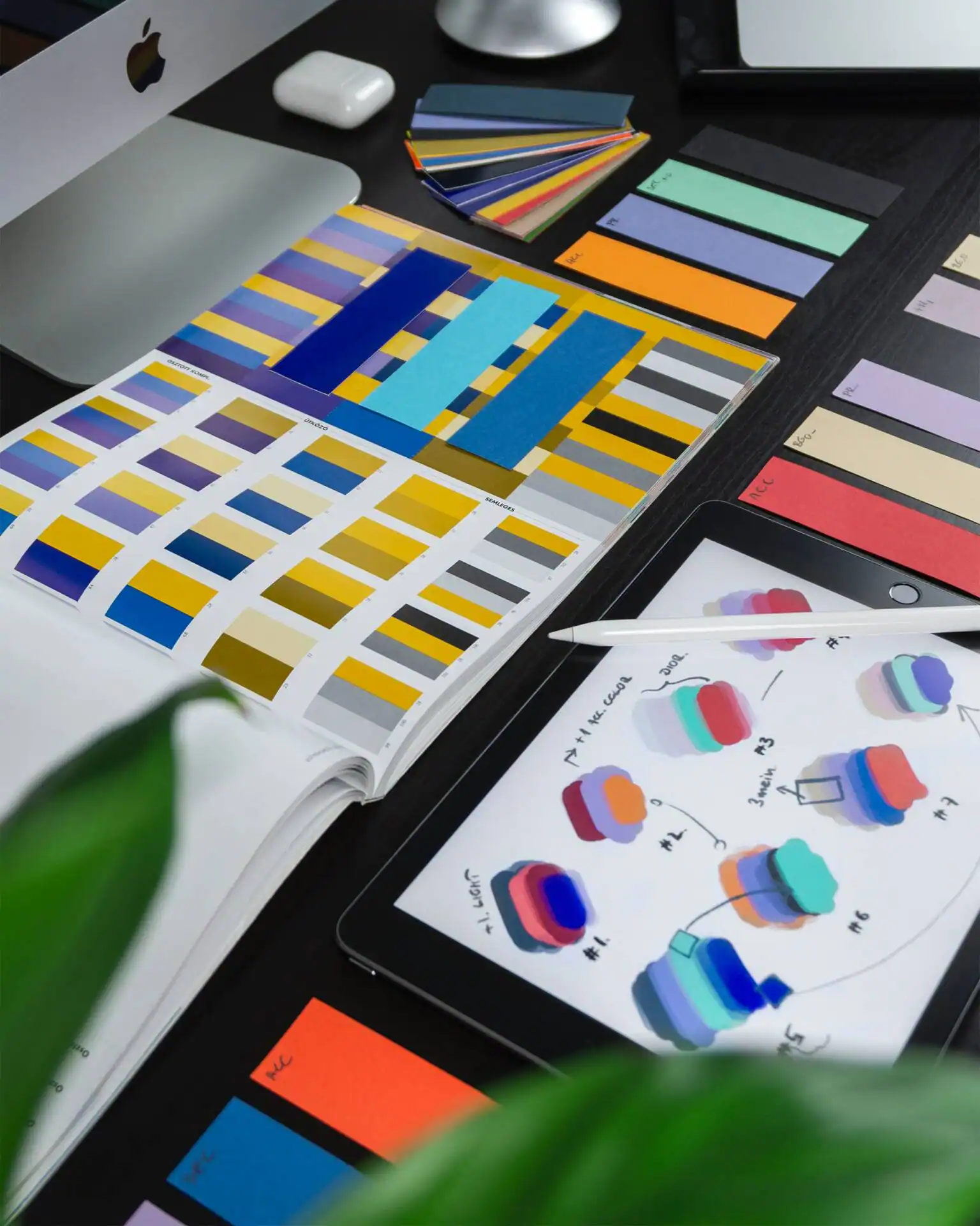
Think About Your Color Palette
Getting the right color or combination of colors is crucial to new logo design. Your client’s target audience is so visual that colors can communicate strong feelings to them almost better than mere words can. Again, think of famous logos like:
- Google’s wordmark
- NBC’s peacock
- Firefox’s fox
- Pepsi’s globe
All of these are purely based on vivid and lively colors. Google’s and NBC’s logos are multi-colored while Firefox’s features stark contrast between orange and blue. Pepsi’s logo features the classic tricolor of red, white, and blue.
Image Credit: Balazs Ketyi
This leads me to segue into the next point: understand the color wheel and color theory, so you can pair and combine different colors for the greatest effects possible.
Be as Unique as You Can
Reject the boredom and complacency of the conventional in your brand identity suite. Dare to be unique and push the design envelope. If you set out to make your client’s new logo as unique as possible, you’ll already give your client the edge in the crowded marketplace. Logos that are unique are memorable and therefore help greatly with marketing and branding.
To come up with a unique design, think outside the box and go for symbolic and abstract interpretations instead of literal representations. An ideal example is Apple. Though it’s a tech company, its logo has nothing to do with computers at all.
Integrate Stunning Typography
A new logo can be strictly typography-based or a combination of fonts and symbols. If you do decide to add a typeface into its design, make sure to use a typeface that’s legible, readable, adapts well to different contexts, and showcases uniqueness.
Experiment with numerous fonts, which includes the weight, spacing and height. Really allow yourself the freedom to see which font goes best with your vision and concept.
Some timeless typography rules to be aware of are:
- Choose 2 to 3 kinds of typefaces to preserve visual balance
- Keep readability and legibility in mind always
- The font has to complement your new logo design and communicate your brand identity
Make Your Brand Identity Relevant
There’s something to be said about using abstract or non-literal icons for your new logo. Nonetheless, there’s a fine balancing act between being unique and choosing a word or icon that’s so off-the-mark that your target audience has a hard time understanding your logo choice.
Solve this potential problem by aiming for relevance. Relevant logos are:
- Intentional
- Clear about your message
- Targeted
For instance, don’t just choose any color for your new logo. Pick one that has great meaning for your client’s brand and ties into its backstory.
Use Good Judgment Instead of Personal Taste
One of the biggest temptations to hit graphic designers in their work is to insert their own taste into their clients’ projects. If you have a favorite font or color, for example, you may want to use it in a project when that’s not the best decision for the brand identity of the logo.
A good rule of thumb is to dispassionately evaluate specific design considerations. Use your designer hat and not your heart to exercise sound judgment on logo work.
Craft a Memorable Logo Design
Just because you’ve made your new logo unique, simple, or relevant doesn’t necessarily make it memorable. However, you want to also aim for memorability because that tends to stick in the minds of the public easily.
Remember that your design will likely be seen by your client’s target audience for just a few seconds or less–whether that’s on social media, in a print ad, a billboard, or anywhere else. You need to make this precious time count.
Reject complicated design elements and clutter in the new logo to ensure it’s simple enough to quickly remember. Your audience needs to be able to recall key elements of your design after glancing at it just briefly.
Aim for Timelessness
Creating a successful brand identity is all about balance. You must strive for a new logo concept that is contemporary or modern, but avoids being just a fad. In other words, you want an aesthetic that’s not “in†for just the moment–and then will look outdated in a few years’ time.
Get around this problem by thinking of modern, which we’ll define as epitomizing all the essential elements of the present day without getting too caught up in the small details. By not obsessing over the smaller details, you can aim for the bigger picture and capture the broader concepts that will carry your new logo into the future with ease.
Think of successful brands like Starbucks, UPS and Burger King. Their logos haven’t significantly changed over the decades due to the timelessness of their original concepts.
Preserve a Balanced Composition
Balance often means incorporating proportional and symmetrical qualities into your design. The most visually pleasing logos tend to rely on these qualities. They use equal weight on both sides of their horizontal and vertical planes. As a result, their symbols are easy on the eyes, which leads to greater accessibility.
That’s not to say that asymmetry is a deal-breaker in new logo design, but it’s generally harder to successfully incorporate it into a logo.
Vectorize Your New Logo
Vectorize is a technical term that refers to making your logo adaptable for a whole host of different uses. Essentially, a vector-based graphic means that you can easily scale it to any size that you want without it losing its quality.
There are three vector formats that are typically used for logo work:
- Encapsulated PostScript (EPS) — Adobe’s EPS is the standard in vectorizing your new logo. It’s highly recommended for you to always vectorize your client’s icon in EPS.
- Adobe Illustrator Artwork (AI) — A modified variety of the EPS format, AI is less popular than EPS, though still widely popular.
- Scalable Vector Graphic (SVG) — SVG is catching up to the other two because it is the W3C vector standard. More and more browsers are increasing their support of SVG, and your logo will support just about any screen resolution in this format.
Make a Minified Version of Your Logo
Minification is when the code and markup in your script files and webpages have been minimized. From a user-experience point of view, this means much faster page load times on websites. From the developer’s point of view, it means much less bandwidth use.
When your logo is minified, it helps to optimize the performance of entire webpages, thus making the presence of your client’s logo on a website or app seamless.
Keep the New Logo as Simple as Possible
Minimalism is the principle of less is more. Whenever you can, make do with fewer elements in your aesthetic instead of making it one cluttered mess. The goal of the logo is to communicate your client’s visual and brand identity, which will be overshadowed with a logo that’s too busy and boasts too many elements.
Let’s think about some of the world’s most famous logos and how their respective brand identities are represented:
- Disney
- Apple
- Nike
- Mercedes
Are you noticing a distinctive pattern here? They’re all enormously simple!
Disney showcases the famous castle with the “Disney†wordmark underneath it. Apple is the iconic apple outline with a bite taken out of it, Nike has its memorable swoosh insignia, Twitter features the silhouette of a bird, and Mercedes has its telltale three-point star.
The beauty with each of these famous marks is that they’re easy to remember, recreate, and describe. This ties into the marketing aspect of great, new logo design: when you communicate your client’s brand identity to your audience, give them something simple to see and think about. This removes the friction that’s typically associated with introducing something new to the marketplace.
Utilize Negative Space or Whitespace Well
Negative space is the space in and around the focal point of your logo design. For example, if your icon is a wordmark, the white space would be the tracking between the letters. Memorable emblem design is marked by the use of space. Closely related to minimalism, negative space in your new logo means that your creation won’t be exceptionally busy or cluttered.

Image Credit: Tim Chow
Negative space also gives your logo much-needed borders or framing, directing the eyes of the public to the more standout features of your design. As a result, the target audience can appreciate the specific design elements within your emblem all the better.
Respect Design Hierarchy
Design hierarchy relates to how the audience of your client’s brand takes in the visual information of your new logo, based on numerous factors. Some elements in a logo should command their attention more urgently; these elements are naturally higher up in the hierarchy and therefore more important.
For example, if one element in your logo is bigger than another, the larger one will garner attention first, so your job as the creative professional is to decide if that larger elements is suitably greater in importance than the other elements around it. This applies to other factors, too, such as colors, typography and reading patterns.
You Have Everything You Need to Start
Now that you’ve checked off all these items from your list, you’re ready to present that new logo to your client as part of their business’ brand identity. Creating a new visual identity for any brand is both an exciting task and great responsibility.
While it seems like there are so many to-dos to check off on your new logo checklist, it’ll all be worth it once your finished design forms a core part of your client’s brand identity.
Products Seen In This Post:
A fun, friendly, FREE guide to build a stellar brand identity.
Download now!




22 Comments